

Rachel Dashiell, CFP, CMT
2.9K posts

Rachel Dashiell, CFP, CMT
@RachelDashCS
Trader. Nature Lover. Chart enthusiast. Head of Technical Research & Strategy @SchwabResearch & Contributor @SchwabNetwork Imp Discl: https://t.co/wYzhxp2xt6
Katılım Ağustos 2025
188 Takip Edilen5.6K Takipçiler

@RachelDashCS You’re doing great work on one of the most important stocks in the market. Can’t wait to see what happens next
English
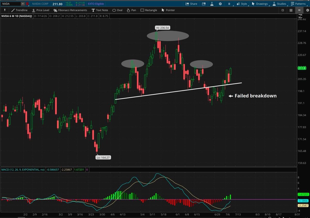
Roughly two weeks ago I shared a daily chart of this head and shoulders breakdown in $NVDA as it was nearing old support turned new resistance (at the time) of its pattern neckline.
I discussed the implications for the broader market if this was indeed a “failed breakdown,” meaning that price had failed to remain beneath old support and re-entered the price formation above $202.
After breaking back above that polarity zone, price has sustained 5 consecutive closes above this level on accelerating bullish momentum, which would give traders confirmation that the bulls are back in control.
As price hovers around its first level of resistance on the daily chart, at the shoulder of the failed formation ~$213, a more interesting development is forming on a shorter time frame.
Zooming into price on the 4-hour chart, we can see that $NVDA is now forming a possible inverted head and shoulders formation with the neckline resistance right around $213.
The depth of this possible formation, from lows to neckline highs is ~$23. This means that if price can break above this crucial short-term resistance, a measured move could place the stock up near former swing highs ~$235, just shy of all-time highs.
Once again, the implications for the broader market could be quite impactful, especially given the fact that $NVDA consumes ~8% weighting in $SPX and an even greater weighting of ~12% in the $NDX.
(Oh and today we may have just seen the first signs to a bullish breakout of the AVWAP pinch 🤫)
*Not a recommendation
@SchwabTrading @SchwabNetwork


Rachel Dashiell, CFP, CMT@RachelDashCS
Chart of the day: The implications for the broader market could be massive if this ends up being a false breakdown in $NVDA *Not a recommendation @SchwabNetwork @SchwabTrading
English
@Wyn2Much Hey Prince! No I do not. I took a brand new role as Head of Technical Research & Strategy within Schwab Center for Financial Research.
I still teach Trading Price Patterns and still will attend some of the workshops :)
English

@RachelDashCS Good Afternoon, you don’t teach the Long Options webcast anymore? If not what do you still teach please?
English

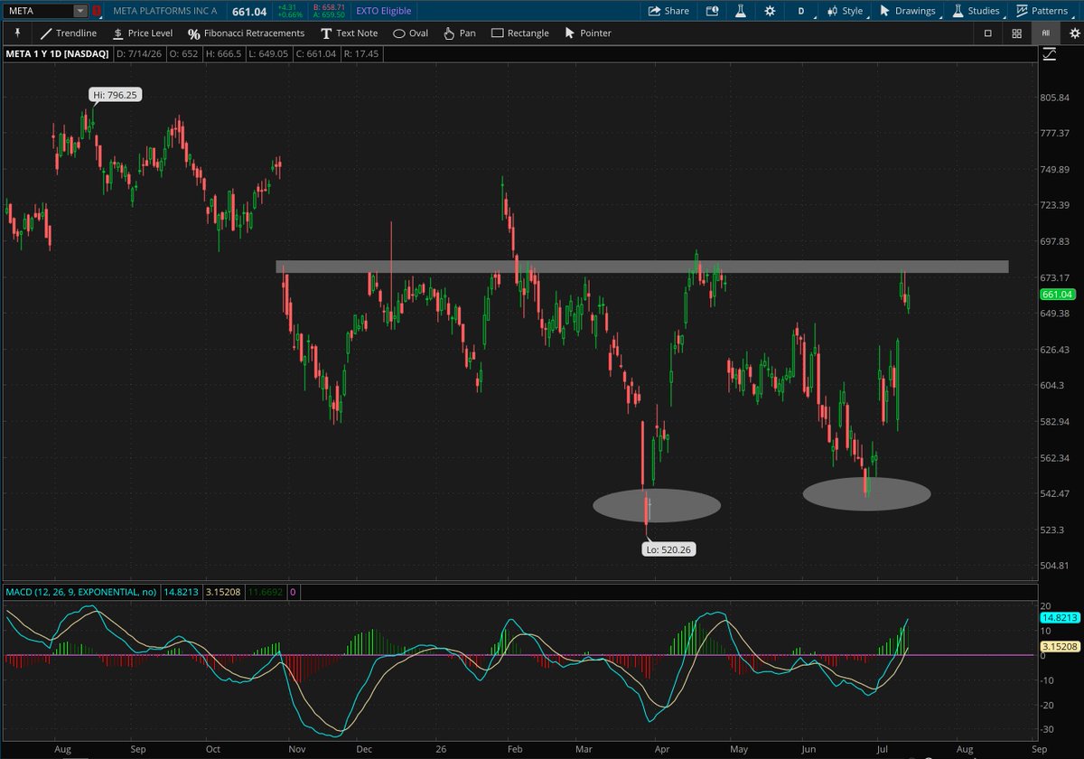
What if we saw a broadening across $Communications & $Discretionary too?
$GOOGL
$AMZN
$META
What if it's a market that's prepping to fire on all cylinders?
*Not a recommendation
@SchwabNetwork @SchwabTrading


English

For anyone who read this long-form content, thank you.
Here is the short-form for the non-reader types:
The evidence seems stacked for the $DXY to break down here and move lower and $EUR/ $USD to strengthen
*Not a recommendation
Rachel Dashiell, CFP, CMT@RachelDashCS
$DXY and $EUR/ $USD: A Lesson in Confirmation, Volatility, and Inflection Points ------------------------------------------------------------ (Disclaimer: These charts are intentionally indicator-heavy—not because indicators predict price, but because they help illustrate the relationship between price, volatility, and key support/resistance levels. The goal with utilizing these indicators is to tell the story surrounding price action and demonstrate how volatility behaves as markets approach and interact with major inflection points.) One of the more interesting developments across global markets this year has been the battle taking place between the U.S. Dollar Index (DXY) and EUR/USD at major long-term support and resistance levels. Despite several attempts by both markets to break through these zones, only one has delivered the type of confirmation that technicians typically look for before declaring a structural, long-term trend change. Remember: A break is not a breakout until it is confirmed. ---------------------------------------------------------- The Importance of Confirmation: Throughout the year until just recently, both DXY and EUR/USD have held key support and resistance zones. The Dollar spent most of its time held in a range between 96-100, with100 acting as a multi-year crucial polarity zone. The EUR/USD pair held over a key support zone ~1.14 as it formed a massive head and shoulders topping formation. However, only one market produced long-term confirmation criteria: - $DXY - achieved two consecutive weekly closes above major resistance, now new support ~100. - $EUR/ $USD - never achieved two consecutive weekly closes below long-term support ~1.14. Confirmation is essential because markets are full of early or false moves. Some of the biggest failed breakouts occur when traders and investors react to the initial break rather than waiting for confirmation. ---------------------------------------------------------- $EUR.USD: Repeated Tests of Support The gray zone on the EUR/USD chart represents that major area of old long-term support now new resistance ~1.14 that has repeatedly influenced price behavior over the past year. Notice how many of the arrows on the ADX panel align closely with important turning points. The ADX (Average Directional Index) measures the strength of a trend. When ADX reaches elevated levels following an extended directional move, it often suggests the trend has reached an extreme. In EUR/USD, several notable peaks in ADX occurred near tests of support and resistance as well as intermediate-term exhaustion points. This doesn't mean a reversal is guaranteed, but historically it has signaled that trend momentum has waned. ---------------------------------------------------------- $DXY: The Mirror Image The Dollar Index has effectively been the inverse story. Instead of repeatedly testing support, DXY has spent much of the year testing resistance. Similar to the EUR/USD pair, notice several notable ADX peaks in the DXY occurred near tests of support and resistance as well as intermediate-term exhaustion points. ---------------------------------------------------------- The Last Ingredient: The Volatility Squeeze One of the most useful observations on these charts comes from the relationship between Bollinger Bands and Keltner Channels. 1. Bollinger Bands - Bollinger Bands measure volatility based on two standard deviations above and below a 20-day moving average (DMA). When volatility expands, the bands widen. When volatility contracts, the bands narrow. 2. Keltner Channels - Keltner Channels also measure volatility, but they use Average True Range (ATR) instead of standard deviation. They tend to be smoother and less reactive than Bollinger Bands. 3. Putting it All Together: The TTM Squeeze - A volatility squeeze occurs when Bollinger Bands move inside the Keltner Channels. This condition signals that implied volatility has contracted significantly. Volatility is mean-reverting, meaning that contractions will ultimately resolve into expansions. With these expansions in implied volatility, prices tend to escape the trading range, and a definitive directional move typically occurs. The squeeze itself does not predict the direction in which the market will expand. It simply identifies periods when volatility has become unusually compressed and a larger move may be approaching. With the momentum oscillator histogram displaying weakening momentum in the US Dollar Index and improving momentum in the EUR/USD, the market may be hinting to the direction in which this volatility could expand. ---------------------------------------------------------- The Bottom Line: Markets frequently test major inflection points multiple times before establishing a durable trend. Price can temporarily move beyond a specified level, volatility can surge, and trend strength can accelerate. But until confirmation occurs through consecutive sustained closes and follow-through, long-term support and resistance remain. The current setup in both the DXY and EUR/USD suggests those markets may once again be approaching an important decision point – and the volatility setup is quite compelling for a directional move that could provide true confirmation for both markets. A sustained move back above ~1.14 resistance in EUR/USD with a simultaneous move back below long-term support ~100 in DXY could carry some life back into risk assets such as equities, international, and commodities. ---------------------------------------------------------- ***Charts and technical analysis for educational purposes only. Not a recommendation to buy or sell any security. ***Technical analysis is not recommended as a sole means of investment research. ***Charts courtesy of thinkorswim. @SchwabNetwork @SchwabTrading
English
Rachel Dashiell, CFP, CMT retweetledi

we cant have a bear market when these lines keep moving higher
Alfonso De Pablos, CMT@AlfCharts
The Advance-Decline Lines for the S&P 500, S&P 400, and S&P 600 have all pushed to fresh all-time highs. Take a look at the chart 👇
English
@UmpaLumpagimp We can't show ETF charts :(
Anchored to yearly highs and recent swing lows!
English

@RachelDashCS Could you post a chart showing the pinch and breakout? Thanks.
English
Did anyone see that bullish breakout in the MAGS from the AVWAP pinch the other day? 👀
(Not a recommendation)
English
$DXY and $EUR/ $USD: A Lesson in Confirmation, Volatility, and Inflection Points
------------------------------------------------------------
(Disclaimer: These charts are intentionally indicator-heavy—not because indicators predict price, but because they help illustrate the relationship between price, volatility, and key support/resistance levels. The goal with utilizing these indicators is to tell the story surrounding price action and demonstrate how volatility behaves as markets approach and interact with major inflection points.)
One of the more interesting developments across global markets this year has been the battle taking place between the U.S. Dollar Index (DXY) and EUR/USD at major long-term support and resistance levels.
Despite several attempts by both markets to break through these zones, only one has delivered the type of confirmation that technicians typically look for before declaring a structural, long-term trend change.
Remember: A break is not a breakout until it is confirmed.
----------------------------------------------------------
The Importance of Confirmation:
Throughout the year until just recently, both DXY and EUR/USD have held key support and resistance zones.
The Dollar spent most of its time held in a range between 96-100, with100 acting as a multi-year crucial polarity zone.
The EUR/USD pair held over a key support zone ~1.14 as it formed a massive head and shoulders topping formation.
However, only one market produced long-term confirmation criteria:
- $DXY - achieved two consecutive weekly closes above major resistance, now new support ~100.
- $EUR/ $USD - never achieved two consecutive weekly closes below long-term support ~1.14.
Confirmation is essential because markets are full of early or false moves. Some of the biggest failed breakouts occur when traders and investors react to the initial break rather than waiting for confirmation.
----------------------------------------------------------
$EUR.USD: Repeated Tests of Support
The gray zone on the EUR/USD chart represents that major area of old long-term support now new resistance ~1.14 that has repeatedly influenced price behavior over the past year.
Notice how many of the arrows on the ADX panel align closely with important turning points.
The ADX (Average Directional Index) measures the strength of a trend. When ADX reaches elevated levels following an extended directional move, it often suggests the trend has reached an extreme.
In EUR/USD, several notable peaks in ADX occurred near tests of support and resistance as well as intermediate-term exhaustion points.
This doesn't mean a reversal is guaranteed, but historically it has signaled that trend momentum has waned.
----------------------------------------------------------
$DXY: The Mirror Image
The Dollar Index has effectively been the inverse story.
Instead of repeatedly testing support, DXY has spent much of the year testing resistance.
Similar to the EUR/USD pair, notice several notable ADX peaks in the DXY occurred near tests of support and resistance as well as intermediate-term exhaustion points.
----------------------------------------------------------
The Last Ingredient: The Volatility Squeeze
One of the most useful observations on these charts comes from the relationship between Bollinger Bands and Keltner Channels.
1. Bollinger Bands - Bollinger Bands measure volatility based on two standard deviations above and below a 20-day moving average (DMA). When volatility expands, the bands widen. When volatility contracts, the bands narrow.
2. Keltner Channels - Keltner Channels also measure volatility, but they use Average True Range (ATR) instead of standard deviation. They tend to be smoother and less reactive than Bollinger Bands.
3. Putting it All Together: The TTM Squeeze - A volatility squeeze occurs when Bollinger Bands move inside the Keltner Channels.
This condition signals that implied volatility has contracted significantly. Volatility is mean-reverting, meaning that contractions will ultimately resolve into expansions.
With these expansions in implied volatility, prices tend to escape the trading range, and a definitive directional move typically occurs.
The squeeze itself does not predict the direction in which the market will expand. It simply identifies periods when volatility has become unusually compressed and a larger move may be approaching.
With the momentum oscillator histogram displaying weakening momentum in the US Dollar Index and improving momentum in the EUR/USD, the market may be hinting to the direction in which this volatility could expand.
----------------------------------------------------------
The Bottom Line:
Markets frequently test major inflection points multiple times before establishing a durable trend.
Price can temporarily move beyond a specified level, volatility can surge, and trend strength can accelerate. But until confirmation occurs through consecutive sustained closes and follow-through, long-term support and resistance remain.
The current setup in both the DXY and EUR/USD suggests those markets may once again be approaching an important decision point – and the volatility setup is quite compelling for a directional move that could provide true confirmation for both markets.
A sustained move back above ~1.14 resistance in EUR/USD with a simultaneous move back below long-term support ~100 in DXY could carry some life back into risk assets such as equities, international, and commodities.
----------------------------------------------------------
***Charts and technical analysis for educational purposes only. Not a recommendation to buy or sell any security.
***Technical analysis is not recommended as a sole means of investment research.
***Charts courtesy of thinkorswim.
@SchwabNetwork @SchwabTrading


English

@RachelDashCS Thank you for this thorough technical analysis, Rachel❤️.
English
My last weekend in Greenville, SC with my sisters 🫶🏼🥹 you truly do make your plans & you hear God laughing!!!!!
“How lucky I am to have something that makes saying goodbye so hard”



English
Btw, this confirmed breakdown in the $EUR/ $USD pair was never achieved...
Looking at the weekly view, you can see there has not been two consecutive weekly closes below this long-term support zone ~1.14, and downside momentum is waning
*Not a recommendation
@SchwabNetwork @SchwabTrading

Rachel Dashiell, CFP, CMT@RachelDashCS
Chart of the day: $EUR $USD pair is breaking long-term support of a year-long head & shoulders topping formation 2 weekly closes below this level would act as long-term confirmation of a further move to the downside *Not a recommendation @SchwabNetwork @SchwabTrading
English
Rachel Dashiell, CFP, CMT retweetledi
