Ramora@RamoraAgency·8hMost beginners ruin their design without noticing: – too many colors – bad fonts – no spacing Keep it simple. That’s the trick.Çevir English0017
Ramora@RamoraAgency·2dSimple rule: If it doesn’t help the user, remove it. Less = better UX.Çevir English00110
Ramora@RamoraAgency·2dLearning with my wife feels different. We’re building something real together. That’s motivating.Çevir English00111
Zayden ✧ SaaS Expert@RakibullHassa13·3dImpressive to see the Header Animation Magician @basit_designsÇevir English343666122.5K445
Ramora@RamoraAgency·3d
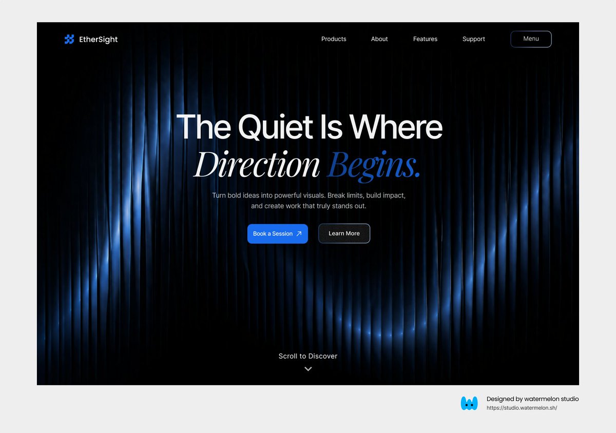
@viktoroddy Straight out of the movie, how long did that take to built?Çevir English0003
Viktor Oddy@viktoroddy·4d
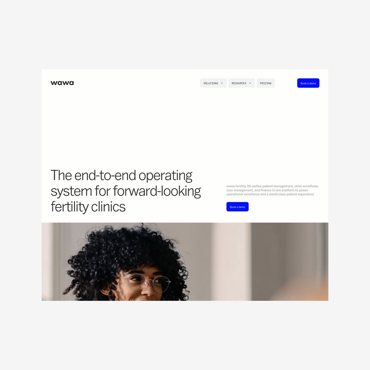
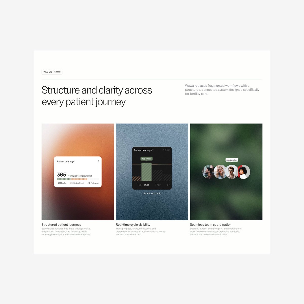
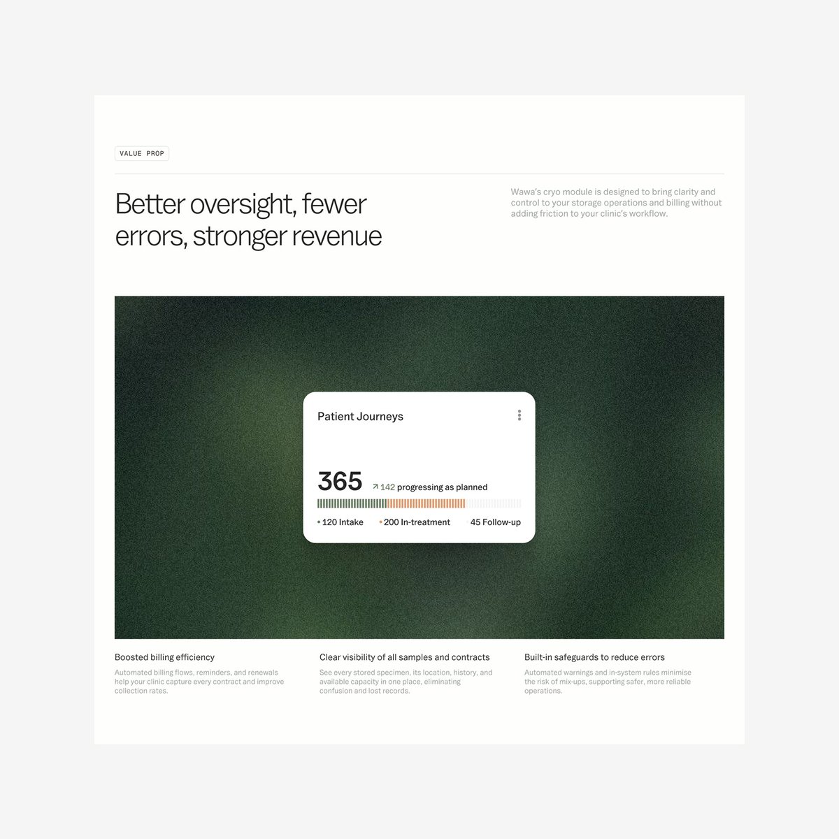
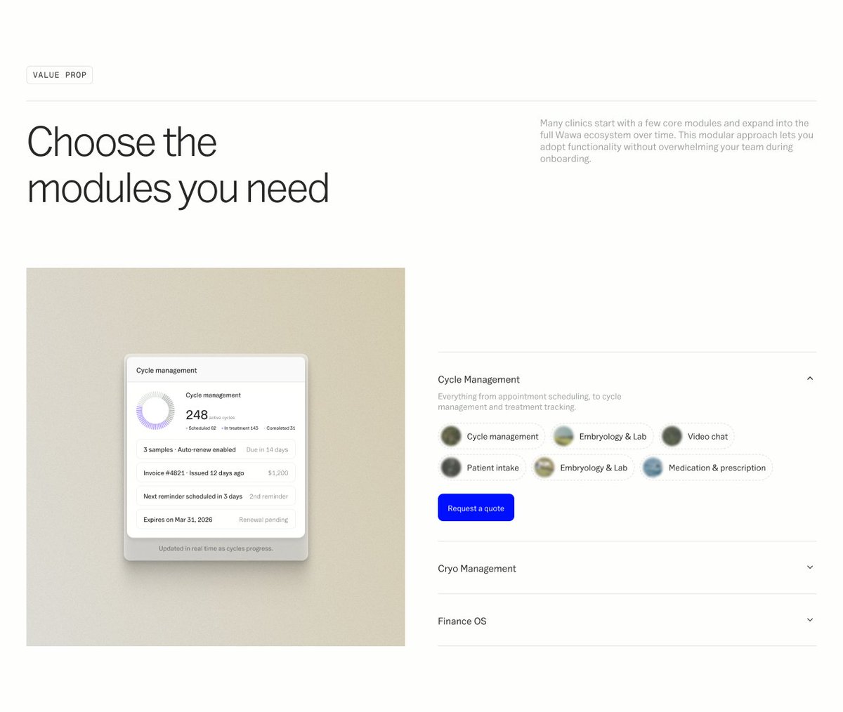
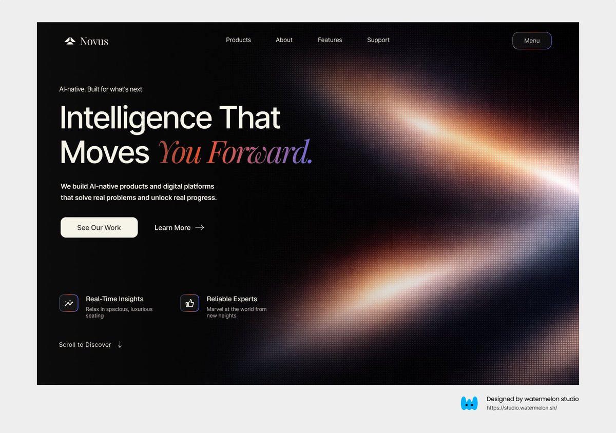
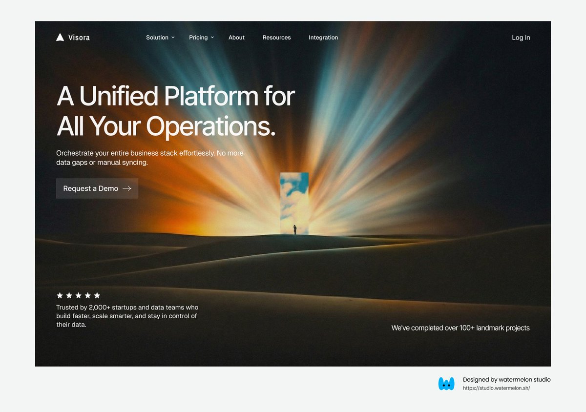
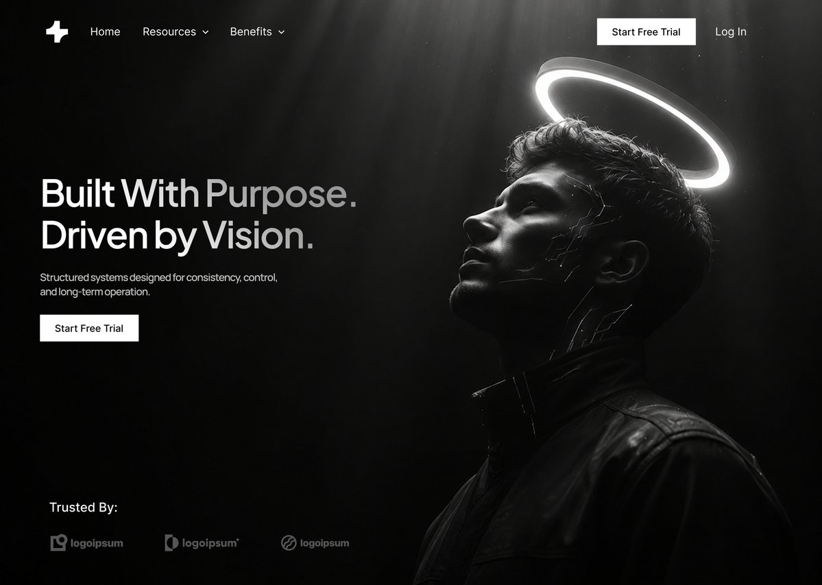
Antigravity + Shaders Premium SaaS Landing page built fully with AI and anyone can achieve the same results. Prompt below 👇Çevir English161524714.3K306
Ramora@RamoraAgency·3d
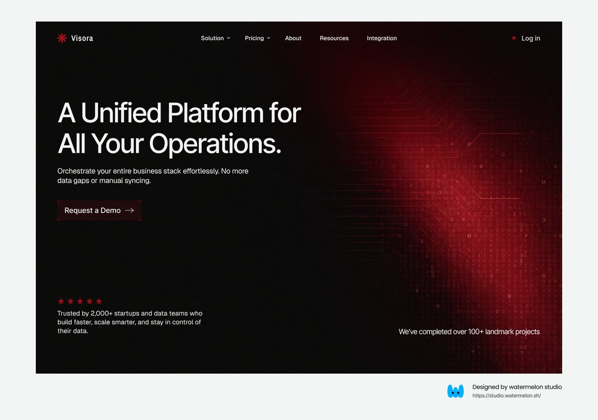
@noordesignn All of them are sick but I think it would be even better if the color would be behind the textÇevir English0000
Sai Satvik@saisatvik_·5dcleanest web design we’ve shipped recently for $5000 🔖Çevir English261462030.6K575
Ramora@RamoraAgency·3dGood design isn’t art. It’s clarity. If users don’t understand it in 3 seconds, you already lost.Çevir English00112
Ramora@RamoraAgency·4dColors have meaning: - Green = success - Red = error - Yellow = warning - Blue = info Use them right.Çevir English00118