
Tanner Antill
1.6K posts

Tanner Antill
@TLAartwork
Graphic Designer | USCB BA | Dm or email me at [email protected] for inquiries
Charlotte, NC Katılım Nisan 2015
659 Takip Edilen1.7K Takipçiler

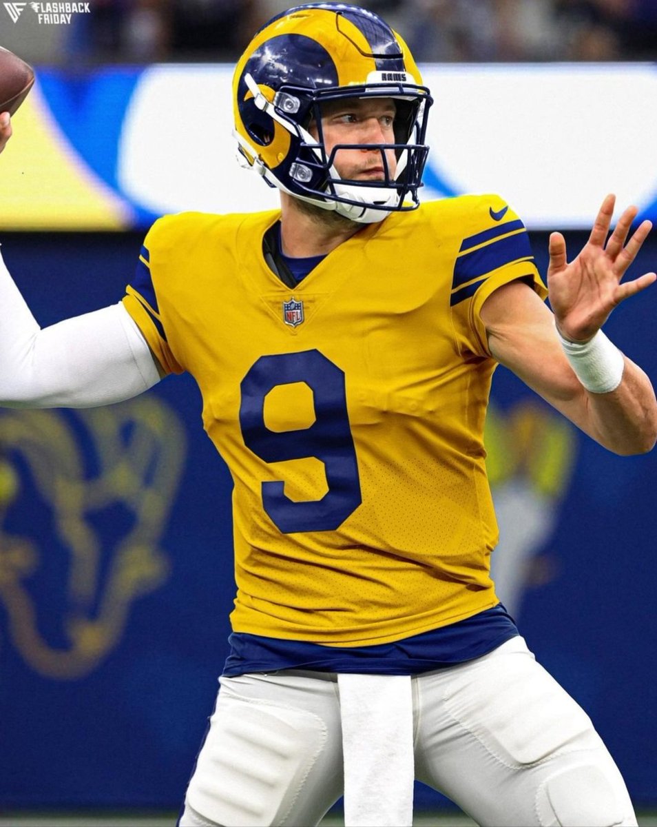
@RamsUp_Ian Yeah, that’s the perfect revamp. I’d be curious to see the yellow and blue flip on the away though.
English

These 4 Uniforms are all the #Rams need...
Modern Blue,
Modern White,
60s White,
50s Yellow,
Fingers crossed at least 3 of these 4 possible combinations happen...
#RamsHouse
#RamsUpPodcast


Zach Cohen@ZachCohenFB
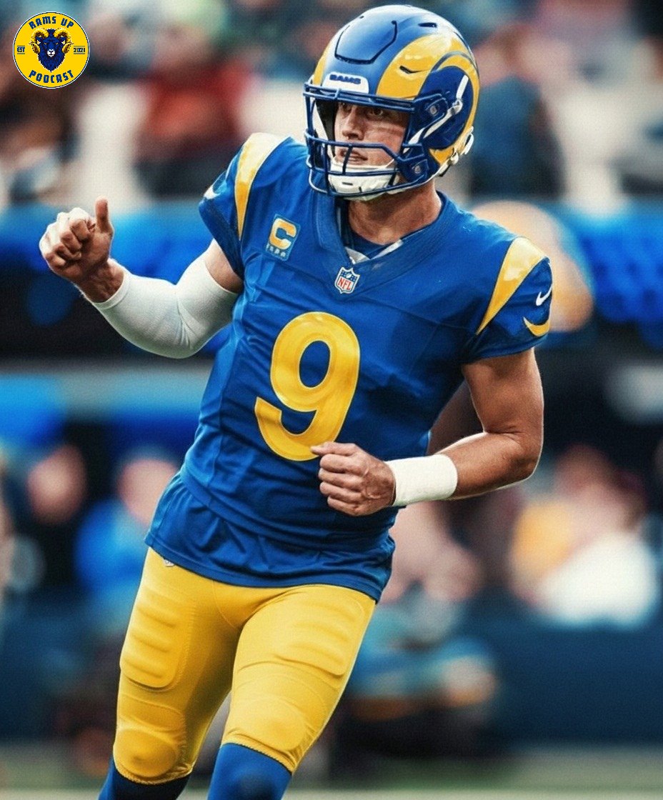
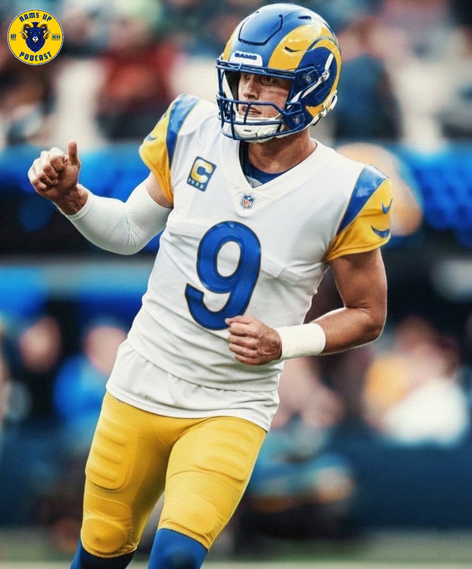
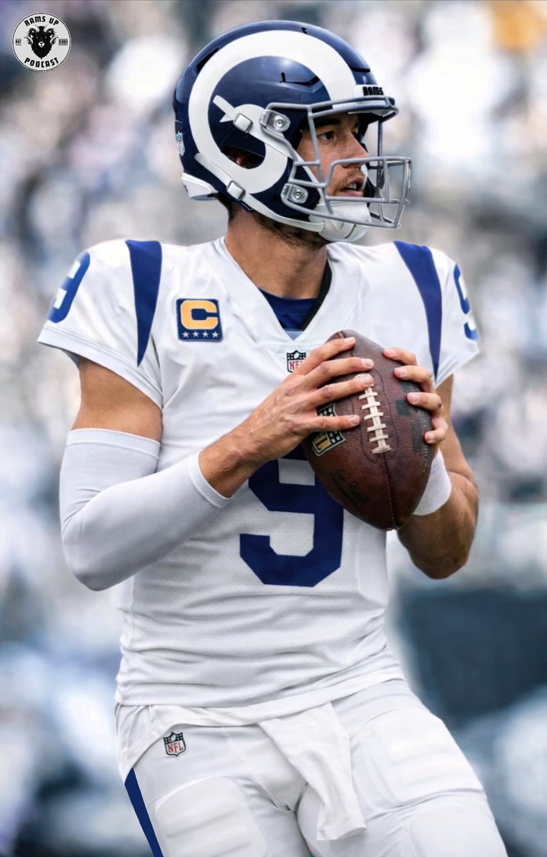
A reminder that the Rams are not changing their helmets, only their jerseys The new alternate uniform will have a new helmet
English

@darealconman @Ravens Thanks for the feedback! I like the trim personally, just something like the broncos collar. Subtle but enough to pop. I do think the nfl panel can ruin collar design though, the bills for example.
English

@TLAartwork @Ravens Just get rid of the Gold stripes on the collar, and it would be a big improvement.
The wing overlay is really nice. If that design element is used, I would expect that to be the iridescent accents that are rumored to be featured.

English

@_monsoon_x @Ravens Yeah I thought about how they could do it. Maybe on the black jerseys they could do white numbers with gold and red outlines? Black purple and red is one of my favorite color schemes.
English

@TLAartwork @Ravens The one thing I wish they would take advantage of is the red accent on the eyes and use it
English

@darealconman @Ravens Which part? The gold or the wing overlay
English

@TLAartwork @Ravens That collar looks horrible, but everything else about this uniform looks decently admirable at minimum.
Love the Iridescent Purple helmet more than anything.
English

@AceOf_Spaid @fashion_nfl @Ravens If they use this on their uniforms, I’m interested to see if they’d take any inspiration from tcus past helmets.


English

@fashion_nfl @TLAartwork @Ravens I think they give a hint with the direction on the primary logo for the helmet, seems to be in the team issued gear players are wearing too


English

@fashion_nfl 100% agree. The aesthetic they have is already amazing. Don’t make big changes
English

Ravens are the most fascinating redesign team in recent memory. From my vantage point, they have a high approval rating with uniform nerds and casuals alike. Personally ranked their wardrobe sixth last offseason.
I'd only make slight tweaks (pant stripe on black pants, wordmark update, and perhaps a return of the bird sleeve logo). But with a sharp logo, unique color scheme, and my favorite city/team name brand cohesion in the league, you're always going to have sky-high potential.
Messing with existing greatness is always a high risk-high reward proposition. But I'm eternally optimistic until I have a reason not to be.

English

How have I never seen these atrocities
JonesC@JonesC39850
@chxnluh @BengalYouTube Are you sure?
English


@mattkaroly It’s the panthers problem too unfortunately.
It’s flat and doesn’t work nearly as well as it did with Reebok.


English

Sounds like the reason they didn’t roll out gray/silver pants is because they couldn’t get the color to blend well with the rest of the fit. Disappointing.
Miles Garrett@MilesGarrettTV
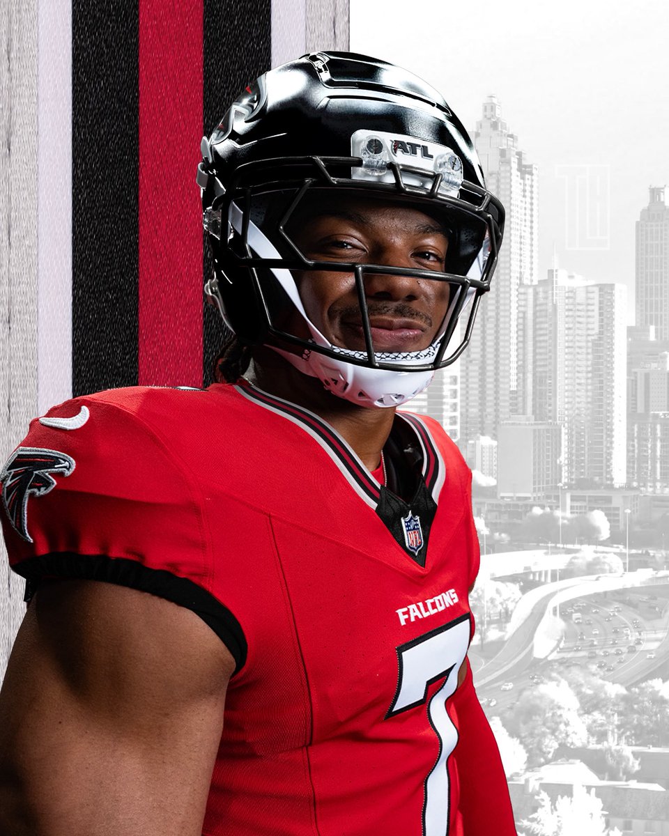
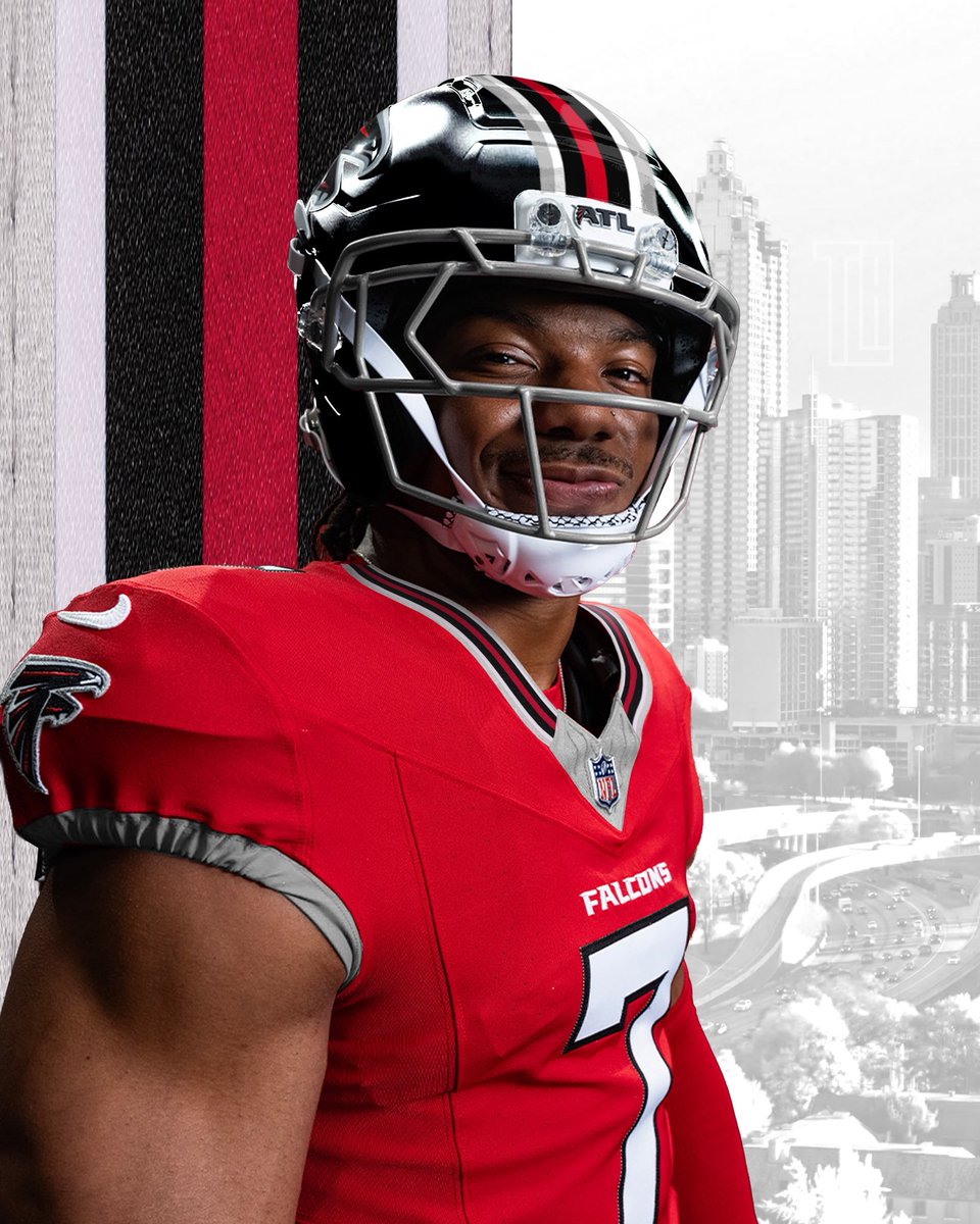
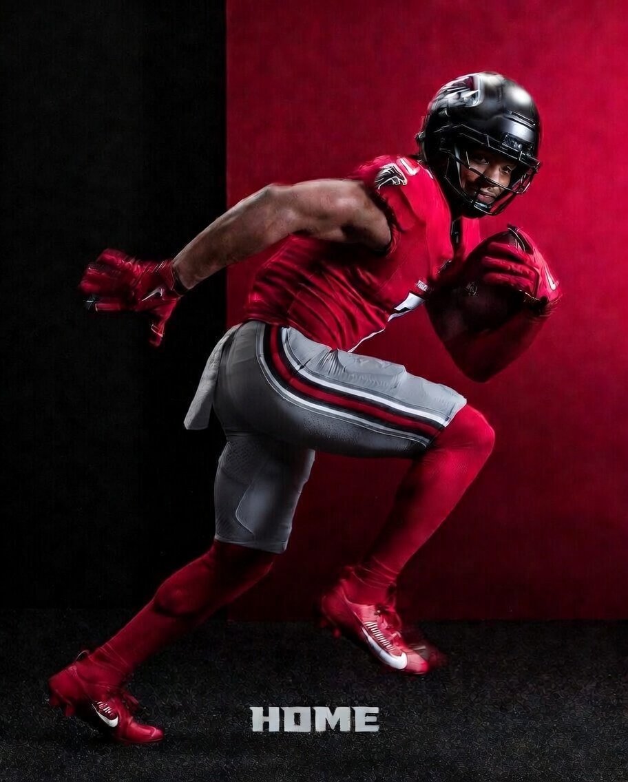
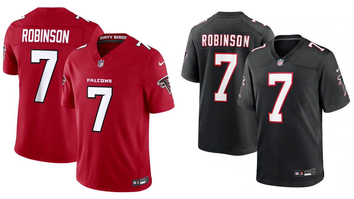
The new #Falcons uniforms are here. @ZachCohenFB offers his thoughts, including the silver discussion.
English

@hkmett51 The word mark is also 20x the size, super similar in that aspect lol
English

Falcons' new unis blow the Cardinals' unis out of the water if you know what you're looking it from a design and aesthetic perspective.
Dov Kleiman@NFL_DovKleiman
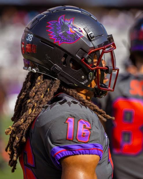
The Arizona Falcons 😭😭 They are nearly identical.
English

@fashion_nfl @LadamirP Something like this would’ve been really cool. Adds more without crowding the uniform. What they made is still miles better though.

English

@LadamirP They could do stripes. There's just very limited sleeve real estate in today's jersey cuts. Theoretically could add a thinner stripe under the Falcon. But the outline and accents of the Falcon already have a lot going on. And a stripe starts making things feel crowded.

English

I’m so confused be Nike. They said they couldn’t do the stripes on the sleeves b/c certain players have different sleeve cuts which would be different from retail jerseys… like they didn’t just do this for the Titans
NFL Fashion Advice@fashion_nfl
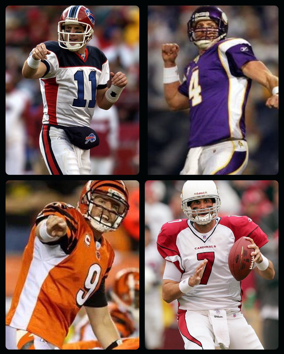
Let's test drive some new uniform matchups and see what happens.
English

The @AtlantaFalcons released their new and improved unis today! I really liked their pant stripe so I did a little reimagining to add more to it.


English

@fashion_nfl I think it’s in combination. The throwback jersey along with the helmet makes for a very clean set. Bland jersey but the uniqueness and contrast of the helmet makes the set great.
English

The notch will always scream Michigan State to me. They popularized it years ago, and then Nike started offering that MSU font to high school teams, so now it just reads "high school".

NFL Fashion Advice@fashion_nfl
Number and nameplate fonts are both spectacular. Numbers in particular are everything I've ever wanted from the Falcons. Taps into a block style but in a non-boilerplate manner. And that notch screams Falcons.
English


