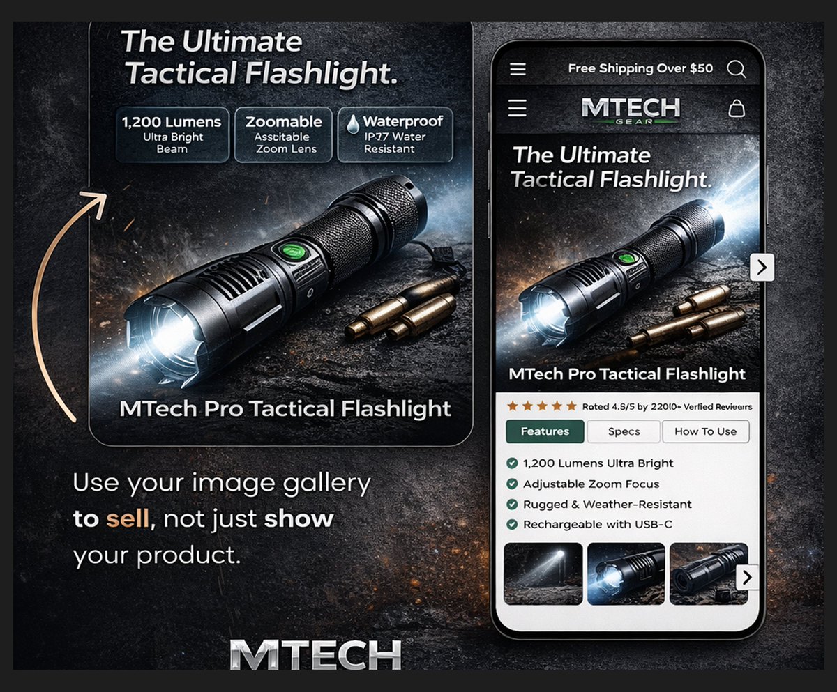
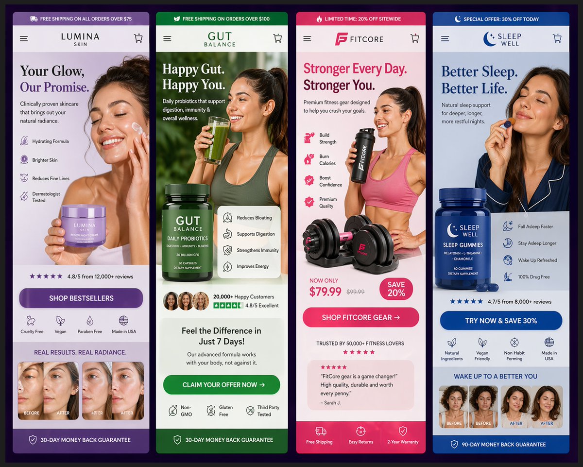
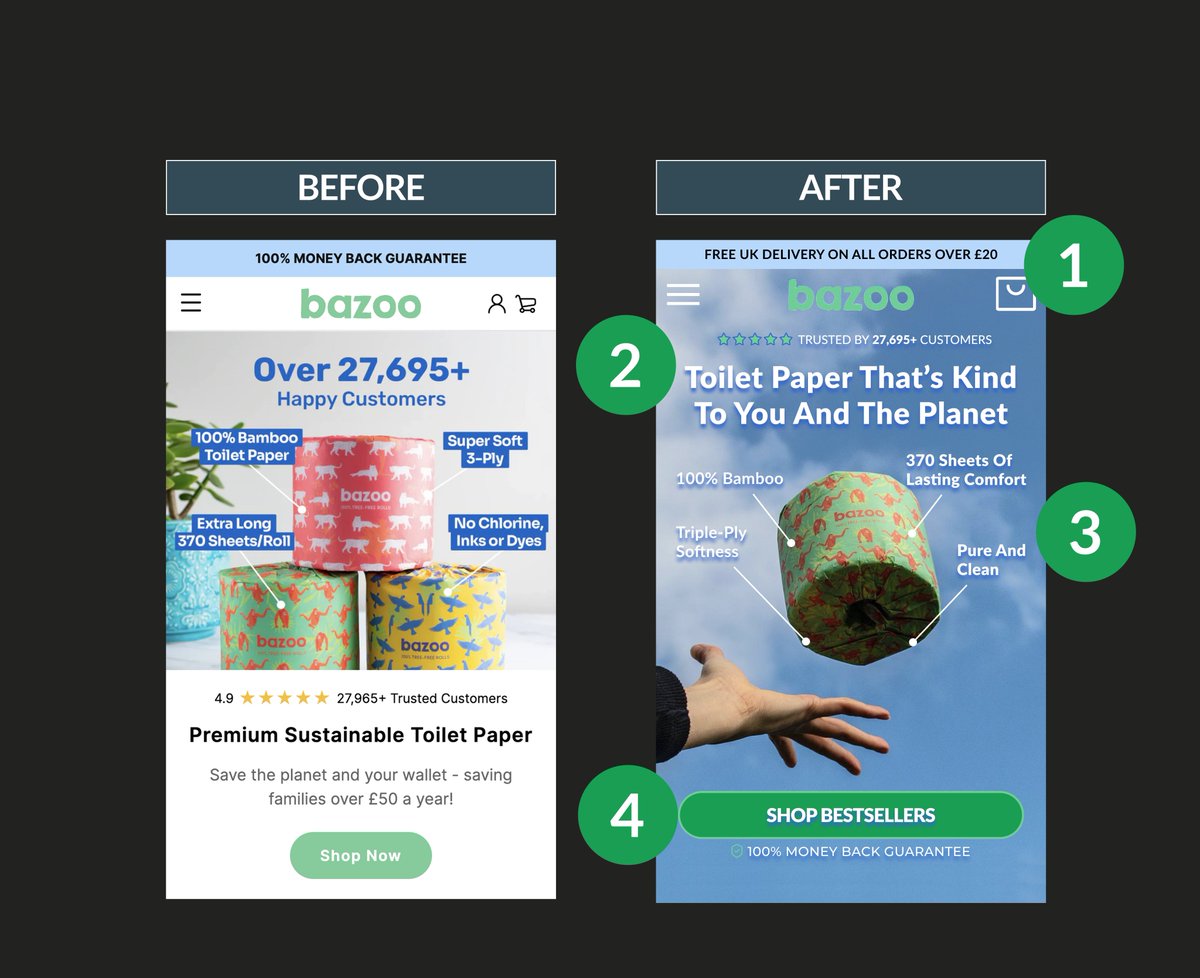
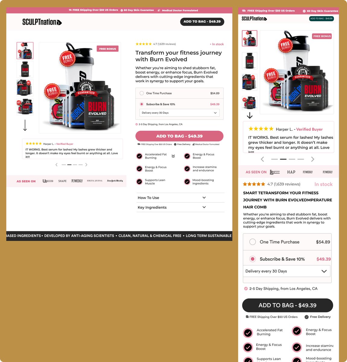
Sunny Ecom

388 posts

Sunny Ecom banner
Sunny Ecom

Sunny Ecom

@ThankGodSunny

Turning More Of DTC Traffic Into Consistent Revenue With High Conversion Focused Landing Pages || Figma Designer || Replo Dev || Shopify expert

Akure,Nigeria. Katılım Aralık 2023
1.8K Takip Edilen181 Takipçiler
Nazar
Nazar@Nazar581486·
@ThankGodSunny @figma wow! Perfectly matching granola colors looks very audience oriented.
English
1
0
1
26
Sunny Ecom
Sunny Ecom@ThankGodSunny·
PDP designed for Bunky brand using @figma
Sunny Ecom tweet media
English
1
0
26
342
Sunny Ecom
Sunny Ecom@ThankGodSunny·
Turned a basic product gallery into a conversion machine. Instead of just showing the flashlight, i focused on: Clear benefit driven visuals Strong feature callouts Real product context Mobile first experience Same product. Better presentation. Higher intent to buy #ecommerce
Sunny Ecom tweet media
English
0
0
2
66
Sunny Ecom
Sunny Ecom@ThankGodSunny·
Behind every great brand is a story that got lost in the noise. These pages were beautiful but busy shoppers were getting lost before they even hit the cart. I helped them strip back the fluff and lead with what matters ( real results). #DTC #Ecommerce #Design #CRO
Sunny Ecom tweet media
English
0
0
19
349
Sunny Ecom
Sunny Ecom@ThankGodSunny·
Pretty isn’t enough,you need to sell. Here’s the breakdown: Sell the result (14-day glow), not the vibe. Show the routine. Make it look easy & tasty. Go big on Before/Afters. Proof = Profit. If they can’t find the "Buy" button in 2 seconds you’ve lost the sale. #CRO #DTC
Sunny Ecom tweet media
English
0
0
15
197
Sunny Ecom
Sunny Ecom@ThankGodSunny·
Hero section designed for Popcorn @figma
Sunny Ecom tweet media
English
1
0
13
288
Sunny Ecom
Sunny Ecom@ThankGodSunny·
Most CRO wins from removing friction not adding more stuff. Made a few key changes to this product page : Product visuals moved up Reviews made instantly visible Cleaner benefits,less cluster Simplified variants + pricing Stronger CTA. #ecommerce #uxdesign #cro
Sunny Ecom tweet media
English
0
0
8
173
Sunny Ecom
Sunny Ecom@ThankGodSunny·
Before vs After The old version talks The new version hits No more trying to say everything at once Just one clear message, one strong visual, one action. You land, you get it and you click. That’s the difference between a page people look at and a page people buy from. #Figma
Sunny Ecom tweet media
English
0
0
12
197
Nick Theriot
Nick Theriot@nicktheriot_·
Month off to a strong start for some of our clients Launching mothers day gifting ads tomorrow to scale even further 🤑
Nick Theriot tweet media
English
14
0
39
3.2K
Sunny Ecom
Sunny Ecom@ThankGodSunny·
One of the sections I'd like working on in a landing page is the buy box. Because conversion doesn’t happen on the whole page,it happens right in the buy box. #Buybox #replo #landingpage
English
0
0
14
239
Sunny Ecom
Sunny Ecom@ThankGodSunny·
Most people treat the hero section like its just a design. Is not It’s your first and maybe only chance to answer: what is this ? who is it for ? why should I care? Miss that and they’re gone. Fix your hero, fix your conversions #Herosection #landingpage #Figma #shopify
Sunny Ecom tweet media
English
1
0
13
126
Sunny Ecom
Sunny Ecom@ThankGodSunny·
I tried a hero section with video as the background, and it changes everything for my client. It feels more real. It’s not just design anymore, it’s an experience. If you’ve been sticking to images, maybe try video once. You might be surprised what it does. @replohq
English
0
0
6
151
Sunny Ecom
Sunny Ecom@ThankGodSunny·
Here's what makes a good Buy Box works: 1. Keep it clean and distraction-free 2. Highlight the core product benefits upfront 3. Make the price, guarantee, and reviews visible 4. Use a strong, clear CTA (no guesswork) 5. Ensure it loads fast and looks great on mobile
Sunny Ecom tweet media
English
0
1
20
266
Nugennath
Nugennath@Nugennath·
Looking for: High level creative strategy agency for 7-8 fig brands CRO agency for brands $30-250k a month Please reply to this post Hello
English
51
1
78
8.3K
Raika Labs
Raika Labs@raikalabs·
@ThankGodSunny @figma Love this approach! Letting real users speak for your product builds trust far better than flashy claims. Smart design just supports the message instead of trying to shout over it.
English
1
0
1
15