Greaze_Mode retweetledi
Greaze_Mode
4.4K posts


Greaze_Mode retweetledi

Greaze_Mode retweetledi

Greaze_Mode retweetledi


Greaze_Mode retweetledi

Greaze_Mode retweetledi
Dancehall ilipo yambili koma orunna alipo ochepa.
Tidzuke, tisambe, tiyambepo.
Indonesia
Greaze_Mode retweetledi

Greaze_Mode retweetledi

The MUBAS 3rd Graduation Ceremony shall be held as follows:
🗓️ Wednesday, 10th June 2026
📍 MUBAS Main Campus
🕣 1st Congregation - 8:30AM | 2nd Congregation - 1:00PM
More details: s.mubas.ac.mw/y9dtm7
#MUBASGraduation
#HUWA
#TheHomeOfInnovation
#Innovate #Create #Generate

English
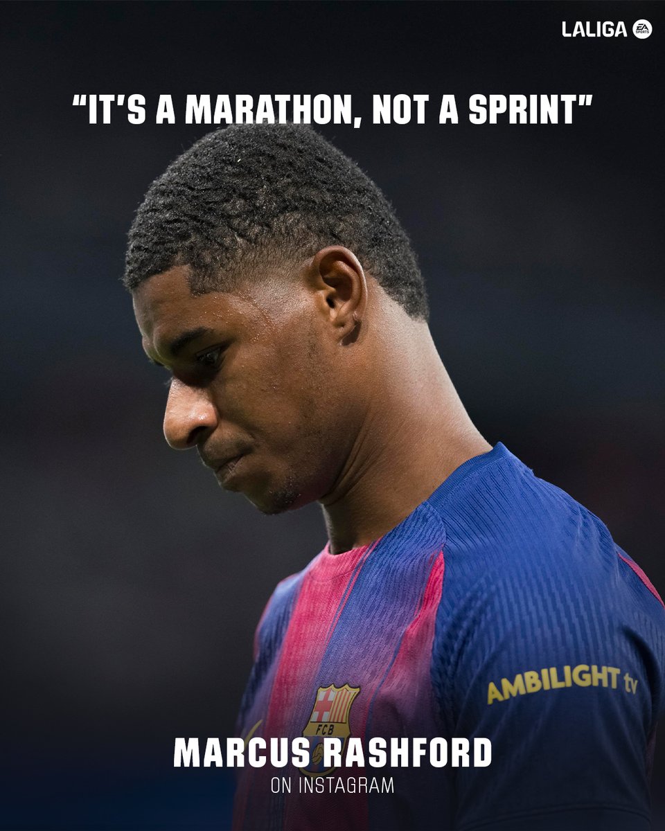
Hansi Flick is selling dreams.
Reshad Rahman@ReshadFCB
❗️Hansi Flick: “Can we compete on the same levels as PSG and Bayern? 100% yes” #FCB 🔵🔴⭐️
English
Greaze_Mode retweetledi


Greaze_Mode retweetledi


Greaze_Mode retweetledi

This Logo Isn’t Just Design—It’s a Blueprint for a Global Brand.
Miles Newlyn is a prominent British typographer and logo designer known for creating identities for major global brands. One of his most recognized contributions is the 2004 Unilever logo, developed in collaboration with Wolff Olins. The redesign replaced the older, more corporate-looking mark with a modern “U” composed of numerous small icons, each symbolizing a different aspect of Unilever’s vast portfolio, from food and hygiene to sustainability and personal care.
Newlyn’s concept centered on expressing the company’s diversity within a single coherent symbol, turning the monogram into a storytelling device that conveyed Unilever’s mission of “adding vitality to life.” The icons within the “U” include representations such as a sun, DNA strand, palm tree, spoon, hand, and recycling symbol, reflecting both the products the company creates and the values it promotes. Alongside the icon-filled monogram, Newlyn also crafted the accompanying wordmark, ensuring a unified typographic voice. The logo has since become an influential example of identity design, praised for its clarity, depth, and ability to humanize a large multinational brand.
#logodecks

English
Greaze_Mode retweetledi
I think people on this app think money is easy to make.
English
Greaze_Mode retweetledi
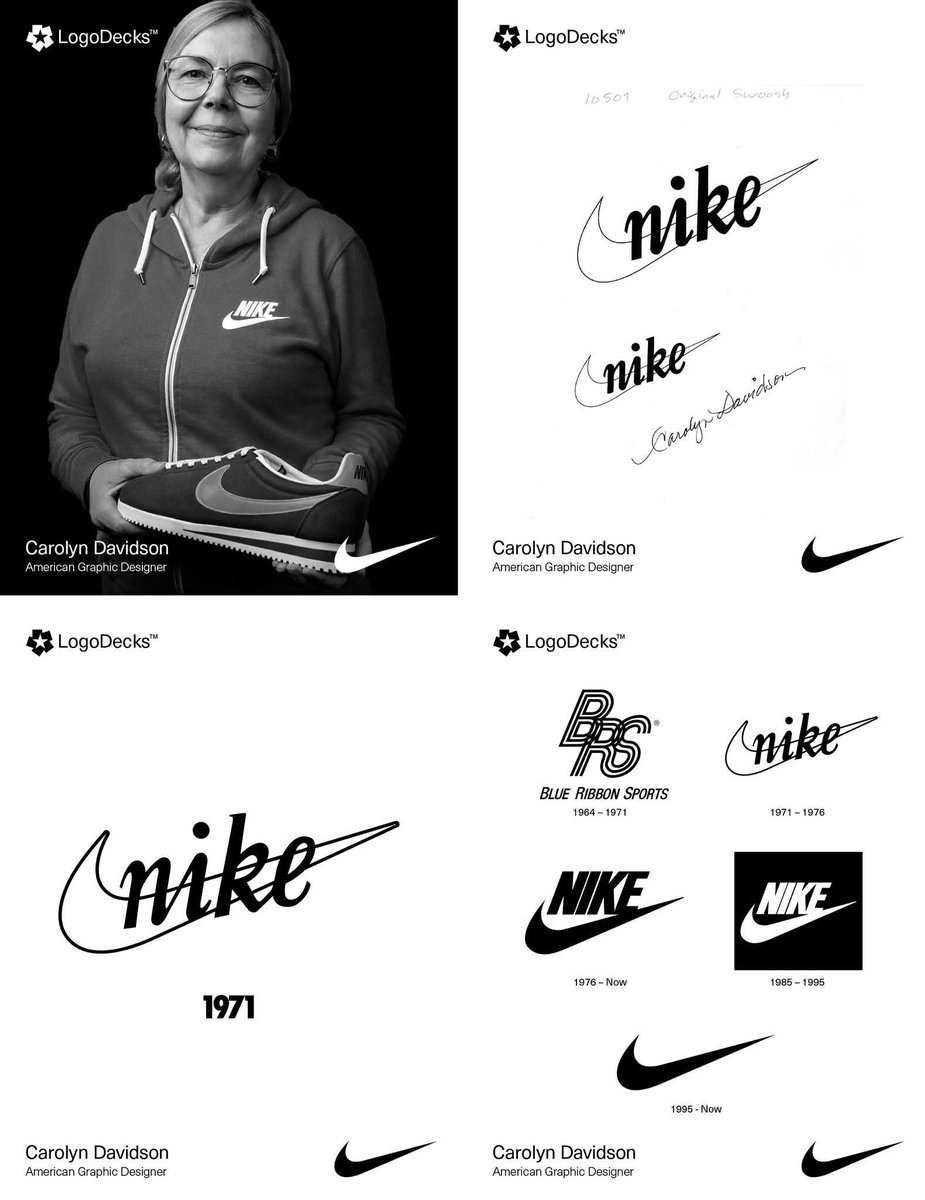
“It’ll Grow on Me”: How Phil Knight Nearly Missed the Power of the Swoosh.
The Nike "Swoosh," designed in 1971 by Carolyn Davidson, a Portland State student, draws from the Greek goddess Nike’s wing, symbolizing speed and victory. Phil Knight, Nike’s co-founder, initially lukewarm, said it would “grow on him.” The logo’s minimalist curve, once criticized as a mere checkmark, became iconic for its adaptability, stretching across products without needing the brand name.
In Greek mythology, Nike, the winged goddess of victory, soared above battlefields, crowning heroes with glory. Daughter of Titan Pallas and Styx, she symbolized triumph in war and sport, often depicted with wings, a wreath, or a palm branch alongside Athena or Zeus. The Winged Victory of Samothrace, a breathtaking 2nd-century BCE sculpture, captures her dynamic grace, embodying success and achievement. Revered by athletes and warriors, Nike’s legacy endures as a beacon of excellence.
Inspired by this divine figure, the Nike brand adopted her name and crafted the iconic Swoosh logo, evoking the goddess’s wing. This sleek, curved design symbolizes motion, speed, and victory, perfectly aligning with Nike’s ethos. Paired with the bold “Just Do It” slogan, the Swoosh has become a global emblem of athletic ambition, adorning footwear, apparel, and stadiums. From ancient Greece to modern tracks, Nike’s spirit of triumph unites mythology and modernity, proving victory is timeless.
#logodecks
English
Greaze_Mode retweetledi

RT please
Who would want their graduation pictures not to look this beautiful eh?
Visit us in Zomba town, Deekays building next to Centenary Bank, first floor, second room.
📸0996 179 730/0880 100 413


Malawi 🇲🇼 English
Greaze_Mode retweetledi

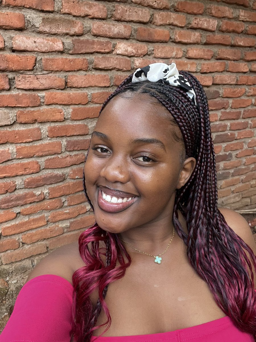
Am I too delusional?my graduation outfit by my deat Chatgpt😂😍...next year kuchema🫵
InshaAllah

English
Greaze_Mode retweetledi

Diploma In Agriculture With Credit🎓🔥
Earned Not Given😎


Ma B.I.G ndinu🤏😎@Bwanali_11
Tomorrow🎓🔥 Theme: Towards Resilient Agricultural Value Chains In Malawi🌾✊️
English
Greaze_Mode retweetledi

Bachelor of Science in Physical Planning with second class🥹❤️
It can only be God!!


English
Greaze_Mode retweetledi

