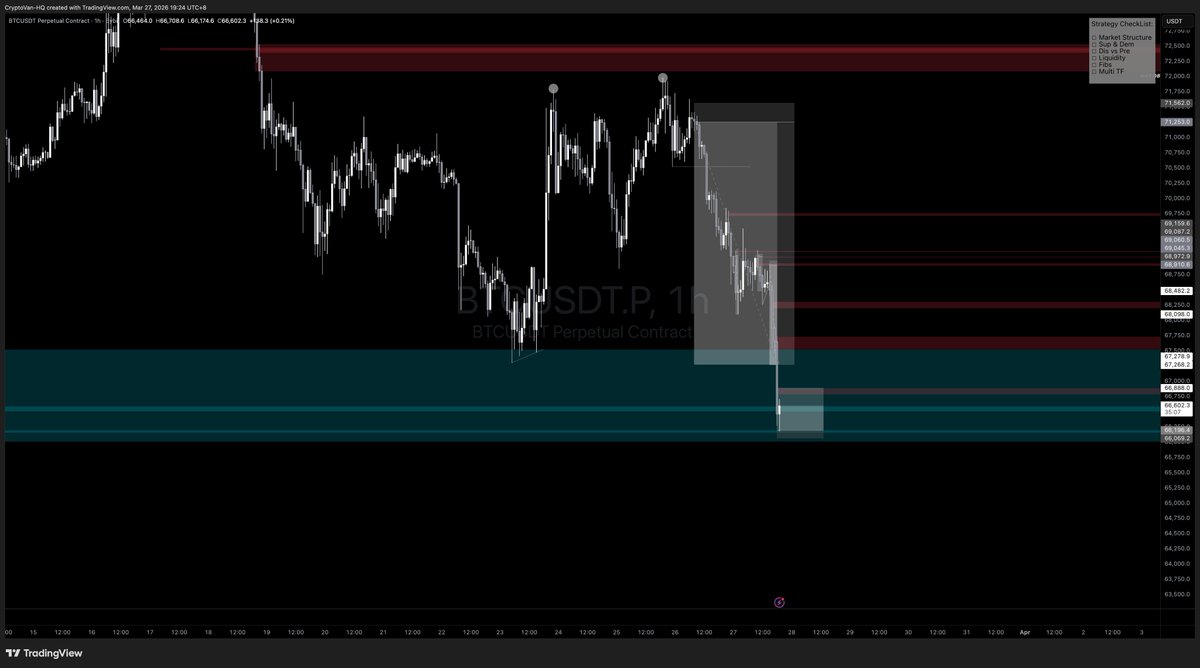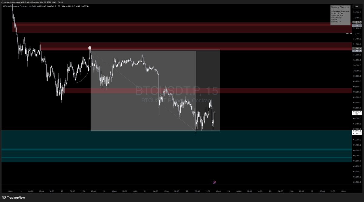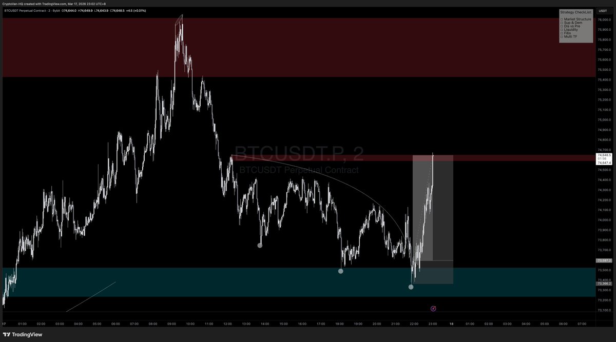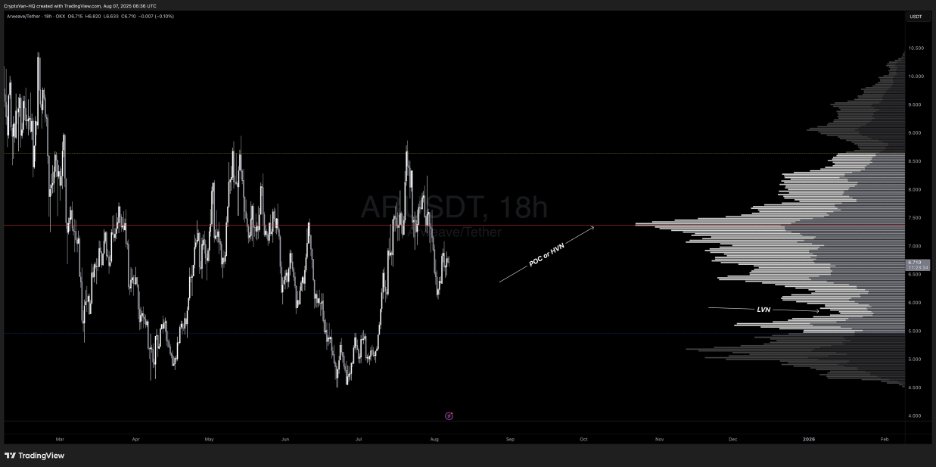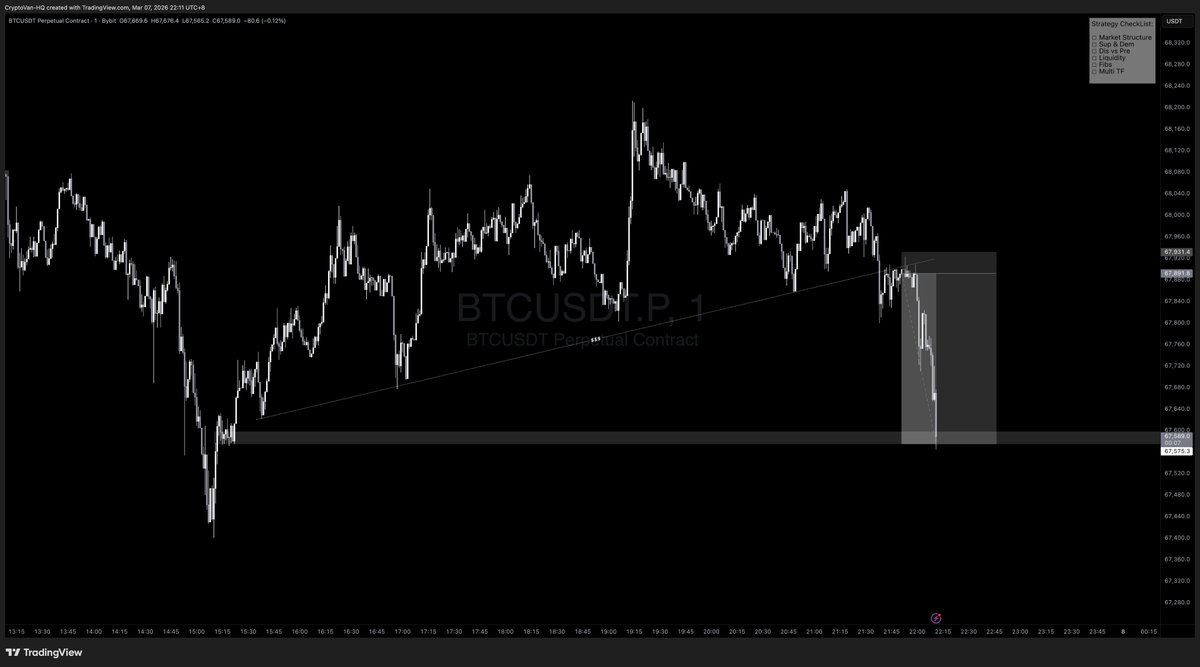

🚨EDUCATIONAL POST: 🔨 VRVP & FRVP VRVP and FRVP are, imho, some of the most underrated advanced charting tools out there. Not many traders I come across use them, yet they pack a serious punch and can add valuable confluence to your trades, no matter the TFs you’re applying them on. Before jumping in, let’s break down the basics. Volume Profile is a histogram shown vertically along the side of a price chart, plotting the total volume traded at each price level over a specific period, creating "nodes" where high or low activity took place. Key components include: 👉POC (Point of Control): The price level with the highest traded volume, often viewed as the "fair value" where buyers and sellers found the most agreement. 👉Value Area: Covers 70% of the total trading volume, bounded by VAH (Value Area High) and VAL (Value Area Low), which also act as dynamic support and resistance (S/R) levels. 👉HVN (High Volume Nodes): Zones of heavy trading activity, serving as price magnets or strong support/resistance, often aligning with the POC. 👉LVN (Low Volume Nodes): Gaps with low trading volume, where minimal activity occurs, allowing price to move through these levels quickly. What is VRVP? VRVP, also known as Volume Profile Visible Range, is a dynamic indicator that calculates and displays the volume profile based solely on the visible portion of your chart. As you zoom in, zoom out, or scroll, the histogram updates automatically to match your current view. It works across any TF to quickly pinpoint S/R levels or HVN/POC levels. In the example below $AR, you’re looking at 3 key components: 👉VAH (Yellow Line): As noted, it acts as dynamic resistance. You can see how it could align with your trading approach for extra confluence. In this case, it lined up with HTF supply/HTF RH at $8.6, triggering a solid correction. 👉POC/HVN (Red Line): As mentioned, this serves as a pivot point where price often bounces or consolidates since it’s the level with the highest trading volume. Losing this area signals weakness. In the example, after rejecting from the VAH (resistance) at $8.6, price bounced off the POC at $7.3% before breaking below, showing bearish momentum with a clear break of structure (BOS). 👉VAL (Blue Line): Acts as dynamic support, likely where price is headed before potentially finding a bounce back to the POC or VAH. You can see how price clearly oscillates between these 3 KLs: VAL (support) aligning with HTF demand, POC (fair value), and VAH (resistance) matching HTF supply. This provides additional confluence for your trades to hunt longs or shorts. If you check the HTF chart (shown below), you could’ve milked this HTF range using S&D in confluence with this powerful tool for extra edge. Let’s dive into one more example on the HTF: The chart below highlights: 👉VAH: Serving as resistance, capping the price below it. Acceptance above this level would flip it into support, making it a dynamic S/R zone. 👉POC: Every touch at the POC (HVN) is met with rejection here, as it’s deemed “fair value” or S/R until price breaks above and holds, turning it into support. Check the PA to the left on the chart below — price found acceptance above the POC and took off! 👉VAL: Acting as support. You can see how these zones can be used to spot potential S/R levels or identify where maximum volume has been recorded (HVN), adding an extra layer of confluence to your trading approach. NOTE: The VRVP indicator on TradingView requires a paid subscription — it’s not available on the free plan. However, there’s a free version I used to use by AlphaViz. You can stick with the default settings but bump up the number of ROWS to 200 for clearer volume bars. 🔨FRVP: One of my favorite tools personally—I use this more often than VRVP. FRVP (Fixed Range Volume Profile) lets you manually select a specific price or time range on the chart and calculates the volume profile just for that fixed segment. Unlike VRVP, it’s static — once drawn, it doesn’t adjust with chart movements. You can apply it to ranges, downtrends, or uptrends on any TFs to get detailed price/volume data at each level within that swing or range. It functions much like VRVP with the same components discussed earlier, but as noted, you can target any specific price and range to spot where maximum volume was traded. Price often PB into these volume clusters before continuing higher or lower. Components: 👉POC: As mentioned, the price level with the highest traded volume, viewed as "fair value" where buyers and sellers aligned most. 👉Value Area: Covers 70% of total trading volume, bounded by VAH (Value Area High) and VAL (Value Area Low), which also serve as dynamic support/resistance (S/R). How to Apply It: 💪Range: Anchor it from the origin of the range to the end (e.g., the most recent bar or a key swing point). For a horizontal range, set it from the SH to the SL to analyze volume distribution within that zone. Trend:Identify the trend. 💪Uptrend: Anchor from SL to SH. 💪Downtrend: Anchor from SH to SL. This reveals the highest-volume areas, often aligning with the POC, which can provide a strong entry on a PB if it coincides with your Fib levels or liquidity zones. Example: For a bearish swing in this example, anchor from SH to SL to reveal buyer/seller activity and where the market found fair value. On the $MANA chart, the current volume cluster aligns with the POC, which is also a HTF partial 1D HOB with 0.5 Fib confluence and an HVN. You can see the clear reaction — bounced 42% — and now price has returned to the exact same level, this time with a 4D OB and 0.705 Fib confluence at the POC and HVN, delivering another strong reaction. I hope you enjoyed the post and would appreciate it if you’d share it. If you’ve got any questions, feel free to drop them in the comments below.