@BobLoukas and the problem is you never know which one you're in until it's too late
that's the whole game right there
the signal looks identical but the context changes everything
@crypt0fan20 Sugar will explode imo,but in that play I’ll prefer to long it with leverage personally, could be a very profitable one, rather than positioning on a stock related….
Sugar
I’m very bullish.
Having the same gut feeling I had before my 12x on Oil….
Could be a very big trade imo.
That 7D HOB is solid but I like a lot that double fib overlap of the 0618 with the 0.5 where I marked the 👁️♨️
Great time to go the through the charts and set stink bids on high quality stocks. Preparation is key.
Here's a couple from me..
$NVDA 153~
$GOOG 270's
$TSLA 330's
$SNDK 490's (half risk)
$MU 320's (half risk)
Not shorting to these levels, just willing to buy if market offers.
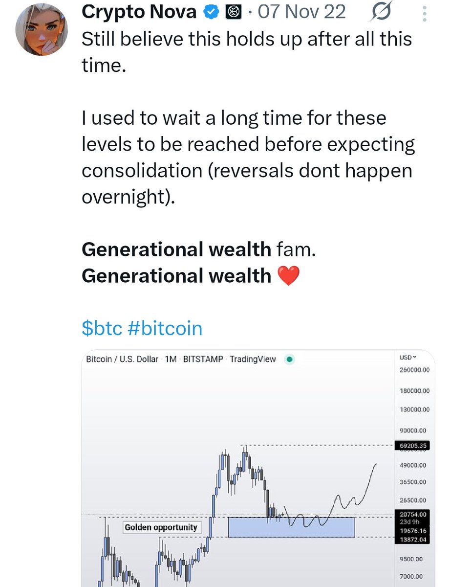
@CryptoGirlNova Timeframe is totally different. Back in 2022, BTC was coming out of the bear market and now it's going into the bear market. Doubt this holds.
Price action today still holding up with my views ~ 2 months ago.
Same fractal in 2022 is playing out in 2026.
To easy? Or will this time be different?
@Mariomnsr That's great. The problem is people blindly go ape something based on these dates without doing any primary analysis on the chart and get rekt. It's good that you mentioned this before.
When you familiarize yourself more with time cycles & see news matching a key date then they are relevant but once again secondary in nature ( as I always preach)
Don't worry my mental health is tip top. I don't share many forward looking dates except once I believe hold some significance
We shall revert back to this post when the date arrives and see how we fair 🫡
“Mate, how can you understand capital rotation? Do you have any tips or framework to follow?"
Ok guys, let’s break down one of the most important (and most ignored) concepts in trading in 4 steps. (❗️Another share of brutal value below❗️)
Disclaimer: this is not about predicting markets.
It’s about understanding how money may move.
(Yes, long post again. Same rules, only for those who want to learn and grow, the rest will skip it as always)
🔸 1st step -> What capital rotation actually is (risk on/off)
Markets are not random as capital is constantly moving between asset classes:
• Equities/crypto (risk)
• Bonds (safety)
• Currencies (liquidity)
• Commodities (inflation)
Big money is always reallocating.
So instead of asking: “Is this bullish or bearish?" I ask myself: “Where is capital flowing right now?”
Because that’s what drives trends.
Markets, as you know, operate in 2 main regimes:
• Risk-on → capital seeks returns
• Risk-off → capital seeks protection
🔍General "clues":
Risk-on:
- Equities trending higher
- Weak USD
- Strong crypto / growth
- Cyclicals outperform defensives
- Small caps outperform large caps
- Bond prices down / yields up
- Liquidity expanding (QE for example)
- Real yields falling
Risk-off:
- Strong USD
- Bonds bid
- Equities weak
- Gold rising
- Liquidity tightening (QT)
- Real yields rising
If you misread this → you’re fighting the environment.
This becomes the primary requirement in order to build a macro thesis and elaborating on specific sectors.
🔸 2nd step -> Intermarket analysis
When I built up an investment thesis I go for IMA as markets tend to confirm each other..nothing moves in isolation.
As we saw before, we have a "general outlook", right?
• Rising yields → pressure on equities
• Strong dollar → risk assets struggle
• Bond rallies → defensive positioning
When markets align → higher probability
When they diverge → lower conviction
This is how you can build context.
However, intermarket can and must be extended within specific sectors to gauge their relative strength/weakness in order to have a broader perspective.
How to?
With the use of synthetic indexes: x.com/IamZeroIka/sta…
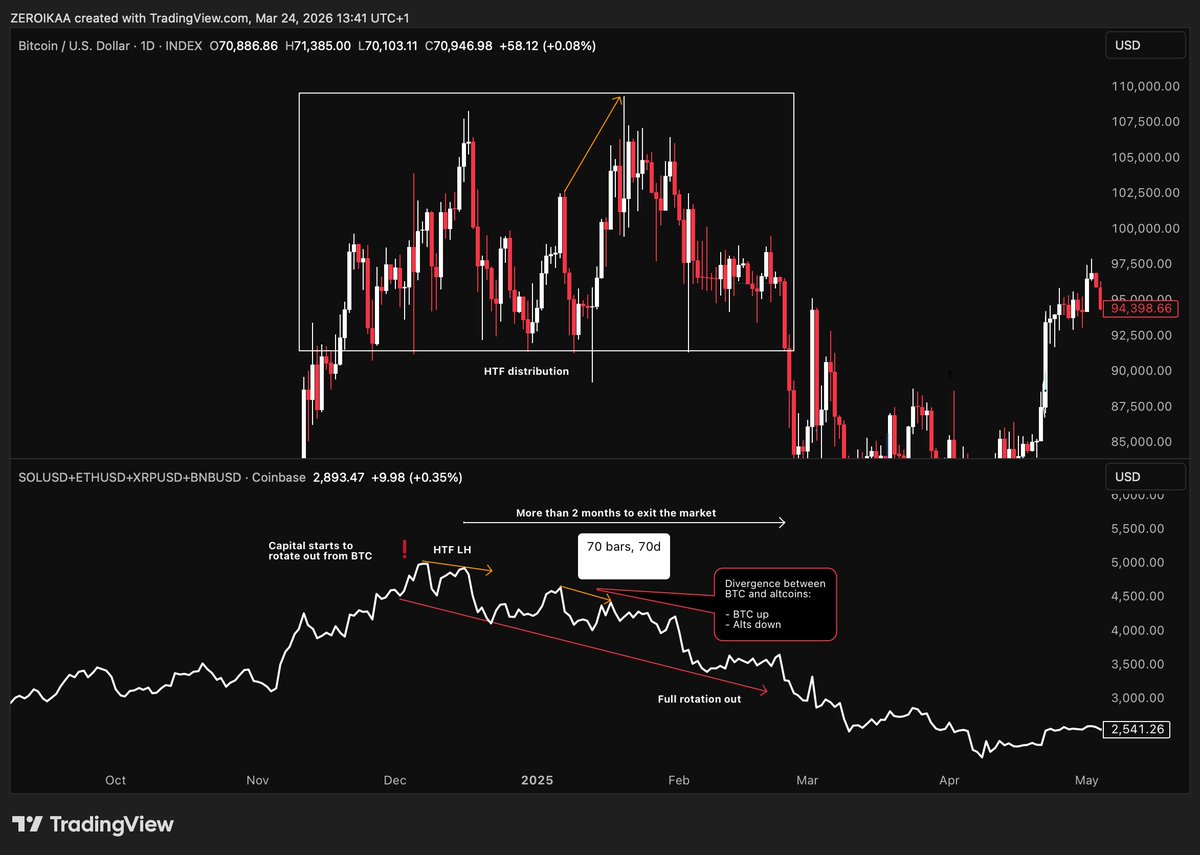
⭕️Example:
In the chart you find out at the bottom, I compared $BTC and a synthetic index made with: SOLUSD + XRPUSD + ETHUSD + BNBUSD.
Why those altcoins? Because they're the "top caps", very well capitalized, and act as reference to understand where capital is rotating.
The distributive range developed on $BTC between late November 2024/late February 2024, even to an "untrained" eye, could have been spotted through the use IMA by observing the behavior of the synthetic index.
In fact, when $BTC was distributing, the index was producing the first HTF LH, signaling a rotation out from the crypto market..why?
Because more speculative assets (and less liquid) experience stronger inflows or outflows and tend to anticipate $BTC movements.
--------------------------------------------------------
Core "extras" to complete this part:
🟡 IMA explanation -> x.com/IamZeroIka/sta…
🟡 Video explanation -> x.com/IamZeroIka/sta…
🔸 3rd step -> COT
Now we start adding the positioning of those who matter.
COT (released every week) answers:
“How is capital positioned within this flow?”
Not the direction (this is something you have to figure it out on your own with intuition + PA) but positioning.
It shows:
• Who is long
• Who is short
• Where trades are crowded
COT splits the market into:
• Commercials (hedgers)
• Non-commercials (speculators)
• Retail
⭕️The key idea is that speculators follow trends while commercials tend to fade extremes.
So now you can combine flow (IMA) + positioning (COT) and that’s where things get interesting.
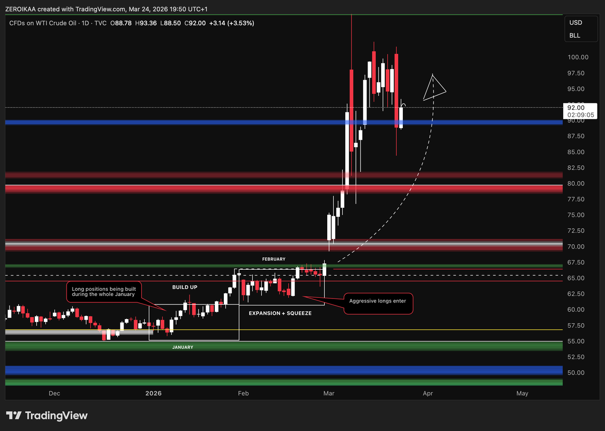
⭕️Example:
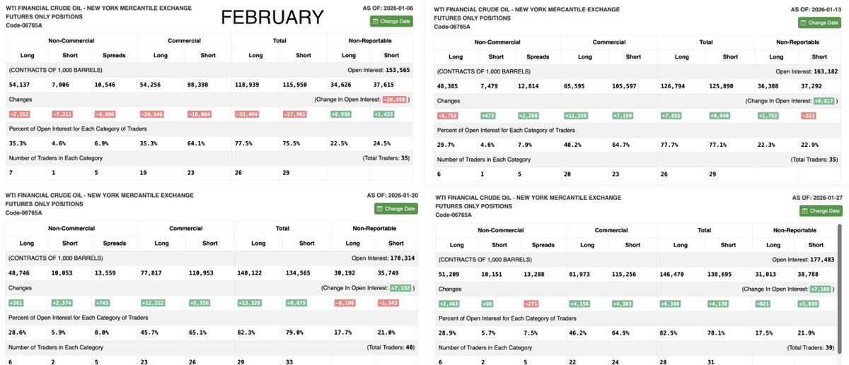
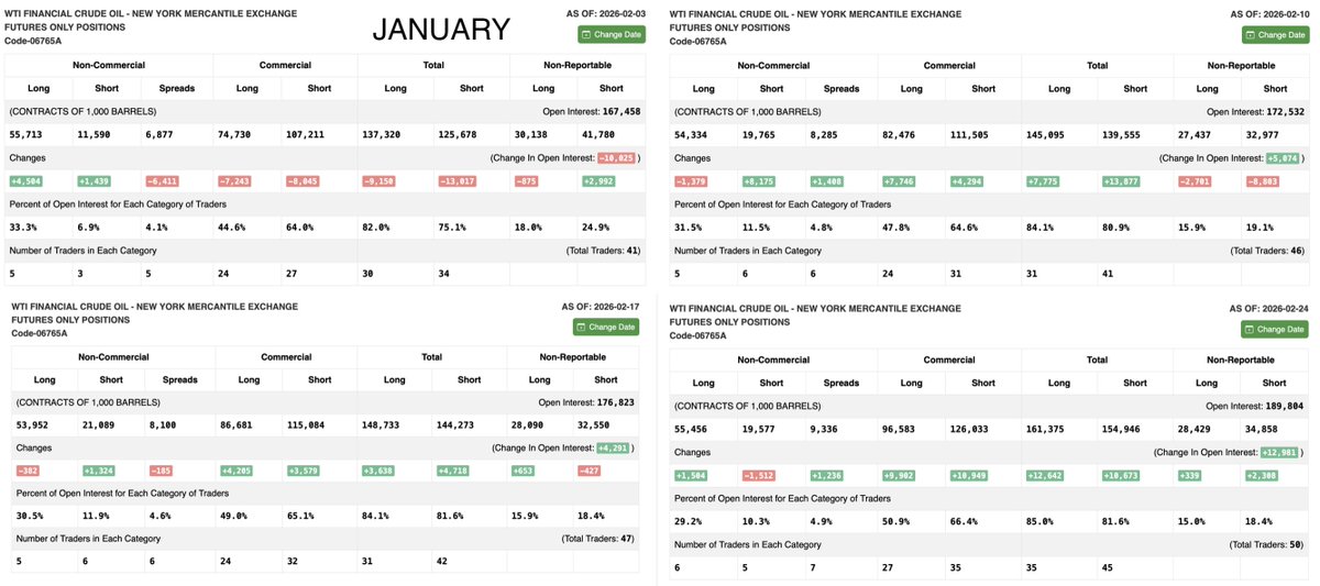
Take a look at the USOIL chart where the bias, due to liquidity dynamics, price action and fundamentals -> x.com/IamZeroIka/sta… was bullish.
Now put your eyes on the 2 rectangles where you read "build up" + "expansion/squeeze" having a look into the COT reports of the whole January + February.
On January 6, we saw a massive drop in Open Interest which was a clear liquidity reset that wiped out positioning.
Then on January 13 and 20, OI started to expand again with broad participation, and this is key as the market was building positioning, but not moving yet. (check longs being added)
Moving into February, on February 3 we got a brief pullback, but then something important changed.
From February 10 onward, the market started to add longs, while shorts were still stepping in.
By February 17, positioning was stretched, and on February 24, OI expanded sharply with longs pushing and shorts getting forced out, triggering the breakout.
When longs keep building for a lot of time and shorts keep fading the move, you create fuel and pressure ⛽️ in the same system.
In this way, you could have be positioned together with institutions.
❗️Important note:
As the COT report is being released every week, you need to constantly keep track of the positioning, elaborating a thesis with the delta provided step by step.
🔸 4th step -> How to use it + execution
This is NOT an entry system.
You use it to:
- Build bias
- Stay positioned
- Avoid potential bad trades
- Identify stretched markets
Then you refine with:
- Your entry models
- Price action
- Liquidity
- Structure
That’s your execution layer, you don't long/short just based on COT/IMA.
👉We can summarize my process in this way:
- Understanding capital flow/building thesis (risk on-risk off)
- Confirming with intermarket
- Checking positioning (COT)
- Finding the setup based on entry models and AMT -> x.com/IamZeroIka/sta…
- Executing
If everything aligns → I engage with more confidence
If not → I wait a little bit more/stay cautious
I believe that most people just watch candles but very few watch flows and how to be aligned with smart money.
As always, if you found this helpful, the like and repost buttons are just a few centimeters below.
Took the decision that subscription will be capped soon and no new members will be able to join
The new cap will be announced soon and what will imply
2026 I want to deliver consistent results and quality content, mentoring the ones who want to put the time and effort
@crypt0fan20 You stay patient, meanwhile many other trades to take.
If close below your level, you exit, with minor losses because you had good risk management, then you make your money back and more on something else
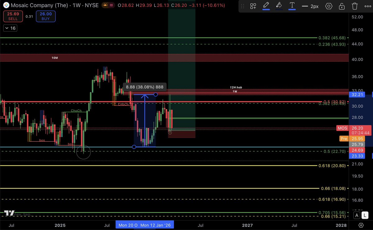
MOS
+38% since December 25
Rejected the 1W BB
Is it concerning?
As long as we don’t close below the 0.5 from the local swing at 22.70, we are good.
Extremely strong support at the Very HTF GZ ( 20.80-18)
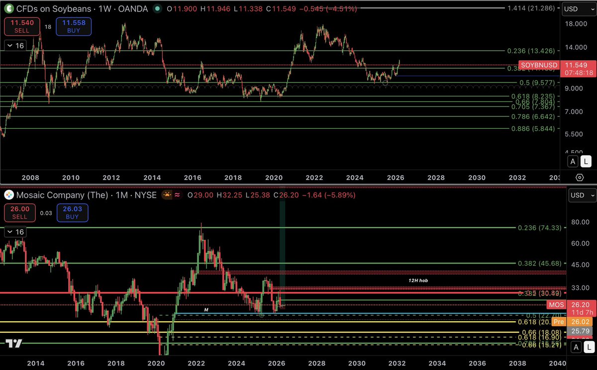
@lucas67261771 What’s the inverse to fertilisers dumping?
Regarding MOS is it sulfur prices. (Mos has domestic supply though) . Or is it simply retresting breakout.
🚨EDUCATIONAL POST:
🔨 VRVP & FRVP
VRVP and FRVP are, imho, some of the most underrated advanced charting tools out there. Not many traders I come across use them, yet they pack a serious punch and can add valuable confluence to your trades, no matter the TFs you’re applying them on.
Before jumping in, let’s break down the basics. Volume Profile is a histogram shown vertically along the side of a price chart, plotting the total volume traded at each price level over a specific period, creating "nodes" where high or low activity took place. Key components include:
👉POC (Point of Control): The price level with the highest traded volume, often viewed as the "fair value" where buyers and sellers found the most agreement.
👉Value Area: Covers 70% of the total trading volume, bounded by VAH (Value Area High) and VAL (Value Area Low), which also act as dynamic support and resistance (S/R) levels.
👉HVN (High Volume Nodes): Zones of heavy trading activity, serving as price magnets or strong support/resistance, often aligning with the POC.
👉LVN (Low Volume Nodes): Gaps with low trading volume, where minimal activity occurs, allowing price to move through these levels quickly.
What is VRVP?
VRVP, also known as Volume Profile Visible Range, is a dynamic indicator that calculates and displays the volume profile based solely on the visible portion of your chart. As you zoom in, zoom out, or scroll, the histogram updates automatically to match your current view. It works across any TF to quickly pinpoint S/R levels or HVN/POC levels.
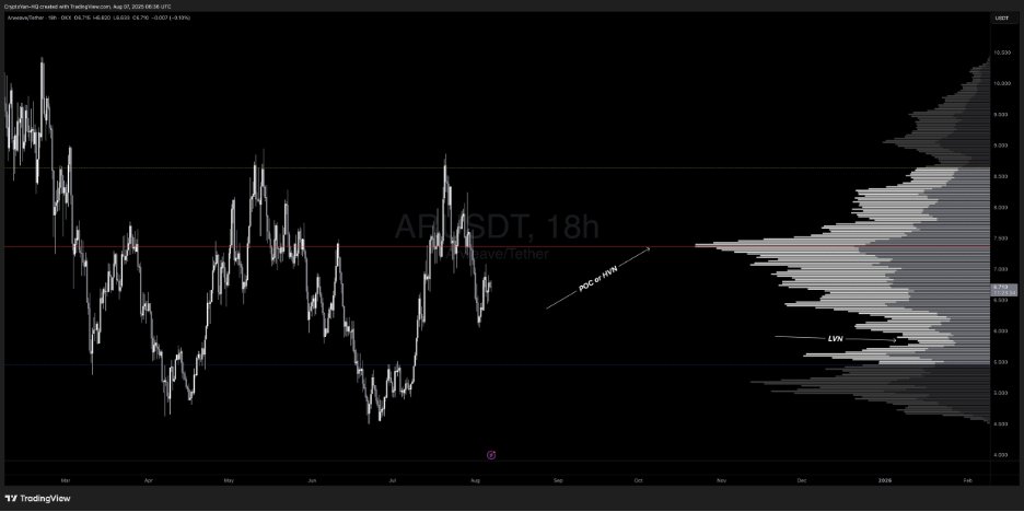
In the example below $AR, you’re looking at 3 key components:
👉VAH (Yellow Line): As noted, it acts as dynamic resistance. You can see how it could align with your trading approach for extra confluence. In this case, it lined up with HTF supply/HTF RH at $8.6, triggering a solid correction.
👉POC/HVN (Red Line): As mentioned, this serves as a pivot point where price often bounces or consolidates since it’s the level with the highest trading volume. Losing this area signals weakness. In the example, after rejecting from the VAH (resistance) at $8.6, price bounced off the POC at $7.3% before breaking below, showing bearish momentum with a clear break of structure (BOS).
👉VAL (Blue Line): Acts as dynamic support, likely where price is headed before potentially finding a bounce back to the POC or VAH.
You can see how price clearly oscillates between these 3 KLs: VAL (support) aligning with HTF demand, POC (fair value), and VAH (resistance) matching HTF supply. This provides additional confluence for your trades to hunt longs or shorts.
If you check the HTF chart (shown below), you could’ve milked this HTF range using S&D in confluence with this powerful tool for extra edge.
Let’s dive into one more example on the HTF:
The chart below highlights:
👉VAH: Serving as resistance, capping the price below it. Acceptance above this level would flip it into support, making it a dynamic S/R zone.
👉POC: Every touch at the POC (HVN) is met with rejection here, as it’s deemed “fair value” or S/R until price breaks above and holds, turning it into support. Check the PA to the left on the chart below — price found acceptance above the POC and took off!
👉VAL: Acting as support.
You can see how these zones can be used to spot potential S/R levels or identify where maximum volume has been recorded (HVN), adding an extra layer of confluence to your trading approach.
NOTE: The VRVP indicator on TradingView requires a paid subscription — it’s not available on the free plan. However, there’s a free version I used to use by AlphaViz. You can stick with the default settings but bump up the number of ROWS to 200 for clearer volume bars.
🔨FRVP: One of my favorite tools personally—I use this more often than VRVP.
FRVP (Fixed Range Volume Profile) lets you manually select a specific price or time range on the chart and calculates the volume profile just for that fixed segment. Unlike VRVP, it’s static — once drawn, it doesn’t adjust with chart movements. You can apply it to ranges, downtrends, or uptrends on any TFs to get detailed price/volume data at each level within that swing or range.
It functions much like VRVP with the same components discussed earlier, but as noted, you can target any specific price and range to spot where maximum volume was traded. Price often PB into these volume clusters before continuing higher or lower.
Components:
👉POC: As mentioned, the price level with the highest traded volume, viewed as "fair value" where buyers and sellers aligned most.
👉Value Area: Covers 70% of total trading volume, bounded by VAH (Value Area High) and VAL (Value Area Low), which also serve as dynamic support/resistance (S/R).
How to Apply It:
💪Range: Anchor it from the origin of the range to the end (e.g., the most recent bar or a key swing point). For a horizontal range, set it from the SH to the SL to analyze volume distribution within that zone.
Trend:Identify the trend.
💪Uptrend: Anchor from SL to SH.
💪Downtrend: Anchor from SH to SL.
This reveals the highest-volume areas, often aligning with the POC, which can provide a strong entry on a PB if it coincides with your Fib levels or liquidity zones.
Example:
For a bearish swing in this example, anchor from SH to SL to reveal buyer/seller activity and where the market found fair value.
On the $MANA chart, the current volume cluster aligns with the POC, which is also a HTF partial 1D HOB with 0.5 Fib confluence and an HVN. You can see the clear reaction — bounced 42% — and now price has returned to the exact same level, this time with a 4D OB and 0.705 Fib confluence at the POC and HVN, delivering another strong reaction.
I hope you enjoyed the post and would appreciate it if you’d share it. If you’ve got any questions, feel free to drop them in the comments below.