@itsshara_ai Yes, if this pipeline is viable, it could likely reduce costs by 50% to 60%.
English
Vigo Zhao
4.1K posts

@VigoCreativeAI
AI visual creator building image & video workflows. Reusable JSON systems & cost breakdowns. Qwen Ambassador · Brand partnerships: DM · Open source cookbook ↓

Qwen3.8 is launching and going open-weight soon!🌐 With a massive 2.4T parameters, this model is continuously evolving. We believe it’s one of the most powerful model available today, compatible to leading frontier AI models , second only to Fable 5. You don't have to wait to test it. Just now, the Qwen3.8-Max-Preview made its debut on Alibaba’s Token Plan, Qoder, and QoderWork. Be among the very first to try it out. Can't wait to hear what you build. Stay tuned! 🚀 Token Plan international:qwencloud.com/pricing/token-… China:platform.qianwenai.com/pricing/token-…

CHARACTER 08 // RYU Quiet, observant, always several moves ahead. While the others trust their instincts, Ryu studies the battlefield until every outcome becomes predictable. He rarely raises his voice. He doesn’t need to. #FLOWBOUND #AIFilm


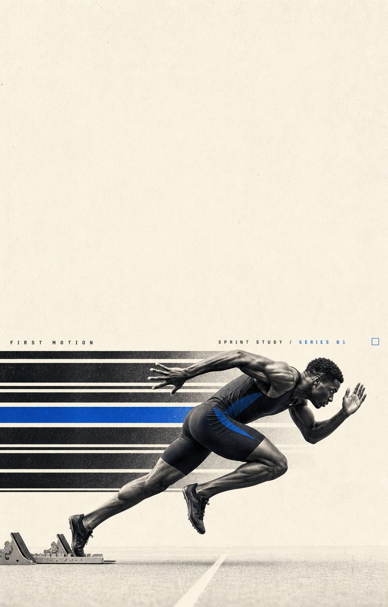
A good prompt creates one image. A good system creates an entire series.These four automotive posters share the same reusable JSON structure. Change the car, character, colors and specs, and the system rebuilds the design.Full JSON in the original post ↓


One of my favorite workflows lately: I create my characters in Midjourney, then make them look real with GPT