Qt this tweet and tell me What you do with pic proof
Abdulquadri | Brand Designer & Strategist
7.2K posts

@atsvisuals_
Helping founders and startups build strategy-led brands that look right, feel right, and get chosen. Portfolio: https://t.co/FPGIulVOIo | Send a DM to work


Qt this tweet and tell me What you do with pic proof


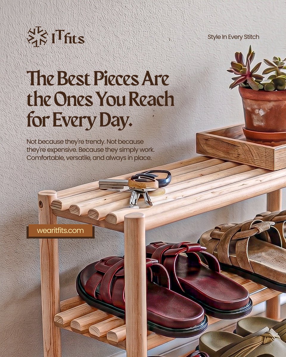
ITfits is a contemporary lifestyle footwear brand built around stylish, comfortable, and versatile leather slides designed for everyday wear. Rooted in effortless fashion and intentional simplicity, the brand bridges the gap between comfort and statement-making design; creating pieces that seamlessly fit into different lifestyles, wardrobes, and identities. The name “ITfits” carries both functional and cultural meaning. On one hand, it represents comfort, precision, and the perfect fit. On the other, it draws inspiration from fashion culture; referencing “IT” style icons and the modern slang “fits,” meaning outfits, reinforcing the brand’s deep connection to personal style and self-expression. For the identity, the goal was to create a logo system that felt as intentional, stylish, and versatile as the brand itself. A bold yet minimal wordmark was developed to ensure timelessness, seamless application across touchpoints, and flexibility for future expansion into broader fashion categories. One of the strongest ideas behind the logo came through typography exploration. The selected typeface was chosen not just for its premium and contemporary feel, but also because its cuts, curves, and structural forms subtly resemble footwear sole patterns; creating a deeper connection between the brand identity and the product itself. The stylized “T” introduces contrast and personality into the wordmark, acting as a statement-making feature that reflects confidence, individuality, and intentional style. During exploration, the “I” and “T” were also transformed into a standalone geometric emblem that conveys balance, movement, precision, and craftsmanship while maintaining a minimal and memorable appearance. The result is a modern, premium, and future-ready identity system that merges comfort, craftsmanship, and effortless style into one cohesive visual direction. Let me know your thoughts on this masterpiece. Full project coming soon. . . If you’re a founder or business owner looking to build a strategic brand identity that doesn’t just look good, but truly represents your vision, positioning, and values; let’s work together. Send me a DM or mail workwithabdulquadri@gmail.com to book a project or make enquiries for your brand. I'm Abdulquadri, Your Ideal Brand Designer & Strategist.


ITfits is a contemporary lifestyle footwear brand built around stylish, comfortable, and versatile leather slides designed for everyday wear. Rooted in effortless fashion and intentional simplicity, the brand bridges the gap between comfort and statement-making design; creating pieces that seamlessly fit into different lifestyles, wardrobes, and identities. The name “ITfits” carries both functional and cultural meaning. On one hand, it represents comfort, precision, and the perfect fit. On the other, it draws inspiration from fashion culture; referencing “IT” style icons and the modern slang “fits,” meaning outfits, reinforcing the brand’s deep connection to personal style and self-expression. For the identity, the goal was to create a logo system that felt as intentional, stylish, and versatile as the brand itself. A bold yet minimal wordmark was developed to ensure timelessness, seamless application across touchpoints, and flexibility for future expansion into broader fashion categories. One of the strongest ideas behind the logo came through typography exploration. The selected typeface was chosen not just for its premium and contemporary feel, but also because its cuts, curves, and structural forms subtly resemble footwear sole patterns; creating a deeper connection between the brand identity and the product itself. The stylized “T” introduces contrast and personality into the wordmark, acting as a statement-making feature that reflects confidence, individuality, and intentional style. During exploration, the “I” and “T” were also transformed into a standalone geometric emblem that conveys balance, movement, precision, and craftsmanship while maintaining a minimal and memorable appearance. The result is a modern, premium, and future-ready identity system that merges comfort, craftsmanship, and effortless style into one cohesive visual direction. Let me know your thoughts on this masterpiece. Full project coming soon. . . If you’re a founder or business owner looking to build a strategic brand identity that doesn’t just look good, but truly represents your vision, positioning, and values; let’s work together. Send me a DM or mail workwithabdulquadri@gmail.com to book a project or make enquiries for your brand. I'm Abdulquadri, Your Ideal Brand Designer & Strategist.