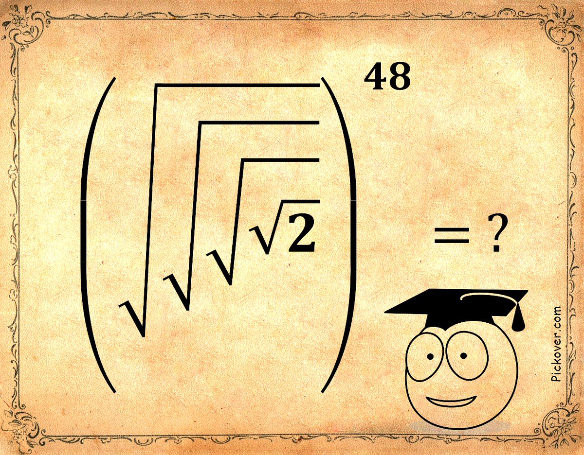
Mathematics.
Can you find a simple solution for this, and explain the steps you took in a way a young person could follow?
Miss Miniver's question for young students.
@wisevis@BjnNowak Still. Could have been worse.
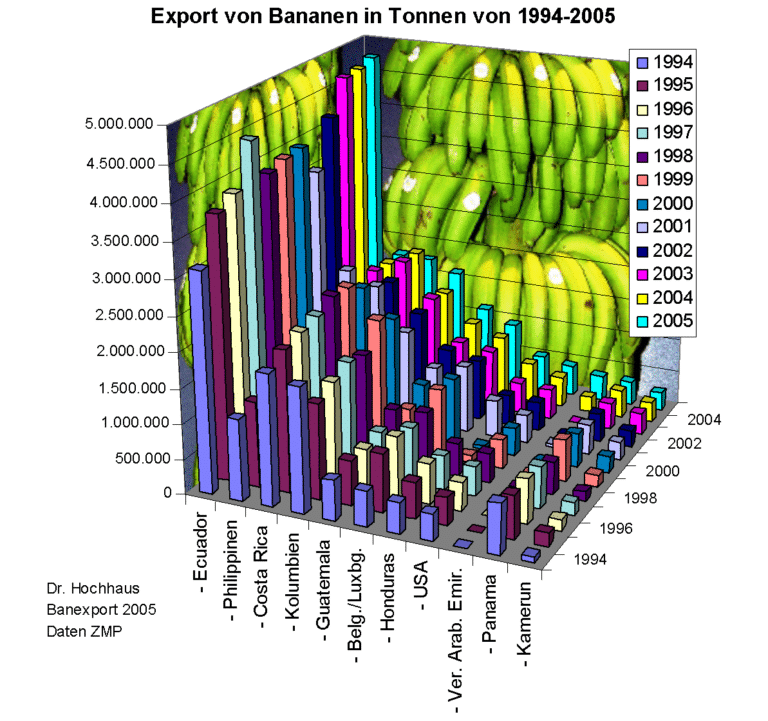
Like every bar to be replaced with a "properly" sized banana. With at least one supplementary touch: the "half-peeled" effect.
Aaa. And a proper title: Ecuador leading the bananas world by a large margin.
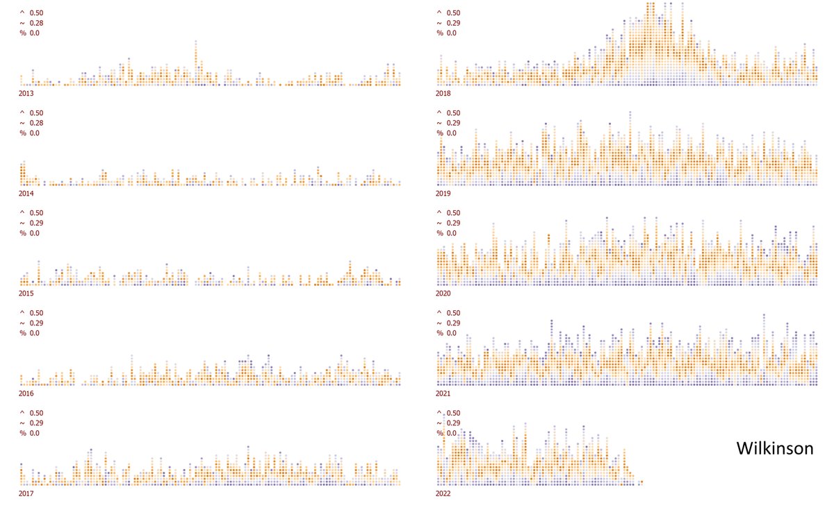
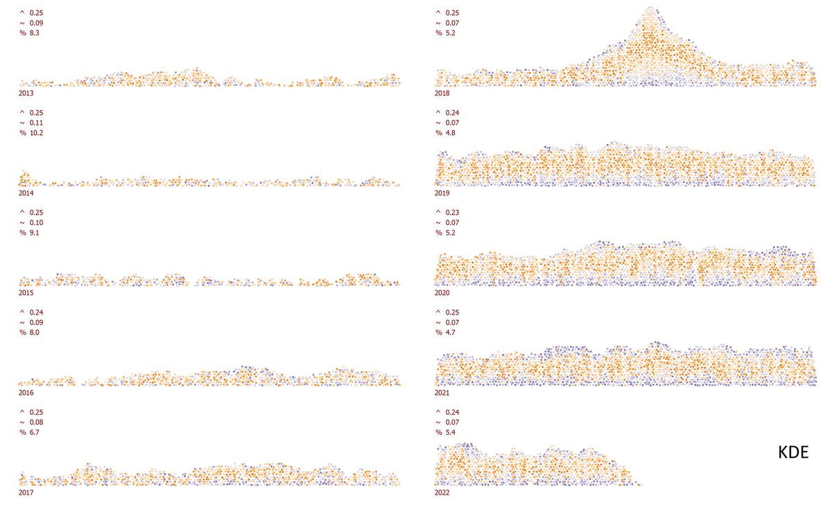
Looking into the evolution of the relationship between two variables.
Using the normalized covariance parts to encode the systematic relationship (how the change of one is reflected in the change of the other). Using different smoothing degrees for interpretation.
KDE encoding wins by a serious margin to Wilkinson, max error placement is a half and average error is a quarter. The 5% overlapping dots area trade-off goes almost unnoticeable.
Triggered by Carlos Barboza LinkedIn post,
linkedin.com/feed/update/ur…
this is how a density dots plot design looks on the very same data (yearly cycle perspective).
@avatorl@KerryKolosko@DGAnalysis@DataRevelations In the absence of the density dots plot implementation, Wilkinson dots plot is often a better solution than a beeswarm. However, showing a distribution based on the dot size bin rarely resemble its faithful shape and is often space limited by the piles height.
@KerryKolosko@DGAnalysis@DataRevelations The way each dot pushes the others to reach its own true value can randomly place another one way out of its true value. The result will always be the most compact (hexagonal packing) but it cannot guarantee neither a faithful distribution shape nor an acceptable placement error.
@KerryKolosko@DGAnalysis@DataRevelations I saw that and many others. The beauty of the physics engine behind VEGA packing algorithm is even more visible in dynamic mode. I assume that changing the forces ratio adjusts somehow the dots placement. I just cant see how this method is able to build a truthfull density shape.
@KerryKolosko@DGAnalysis@DataRevelations VEGA pushes the dots without preserving the value (at least not in the LEGO example shown in this thread), using physical collision algorithms. Their beeswarm looks cute, but is not a proper distribution representation and dots positions are unacceptable off.
@KerryKolosko@DGAnalysis@DataRevelations I am not sure. There are some variations, true, yet the algorithm behind (except VEGA, of course) basically tries to pack the next value as close as possible to the base, preserving the X value. Parsing the dataset in a different ways creates slightly different outputs.
@wisevis Interesting that you doubt yourself enough to double check. IMO ChatGPT knows nothing. Machine is smart. It clearly says: Look, if you want a thin slice of bread, don't waste a large bread for that, OK? Choose a small one.
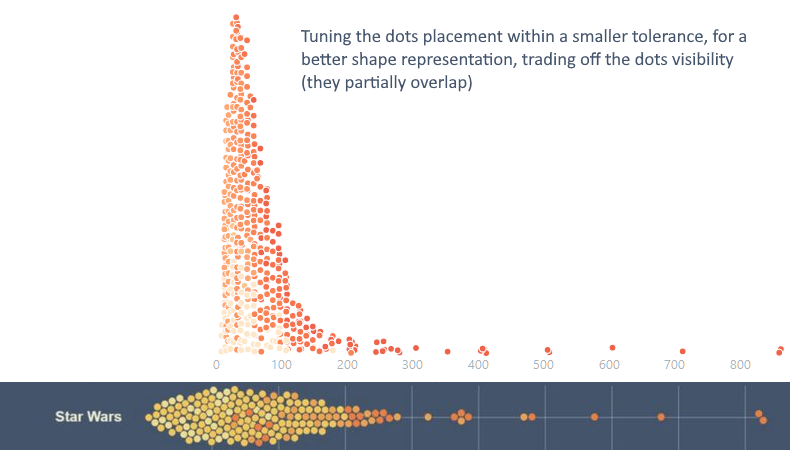
@DGAnalysis@DataRevelations Eventually, here is a more tuned approach I programmed lately, improving the density shape, trading off the dots visibility (they partially overlap). This approach is recommended when the distribution/density shape AND the dots positions need to be more accurate.
@DGAnalysis@DataRevelations The only package which comes close to what I call the "density dots plot" (better name than the "KDE dots plot") is written in R and it doesnt have the tolerance parameter (mandatory for controlling the dots placement error).
mjskay.github.io/ggdist/referen…