Dave Latta

652 posts

Dave Latta banner
Dave Latta

Dave Latta

@dave_latta

Currently leading @McKinsey's enterprise design system 👨‍💻 ❖ 🎨 📐 Design & code for 15+ years. Posting about design & systems.

United States Katılım Ekim 2016
193 Takip Edilen342 Takipçiler
Sabitlenmiş Tweet
Dave Latta
Dave Latta@dave_latta·
#DaretoShare24 reignited my creative side❤️‍🔥 Thanks for getting this going @bentenwoodring! 
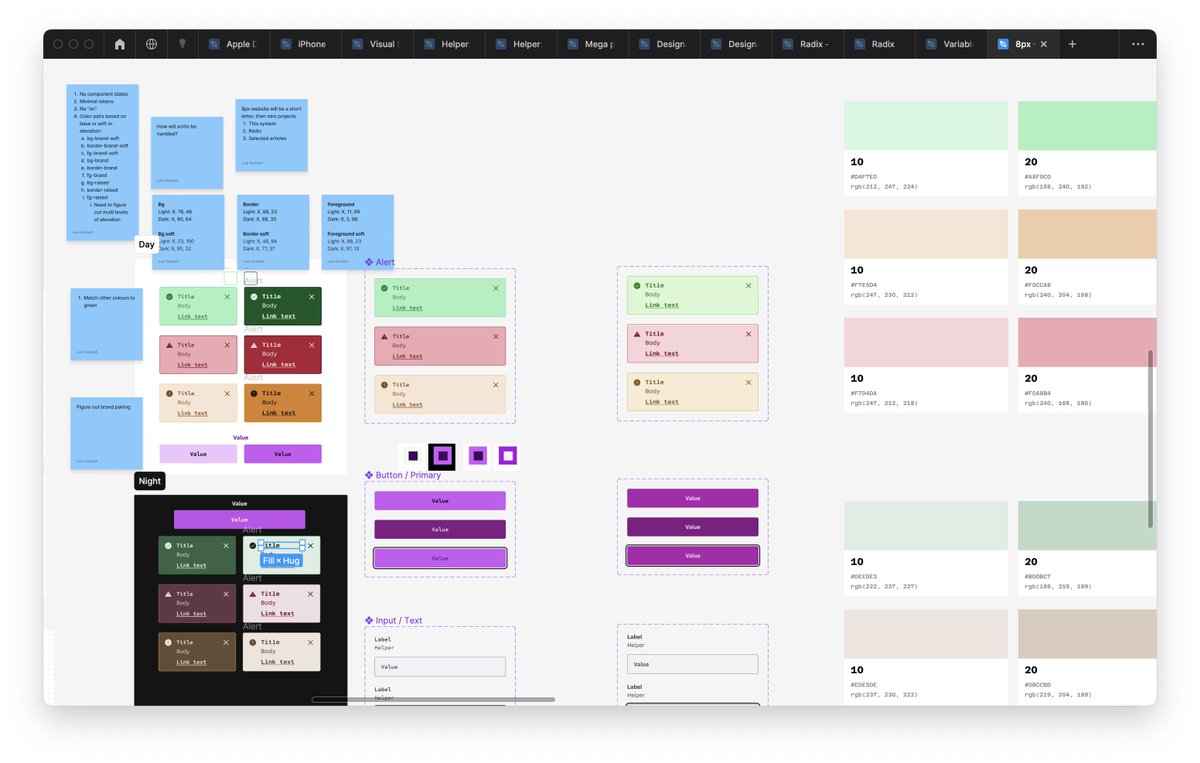
Illustration created in @figma New on X so really appreciate ❤️ and 🔄 🙏🏽
Dave Latta tweet media
English
7
2
37
7.7K
Benten
Benten@bentenwoodring·
Designing the longest web page of my life over here
Benten tweet media
English
41
1
203
23K
Dave Latta
Dave Latta@dave_latta·
It'd be great if we could set base values in CSS as you've laid out and use a CSS filter to force accessibility. (If this exists I haven't heard of it yet) Concept: .icon-brand { background-color: var(--color-brand-primary); /* Set base color value*/ filter: force-contrast(3:1); /* Force 3:1 contrast across any bg*/ } a { color: var(--color-brand-primary); /* Set base color value*/ filter: force-contrast(4.5:1); /* Force 4.5 contrast across any bg*/ }
English
1
0
0
81
luis.
luis.@disco_lu·
Been thinking a lot about the volume of variables we create in systems and whether there's a way to consolidate them massively by using...opacity I'm still hung up on the efficiency of primary/secondary/tertiary labels 🤔
luis. tweet media
English
13
3
61
8.3K
Dave Latta
Dave Latta@dave_latta·
Yeah, sure. Here are a few examples where icons are defaulted to 3:1 for a more subtle default and text is defaulted to 4.5:1. I'll grant that differences can look subtle but if accessibility is an imperative then this is a decent approach that provides more flexibility especially for fine tuning "what feels right" across modes.
Dave Latta tweet mediaDave Latta tweet mediaDave Latta tweet media
English
1
0
1
46
luis.
luis.@disco_lu·
@dave_latta Do you have cases where your icon and text combos have different darkness/lightness then? Would love to see an example
English
1
0
0
109
Dave Latta
Dave Latta@dave_latta·
@nathanacurtis imo teams or projects adopt and people who use ds resources are users. I think about it like this because tracking metrics and conducting research at each level is different.
English
0
0
0
53
Nathan A Curtis
Nathan A Curtis@nathanacurtis·
Can we norm on what we call those that our design systems are for?
English
9
3
3
2.5K
Dave Latta
Dave Latta@dave_latta·
@rogie I created these in Figma earlier this year.
Dave Latta tweet mediaDave Latta tweet media
English
2
0
40
2.1K
˗ˏˋ rogie ˎˊ˗
˗ˏˋ rogie ˎˊ˗@rogie·
Who uses Figma and vectors like whoa these days? I wanna see who pushes its limits for product illustrations, art, and rich visuals.
English
46
5
349
89.6K
Dave Latta
Dave Latta@dave_latta·
@miggi @figma Love the way you used the geometry of the building. Very cool.
English
0
0
2
154
miggi from figma
miggi from figma@miggi·
Hello Times Square, but say it with a @figma prototype. 👋🏽
English
13
36
593
41.3K
Dave Latta
Dave Latta@dave_latta·
@ethansuero_ @figma I carefully name every layer in a component library. But that’s the only situation.
English
1
0
1
162
Ethan Suero
Ethan Suero@ethansuero_·
Am I the only designer naming layers in @figma?
Ethan Suero tweet media
English
93
6
224
34.8K
Dave Latta
Dave Latta@dave_latta·
@itsdesignertom More often than not I see this used as a rhetorical question following an opinion rather than a sincere question. It often translates to: “You obviously agree with me, right?”
English
0
0
1
49
Tommy Geoco
Tommy Geoco@designertom·
Hot debate on in my TT video comments going down right now: Is “Does that make sense?” passive-aggressive?
English
11
1
4
1.7K
Dave Latta
Dave Latta@dave_latta·
@itspatmorgan “Cognative load”. I know what it means but I still get second-hand embarrassment whenever it’s used.
English
0
0
1
54
Patrick Morgan
Patrick Morgan@itspatmorgan·
Which design terms baffled you when you started your career? I'll go first: "Affinity Mapping"
English
11
0
44
10.8K
luis.
luis.@disco_lu·
I'm in a hellhole of colour contrasts and variables and modes, please send snacks
luis. tweet medialuis. tweet media
English
12
1
92
12.6K
Jan Toman
Jan Toman@HonzaTmn·
Designers and engineers trying to get dedicated time for design systems work
English
4
8
94
8.3K
Dave Latta
Dave Latta@dave_latta·
I’m in favor of prioritizing discoverability over variant construction. Cramming all options under one variant group forces users to explore all props to figure out what the options are. Putting component “types” in separate variants shows users at a glance the major options available. That said, in your example, I’d consider these “styles” because it’s just a color change. A “type” would be a difference in construction or use case. Example of “types” might be: article card, profile card, data card.
English
0
0
4
536
luis.
luis.@disco_lu·
Okay my favourite question – should component types be split into separate variants, or bundled as one? Or, a third option? Possible a neutral style, where you apply overrides at the instance level
luis. tweet media
English
33
11
177
41.8K
Dave Latta
Dave Latta@dave_latta·
Late last year I broke my ankle running. I was just a few miles away from a new personal best. Wanted to quit for good. Yesterday, early into a run I wanted to quit but managed to push thru it. It reminded me that overcoming your own mind is one of the best reasons to run.
Dave Latta tweet media
English
0
0
2
339
Dave Latta
Dave Latta@dave_latta·
@jina I attended Clarity back in 2019 and recall @beep’s standout talk calling for unionization because designers and devs were being tasked with working themselves out of a job. That seems, at least partially, to have come to fruition with AI.
English
2
0
0
163
Jina Anne
Jina Anne@jina·
publishers shutting down. indie conferences cancelling. continued layoffs and professional development budgets slashed. I can't help but worry about the future of learning in the indie design & dev communities. At this rate, all that will be left are corporate marketing efforts.
Oakland, CA 🇺🇸 English
7
2
54
8.4K
Dave Latta
Dave Latta@dave_latta·
From my experience, when design is truly democratized, outcomes tend to be mediocre because the output is a compromise between many people that don’t share the same expertise or tastes. At some point you have to just get something out there usually by giving everyone a little say and calling it an MVP. The other issue is that democracies are designed to be slow with the hope that progress is gradually made over time. Not sure this is the best model for rapid innovation or progress. Of course, there are outliers. And as a caveat, I have seen many out-of-the-box, creative ideas by including everyone in the ideation phase of design.
English
0
0
1
201
Nathan A Curtis
Nathan A Curtis@nathanacurtis·
I'm all for collaboration and inclusiveness in design activities, and work hard to get everyone's voice heard. Yet, across all my roles: designer, architect, manager, leader, business owner, consultant, one reality remains true: Design is not a democracy.
English
6
10
103
12.7K
Dave Latta
Dave Latta@dave_latta·
@pwnies For line-height I prefer ems which are relative font-size. It’s essential a percentage though
English
0
0
1
100
Jacob Miller
Jacob Miller@pwnies·
% or px for line height?
English
18
2
5
10.2K