
Dean Oakes
3.6K posts


Marco Bizot fails to claim the Brighton corner and Jan Paul van Hecke puts the Seagulls ahead!
English
Loaded up the free #FM26 demo to see if things had improved. They haven’t. This is one of the most absurd UX oversights. Subnavigation breadcrumbs that 1) Repeat & make no sense, 2) Can’t be clicked, and 3) Persist even when I navigate away from the First Team via the primary nav

English
@Gareth230591 @nocontextfm1 Any chance of a screenshot of his attributes please? Ta
English

Who is the most signed player so far on Football Manager 2026, do you think?
English

🧐 Here's the complementary list for #FM26 Wonderkids.
All under-21 talents with negative PA (range) of -85 or better! Sorted by CA. 🗃️
-10 [170-200] ➔ 4 players
-95 [160-190] ➔ 8 players
-9 [150-180] ➔ 47 players
-85 [140-170] ➔ 171 players
Here 👇
fmscout.com/a-football-man…

English
@Amorims_RedArmy @nocontextfm1 Make the data export an add-on and I’ll happily pay £45 for it so SI don’t lose out. I’m sure I wouldn’t be the only one.
English

@nocontextfm1 I have a feeling you can't export data because they know people will just take the updated database and bring it to FM24.
English
For me, the biggest disappointment with Football Manager 2026 isn't the UI, it isn't the bugs...
It's the removal of detail.
What do you mean I can't see heatmaps, I can't export to excel and there's no 'Around the world' page?!
English
@AndrewFearn95 @avfc_stef And Van Persie’s didn’t bounce 4 times before crossing the line!
English

@avfc_stef It’s really not. The angle for the pass is much easier, compared to Rooney having to play a straight ball dropping into a tighter window.
Fleming also gets to see the ball all the way due to the angle, whereas Van Persie because it’s dropping over his shoulder can’t.
English

@nocontextfm1 A sterile, joyless mess of illogical and inconsistent design
English
You’ve now had two full days to play Football Manager 2026…
Describe it in one sentence
English
@HughShait @fminside It's one of dozens of regressions from previous versions which might not be "that big of a deal" in isolation, but the cumulative effect is massive.
English

@deanoakes91 @fminside No but that's why they added attribute masking for realism. I'm just saying why it's a thing, and it's not that big of a deal really.
English

@HughShait @fminside Shall we convert player attributes too then? Harry Kane can have 'reasonable' pace and 'good' passing.
English
@deanoakes91 @fminside They value making it more realistic more than the capacity for min-maxing. That's also why they removed the percentage back in the day for fitness. (Though the underlying numbers remained the same)
English
@Mooonski I found breadcrumbs that said First Team > First Team > First Team
English

@WorkTheSpace Useful tip unfortunately only made necessary by the appalling UI. The primary navigation should be the front door to everything the user needs, with the search bar serving as the fire escape.
English

#FM26 Pro Tip: If you ever can't find a screen, you can search for it at the top, and it will give you a link directly to the page.
From there, you should be able to figure out how to navigate to it next time you need it.
floot@flootdesigns
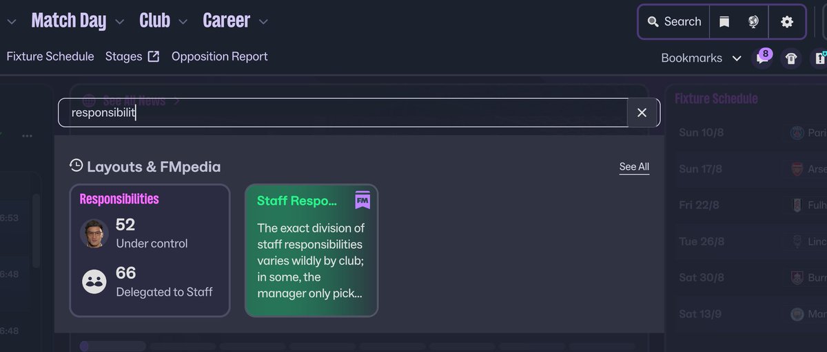
@WorkTheSpace I've been sat for an hour trying to find where to delegate staff responsabilities
English
@fminside It’s telling that the good example you’ve highlighted is an onboarding screen before you get into the game. It has a clear purpose that the user can focus on. As soon as you get into the game itself, it falls apart and the UX (or lack of) creates complete cognitive overload.
English

About the UI > It has soooo many potential but needs polishing (a lot)
For example this screen. I love this screen and the idea behind it. It's clear & easy on the eyes, it's visual and there is not to many clutter.
Things I don't like > The pink titles. Seems off compared to the rest. The quite large fonts (even on smallest setting), all the popups you get when you are looking for info. Makes it very messy.
And I'm not a fan of the top navigation. This one takes up unnecessary space, is too big compared to the rest and looks like it was pasted on afterwards. Seeing they want to create a 'dashboard' kind of style, it would make more sense to have a side navigation just like Dashboard software.
Nevertheless, it has a lot of potential 🥰
English
@BenDoesFM Yeah it could be. But the fact 500+ people have liked your tweet shows that a lot of people will use this loophole while it exists, which brings into question why they wouldn’t just display the attribute numbers anyway. Most of this game is about marginal gains, and numbers help
English

@deanoakes91 Yeah I agree mate! Could be a bug and we werent mean to see the numbers?! 😆
English
@BenDoesFM Yep thanks for finding and pointing out as it will help others. But this is typical of the poor UX decisions that have been made/ignored. They are creating unnecessary friction for the user to find the thing that they actually want.
English
@deanoakes91 Yeah agree mate - doesnt make any sense but helpful to know this!
English
@fracrere @skumpuntele Harping on about it. I may purchase again if the UI and UX is overhauled, but that certainly isn’t going to happen pre full launch, and probably not before FM27 given how integral it is to the core functionality of the game 2/2
English

@skumpuntele @deanoakes91 Again, many are saying it’s too small and others are saying it’s too big. And I’ve also seems people complaining about the font itself
All of it’s fine, there are some issues but in general the ui is fine and people are wildly overreacting
English
@fracrere @skumpuntele There are lots of qualified and unqualified opinions being circulated. As someone who has spent the last 9 years building digital products for a day job, I would consider myself in the “qualified” camp. Anyway, I’ve already been refunded so I’m not going to spend weeks… 1/2
English
@fracrere Almost as if people have different devices and setups… In my case, the font is tiny on the squad screen and other key interfaces. Iconography is even worse.
English
@deanoakes91 Very funny how I’m seeing some people complain about how small the font is and others saying it’s way too big
You guys are all ridiculous, the font is fine my god
English