
Edit Gyenge
127 posts
Edit Gyenge
@edit_gyenge
Information designer https://t.co/KB3aM87ptk
Katılım Ağustos 2022
856 Takip Edilen778 Takipçiler
Edit Gyenge retweetledi

June Most Liked 👍
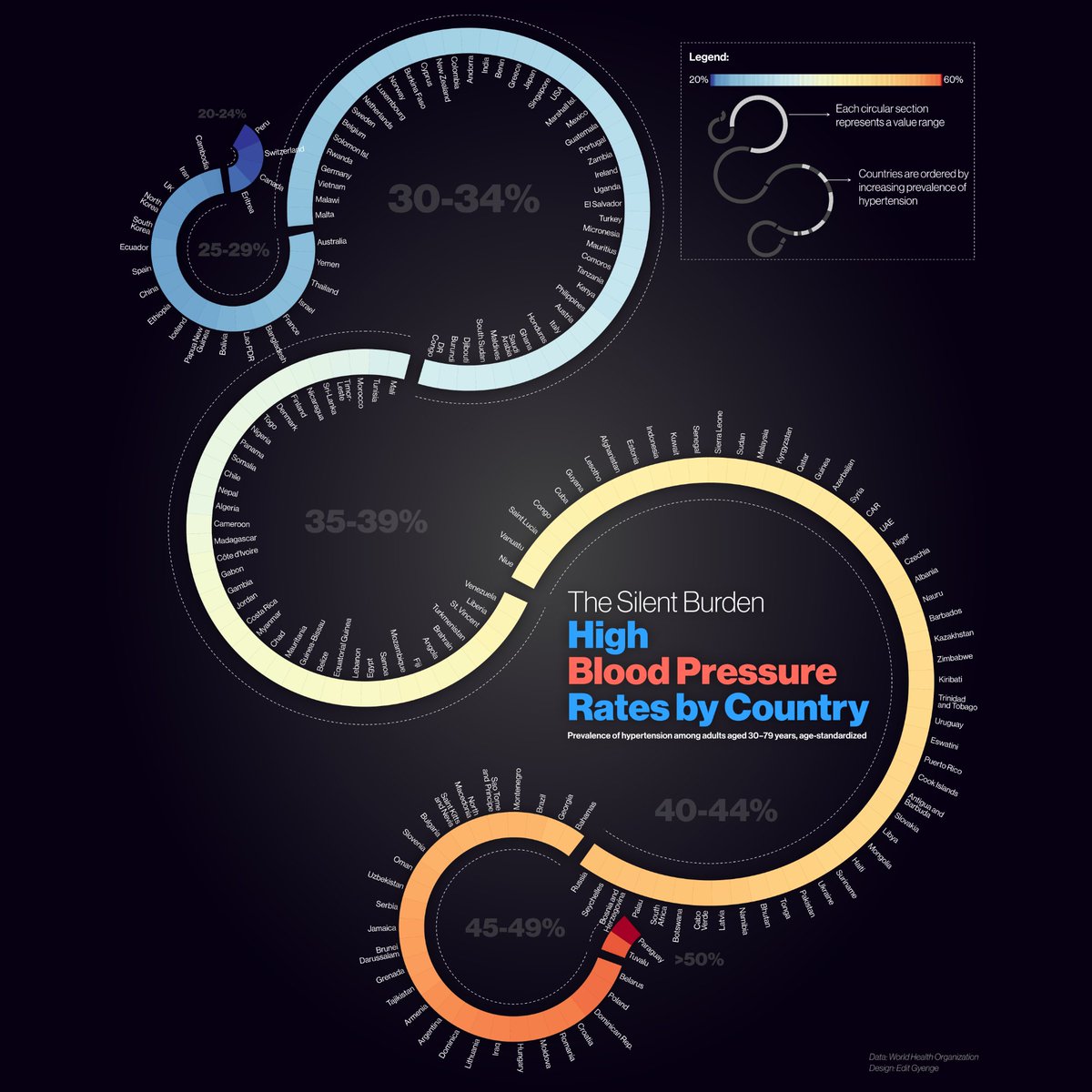
High blood pressure affects just 21% of adults in Switzerland—but over 50% in Paraguay. This striking infographic by @edit_gyenge received the most likes last month.
See how your country ranks: voronoiapp.com/healthcare/Hig…
English
@editgyenge/note/c-126413947?r=23evuy" target="_blank" rel="nofollow noopener">substack.com/@editgyenge/no…
ZXX
Edit Gyenge retweetledi
Just in: "Mapped: High Blood Pressure Rates by Country" by @edit_gyenge 🩺
voronoiapp.com/healthcare/Hig…
English
High blood pressure rates by country.
Latest piece on @VoronoiApp
#healthdata #hypertension #HealthyLiving #worldhealthorganization #charts
English
Edit Gyenge retweetledi
New: "Youth Unemployment Trends Across Europe" by @edit_gyenge 💼
voronoiapp.com/economy/Youth-…
English
In yesterday’s newsletter, I shared why beauty in data visualization is about much more than looks, it’s about culture, timing, and how people feel about data. Data doesn’t speak for itself, it speaks through people.
editgyenge.com/newsletter/
#newsletter
English
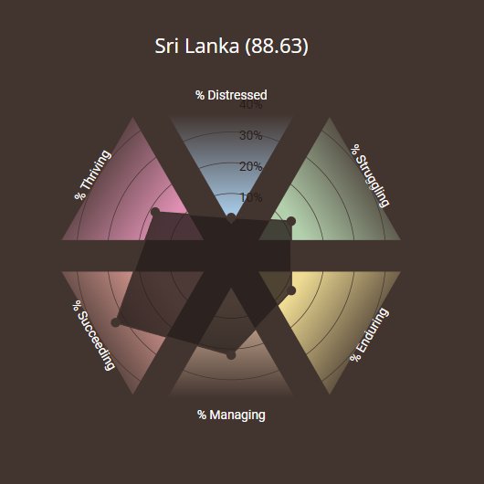
This personal project was inspired by an article and insights from the Mental State of the World Report. It’s an interactive piece built with #D3 , and I just published it on my website!
editgyenge.com/visualizing-th…

English
Edit Gyenge retweetledi

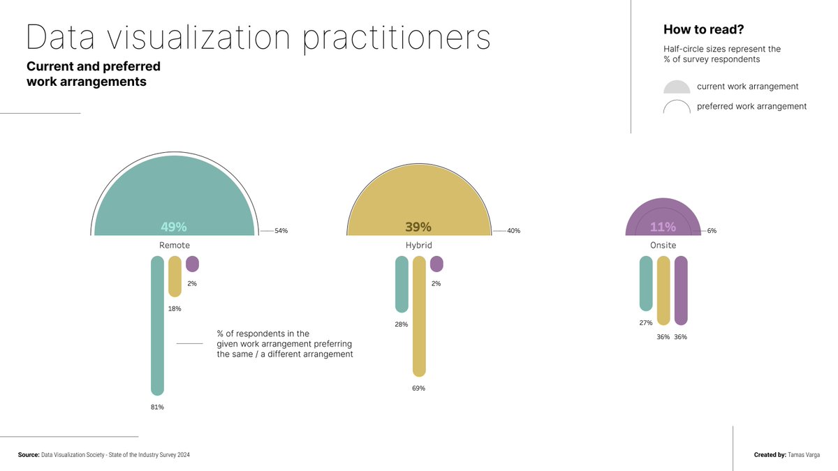
#MakeoverMonday meets @DataVizSociety ! The State of the Industry survey is now out and MakeoverMonday selected the section about the current and preferred work arrangements of #dataviz practitioners.
#DataFam #Tableau
English
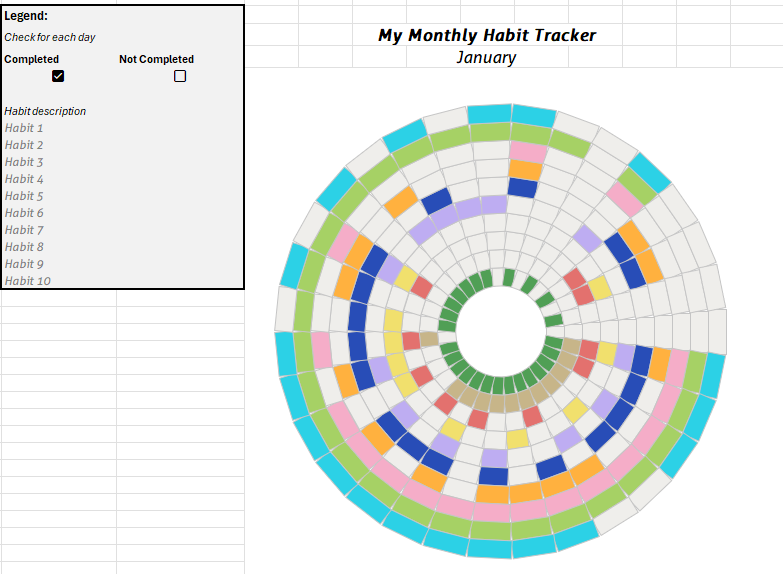
Small daily efforts add up over time, and tracking your progress can be a game-changer. I’ve shared an article on how to create a custom radial chart habit tracker in #Excel to turn your journey into a monthly #datavisualization project.👇
editgyenge.com/step-by-step-g…
English
Edit Gyenge retweetledi
Last week to vote for Visual of the Year 2024! Here are some nominees:
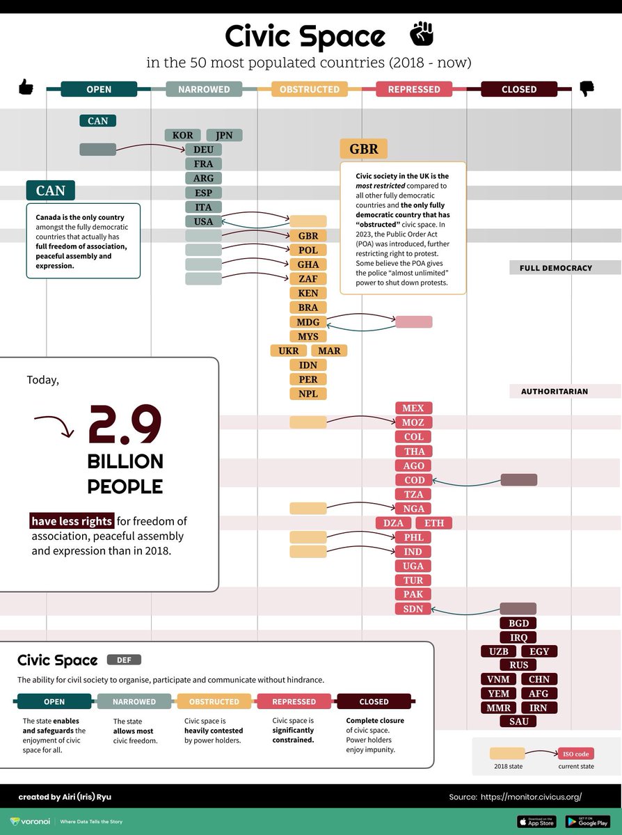
🌍 State of Civic Space Worldwide by @DearSustie
🌳 Urban Tree Cover in European Capitals by @ScallyCap
💵 Polymer Banknotes Globally by @edit_gyenge
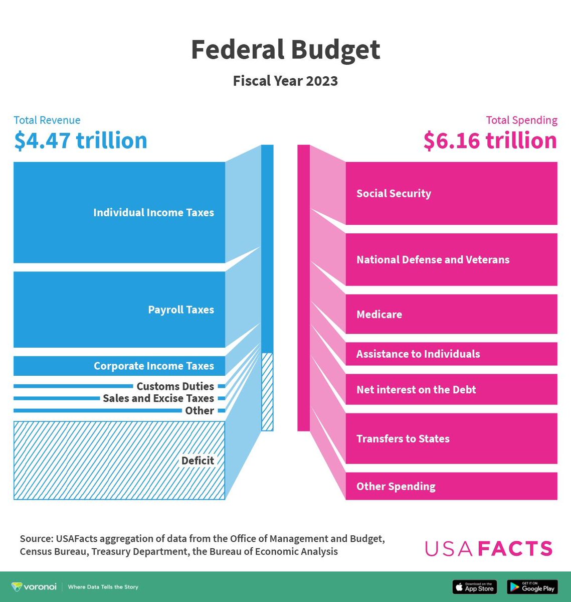
💰 Federal Budget Fiscal Year 2023 by @USAFacts


English
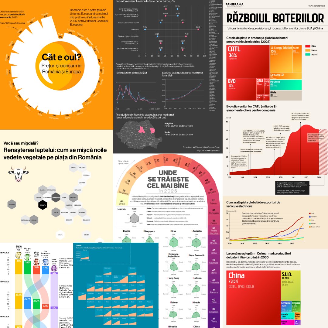
🚀 Thrilled to share my latest project: an interactive deep dive into Romania's last 30 years through 16 socio-economic indicators.
400+ maps & charts, plus #sonified county rankings (yes, #data you can hear 🎹). #datavisulization
Check it out! 👇
panorama.ro/romania-30-yea…

English
Edit Gyenge retweetledi

A bit late, but December 1st represented my four-year Tableau anniversary. It's been quite the journey... thank you #DataFam for all your support! 🙏
My first viz... Dec 1, 2020: public.tableau.com/app/profile/de…
And my last... Nov 24, 2024: public.tableau.com/app/profile/de…
English
Ever go back through your work and notice something you didn’t expect? I’m updating my #Portfolio, and I’ve uncovered SO MANY CIRCLES!
Have you ever noticed a recurring theme in your work? It’s funny how these habits sneak up on us #dataviz #creativeprocess #design #charts
English
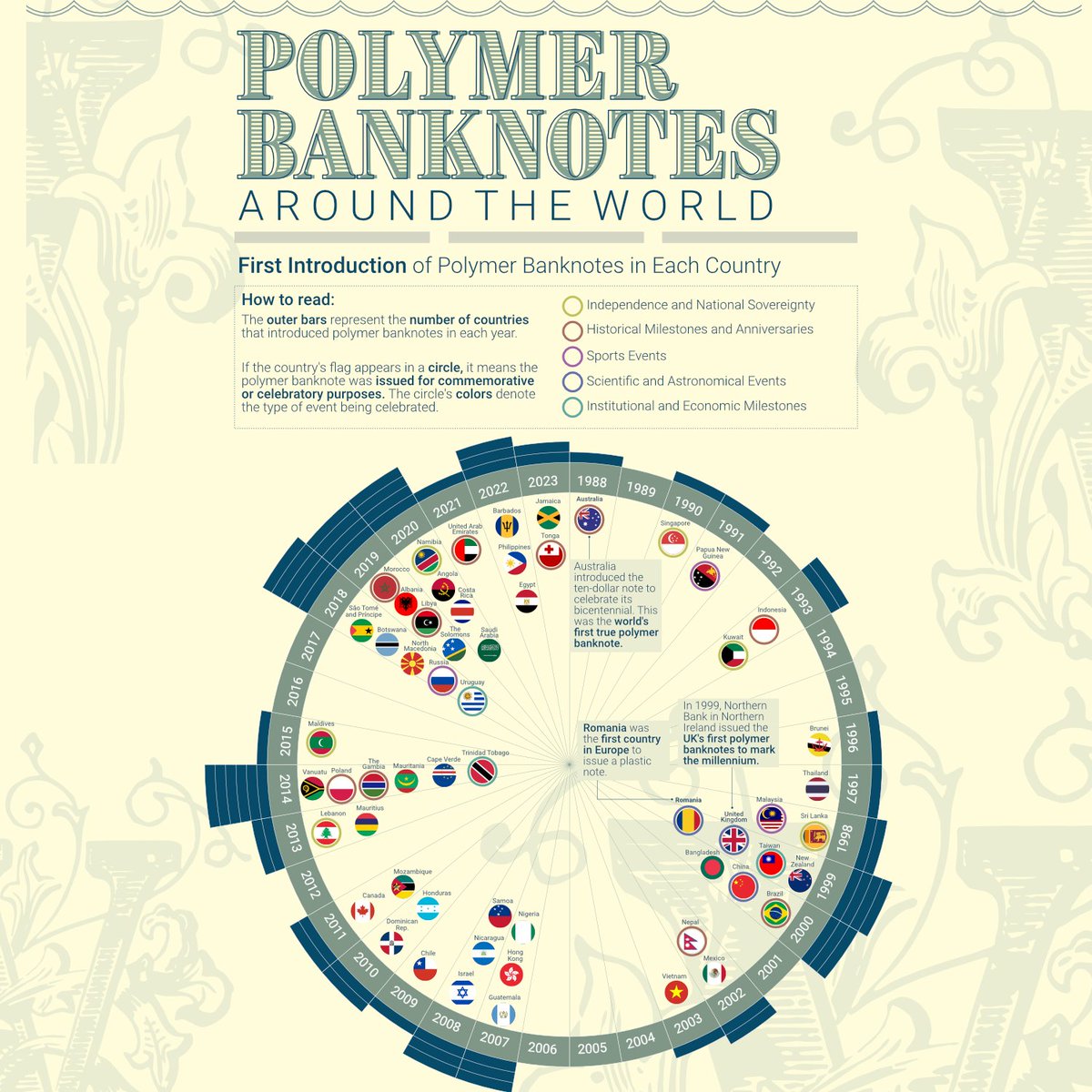
My visual, "When Polymer Banknotes Were Introduced (1988–2023)", is nominated for Visual of the Year in the @VoronoiApp ! 🎉 🗳️ Vote daily until Dec 18.
voronoiapp.com/posts/voronoi
Thanks for your support! 📊✨ #DataViz
English
Edit Gyenge retweetledi

Help Me Find My Next Role!
I’m seeking opportunities as a Data Visualization Analyst, #TableauDeveloper, or BI/Data Analyst. Check out my work showcasing impactful dashboards and insights.
🔗 linktr.ee/victoryomovrah #DataFam #OpentoWork
@salesforce @Google @tableau


English
Edit Gyenge retweetledi

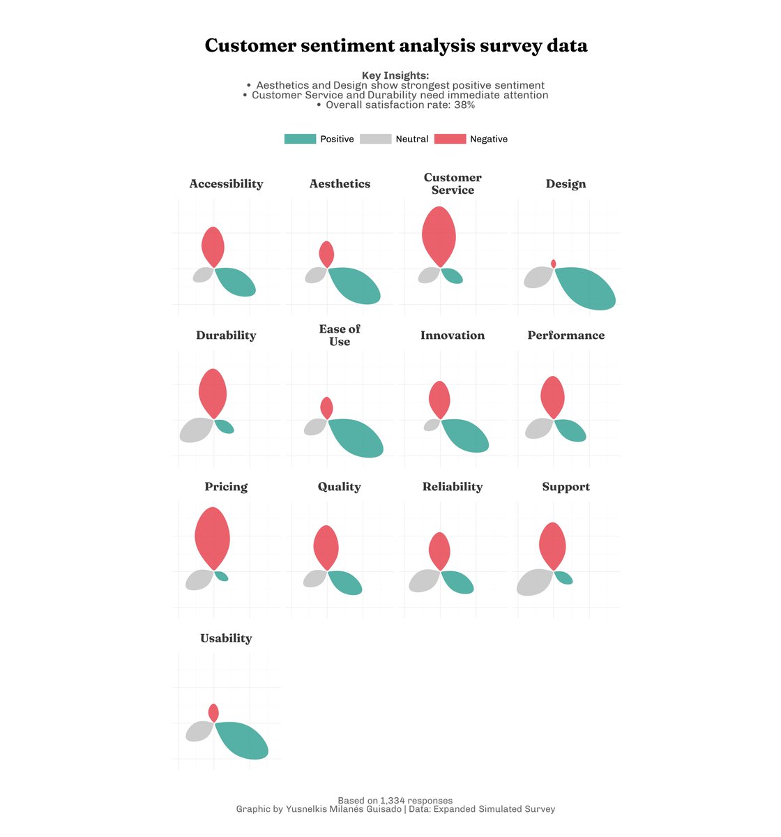
My last data viz !
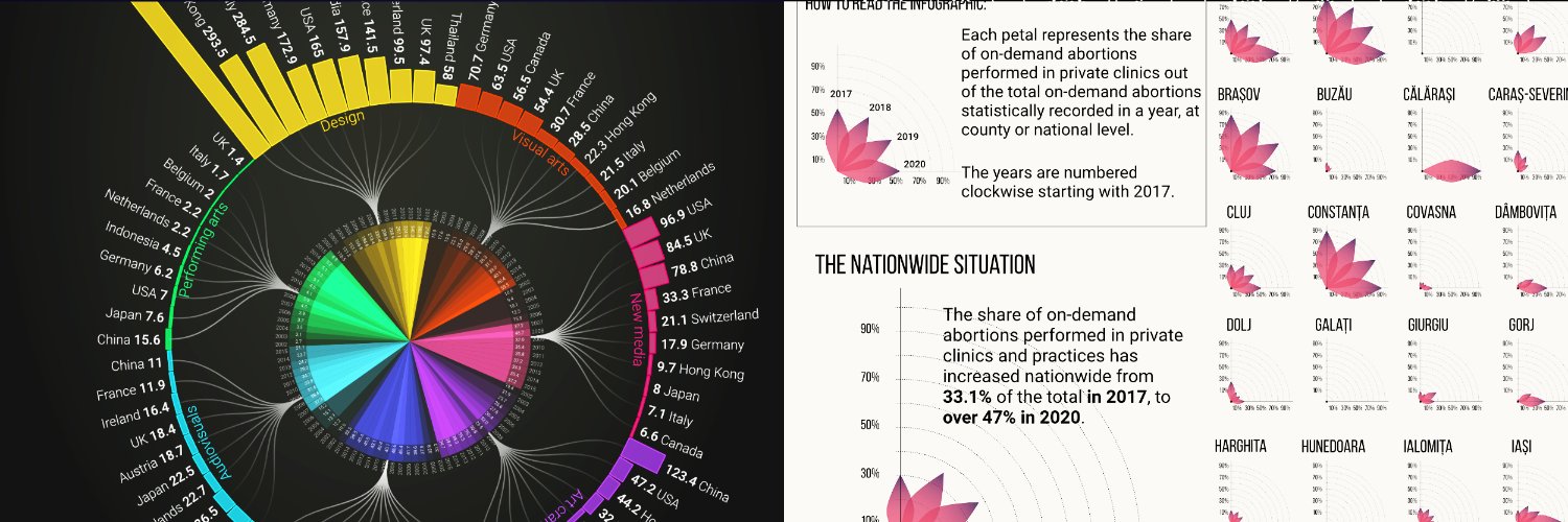
Sentiment analysis survey data using petals
Here you are code, simulated data and chart:
github.com/Yusnelkis/Port…
CC: Inpired in Muhammad Azhar
English
@Esteban1138 Thank you! The maps were created using Flourish Studio, with some custom coding and data preprocessing beforehand.
English

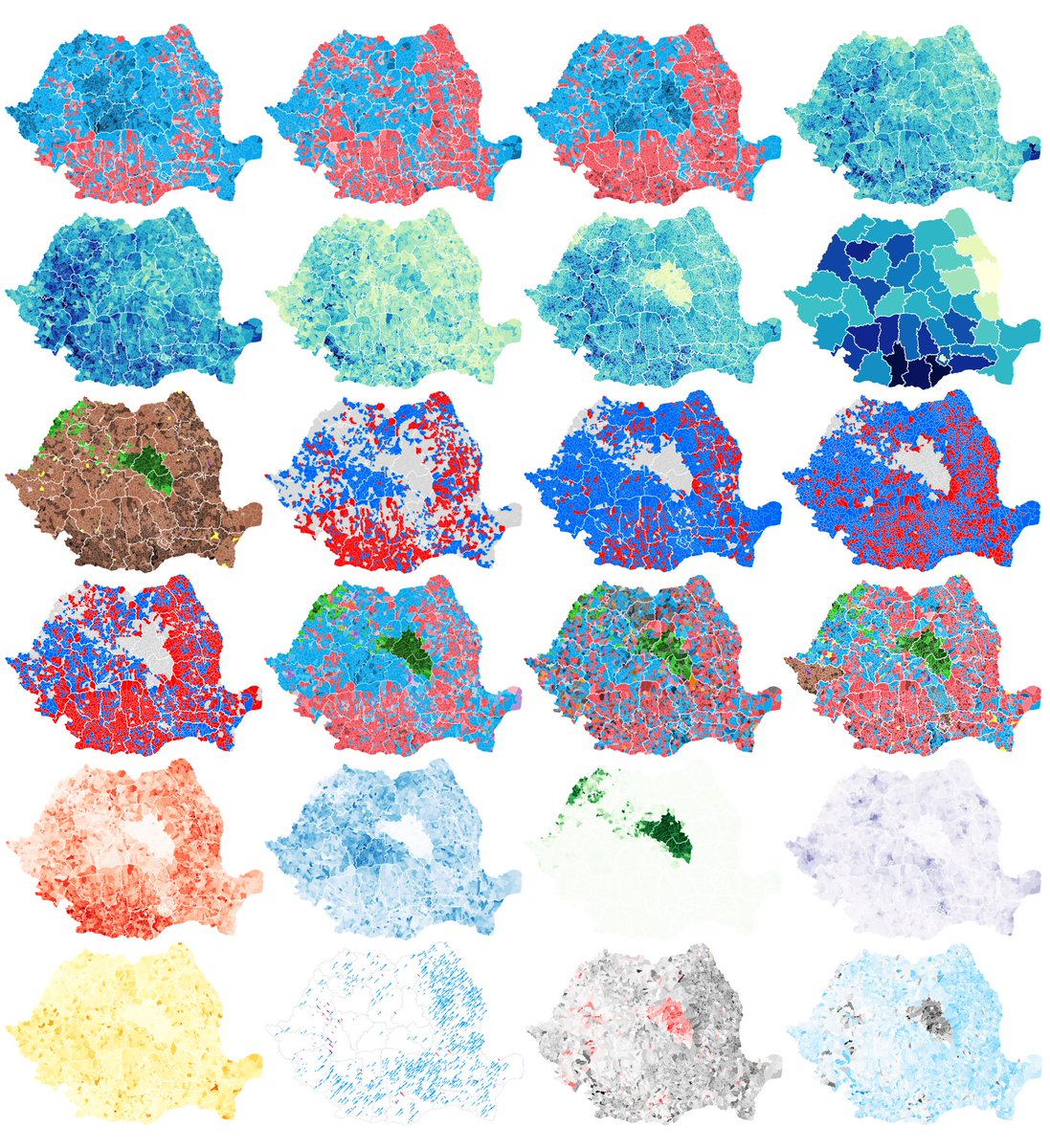
One of my most challenging and exciting projects this year: over 400 charts and maps unpacking Romanian election data. From turnout to trends and hyper-local insights, it’s designed to be a tool for discovery!
👉alegeri.hotnews.ro
#elections #maps #dataviz #choropleth

English