Little life update: this quarter I traveled the most I have in my life. It was amazing, but terribly exhausting while being in the midst of growing a business. I’m craving just having a boring routine for some time.
I’m actively building acquisition systems right now. For the past 2.5 years, we have been building a genuinely great service with a solid foundation, and I know more brands could benefit from it.
We have the most amazing people on our team. I’m planning on doing live ecommerce events in Bali.
And a lot more interesting projects are in the pipeline for this year. I can’t wait to reveal more details soon.
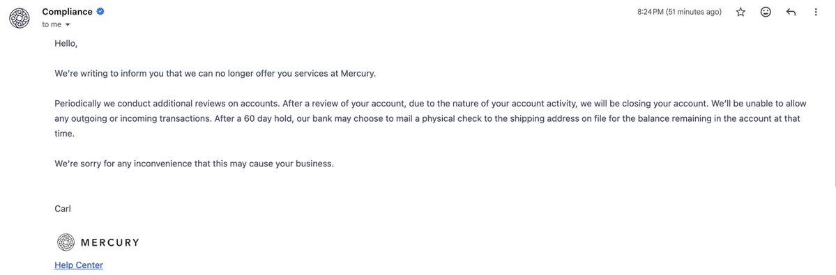
@MohammedEcomm@mercury@immad They're so random with their choices, same happened to me one year ago .. closure with no reason. I don't know if you can hire a lawyer and don't forget to leave your review on Trustpilot.
@mercury@immad@mercury@immad A physical check after 60 days is not an acceptable solution. We want our account reinstated or our funds released immediately by bank wire.
@immad please help look into this urgently.
@Mercury suddenly closed our account for no reason and is now holding funds our business depends on. This makes no sense and appears to be a mistake or system glitch.
@immad Please look into this.
@spencepawliw I love that you choose normal products and not unique ones that stand out because of their marketing. Proof again that the right angle and the right execution through creatives can make any product work..
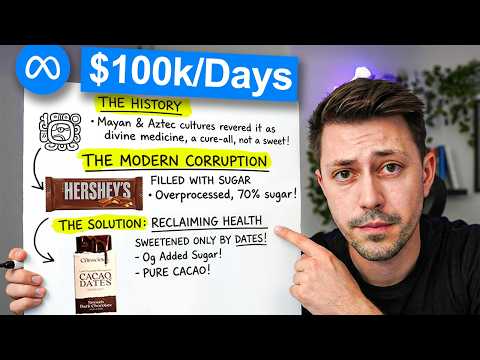
I spent $85 on chocolate bars because of this ad.
That's the power of storytelling.
If you want the exact scene by scene breakdown of the strategies they used
And you want to learn what makes it the #1 ad out of 610 active ads in their library
I just dropped a video explaining all of the tactics used
It's 100% free, and so far people seem to like it.
Check below 👇
Just because a company makes millions doesn't mean all of their ads are perfect.
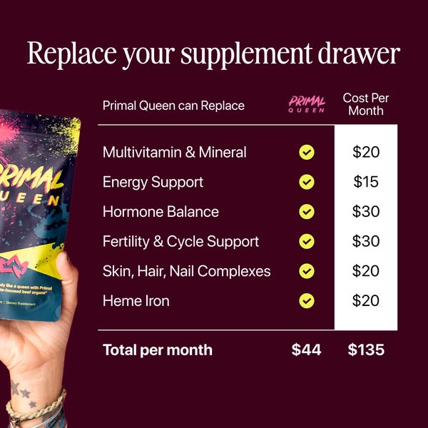
Take a look at this Primal Queen ad.
It's been active since December 2025.
And yeah, most likely it's profitable.
But it could be better. Here's what I'd change and why:
1. Headline
"Replace your supplement drawer"
It's vague and without any emotion.
No outcome, no benefit, no transformation.
It's not even mentioning the product.
Just some order without the context.
I would change it to:
"Stop overpaying for your supplement stack"
Now the viewer understands something immediately - their current approach is costing them more than it should.
Same stack, 3x cheaper, one product.
The headline does the math for them before they even look at the table.
2. Creative
$44 vs $135 - that's a strong difference.
But both numbers are sitting in the same size, same weight, same color.
Sometimes design sells better than copy, but in this case it doesn't sell at all.
What I'd do:
- $135 in red, crossed out, large
- $44 in green, bold, larger
- The savings ($91/month) called out: "Save $91 every month"
The contrast should hit you before you read a single word.
3. The table is features, not benefits
"Multivitamin & Mineral" - ok, and?
"Hormone Balance" - what does that mean for me?
"Heme Iron" - what is that?
This table lists what Primal Queen CONTAINS. Not what it DOES for the viewer.
Every row should answer: "why should I care?"
I understand it's not really doable in this specific ad, but they could create two split pictures of current supplement stack vs Primal Queen.
The current would be described with features.
The Primal Queen with benefits.
At the same time we could still present the cost-saving angle,
4. What they got right
The core concept is strong - one product replaces six.
$44 vs $135 is a no-brainer if you present it right.
The problem is the execution.
A stronger headline, visual contrast on pricing, and benefit-driven rows would take this ad from "probably profitable" to "definitely scaling."
Framework you can steal:
If your product replaces multiple alternatives:
- Lead with the COST savings, not the product
- Make the price difference impossible to miss visually
- Translate features into outcomes in every row
- The comparison table should make the viewer feel dumb for NOT switching
Most product photos suck.
In order to increase your CVR I want you to treat your product photos same as static ads.
And be intentional about how you order them.
We’ve been testing what is the best performing order and this won:
1. Main product (add “Made in [country]” + mention the offer & freebies)
2. Benefits (1x or 2x)
3. Feature
4. Social Proof
5. Size Guide (for fashion brands)
6. Lifestyle photos
Cheff Kiss 👨🍳