Font Bureau

3.1K posts

Font Bureau banner
Font Bureau

Font Bureau

@fontbureau

A digital type studio since 1989. We design typefaces and make fonts.

MA Katılım Mart 2009
129 Takip Edilen27.4K Takipçiler
Font Bureau
Font Bureau@fontbureau·
@TiroTypeworks @benkiel @ninastoessinger @rileycran You've been pushing the base table since 2016 and have never supported, documented or demonstrated anything else on our presence. And "everyone" does not think I'm talking about UPM scaling, that was answered in the first conversation with MS on this issue and you were present.
English
0
0
0
0
Tiro Typeworks
Tiro Typeworks@TiroTypeworks·
@fontbureau @benkiel @ninastoessinger @rileycran I have been pushing for script-specific vertical metrics for years, as is well documented. At the last TYPO Labs, I also demo'd a concept of a variable font that reacts to available vertical metrics. You can watch the video.
English
2
0
1
0
Tiro Typeworks
Tiro Typeworks@TiroTypeworks·
@ninastoessinger This covers much of what we talked about recently regarding vertical metrics. #latest" target="_blank" rel="nofollow noopener">typedrawers.com/discussion/455…
Tiro Typeworks@TiroTypeworks

This morning, @anaghanarayanan asked me some questions about font vertical metrics in the context of her Tamil+Latin biscript project. I ended up writing rather a lot in response—productive procrastination for the win!—and Anagha said I could post the exchange to @TypeDrawers.

English
1
0
4
0
Font Bureau
Font Bureau@fontbureau·
@TiroTypeworks @benkiel @ninastoessinger @rileycran Microsoft, Tiro Typeworks and Armenotype, Granshan, Apple and Adobe, have all rejected the independent interoperable variation of vertical metrics in any script, much less among them. The em is latinized and that is apparently final.
English
3
0
1
0
Tiro Typeworks
Tiro Typeworks@TiroTypeworks·
@benkiel @ninastoessinger @rileycran The more I think about it, the more wrong-headed it seems to try to rely on font metrics to automatically vertically centre text in buttons (or any other kind of container). Wrong-headed and also Latin-centric: other scripts utilise vertical space in many different ways.
English
1
1
7
0
Tiro Typeworks
Tiro Typeworks@TiroTypeworks·
I can’t decide if I’m just not very good at writing about typeface designs or if, in fact, there is simply nothing very interesting to say on the subject.
English
7
0
36
0
Tiro Typeworks
Tiro Typeworks@TiroTypeworks·
Not sure whether I would re-engage with Typophile if this were to come to pass, but I sure would like to be able to rescue the many, many things that I wrote there over the years.
Typophile@Typophile

@sparkleglitch13 we miss you too! not dead, but re-emerging soon after a hiatus.
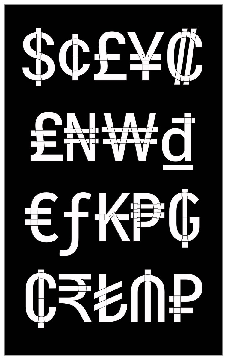
English
3
1
10
0
Font Bureau
Font Bureau@fontbureau·
@hhpapazian @davelab6 @glyphe @googlefonts @kupfers @arabictype No other links or topics yet, thanks. Grade as the name of the axes and as a value given to styles along it, in both incarnations, is "even more confusing" than what? And what does it mean to have one word "doing more of the work" than another? How does "three" outwork "Grade"?
English
1
0
0
0
Oliver Schöndorfer 🇺🇦
The #FontMatrix is a different way of seeing typefaces 🤯 Knowing about it earlier would have saved me a lot of time & guessing, when it comes to choosing, especially to #PairingFonts. It is based on the work of @kupfers, it helped me make more sense of type categorizations. 🧵👇
English
2
6
33
0
Font Bureau
Font Bureau@fontbureau·
@typographica Thanks for the opportunity to give you a broader view. You present the use of font products that benefit “normal” readers for as vast a discussion as you can get...further reading has been provided.
English
1
0
2
0
Font Bureau
Font Bureau@fontbureau·
@hhpapazian @davelab6 @glyphe @googlefonts @kupfers @arabictype "Grade" in instances was part of a style name, but always joined by names like "one", "two" or "three". In variable fonts, the transition to an axis with numerals should not be confused by this change, and has overwhelmingly not been. Thanks.
English
1
0
3
0
Tiro Typeworks
Tiro Typeworks@TiroTypeworks·
Are there any examples of TN parametric variable fonts with non-vertical contrast? I am trying to wrap my head around how the x,y parametric model is applied to designs with strong diagonal stress. @dberlow @TypeNetwork @googlefonts @davelab6
English
2
0
3
0
Font Bureau
Font Bureau@fontbureau·
@googlefonts @hhpapazian @Igor_Freiberger @TypeNetwork @dberlow Sounds fishy for someone who hasn't driven it to decide the engine's bad. Besides which, we only built the chassis, cabin, steering and accelerator. The owners of the spec built the engine, (and failed to deliver the brakes on time for this build).😇
English
1
0
1
0
Font Bureau
Font Bureau@fontbureau·
@googlefonts @hhpapazian @Igor_Freiberger @TypeNetwork @dberlow Looking may take some time. There are a lot of sizes between "text" and "display." There are a lot of uses considered as both, neither or either, based on reader, distance, script, drift and much more...we wish we knew. Even if found, to dictate such a thing seems... autocratic.
English
0
0
0
0
☞ Rachæl Miller
☞ Rachæl Miller@spikebackpack·
I honestly can't figure out if this is intentional or not. New type trend OVERLAPS. found on an article about 𝑔𝑎𝑚𝑒𝑟𝑠
☞ Rachæl Miller tweet media
English
3
0
13
0
Font Bureau
Font Bureau@fontbureau·
@espiekermann Der deutsche Großbuchstabe S wird nicht gefunden oder shriftencraffted?;)
Deutsch
1
0
0
0
Font Bureau
Font Bureau@fontbureau·
@realdougwilson Thank you for your follow up. The designer thinks working on an essay surpasses twitter in answering questions, rhetorical or otherwise. Will send you a copy in advance, if you ask?
English
0
0
0
0