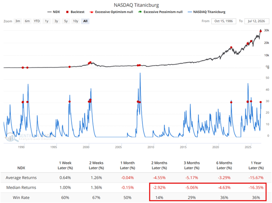
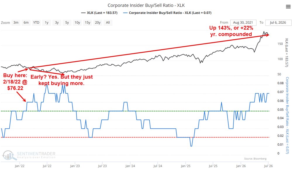
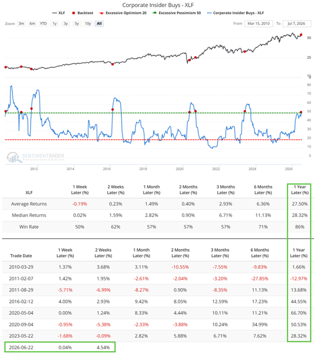
You don't need to predict when the next big correction is coming. You need a plan for what you'll do when it arrives.
Jay Kaeppel
6.8K posts

@jaykaeppel
Jay is Senior Market Analyst at https://t.co/BNBZdQZHaj and author of Seasonal Stock Market Trends (Wiley). Trader, writer, instructor and former CTA.

You don't need to predict when the next big correction is coming. You need a plan for what you'll do when it arrives.


Conventional wisdom says rate hikes are bad for stocks. The data says not so fast. Look at this chart. 1997. The Fed hiked rates and the S&P 500 was up nearly 40% one year later. 2004. Hikes started and the market was up 5.6% a year out. 2015. Barely a scratch. Yes, 1987 and 2022 were ugly. Nobody is pretending otherwise. But the idea that a rate hike automatically means stocks go down is not supported by the historical record. It depends on why rates are rising, how fast they rise, and what the economy is doing underneath it all. Chart @_JoshSchafer


🇺🇸 S&P 500 When everyone is piled into equities and valuations are stretched, there isn't much cushion left. History doesn't say a crash has to follow, but it does show that markets priced for perfection rarely handle surprises well 👉 isabelnet.com/?s=S%26P+500 h/t @Callum_Thomas


Almost 60% of Tech Stocks are now in a bear market 🐻 📉 😱


🚨 Never forget… Your whole idea of buying every dip through ETF and chill is a 13-year illusion. 100 years of S&P 500 real returns, split into regimes: – 1928-1948: 0.6% a year – 1949-1968: 12.7% – 1969-1984: 0.5% – 1985-1999: 15.1% – 2000-2012: -0.8% – 2013-2025: 11.8% Notice the rhythm. A golden era, then a dead one. Feast, famine, feast, famine. Not one regime in a century simply continued. The long-term average of 7% real that everyone plans with? Almost no generation actually experienced it. You got 12%, or you got zero. The average is a fiction made of two extremes. Everyone who started investing after 2009 has only known the feast. Buy the dip worked every single time. Not because it's a law. Because you happened to live inside the blue bar. But the current run is already as long and as rich as the two golden eras before it. And every one of them ended the same way: not with a warning, with a decade. Mean reversion doesn't announce itself. It just stops paying. The next 0.5% decade will feel impossible right up until it starts. It always has.


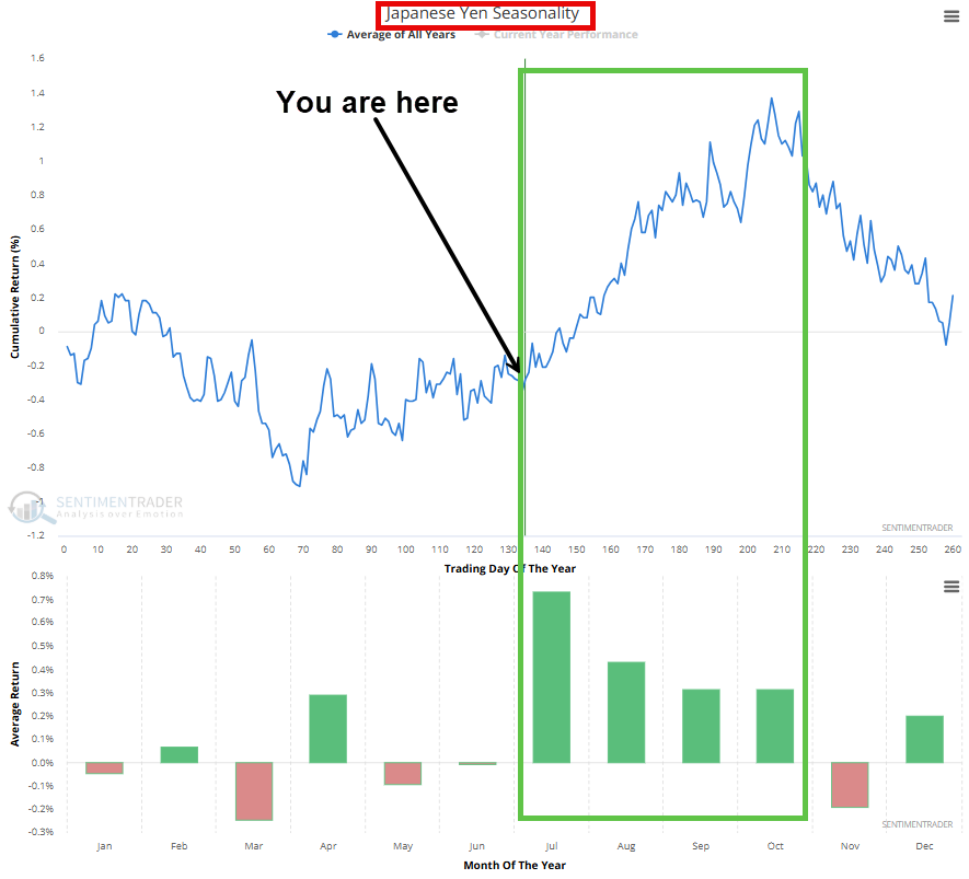
The Japanese Yen is at its lowest level since 1986 against the US Dollar, losing 54% of its value from the 2011 peak. Video: youtube.com/watch?v=6Spz0W…


Key levels for short-term counter-trend traders (IMO): QQQ = 748.65 (Above that trend confirmed; until then, anything goes GLD = 360.00 (is the "Line in the Sand" for any speculative bullish trades) UUP = A drop back below 28.00 would complete a "bull trap"

🇺🇸 This is the most persuasive chart in finance. It has also ruined more retirements than any crash on it. One dollar invested in US stocks in 1870 is worth $35,082 today, after inflation. Every catastrophe on the timeline shrinks to a dent. The Panic of 1907. The Depression. Black Monday. All noise on a log scale. The pitch writes itself. Hold long enough and nothing can touch you. Now ignore the red line and look at the flat blue segments. Those are years spent underwater, waiting to reclaim a previous peak, in real terms, with dividends reinvested. 1901 to 1921: twenty years. 1929 to 1949: twenty years. 1968 to 1983: fifteen years. 2000 to 2013: thirteen years. A working life gives you about forty investing years. This chart eats them thirteen to twenty at a time. The market had 155 years to be right. You get forty. And you don't get to pick which forty.