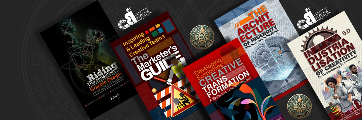
KMak | Creative Scientist
5.5K posts

KMak | Creative Scientist
@kudaMak
CREATIVE SCIENTIST & CONSULTANT | FOUNDER: CBI & DECOZ | Author, Systematic Innovation & Neurodesign Series #NDS2


This is good, progressive packaging from Cairns….. 👏🏽👏🏽bright, confident and properly placed for the category. It looks like crisps packaging should look, visible, appetising and alive on the shelf. I can’t quite believe people thought the old khaki packaging was better. Perhaps we need an aesthetics refresher. That khaki look was largely a child of the currency shortages and packaging economies of the 1990s. The duller the material, the cheaper the production. Like most card boxes and exercise book covers. NOT a golden age of design. Unfortunately, people became accustomed to that dullness…. incidentally a lesson to all marketers I’m glad this has changed. Food must first invite the eye before it asks for the hand….


#TeamFulo Poll. There have been reactions to the new packaging of Spuds Crisps by @CairnsFoods Your chance to vote . Frame I - Original Packaging. Frame 2 -New Packaging . Which one do you prefer and why?


