
おもちもちもち
15.1K posts
おもちもちもち
@kymt
デザイン/ロゴ/フォント/モーショングラフィックス/建築が好き。ハードウェア/ガジェットも好き。 メーカープロダクトマーケ→広告クリエイティブディレクター→メーカープロダクトマーケ
Katılım Nisan 2008
1.2K Takip Edilen653 Takipçiler
おもちもちもち retweetledi

Hayatında 5 dakikayı bile çocukla geçirmemiş kişi tasarımı
Wolf of X@WolfofX
This library in Virginia created a desk for working parents
Türkçe
おもちもちもち retweetledi

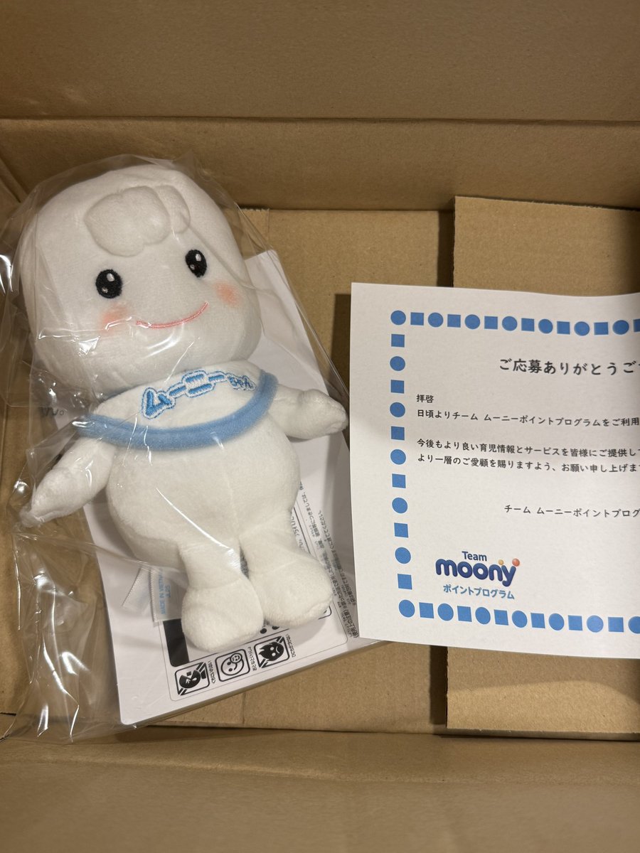
@UnicharmCorp_jp ポイントで頂いたムーニーちゃん人形も、ベッドで一緒に寝たり、登園のお供に連れて行ったりと娘も大変気に入ってかわいがっております。トイトレ中も自らトイレに持ち込んで見守り係をお願いしてました。オムツもプレゼントもありがとうございました!
日本語
おもちもちもち retweetledi

おむつ卒業、おめでとうございます🌸生まれてからずっと、ムーニーが成長のお供をさせていただけたこと、とても嬉しいです☺️毎日のおむつ替え、本当にお疲れさまでした🏅✨
おもちもちもち@kymt
娘がおむつを卒業したので、最後のポイント交換。生まれてから延べ2.2万ポイント貯めた。 今までありがとうムーニー😭
日本語
おもちもちもち retweetledi

というか「小児ワクチンが弱点」って、その赤ちゃんヒーローとやらはウイルスや菌の化身なのでは…
技術系会社員🗣️🇷🇺📣🟠🦕🦖🌎☄️🌑👁️🪬✡️🌸🇯🇵⛩️🧠@_137_036
反ワクチン主義の絵本作家が描いた「小児ワクチンが弱点の赤ちゃんヒーロー」の絵本が、先月末に出版されてしまっていました。皆様この表紙にご注意下さい。
日本語
おもちもちもち retweetledi

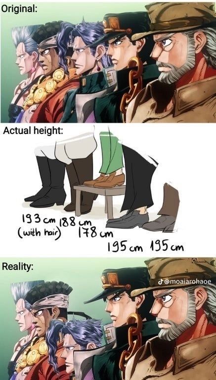
en la vida soy kakyoin al lado de mis amigas jajaja
Español
おもちもちもち retweetledi


おもちもちもち retweetledi

おもちもちもち retweetledi

おもちもちもち retweetledi

ナチュラルワイン推しの飲食店は店主の舌がおかしいか良心がないかのどちらかあるいは両方だから、いい店なわけない。
ツカルミズナ@tsukarumizuna
日本橋東側(人形町周辺)でナチュラルワインを買えたり飲めたりするお店をまとめてます。一昨年作ったものの更新版。ちょっと細かくて見難いですが飲み歩きの参考に是非。 単純に飲食店として美味しいお店ばかりなのでナチュラルワイン飲まない人にもおすすめ。
日本語
おもちもちもち retweetledi

都市公園法によって公園には「屋根」が設置できない。酷暑化する日本において、もっと柔軟に日よけを設置できるよう国会でも議論して欲しい。
自治体は法をかいくぐって、タープやフラクタル日よけをなどを模索中。港区も有栖川宮記念公園で実証的な取り組みに着手しています。
東京新聞編集局@tokyonewsroom
「子どもの遊び場に日陰を」 暑すぎる夏、住民の「熱意」に行政が動いた 杉並区の公園、タープで涼しく tokyo-np.co.jp/article/486085 東京新聞デジタル
日本語
おもちもちもち retweetledi


おもちもちもち retweetledi

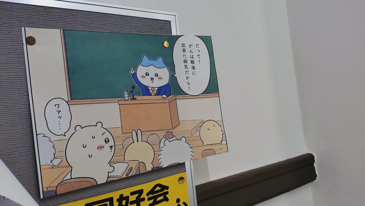
泉京香は黙らない、面白かった。
さっきもツイートしたけど、これ「漫画家の家に遊びに行こう」をドラマ化したいけど露伴が敵キャラになるのをどうにかしようみたいな発想だよね絶対!
完全オリジナルと見せかけた裏技じゃん!!
#泉京香は黙らない
日本語
おもちもちもち retweetledi

おもちもちもち retweetledi

おもちもちもち retweetledi

おもちもちもち retweetledi

おもちもちもち retweetledi


おもちもちもち retweetledi

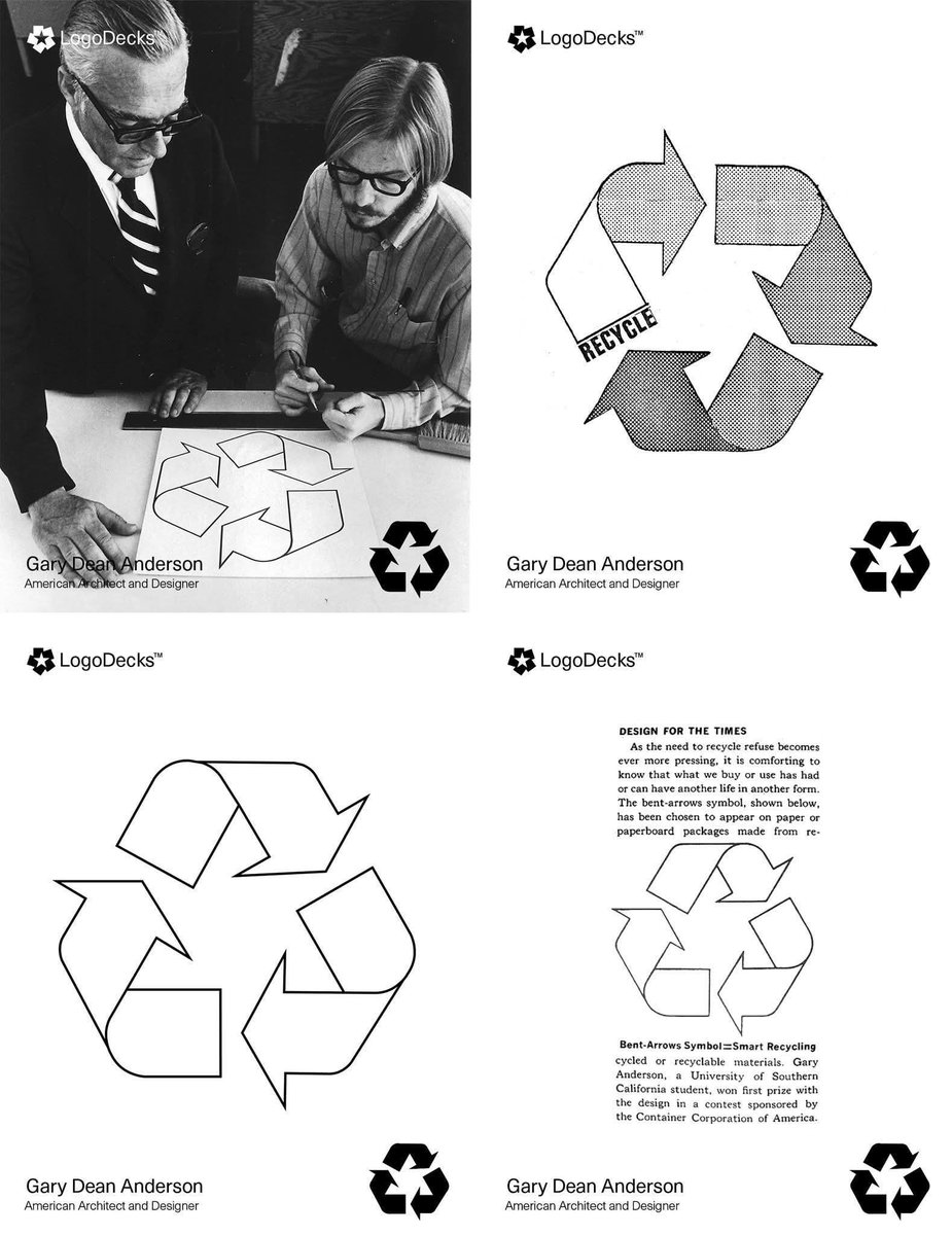
The College Student Who Designed the Most Recognized Symbol on Earth.
Gary Dean Anderson is an American designer best known for creating the universal recycling symbol, an image that has become one of the most recognizable icons in the world. In 1970, while he was a college student, Anderson entered a design competition centered on environmental awareness and developed the now-famous three-arrow loop. The logo, often referred to as the Möbius loop, features arrows chasing one another in a continuous cycle, representing the process of reducing, reusing, and recycling materials.
A lesser-known but meaningful detail of the design is the use of negative space, which subtly forms the shape of a pine tree, reinforcing the symbol’s connection to nature and environmental protection. The logo’s clean, minimal form allows it to communicate across cultures and languages with ease. Rather than being decorative, Anderson’s design is functional and symbolic, proving how thoughtful graphic design can shape global attitudes toward sustainability and conservation.
#logodecks
English