Sabitlenmiş Tweet
laugri
1.1K posts


laugri
@laugrima
📌 Tweets about design, product management and learning
Lisbon, Portugal Katılım Mart 2012
210 Takip Edilen308 Takipçiler
laugri retweetledi

@andybudd I am confused by this take. IMO the part of design that creates the most value is not designing buttons or other UI patterns but rather conceiving experiences that solve a given problem for someone (including e.g. storyboarding, the right prototypes, usability tests, ... ).
English

I think the answer is a) yes we have designed ourselves out of a job but b) it was also somewhat inevitable.
Agent Smart@agentsmart
@andybudd Neat. Have we designed ourselves out of a job? Or have we just bypassed the need for design being a conscious act?
English
@hobdaydesign It's interesting that cynical is the adjective you chose here. What made you do that?
English

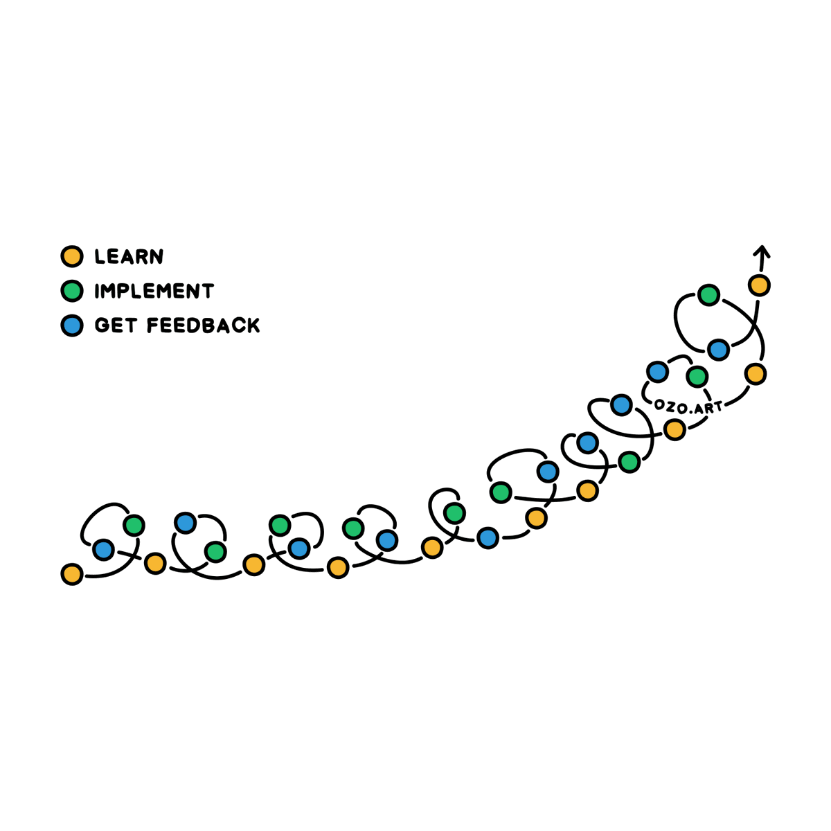
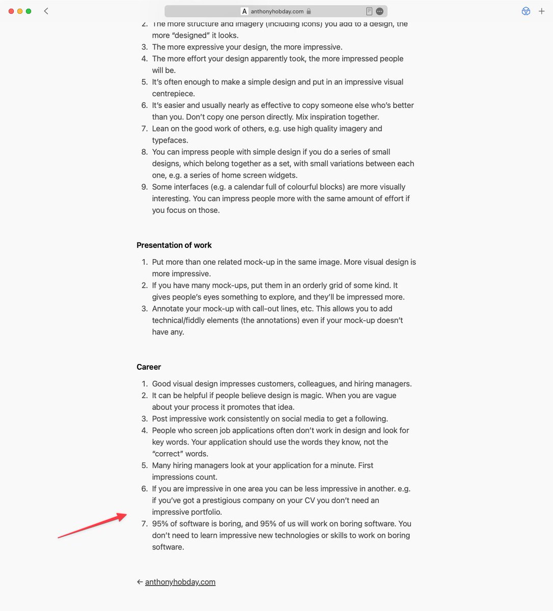
I've added two new points to my list of cynical design advice.
anthonyhobday.com/blog/20231112.…
English
@hobdaydesign @Gavmn @KatieLangerman @rsa Thanks for collecting those quotes by the way, I enjoyed reading them.
English
@Gavmn @KatieLangerman @rsa I think I remember being shocked that more people didn't know about it. Rams talks a lot about his philosophy, which I prefer over "here's a collection of my work".
I've just checked anthonyhobday.com/sideprojects/d…, and it looks like I saved 21 quotes from the book.
English

@wildekek @carlvellotti This 100%! "FiNisH thIS DesiGn bY ToMoRrow oR tHe enGinEers wIlL not Be bUsY"

English


Where should a product manager focus most of their energy?
Wrong answers only.
English
@hobdaydesign I have a checklist of all the things that are typically forgotten.
English
If you have a full time job as a designer and work on an application interface, do you have any practical methods to help you make sure you don't miss anything, other than "show my work to other people"?
Tell me about it/them, please.
English
laugri retweetledi
laugri retweetledi

Professor Kevin Anderson is addressing all of us in very clear words:
»We are heading towards 3 to 4°C of warming across this century, an absolute climate catastrophe for all species incl our own. And all we are doing so far is giving rhetoric and optimism and greenwash.«
🧵1/8
English
laugri retweetledi

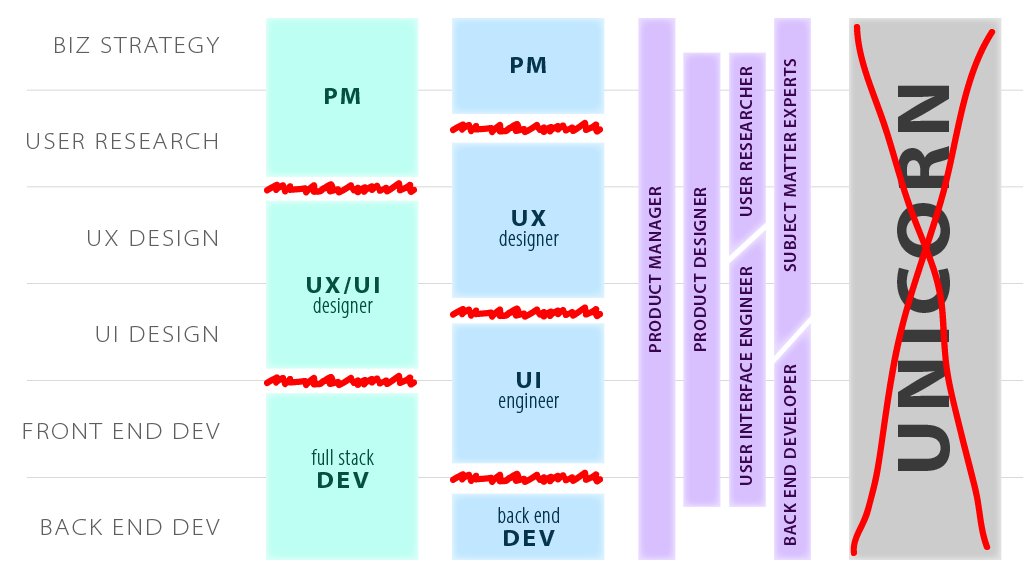
Whichever way you slice it, "clean" handoffs between stages of the software development process create friction and leave each role frustrated due to lack of influence into neighboring spaces.
The solution is working in parallel, not expanding your "slice" until burnout.
1/
English
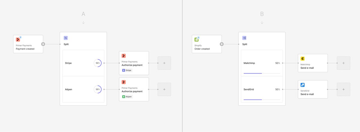
@jarekceborski @primer_io I find the B version clearer for everything, expect for the progress bar, which I think is too disconnected from the number in B, and works well on A.
English

Work in progress on the ✂️ Split tool in @primer_io This tool allows for all kinds of A/B tests, e.g. payment processors or email providers.
Which way of showing the desired distribution and which tool's icon do you think is better?
English
@erikdkennedy @hobdaydesign I use robust too often for the same use cases.
English

I’ve started a list of design-related words that have a useful meaning but that I don’t see used often.
e.g. “rigour”.
Do any words that you rarely/never hear but that have a technical meaning in the world of design (not just interface design) come to mind?
English
@imuratalpay Right, the left green icon reminds me too much of a button you can actually click. But you could use the background color accent from the left if you want to keep some color!
English


I am seriously considering getting a place in San Francisco to work in the office and meet with founders. It’s an hour flight on a good day and would be easy to go back-and-forth.
Palm Springs, CA 🇺🇸 English

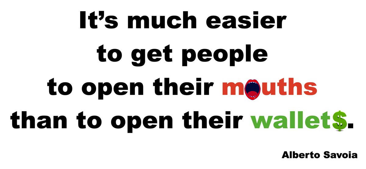
@laugrima @robfitz Talking to potential customers is one way to COME UP with new product/feature ideas, but a terrible way to VALIDATE those ideas. You'll get a of false positives and false negatives.
Instead, use pretotyping to collect data with Skin In The Game to VALIDATE ideas.
Good luck!
English
@Pretotyping Hi Alberto. I've applied the pretotyping approach on two projects over the last month. It's great and I loved the book. One question though: how do you think pretotyping and user research should be combined ? For example (next tweet):
English


@hobdaydesign @saasshots @ortto Please do more. I always find critiques or "before/after" exercises helpful to learn new techniques and things to pay attention to.
English
As a rule I avoid negative critique on Twitter. I've decided to try it, and see how people react.
I think I'll probably piggyback off @saasshots for this 😂 So first up is this screen from @ortto.
AI Shots 📸@saasshots
New Report View from @ortto
English