Mudasir Fayaz

809 posts

Mudasir Fayaz

Mudasir Fayaz

@mudasirbuilds

Frontend Engineer | Building Modern Interactive Web Interfaces With Tailwind CSS & React Motion building: https://t.co/9r9THaGcV2 https://t.co/7VIbR3zM8H https://t.co/cFwSIBAnFh

Anantnag, Jammu & Kashmir Katılım Mayıs 2024
156 Takip Edilen165 Takipçiler
Sabitlenmiş Tweet
Mudasir Fayaz
Mudasir Fayaz@mudasirbuilds·
built this card component with react, tailwind, motion/react inspired from clerk website learned with @mannupaaji Framer Motion YT Playlist EP-2 GIVE YOUR FEEDBACK
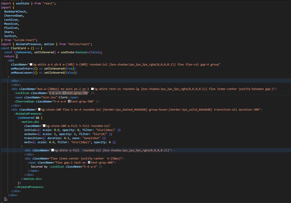
Mudasir Fayaz tweet media
English
2
1
11
682
Andras Bacsai
Andras Bacsai@heyandras·
I would like to ship another version of Coolify today, but probably it will be postponed for tomorrow morning.
GIF
English
3
0
17
1.4K
Mudasir Fayaz
Mudasir Fayaz@mudasirbuilds·
@heyandras @coolifyio just working on coolify landing page refactored inline svg icons into component files more sections in homepage ui & navbar improvements will be pushed soon to repo how does it look ? give feedback
Mudasir Fayaz tweet mediaMudasir Fayaz tweet mediaMudasir Fayaz tweet mediaMudasir Fayaz tweet media
English
1
0
1
45
Amena
Amena@AmenaiSabuwala·
Just got a new client 🥳
Amena tweet media
English
55
6
182
4.4K
Eduard Bodak
Eduard Bodak@eduardbodak·
020/100 Buttons. Total time so far: 161h We got a more simple animation here that we also see on a lot of websites. I added a bit more depth to it by making the text move slightly into the back on hover. The fun part is always that there are a lot of ways to create those animations. Sometimes you just try some CSS styles like clip-path or the sin() function, and by doing that, new ideas emerge. For example, here I could have just used a clip-path for the duplicated part and revealed it. Adding the text movement, and that’s basically it. Or I use overflow: clip on the button container and move the duplicated button below it with translate: 0 101%. 101% because sometimes you can see a small pixel line of the button when using 100%. Then I animate that duplicated button to translate: 0 0 with a little scale and movement on the text behind it. To stack the duplicated button above the default one, there are also two ways. One is using position: relative on the parent and position: absolute on the duplicate with inset: 0. The other one is grid stacking. display: grid on the parent and grid-area: 1 / 1 on the children, so they stack on top of each other. Even z-index works perfectly then without needing position: relative/absolute. Crafted 100 Buttons with @osmosupply Available on Osmo
English
4
4
57
2.8K
Mudasir Fayaz
Mudasir Fayaz@mudasirbuilds·
@irsyad Ofcourse that's purpose for building this component, placeholders should be customisable
English
0
0
0
41
Irsyad A. Panjaitan
@mudasirbuilds I should probably use a toggle or something similar, but the point is that what appears as the skeleton shape should reflect the actual final UI.
English
1
0
1
362
Irsyad A. Panjaitan
Small update to the Skeleton component. You can now wrap your actual UI with Skeleton, set isLoading, and everything inside will automatically animate as a loading state. Cleaner API, less duplicated placeholder markup.
English
6
15
310
25.6K
Jeet
Jeet@jeetnirnejak·
Currency Converter Component: digits rolls, flag flips and swap arrow spins Designed in @paper, animated with @motiondotdev
English
16
5
269
10.1K
Eduard Bodak
Eduard Bodak@eduardbodak·
018/100 Buttons. Total time so far: 152h I see quite often that when using scale on button hovers, it’s mostly something like transform: scale(1.1). That works with small buttons. But as we don’t always have the same height and width, the button looks weird with a 1.1 scale when it gets too long. That’s why a lot of people (me included) use something more like scale: 1.035 1.075; so it looks visually correct. On this button, I used another solution. We have two data attributes where we can add pixel values, one for width and one for height. For height I use 8 and for width 16. We then use JavaScript to calculate the correct scale from those values. It sets the correct scaleX and scaleY as CSS variables that we can use in the animation. With that, you can dynamically define how much bigger you want your button to be, while still keeping it visually correct. One small detail is that I animate the background separately from the rest. So the background has its own animation, while the inner part with the text has a slightly smaller animation. That makes the button feel more snappy. On the “Boost” tab, I added bigger values to the data attributes. Crafted 100 Buttons with @osmosupply Available on Osmo
English
3
4
45
1.7K
Mudasir Fayaz
Mudasir Fayaz@mudasirbuilds·
@heyandras I have forked coolify landing page repo Refactoring Pages Improving Design Adding Micro Interactions It will be my first open source project on which I'm contributing 👍
English
0
0
2
318
Andras Bacsai
Andras Bacsai@heyandras·
🛠️ Coolify 4.1 released - Railpack (beta) - Instance level MCP so you can talk to your Coolify instance from any AI. - Improved diff tracking so if you change a config, you will see what is changed exactly before you redeploy. And a lots of fixes, other smaller features. Happy update 🫰
Andras Bacsai tweet media
English
16
1
203
12.6K
Amena
Amena@AmenaiSabuwala·
working on a new hero section is it worth $125?
Amena tweet media
English
21
1
68
1.8K
Mark Lou
Mark Lou@markproduct·
Morning Coffee → Design Idea ☕
English
10
7
179
4K
Zahra | SaaS Web Designer
Zahra | SaaS Web Designer@zahragr8r·
Premium hero sections. Designed in Figma. Backgrounds made with ASCII.
Zahra | SaaS Web Designer tweet media
English
30
6
145
3.7K
Mark Lou
Mark Lou@markproduct·
See how beautiful it is 😍
English
7
13
456
19.2K
Amena
Amena@AmenaiSabuwala·
If you're the client Which is your favorite? 👀
Amena tweet media
English
51
5
189
5.6K
Alex roy
Alex roy@alexroyhe·
Small things create bigger impact
English
3
1
26
1.1K
SHARIAR
SHARIAR@shariar_design·
toggle on/off interaction 🌑🟢
English
9
2
54
3.8K