#1 Fan retweetledi
#1 Fan
345 posts

#1 Fan
@nashvolnative
#1 fan of the Vols Titans and Preds. Will not support Nashville MLB team if they are not called the Sounds. Never been a Houston Oilers fan
Katılım Haziran 2025
72 Takip Edilen17 Takipçiler
#1 Fan retweetledi
#1 Fan retweetledi


@fashion_nfl White mask white shell is a soft look. Football is a tough sport.
English

@StevenMJohnson_ Memphis is way more passionate about the Grizzlies than Nashville is for the Titans. Cities like Memphis deserve pro teams. Nashville just generates tourism money
English

@FB_Helmet_Guy The socks need stripes. The red stripes are too thin and hardly noticeable. And the facemask should’ve been red. It looks like the Walmart knocks of Houston Oilers jerseys
English

@CHANNEL_TN_ That team had a lot of talent but I think Chism was the heart and soul of it. He’s easily one of my favorites of all time
English

@C_Zambetti I don’t think it looks good at all. It’s very boring overall and has no character to it. It’s literally the same logo with Oilers colors and the flames removed.
English

@titanfan8 I’ve been saying for a while they need to do something honoring the music city miracle. I think a statue of Wycheck throwing across the field to Dyson would look nice. Other NFL teams and colleges have these types of things
English

I do think #Titans have a golden chance to really do something special to honor the team and their tradition with this new stadium so why not honor two players who built this franchise into a winner McNair & George and build a statue with this likeness
Thoughts on this idea....

English

@WardtoLove I’m a fan of my hometown Nashville. If the Titans or Preds left they could go f themselves. I don’t root for an ownership group
English

@fashion_nfl The number and large name plate look great. The red stripe is too thin on the new look and hardly noticeable
English

@MikeHerndonSk1 @HeHateV It’s the dolphins helmet with a soulless logo. Just titans colors
English


@himcryptox @NoLimitGains That’s broken. Rates should have never gotten that low if they weren’t going to stay there for a long time. People were paying nearly double the price for the same home their neighbors purchased just a few years before them. The increase was way too fast.
English

@NoLimitGains Not ‘broken’.
It’s the 3% mortgage trap.
Millions locked into cheap loans won’t move.
New buyers can’t afford 7% rates.
Supply vs demand looks weird but it’s a rate distortion, not a housing crash.
English

@PaulKuharskyNFL They literally put the fire out and quit on the vision Bud had originally laid out for Nashville. It’s nothing Titans or Oilers. It’s a soulless redesign. Any great player from here on out won’t look like they are part of the same team as the legendary Titans.
English

One thing the #Titans redesign clearly does:
It moves away from parts of the Titans era.
What stands out most to you in the new uniforms?
English

@titanfan8 The current ownership group hates that Bud renamed them and moved out of Houston. Tennesseans get a team that would rather be somewhere else
English

Agree 💯
I don't like it at all.
There is no Titans in this new look anywhere.
Looks completely Oilers to me
Like many Tennesseans i didn't buy into this team at all until the '99 rebrand happened
NFL Fashion Advice@fashion_nfl
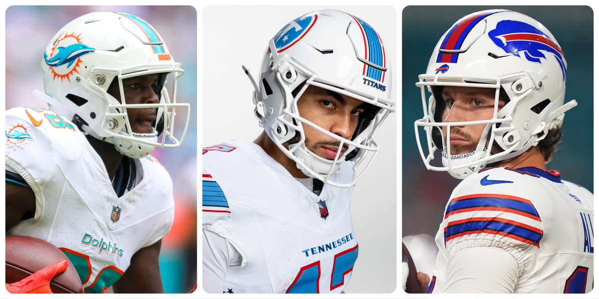
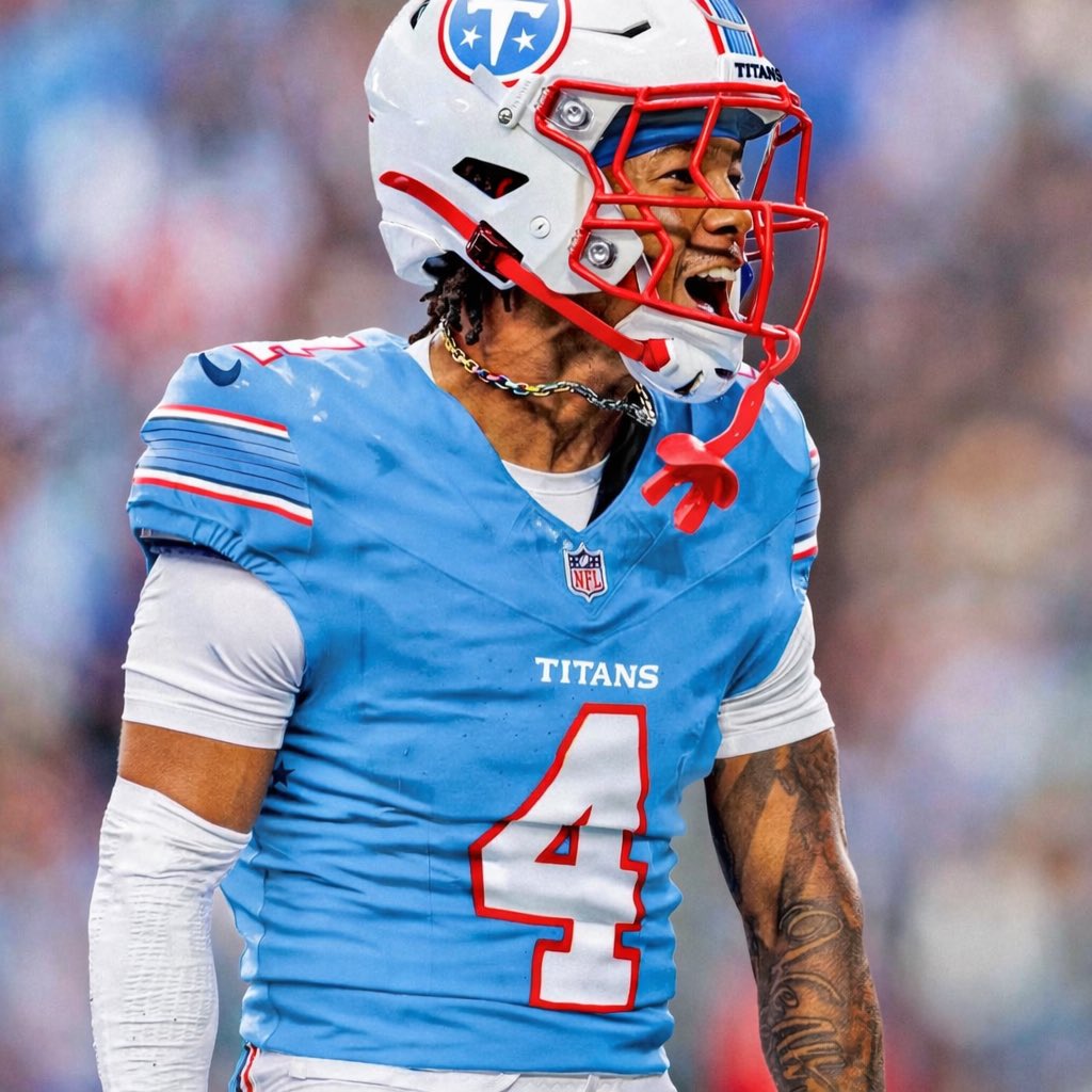
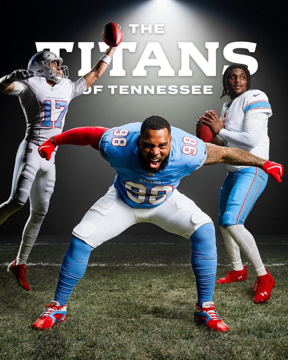
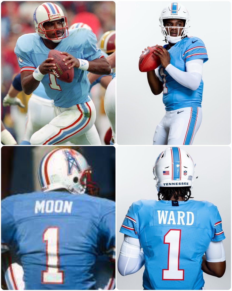
Clearly going for an Oilers-esque return but white mask over red is a half measure and missed opportunity. My overarching gripe is what appears to be a brand identity crisis. Logo downgrade included, it's a complete omission of anything that evokes Titans.
English

@ChattTitansFans It’s really sad that is considered a win by anyone. Houston’s feelings mean more to this franchise than Super Bowl would
English

@fashion_nfl Unsurprisingly disappointing. Tried too hard to look like Oilers uniforms but still keeping the corny modern day touches. These turned out looking like Walmart knockoffs
English


