Have you ever wondered why some visitors add to cart within 30 seconds, while others spend 5 minutes on the same page and leave?
It's not always the product.
It's not always the price.
And it's definitely not always the ads.
Sometimes the answer is hiding in the buy box.
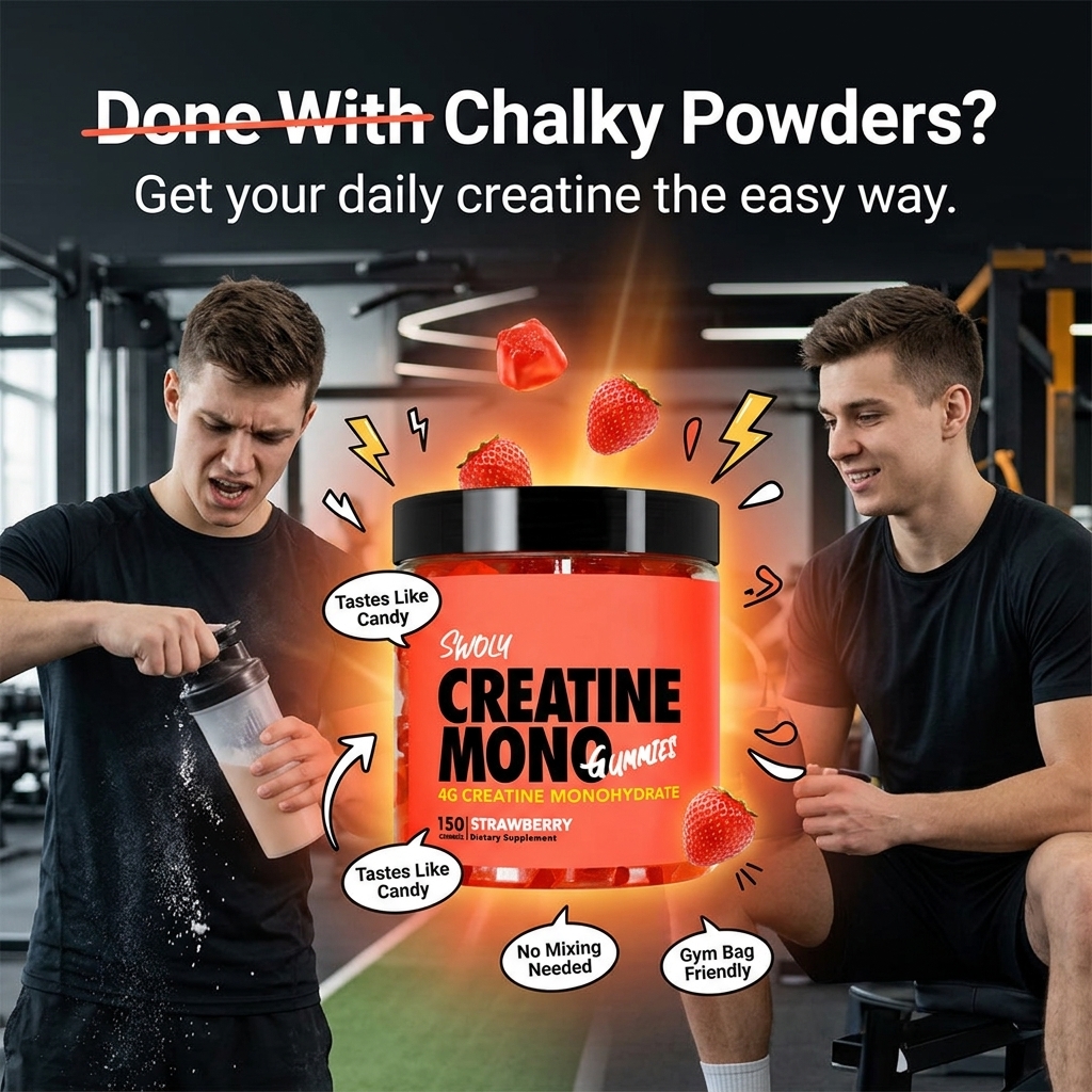
I designed this hero section for a pet brand.
If visitors land and can’t quickly understand what the product does, who it helps, or why they should trust it, they leave.
Your hero section should after clarity first not the way around.
#Ecommerce#DTC#Design
People with sweaty feet don’t think, “I need foot lotion.”
They think, “Not this again.”
That’s what I focused on when designing these static ads for Carpe.
Less product talk. More problem awareness.
People stop scrolling when they feel understood.
Buy boxes fail when users start thinking too much.
I fixed that.
Less noise, clearer price, stronger CTA = faster checkout.
Want me to audit your buy box? Drop it below👇
#DTC#Ecommerce#Shopifystore#CRO
Brands often over-focus on the hero, then overload the product section with too much competing information.
By the time users reach pricing, variants, reviews, and CTAs, the buying flow starts to feel heavier than it should.
Simplify the section, speed up the sale
Random thought:
The best static ads don't scream for attention.
They quietly make people stop scrolling, look twice, and think, "Wait... what's this?"
That's the kind of ad I designed today.
Need static ads that grab attention before the copy is even read? Let's connect.
New month, same mission.
Still designing landing pages that turn visitors into customers.
Still learning.
Still testing.
Still improving.
June, let's build better experiences. ✌️
The first thing I check on a landing page isn't the design.
It's whether I can understand the offer without scrolling.
If visitors have to search for your offer or button, you've already made things harder than they should be.
Keep it simple. Make the next step obvious.
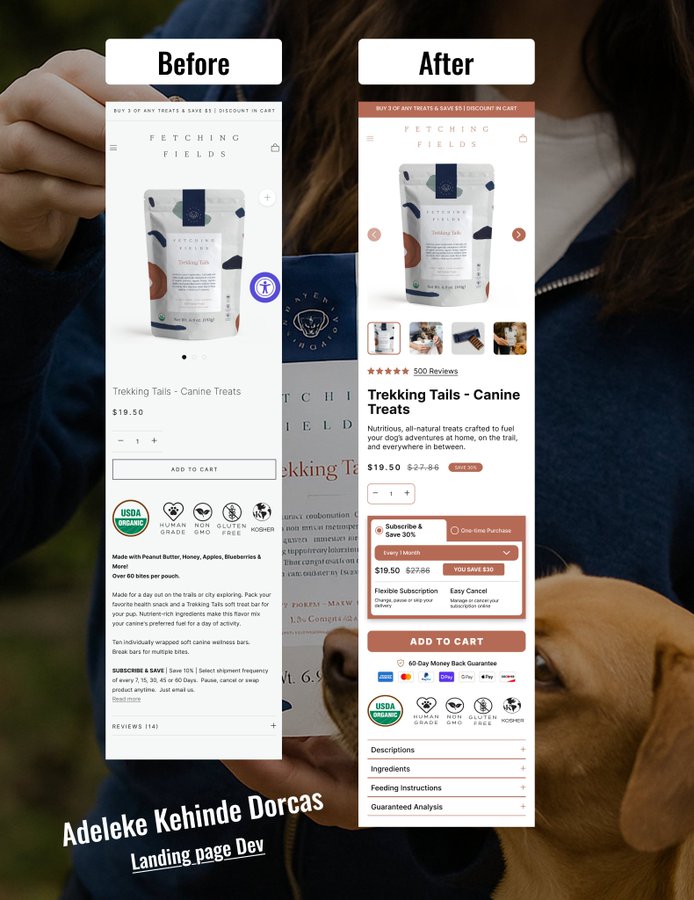
The "before" issue wasn’t the product, but the buying experience.
The after: I improved the hierarchy, pushed social proof higher, clarified pricing, surfaced subscription value, and strengthened trust around the CTA.
The goal is to remove hesitation at the moment of purchase
Many brands lose conversions in the buy box without realizing it.
Weak hierarchy, unclear offer, clutter and missing trust cues cause hesitation at conversion.
I designed this section to reduce friction and boost purchase intent
How much attention does your buy box get?
#Ecom
Your landing page looks great on desktop.
But 80% of visitors are on mobile.
Broken mobile design = broken trust = Lost sales.
We audited 12 landing pages last month, 9 were built for desktop, not for Mobile.
Mobile design isn't optional. It's necessary.
This brand didn’t have a design problem, it had a conversion problem.
Visitors saw the visuals but missed the value.
I redesigned the hero section to communicate faster, build trust instantly, and reduce friction in those first seconds.
#Ecom#CRO#DTCbrands
Our support team gets in the weeds with brands to make bundles work exactly how they need them to.
For Good Feels’ Explorer Pack, our technical support team customized the bundle to match their theme and helped them surpass Shopify’s variant limits.
Stunning!
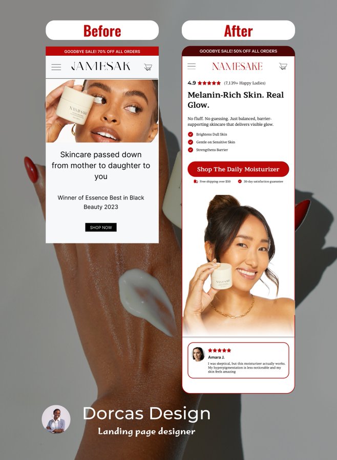
Redesigned this, and it wasn't about "making it prettier."
The BEFORE version forces users to work to understand the offer.
The AFTER version guides the decision for them.
Good CRO design is rarely about adding more.
It’s about presenting the right information in the right order.
On mobile, especially:
Hierarchy > decoration.
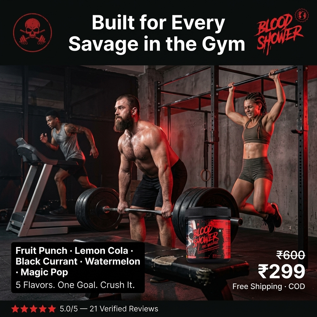
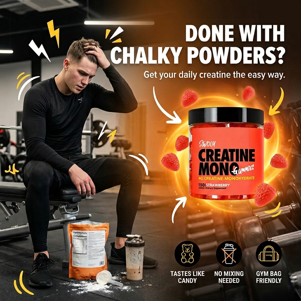
Two static ad directions for a creatine gummies brand.
One highlights the frustration of chalky powders.
The other focuses on a smoother, easier daily routine.
Both are built for quick attention and strong product clarity.
Which direction feels more scroll-stopping to you?
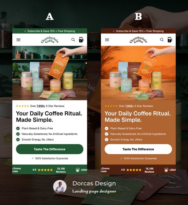
I tested two hero sections (A vs B) for a brand. Same offer, different layout and messaging focus.
The difference in intent is subtle but could impact how fast users decide
What do you observe from the design ?
Drop your thoughts below.