Kamal Kant
367 posts

Kamal Kant
@rkant7
co-founder https://t.co/F9EwmhFCay - app store screenshots, design & mockups I tweet about app design, growth & marketing
San Francisco Katılım Mayıs 2016
268 Takip Edilen59 Takipçiler

@PlaykitUGC What’s interesting is that all of these hooks create an emotional gap the brain wants to close. The moment people feel curiosity, tension, or relatability, they stop scrolling to look for the resolution.
English

@seyiProducts These look super polished. The soft gradients, clean spacing, and playful illustrations make each screen feel modern without overwhelming the user.
English

What stood out to me most here is that the real innovation isn’t the AI workflow, it’s the understanding of human psychology. The format works because every slide creates curiosity that only resolves at the end, so the CTA doesn’t feel like an interruption, it feels like the emotional payoff to the story.
English

@alxui_ux Naah! AI can't build this without real human intervention. Someone needs to envision it before it is created!
English

If AI can build this, learning design today is a waste of time 😭
ALX 🇺🇸@alxui_ux
If AI can build this, learning design today is a waste of time 😭
English

@pounddz The ethical side is obviously debatable, but the bigger lesson here is how powerful emotionally charged storytelling is when combined with a super clear product payoff. Distribution today is less about production quality and more about making people instantly feel something.
English

Everyone should be taking notes from this down syndrome avatar account
Not the fact they marketed a product in a pretty grey hat aggressive way
but the fact that they generated 32 million views in 3 days on IG
Your just one good story away from generating millions of views pretty damn fast and It doesn't need to be grey hat
32 million views to an affiliate product that converts well with a story that doesn't just entertain but
> educates
> evokes emotion
> simplifies a solution
Targeted at a specific ICP prints
Jacob Rodri@jacobrodri_
32,000,000 views in 3 days using an AI generated character with down syndrome dropshippers are absolutely insane
English

A little animation of the hero section 🧚🏽
Wuraola | Product Designer@Wuraoladesigns
Shots from the hero section for a SaaS product I designed. The details >>>>

English

@iamgdsa This is such an underrated point. Most people judge creators from one viral post, but the real signal is whether they can iterate, take feedback, and keep posting consistently after low view videos.
English

1000+++ creators later,
the lifecycle of a creator
stage I: the birth
your next viral creator is buried in 200 views videos
you can't predict who'll pop off, at this point is spray and pray
once you sign one, run 15-video sprints. the goal is to find answers to these questions:
can she take feedback?
is the account shadow banned?
15 videos, still under 1K views on everything?

English

@Tobby_scraper A lot of indie devs still treat ASO like polishing, when it’s actually positioning. The app that communicates value fastest usually wins, even if the product itself is simpler.
English

The iOS app that wins isn't the most beautiful.
It's the one that shows up first when someone searches.
ASO is not optional. It's your distribution channel.
Title → keyword + outcome
Subtitle → second keyword + social proof
Screenshots → outcome first, feature second
Reviews → reply to everything, fast
You can outrank an app with 10x your downloads
just by being more intentional with your listing.
English

@iamgdsa What works get repeated, maybe the same idea can be repeated for different niches!
English

@justddev This is a great example of how distribution + niche matters more than complexity. Students already have the pain point, so the app just removes friction from something they were already trying to do manually.
English

@rsalimx What’s funny is that the AI images are almost secondary here. The real growth lever is the relatable transformation hook because people instantly imagine themselves in the “after” version.
English

this app is pulling hundreds of thousands of views on tiktok and it's literally just ai avatars in mirror selfies with text slapped on top 😭😭
nano banana for the pic, canva for the text, that's it
how to copy this format:
1. go on pinterest, search mirror selfie poses. save a few you like
2. open nano banana or gpt-image-2, prompt an avatar in that same mirror pose. generate a before and after of the same character
3. throw both into canva side by side, add your hook as big text on top
4. post to tiktok with a trending sound
the pics don't even need to be that good. the hook does most of the work

English

@wadebryant23 Damn! One of the smoothest paywall ideas I saw in a long time
English

🎬A tiny animation for the MyDooors Paywall.
"She falls gently from the sky,
lands in the grass,
and rests for a while."
We wanted the paywall to feel less like a wall,
and more like a soft place to land.
🔗:apps.apple.com/cn/app/mydooor…
English

@shalevhvs Not sure! These kind of ideas need to be treated with much better care, if we don't it can do more harm to our brand than good!
English

@KiteSprint Damn! The onboarding looks super unique man, straight fire 🔥
English

Waking up knowing 100k+ people are using my app gives me so much energy!
This is another little app I made — habitStar ✨
apps.apple.com/us/app/habitst…
KiteSprint@KiteSprint
It’s been a while since an app genuinely impressed me 😭✨
English

@PaulSolt One underrated trick here is that the best screenshot copy makes users imagine themselves inside the outcome before they even download the app. Most developers explain features, but the screenshots that convert are the ones that sell a future version of the user instead.
English

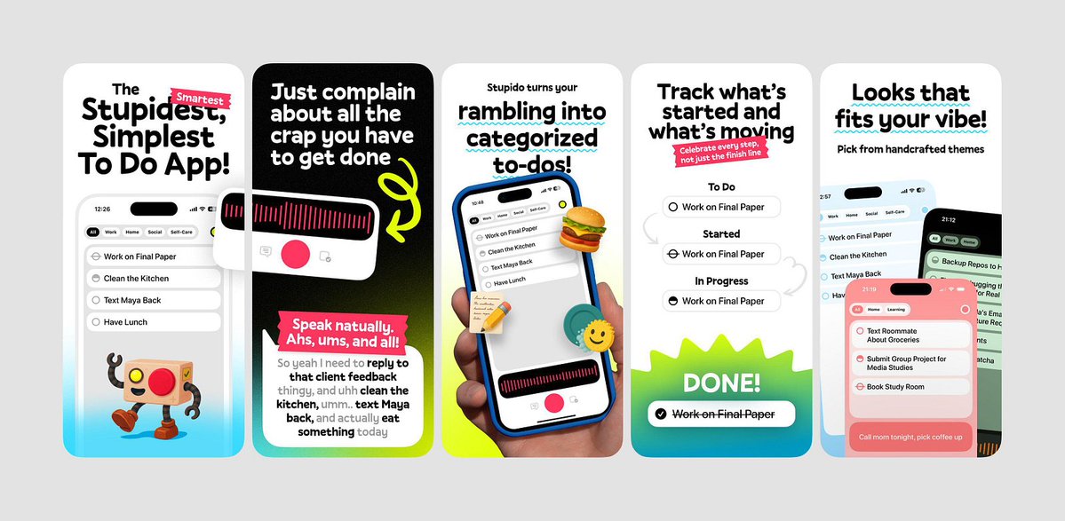
@SheikhSadi70825 Love the playful energy here. The bold typography, hand drawn elements, and vibrant gradients make the screenshots a scroll stopper.
English

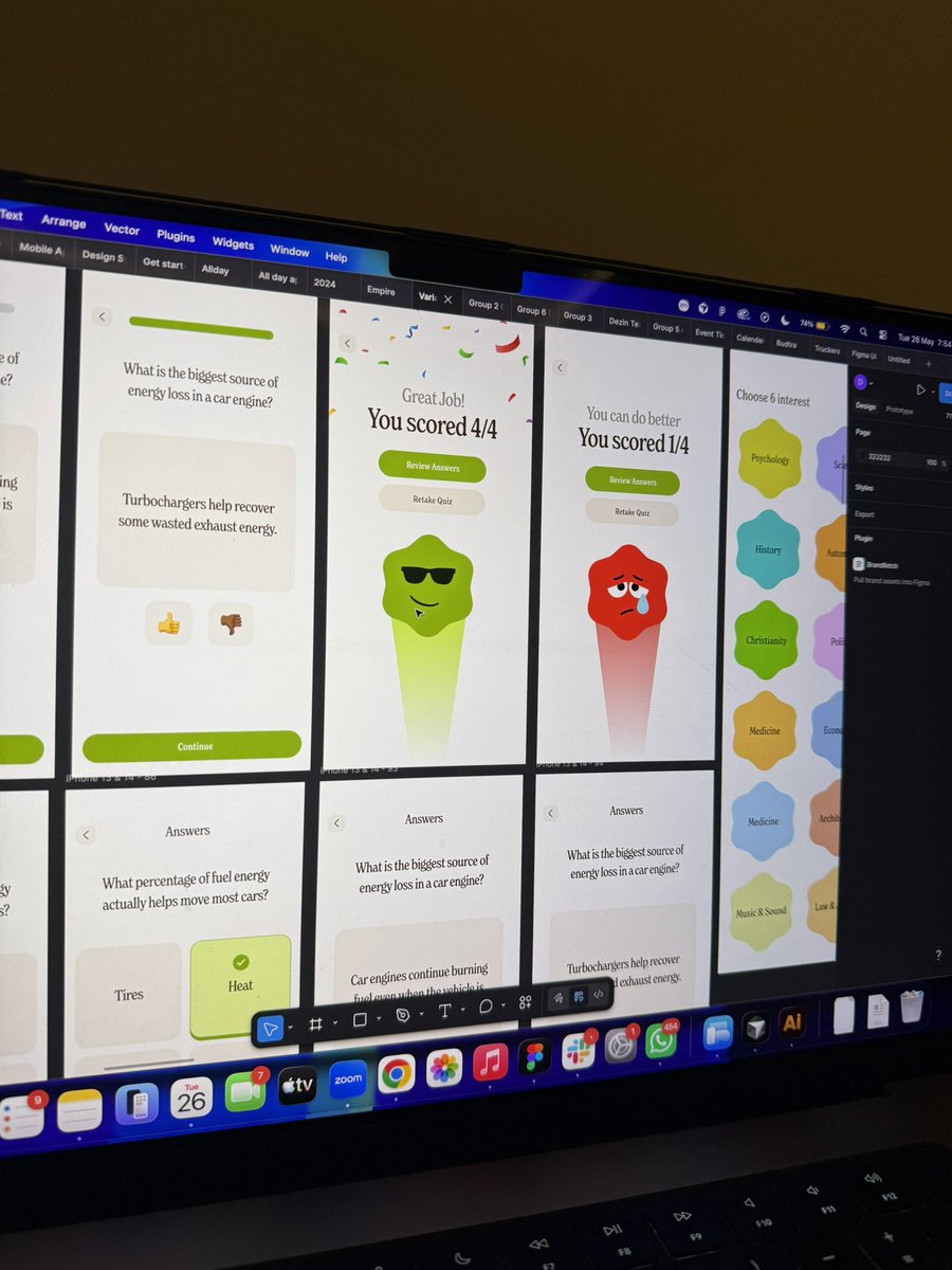
@thedennisobaro1 This is such a smart design direction. Reusing the same star character across different emotions and moments makes the whole app feel alive, and it gives users something emotionally familiar to connect with while learning.
English

Learning should feel this fun.
The curved star shape became a recurring design language across Zingo, showing up throughout the experience with different moods and personalities depending on the moment.
One of those projects where every screen was genuinely fun to design.

Dennis Obaro the UI/UX KING@thedennisobaro1
What if TikTok made you smarter instead of dumber? That's Zingo. Spin. Pick. Learn. Daily.
English