
Salome
276 posts

Salome
@salomecreates
Product & Web Designer | Available for work
Remote Katılım Haziran 2025
312 Takip Edilen334 Takipçiler

I’m so excited to be joining the #FramerChallenge 2.0 🚀
Goal: $5k
Will be sharing the wins and lessons along the way
framer.com/challenge/
English


This client I’m working with is using ChatGPT to give me feedback… damn.
English
A few people have asked what “overusing auto-layout” actually means, so here’s a quick example from a design system I’m refining.
It might not look like a big deal in isolation, but when you are repeating this across hundreds of components, it quickly becomes a massive time drain.
Auto-layout is powerful only when used intentionally. If it’s not solving a real layout problem, it’s probably adding unnecessary complexity.
If you’re not using auto-layout properly, it’s often better to stick with simple groups or frames.

Dan@TheProductGuy__
junior designers will auto-layout everything and anything. wth is this figma file? 🥲💔
English
@madebycaro Omg! This is how I’m currently feeling but seeing all the people who joined has motivated me. Hoping to make my first income through Framer 🫶🏾
English

Season 1 I watched from the outside cause I was too scared to participate.
Now I’m going all in.
I haven’t made a single dollar on framer YET so I’m setting my goal at 5k by the end of the challenge.
I know I’ll make make it. Super excited to be a part of this.
#framerchallenge
framer.com/challenge/
English
@framer officially approves my #FramerChallenge application and it begins April 5th.
My goal is to go from $0 - $5k with template and component sales, and client work.
Let’s do this ✨

English

Hey @framer 👀
I’m officially IN for Season 2 of the #FramerChallenge 🚀🔥
$5K goal.
No idea if I’ll hit it — but that’s exactly what makes this exciting.
I’m pushing myself, testing my limits, and going all in to see what my skills can actually do.
This is going to be fun. Let’s go ⚡️

English

I'll be wrapping up two projects i've been working on for a while next month.
And i will be able to accomodate 1 or 2 new projects in Q2.
If you're a founder or company looking for a product designer to take your product from 0 > 1, I'm your guy.
Kindly repost, Thanks🙏


English


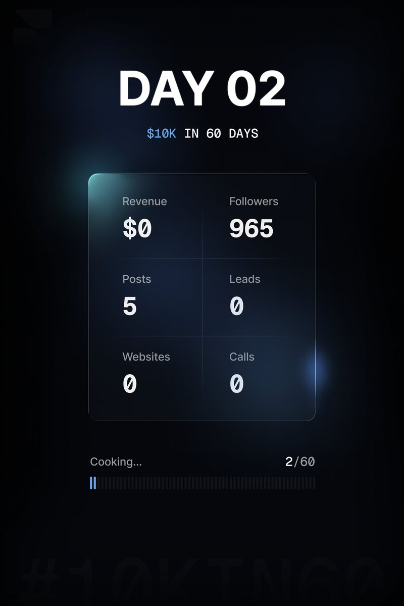
Day 2/60 - $10k with @framer
Starting from scratch, no audience, no network, just skill. Let’s see where this goes.
Inspired by @learnframer
English


Chat!!! Tell me, did I cook?
My submission for @Atomthecreator redesign challenge.
Coming a little bit late, was juggling between exams and more.
@Atomthecreator, please make out time to read, I know it's lengthy.
Had to avoid glossy colors and wild gradients, design tone had to match a real identity of an existing product's branding(if there was any.)
View images and their ALTs, if you can't read the entire thing.
Here's a breakdown on specific segments and implementations in the redesign.
Slide 1. Hero Section needed a little bit of work, at least something that would stand out immediately on first view. With an updated header and additional information in proper place and better layout. Included screenshot images of the app interface accross a mobile device and iPad.
Slide 2 - First Part: The aim is to simply communicate the value the product provides and how many people benefit from it. Not too much language or unneccessary layouts and grids, a simple "why choose us and how many people already do."
Second Part: An onboarding process was included in the initial AI design, but no solid conversion from that stage, what if we told users how smooth the onboarding and also made new users see for themselves? Hence, the included quick links at the top of each copy heading. e.g Create Your Account - An underlined link above that takes them straight to the create account/sign in flow - "vaultify/account". Also each onboarding process had simple UI elements/images to communicate better and for visual support and beauty.
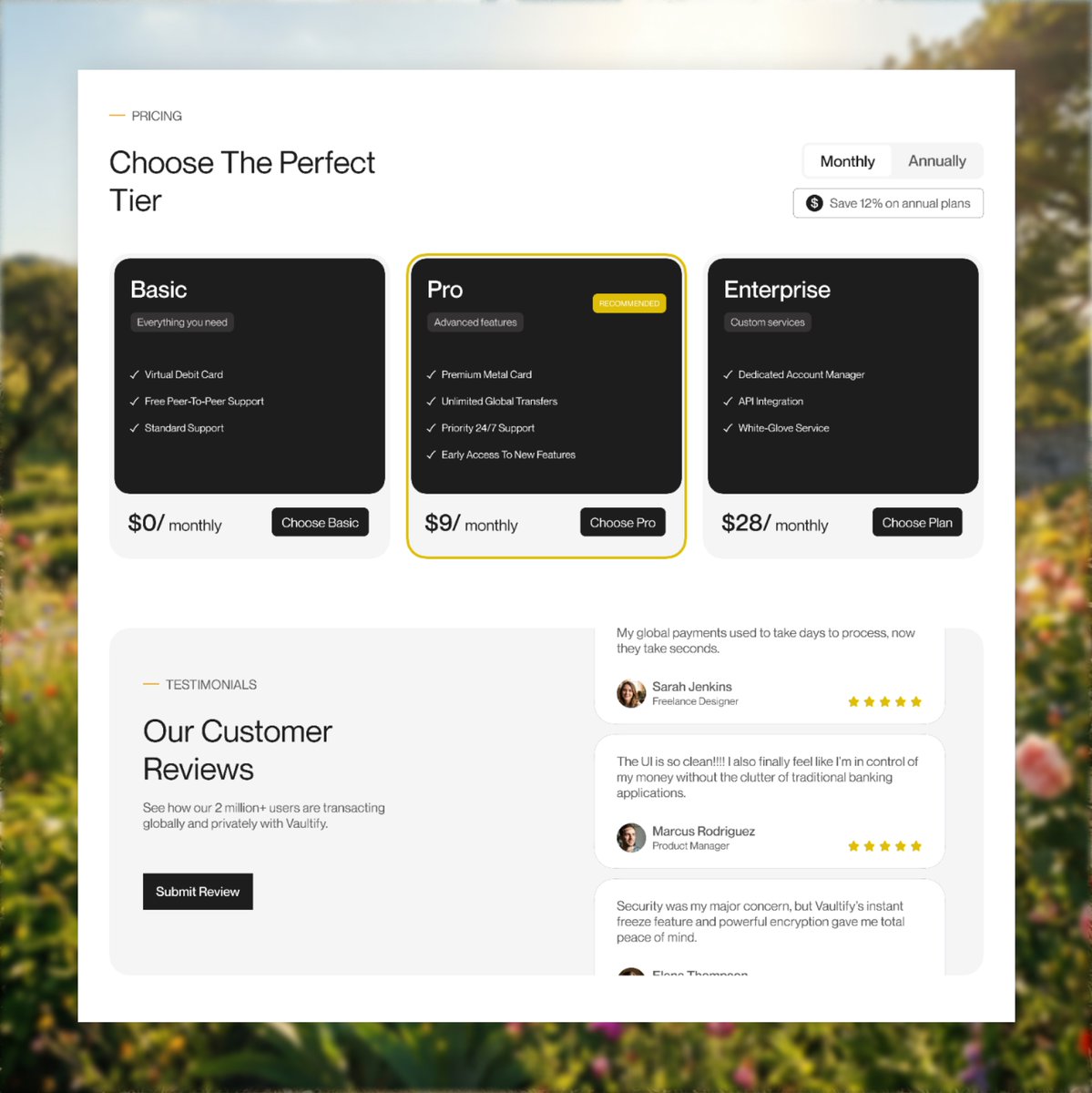
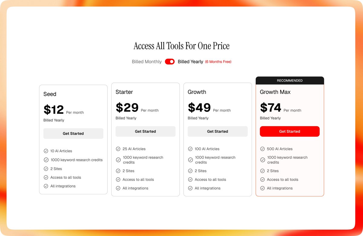
Slide 3. Pricing and Testiomonials section had to be tweaked!!!! I redesigned the pricing cards to be simple and very informative and I also included a toggle for users to view and choose between monthly and annual subscription.
For the testimonials section, I implemented a simple scroll animation for existing reviews and I included a button for users to also submit reviews as well.
Slide 4. The Footer!! I had to make the footer very "not-so-boring"... I hate boring footers. But still had to make it simple as well. I implemented final CTAs (Download App and Join Our Newsletter), hinting at the chance of doing both. I had an idea to also implement a pop-up triggered by the Download App button that dispays a QR code for simple device scanning that takes you straight to the App Store for people who want to download but are viewing on their PC, to make the process smoother and easier for them but a link would still be in the pop-up, regardless.
Comments, retweets and follows would be very much appreciated. But retweets especially, share your thoughts with me too.
- Divine Sam.
@Daviowhite @leyeConnect @thedennisobaro1 @Ayomide0_


Atom the UiUx Designer@Atomthecreator
100K naira for the best redesign for this Google stitch landing page. Let’s see if you’re better than Ai Quote this with your design.
English


I agree.
In fact you can go ahead and compress your image (then convert it) to WEBP file, it will maintain quality and 500-800kb max for high resolution images.
If you’re not doing this yet, you should start now.
ZINEDDINE@itszineddine
A lot of @framer websites feel slow because images are handled badly. They are exported from Figma way larger than needed. If the image shows at around 700px on the website, don’t export it at 3000px for no reason. Keep it close to the real size, max 2x if needed. Better loading speed. Better performance. Less unnecessary weight.
English