Rupesh satpute

293 posts

Rupesh satpute banner
Rupesh satpute

Rupesh satpute

@satpute482

Creative Director at @flowdojo_studio Designer filled with Obsession and Craft. Ex Founder @theairley. Ex: PixelUpLabs, Epyc, Superlaunch, Curelink

Bhopal Katılım Temmuz 2014
294 Takip Edilen55 Takipçiler
Sabitlenmiş Tweet
Rupesh satpute
Rupesh satpute@satpute482·
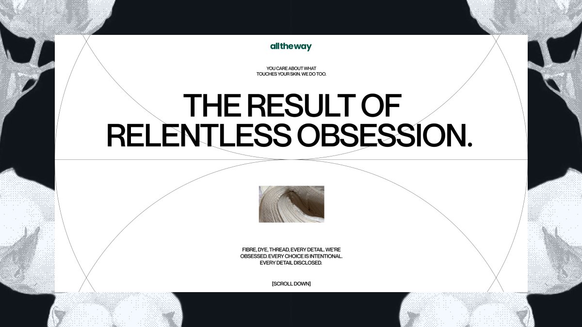
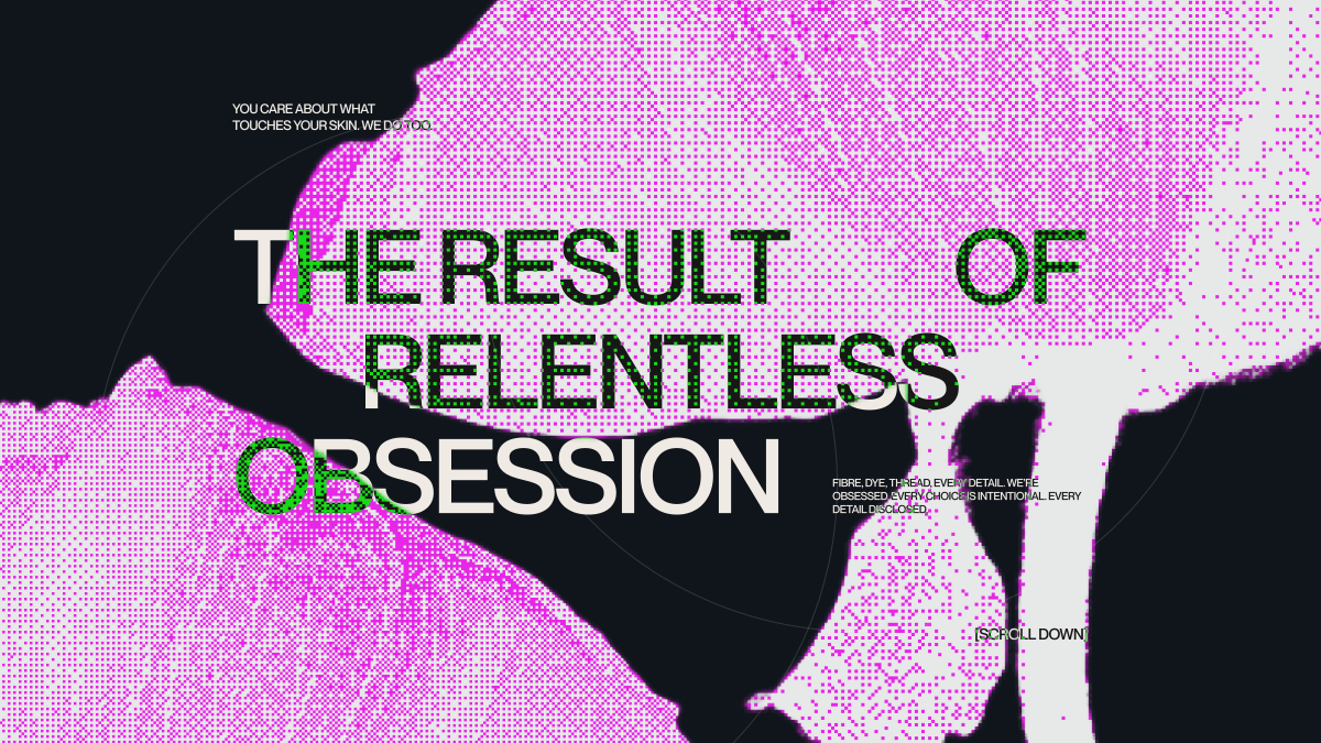
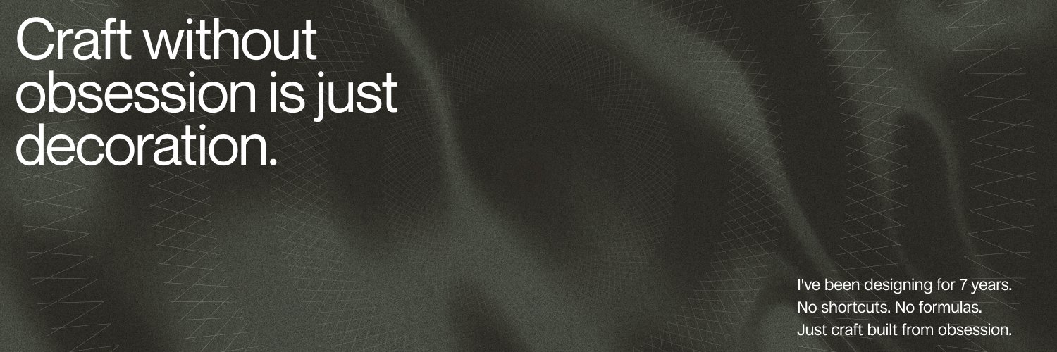
“It’s high time to level up, not just a bit, but all the way.” 
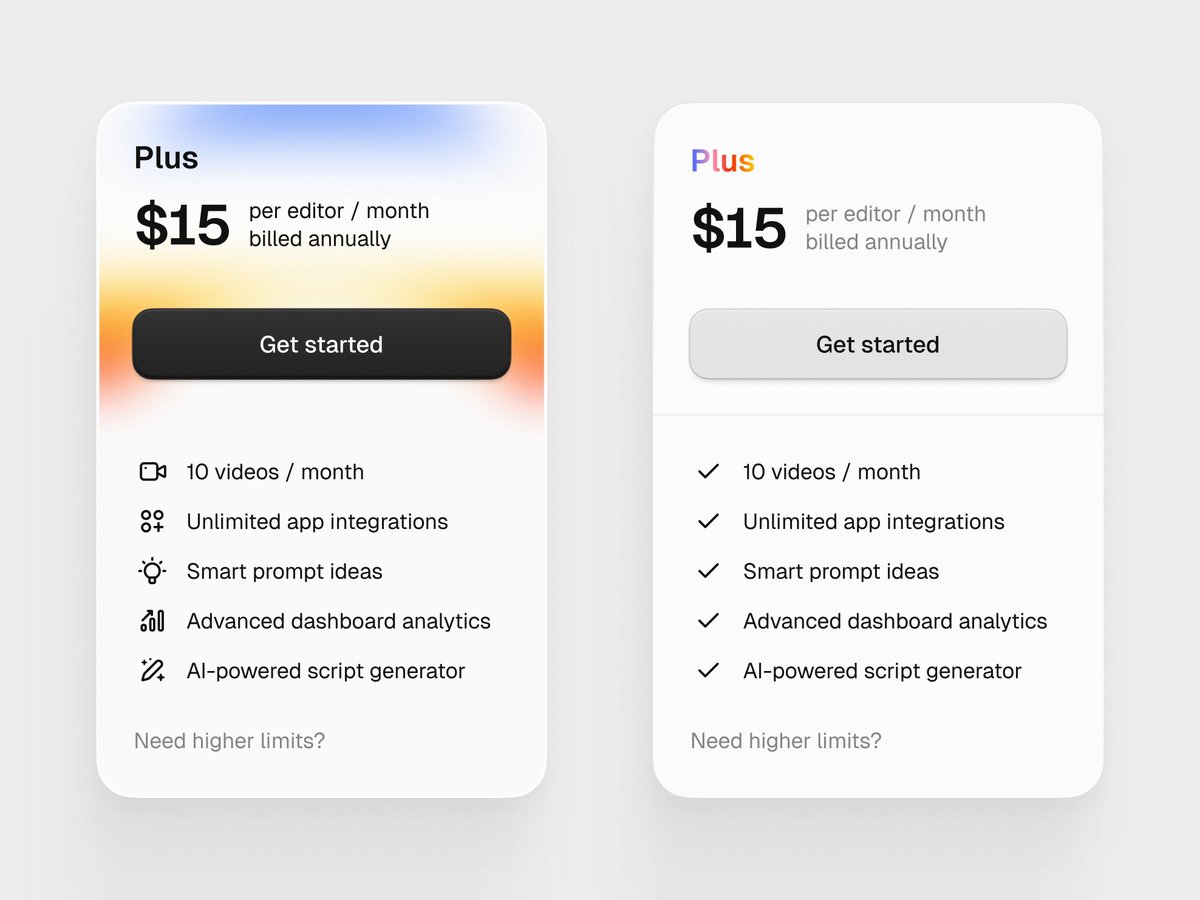
Relentless obsession never looked this good.
Rupesh satpute tweet mediaRupesh satpute tweet mediaRupesh satpute tweet mediaRupesh satpute tweet media
English
0
2
10
690
Rupesh satpute
Rupesh satpute@satpute482·
Designers, you should be directing content. Not writing it. Directing it. When you're doing IA you already know what every section needs. How long the heading should be. What emotion the body carries. What this section is even trying to do. That's the brief. Give it to your content writer. Most don't. Then wonder why the copy never fits the design. We fixed this at Flowdojo. Changed everything.
English
0
0
0
17
Rupesh satpute
Rupesh satpute@satpute482·
Is it me, or do designers really not know they should also do write and direct content for content writers?
English
0
0
0
16
SHARIAR
SHARIAR@shariar_design·
Left or Right? 🤔
SHARIAR tweet media
English
73
1
151
11.6K
Rupesh satpute
Rupesh satpute@satpute482·
First day as Design Director at @flowdojo_studio. 5 years at a design studio taught me one thing: the gap between a site that looks designed and one that actually works lives in the decisions nobody talks about. Structured moodboards. Content before design. Competitive analysis on every project. A standard every screen has to meet before it leaves. But the process only works if the team behind it is sharp. Daily site of the day in the team channel. Feedback that always comes with a reason. Design sprints every week: 30 minutes of inspiration, 60 minutes of free designing. Good taste is built, not assumed. That is what changes from today.
English
1
0
4
63
Rupesh satpute
Rupesh satpute@satpute482·
Justtttt working on a template for my account, and I made this gradient. I’m really happy seeing this feel calm I can be a sound stupid, but fuck who cares.
Rupesh satpute tweet media
English
0
0
0
43
Rupesh satpute
Rupesh satpute@satpute482·
bro a disco ball doesn't mean disco music 😭 it shows up at rock shows, jazz bars, pop concerts, literally everywhere music is being celebrated. it's not a genre thing, it's a music experience thing. And the whole point is this isn't just a '20-year-old yay' badge. It's about what Spotify has done to the music world over those 20 years. They're not celebrating themselves; they're celebrating music culture. And what represents music culture better than a room lit up by a disco ball where everyone's vibing to completely different tastes? Now, from this part, what are you going to design to celebrate music I loved the idea of showing off the lit-up ball, honestly I am talking about the real one, not this one
English
1
1
1
42
Karan Suthar
Karan Suthar@karansuthardev·
@satpute482 @faelpontopt maybe a music node shaped as 20, taking that same circular background shape and having those Spotify wave lines on top. not the best but I think we can think of better ideas than that.
English
1
0
1
84
Karan Suthar
Karan Suthar@karansuthardev·
@faelpontopt I don't like this whole idea of having a disco light, we have all kinds of music on Spotify not just one category. You have implemented that disco light idea better than them though. good work!!
English
2
0
3
1.5K
Rupesh satpute
Rupesh satpute@satpute482·
My X is full of Spotify Icon discussion, which makes zero sense for all
Rupesh satpute tweet media
English
1
0
0
25
Ramakrishna
Ramakrishna@RamaKrishnaUX·
Looking for a brand designer (or studio) to help shape something ambitious from the ground up. High bar on taste, craft, and systems thinking, not just logos. If you’ve seen or worked with someone exceptional, would love recommendations. Portfolio links appreciated. 🤞
English
63
4
111
12K
Jack Appleby
Jack Appleby@jappleby·
This is one of those design / marketing moments where I just scratch my head. There are huge readability & brand issues. - Different color green - The green is too dark against the black - disco ball texture looks pixelated on a tiny phone screen A kinda dumb mistake.
Jack Appleby tweet media
English
683
275
8.7K
1.9M
YG
YG@YGnacko·
Hi My name is Yacouba This is my first-ever post. I do a bunch of cool stuff. Let's connect!
English
146
44
1.1K
99K
Swarnima
Swarnima@swarnima_otw·
encapsulating WMA's branding in one frame
Swarnima tweet media
English
6
40
458
7.6K
Rupesh satpute
Rupesh satpute@satpute482·
@rahulbhadoriiya haan, aisa lagta hai ki main X par aata hoon. ye dikhne ke liye accha aaj, kisne chori kari hai design kis ki?
हिन्दी
0
0
2
93
Rupesh satpute
Rupesh satpute@satpute482·
As a creative designer I can confidently say Claude can replace a percentage of designers out there.
English
0
0
0
32
Rupesh satpute
Rupesh satpute@satpute482·
Exploring brand concepts isn't a real project, but I still did 40 iterations of a hero section to capture all possibilities on one canvas.
Rupesh satpute tweet mediaRupesh satpute tweet mediaRupesh satpute tweet mediaRupesh satpute tweet media
English
1
0
0
85
Rupesh satpute
Rupesh satpute@satpute482·
I’m really happy to be using Claude for design wireframes and early-stage exploration; it makes my process ten times better, honestly.
English
0
0
0
39
Daksh Aswal
Daksh Aswal@dakshpixelup·
from Diplo's set in Rishikesh, India This is just beautiful.
Daksh Aswal tweet mediaDaksh Aswal tweet media
English
3
0
73
2.6K