Sabitlenmiş Tweet

Another bit of UI fun whilst I'm on baby shift tonight 👶 Used midjourney for the planet illustrations and then smart animated between frames in figma with a 10,000ms ease out. Digging the Praetorian font too.
English
Tom D - Growth Design Partner
6.9K posts
@thomasdunnuk
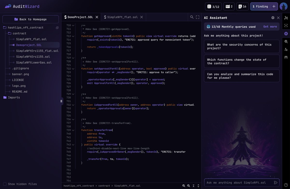
Transforming ideas into life changing products people love 🪄 Research/UX/UI/Growth 🛠️ Prev Founding Designer @audit_wizard + Senior Product Designer @Buffer


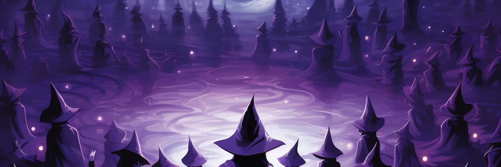
Designing to induce fear can work wonders for positioning and growth when used correctly. I see too many web3 products jumping on the happy rainbow themed vitamin train instead of communicating the terrifying realities of this industry. I love designing to delight but sometimes want to see more hard hitting truths in design. Used Midjourney, Runway and Figma to mock this up in 15 mins

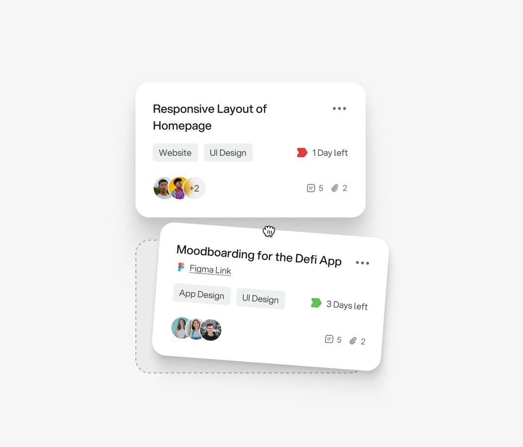
Project designed for client back in 2021, does it still feel fresh? 🤔