random feedback:
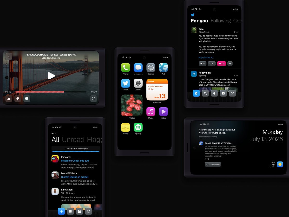
- I’d make the Mail app text smaller and a bit more bluish instead of grey as it stands out a bit much for my liking
- Music app stripes feel like they’re a little… glitched almost? so maybe I’d vary their width or play with gradients on them, perhaps it’s also just the shade of pink which is very saturated against the already saturated background
- Dia text feels like an overlay, not like the background, perhaps consider adding a subtle glass effect to the logo with minimal to no blur to make the shape feel more substantial
#Config2026 Wishlist:
– Vertical Wrapping
– Video Export on Prototypes
– Connectors support in Design
– Native AutoLayout for Sections
– Multiple Stroke Widths
– Math in Variables
– Quick Plugins via Figma AI
– More Effects
– Animation Tooling
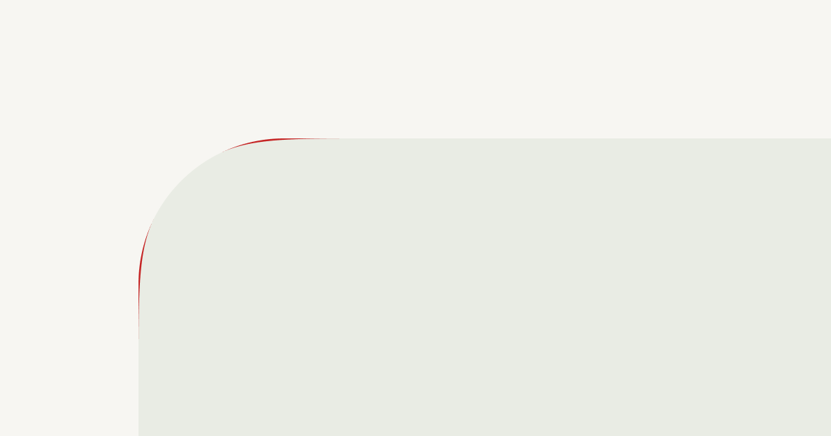
I have been obsessed with smooth corners since I discovered them, and yet, they still haven't truly made it to the web.
My obsession and I have built an early version I'm happy to share; open source, and open to suggestions.
corne.rs