Sabitlenmiş Tweet
Karan Jha
776 posts

Karan Jha
@uibykaran
Building landing pages, websites & UI designs that help brands get more clicks, leads and sales. 🚀 DM for design work.
Katılım Mart 2025
17 Takip Edilen23 Takipçiler
@MARakibKhan1 Your package design and logo design both look really great.
English


@adamhmwn Your design idea looks really good, but I have a few suggestions. In the hero section you could place the heading over the image. Also, since there is quite a bit of space in your design you can increase the text size. This will help fill the space and make the text more readable
English


@alimdesigner_ Your design looks very modern and visually engaging. The dark theme and glow effects create a strong futuristic feel, and the overall layout is clean and well-balanced.
Just improve the text contrast a bit for better readability. Overall, sleek and impressive work.
English

@Replo_expert Your design looks clean, refreshing, and well-aligned with the brand. The product presentation is strong. Just highlight the CTA a bit more and add some white space for a more premium feel. Great work!
English

The secret to a 7-figure landing page isn’t the aesthetic. It’s the Information Architecture.
For the YOSHI build, "pretty" wasn't enough. We had to bridge the gap between wellness and nightlife.
The Conversion Strategy:
1. The Hook: Immediate value prop above the fold to kill bounce rates.
2. Objection Handling: Solving the "Matcha + Alcohol?" confusion via visual storytelling.
3. The Close: A frictionless subscription UI designed for recurring revenue.
Design + Dev + Psychology = ROI.

English
@OlaitanRodiah @figma Your design looks very clean and conversion-focused. The product presentation is strong, and the layout is well-structured especially the bundle section and pricing clarity. Overall, a really solid design.
English

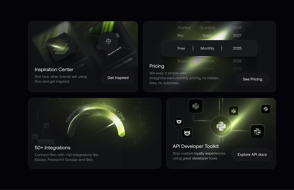
Designday!
Product Buybox designed in @figma
#productpage #ecommerce #landingpage #prelander #listicle #Salesfunnel
English
@zanlaucius Your design looks premium and visually engaging. The dark theme and lighting set the mood perfectly, and the typography is clean. Just make the CTA a bit more prominent for better visibility. Great work!
English

@uixabuhossain Your UI looks very clean and visually appealing. I have one suggestion: you could increase the text size of the CTA to make it more visible. This will also help fill the empty space and improve the overall balance of the design.
English


@alex_momeni Your design looks clean and well-structured, with strong storytelling and layout. Just adding a bit more white space and highlighting the CTA would make it feel even more premium.
English

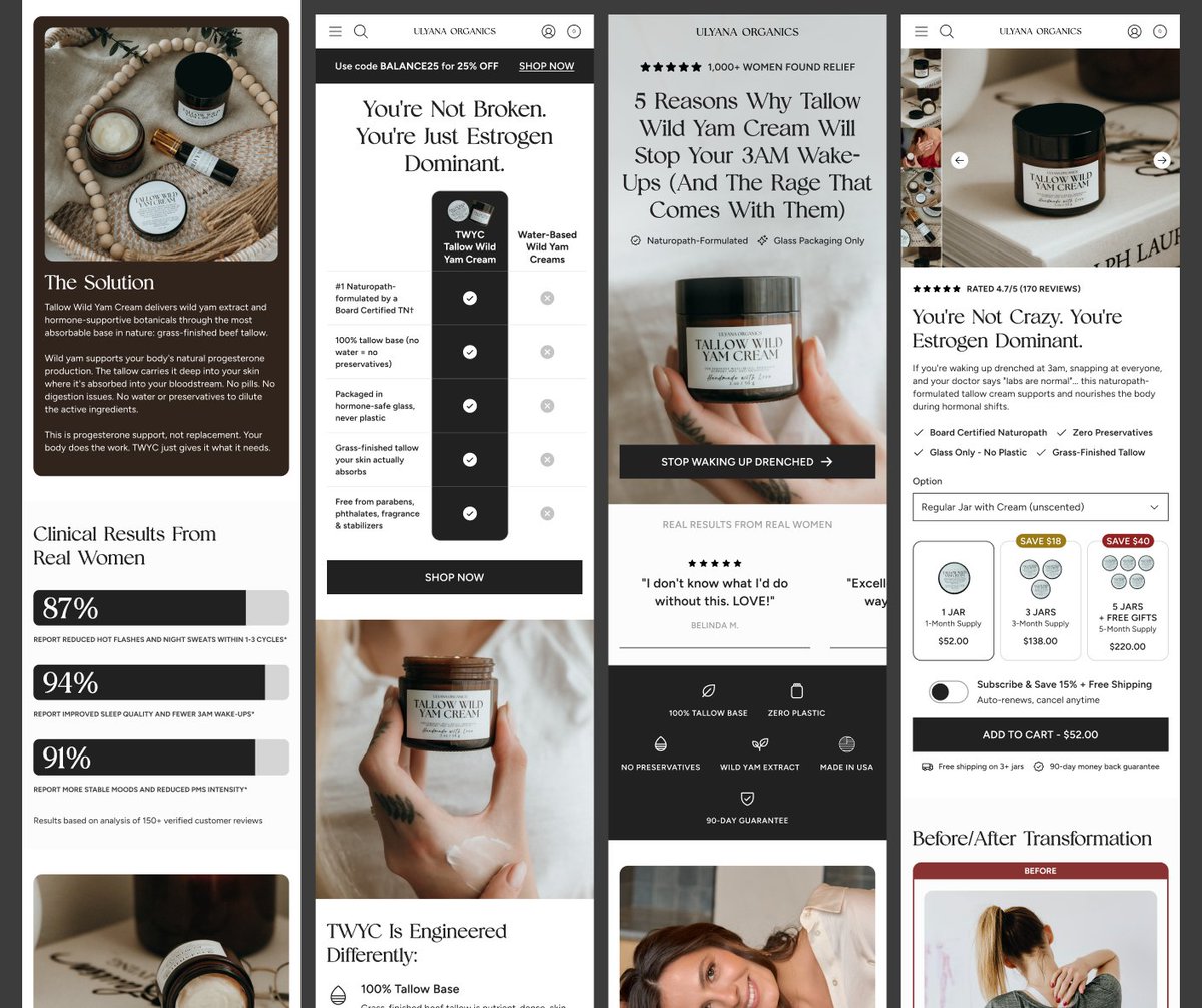
Our landing pages increased Ulyana Organics' conversions 82%
DM me if you want to make your meta ad spend more profitable
English
@Njoagwuani_ Your design looks very clean and visually appealing. The product presentation is strong, and the color palette perfectly matches the natural and premium feel. The hero section instantly grabs attention, and the layout is well-balanced. Good work!
English

@pixcutstudiollc @framer Your design looks very clean and gives a premium feel. The typography and color palette perfectly match the luxury vibe. The hero section is strong and creates a solid first impression.
Just one suggestion: you could make the CTA button a bit more prominent so it stands out more
English

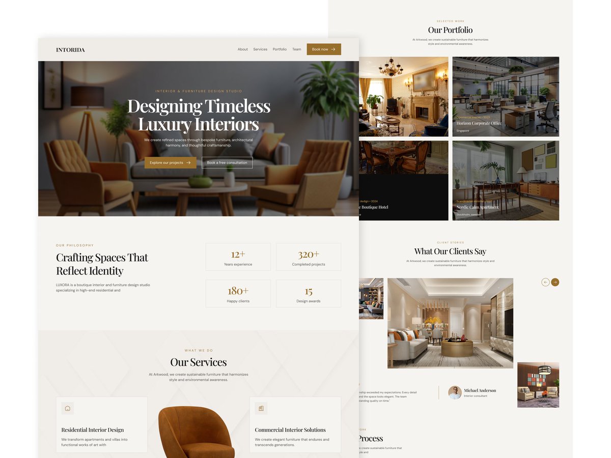
Introducing Intorida 🛋️
@framer template Modern Furniture & Interior Design
Preview :Link in Comment👇
English
@MdAminu33423973 Your design looks very good, but I think you can improve the product image it feels a bit too simple right now. Apart from that, the rest of the design looks very clean and well done. Good work!
English

If you’re building an eCommerce brand and want a high-converting experience, let’s connect.

English
@Tommytech123 @Shopify @figma @replohq Design looks quite simple, but it can be improved. You can fix issues like too much text, inconsistent typography, color overload, and cluttered layout. Because of these, the product focus feels weak. By improving these areas, your design will look more polished and eye-catching
English

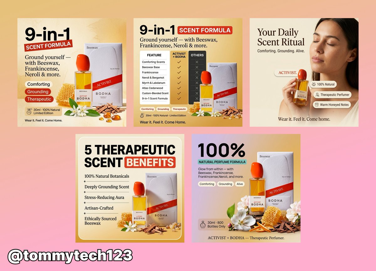
Built these static ads
Started from scratch, worked through the angles, wrote the copy, and designed everything end to end.
English
@uiximran Your design looks very good, and the dark theme with the black background gives it a great look. However, I think the ‘Book Now’ CTA text could be made a bit bolder—it feels a little too light right now. Apart from that, the overall design looks really great.
English

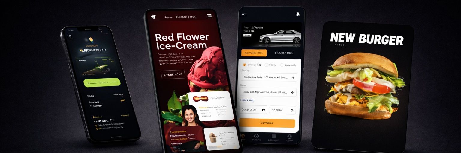
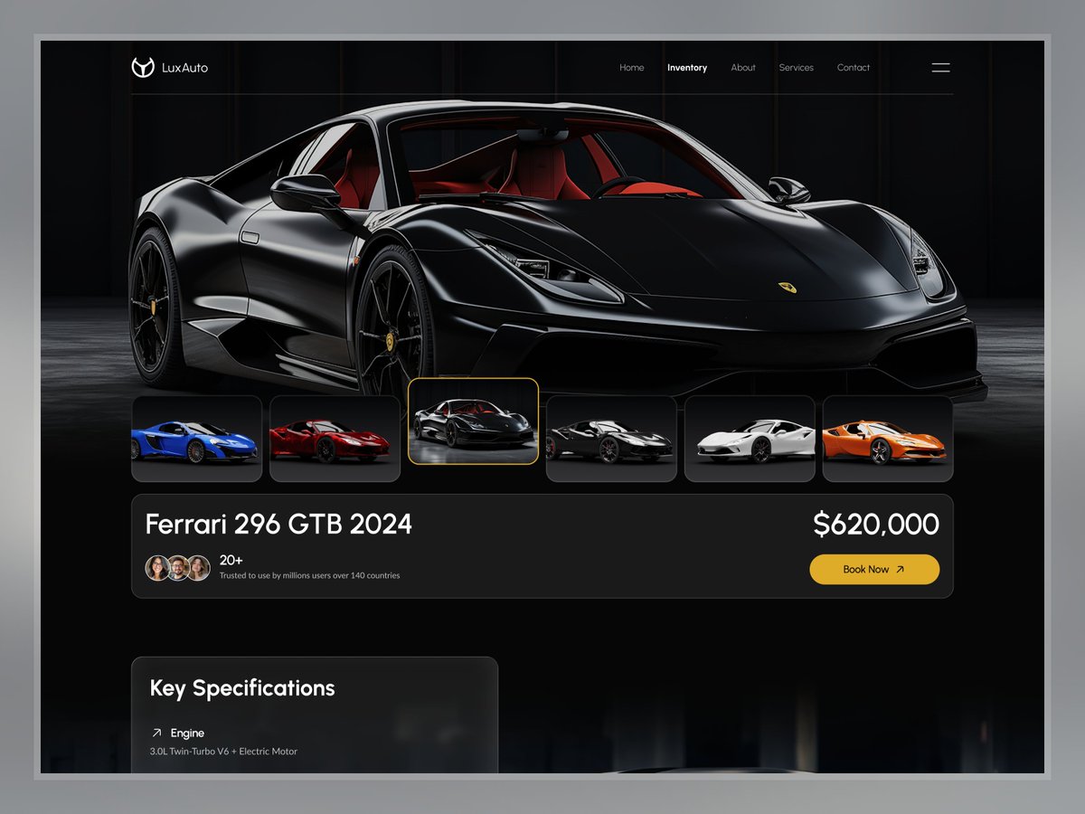
Product Overview Page — Luxury Automotive E-commerce UI Design
English
@bogdan_rmb Your design looks very clean and conversion-focused. The product presentation is strong, and trust signals like reviews and guarantees further enhance credibility. The CTA is well-placed and clearly stands out. Overall, it’s a very solid and user-friendly design.
English

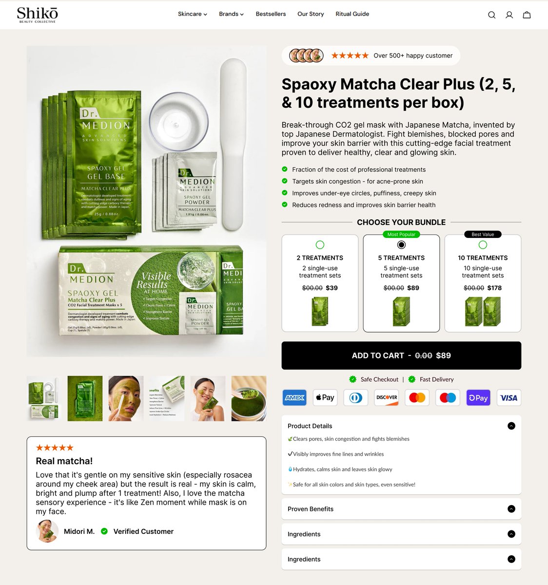
New PDP designed for Vital Sleep.
What do you think?

English
@OlabodeFasae @replohq Your design looks very good, very trustworthy, and very clean. Good work.
English

@_sameerrr0 Your design looks very good and very professional. The animation also looks really nice.
English

@IsmailLate52662 Your after design looks much stronger and more conversion-focused. By adding trust signals like reviews and guarantees, you’ve made the design more powerful. The content is now clearer and more engaging. Overall, great improvement.
English

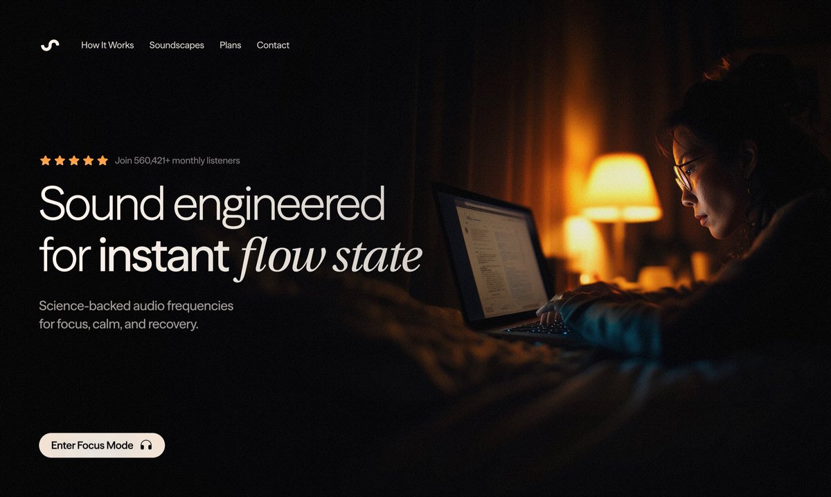
A lot of hero sections look nice… but they don’t actually make people buy.
Here’s what I changed 👇
Before:
Just a headline and a button. No trust. No reason to click.
After:
1️⃣ Social proof (2,500+ happy customers) builds instant credibility
2️⃣ Supporting copy that clearly explains the benefit
3️⃣ A money-back guarantee under the CTA reduces risk
The result?
The hero doesn’t just introduce the brand —
it guides the shopper toward buying with clarity and trust.
That’s the difference between “pretty design” and conversion design.
#ecommerce #CRO #DTC #landingpagedesign

English
@AyomideOpe36297 Your design looks very clean and premium. The hero section is strong, and the product presentation builds trust. The typography and layout are well-balanced. You could make the CTA more prominent for better conversion. Overall, great work.
English

@Designbysaif Your design looks great, and the hero section is strong. Just move the lower text slightly up for better readability, and consider increasing the text size or adding a background image in the bottom section.
English

@JessicaCre62465 Your design idea looks very good. It feels vibrant and eye-catching, and the color palette perfectly matches the beauty niche. Improving the spacing and text hierarchy slightly would make it feel even cleaner. Overall, good work.
English

Your product page is your closer. If it’s slow, unclear, or cluttered, people bounce. A well-optimized product page loads fast, shows value instantly, builds trust and makes buying easy especially on mobile.
#Ecommerce #Shopify #Figma #Replo #Instant #Landingpage #Dtc #Cro

English