Sabitlenmiş Tweet
Hasnur Alam
1.8K posts

Hasnur Alam
@ujjhas99
Lead UX Designer & CEO at Jumatechs | UI/UX Design/ Development for SaaS, Fintech, MVP & Mobile Apps | Trusted by 80+ ✦ Dribbble: https://t.co/T49sUEGQbe
Dhaka, Bangladesh Katılım Mart 2025
1.7K Takip Edilen262 Takipçiler

@designer_tanbir The interface elements are clearly mapped, ensuring the user always knows how to interact with the device.
English

@AlfiFromToasty The interface elements are clearly mapped, ensuring the user always knows how to interact with the device.
English

@simi_uiux The intentional use of white space around calls-to-action makes the site feel breathable and far less overwhelming.
English

@farhanrizzvi The intentional use of white space around calls-to-action makes the site feel breathable and far less overwhelming.
English

@shahidux Large, well-spaced tap targets ensure that navigation is accurate and frustration-free, even on smaller screens.
English

@uixabuhossain Large, well-spaced tap targets ensure that navigation is accurate and frustration-free, even on smaller screens.
English

@Mohammad_ali_jr Large, well-spaced tap targets ensure that navigation is accurate and frustration-free, even on smaller screens.
English

@masuderrahaman9 The use of a sticky call-to-action bar is a smart way to keep conversions top-of-mind without being intrusive.
English

@hussain_mu20778 @framer The use of a sticky call-to-action bar is a smart way to keep conversions top-of-mind without being intrusive.
English

Subflow - Free subscription agency @framer template
View it Live: framer.com/marketplace/te…

English

@MdAminu33423973 The use of a sticky call-to-action bar is a smart way to keep conversions top-of-mind without being intrusive.
English

@farhanrizzvi The use of a sticky call-to-action bar is a smart way to keep conversions top-of-mind without being intrusive.
English

@ujjhas99 Clean fintech branding, feels very modern and trustworthy
English

@JessicaCre62465 @figma Beautiful balance between visuals and whitespace.
English

Just wrapped up a homepage concept focused on clarity, strong hierarchy and conversions.
Simple layout. Clean visuals. Smooth user flow.
Designed in @figma

English

@yasirahmadnoori Beautiful balance between visuals and whitespace.
English

Presented 4 hero options
✨Guess which one got selected?

Yasir Ahmad Noori@yasirahmadnoori
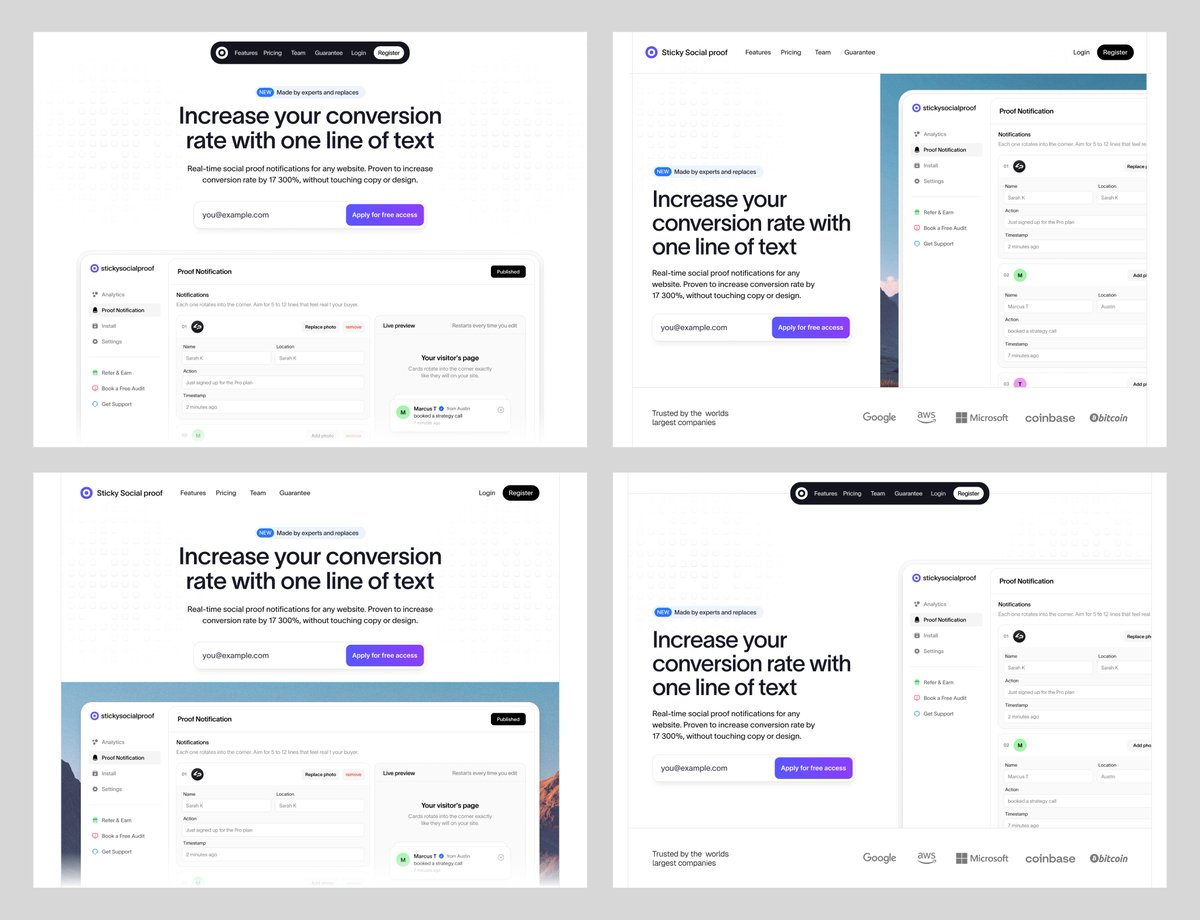
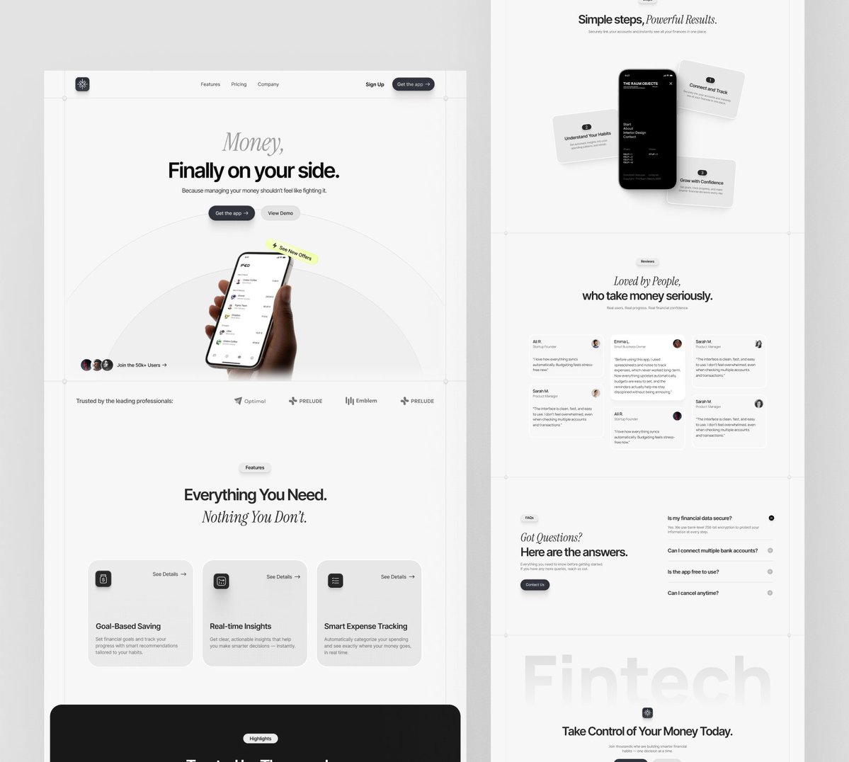
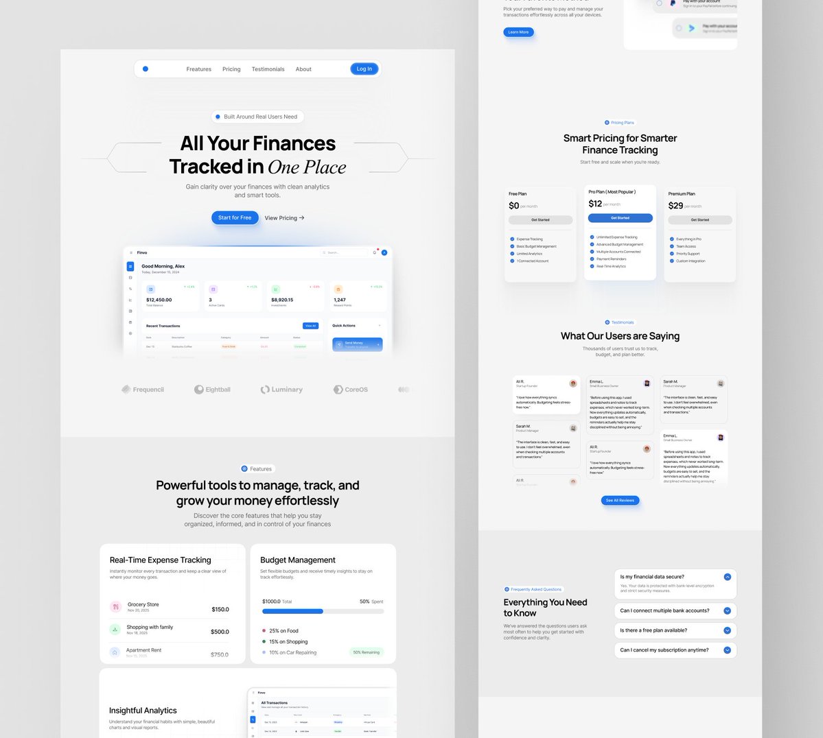
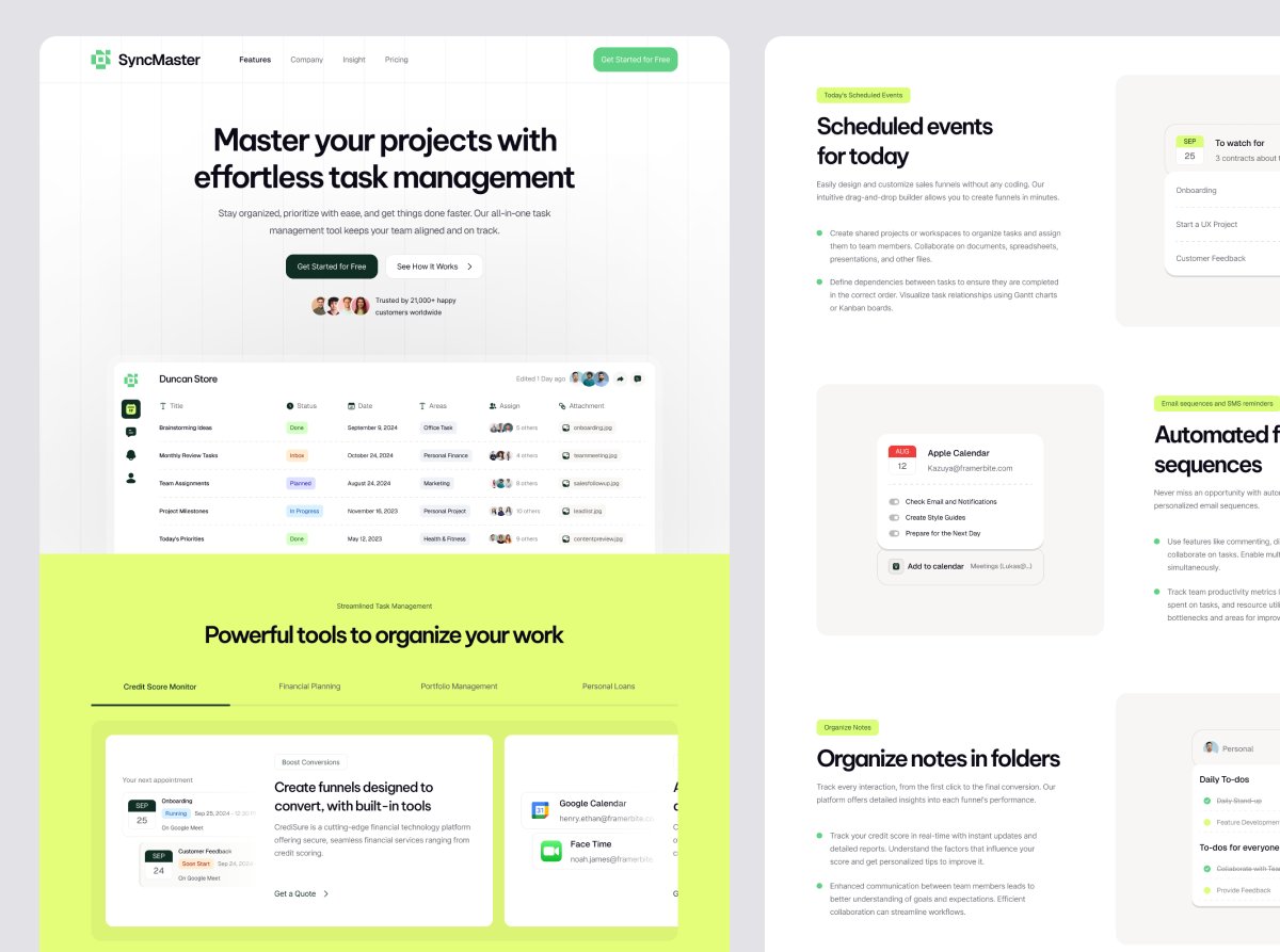
Hero section done. Clean & simple. ✨ I enjoyed designing this one. What do you think? 👇
English

@webocean_io Your choice of imagery is top-tier. Every photo feels intentional and perfectly aligned with the site's overall message.
English

@AmenaiSabuwala Your choice of imagery is top-tier. Every photo feels intentional and perfectly aligned with the site's overall message.
English

@hussain_mu20778 @framer Your choice of imagery is top-tier. Every photo feels intentional and perfectly aligned with the site's overall message.
English

Shots from my recent Healvora - free healthcare @framer template (100% Free)
View it live: framer.com/marketplace/te…


English


