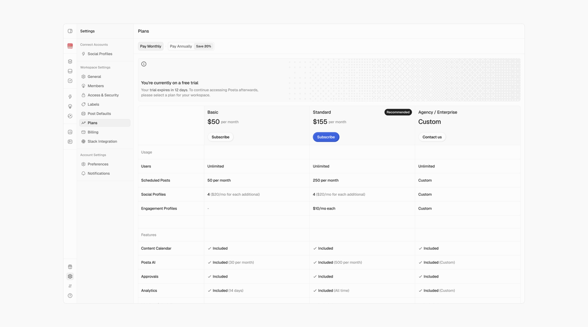
@uxnaiza Crisp works! Maybe you could try to make the check icon also blue on the "pro" card to clearly differentiate that plan.
Also I think you could make the check icons smaller than the line height 🤔
@_heyrico thank you for the feedback 🫡. i see what you mean about the hierarchy and distinction. i was trying to keep it subtle and maintain the consistency