VIKARE
20.1K posts

VIKARE
@vikare06
Post about cinema, art, what I like, my art, artist I like, support artists etc...
Katılım Şubat 2018
615 Takip Edilen70.5K Takipçiler
Sabitlenmiş Tweet

This is one of the best examples of misunderstanding a shot. Look at abyssal difference between these two. In Chung's original animation the scene builds up towards the eye that is setup to function like a venus flytrap. It's insidious, it meets your expectation even though it makes no sense. The shot is so simple and controlled, you arw drawn to the trap (the curving lock of hair guides us).
Look atbthe movie, it just looks like a fly flew accidentlaly into her eye out of nowhere, just randomly.
English
@HerakleitosEph the movie came out in 1919 but it was filmed throughout 1918
English

You guys laughed at me when I said this would happen

DiscussingFilm@DiscussingFilm
First look at Odysseus in Fortnite.
English

@KrampuzzzDA no but i didn't regrade, i regenerated as albedo only, so just textures without shader
English

@vikare06 Obv the Rock one doesn’t look good, but here are some examples from 8 Million Ways to Die (1986) People just used to be so much more orange in film (i had to edit the last shot because the youtube vs was super desaturated to what i remember)


English

I think Disney should completely skip hdr and just remove any shading, all albedo


Global Box Office@GlobalBoxOffice
MOANA live-action previews bombed with only $4.5M earned domestically yesterday. Starring Dwayne Johnson, the movie is now surely missing the $50M domestic mark this weekend, and may not even reach $40M. The movie had a budget of $250M.
English

@plonkly @yuungsheldon no it won't if you convert to YCbCr or LAB or HSV and just increase contrast in luminance channel
English

@vikare06 @yuungsheldon adding contrast will add colour since it juxtaposes colours more against each other, reducing will do the opposite
reducing exposure deepens colour
brightening means pale colour
English
@Rahll @yuungsheldon if you increase contrast only in L channel it won't touch chroma
English
@vikare06 @yuungsheldon Well, let me be the first to tell you that unless taking steps to mitigate it, adjusting the contrast will also boost chroma, which is effectively adding color. Adjusting the tint is also messing with the color. It's fine if you don't like the grade, but come on, lol.
English

@_notvance I don't care about the marvel comparison, but it's not the right comparison you are doing either because Digger has also low contrast, so you should show Kane like this. Does it look good now?

English

Infinitely more color on the right


a*@ftersuns
@lovechazelle infinitely more color on the right
English

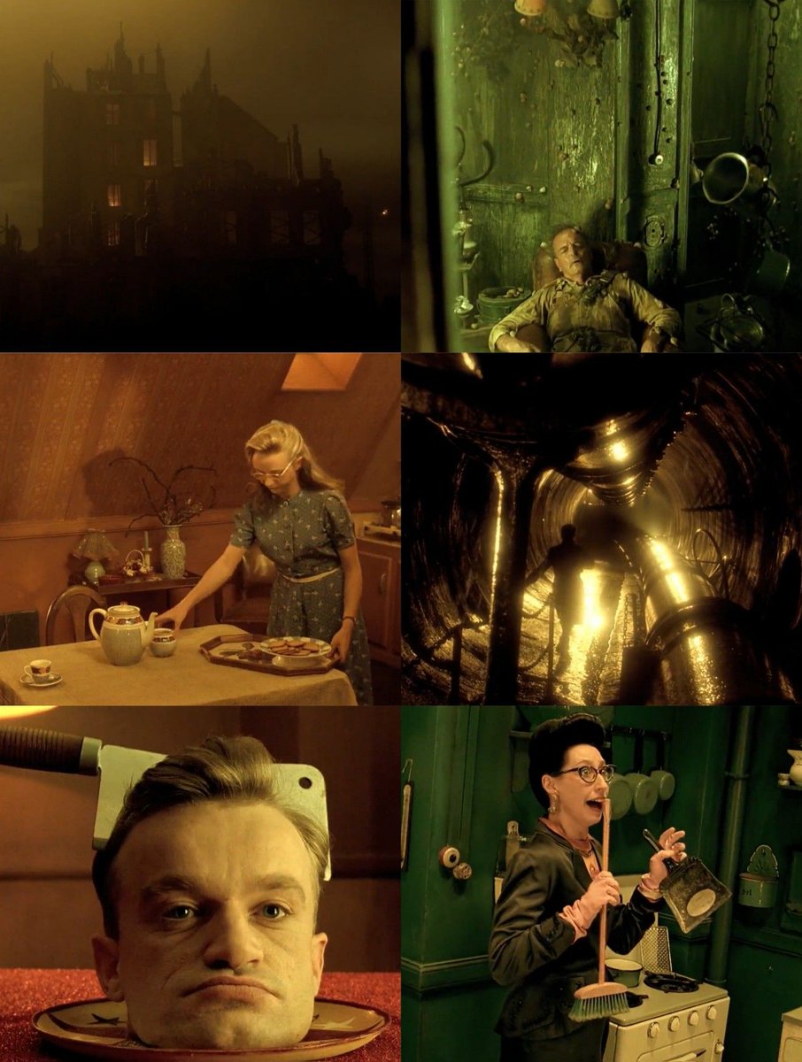
@addymakes yes but it's unwatchable like that to me. Sickly look doesn't mean I shoudln't be able to see it. Delicatessen makes you almost feel ill with the look they chose and it is absolutely beautiful

English

It doesn't matter which one you prefer, I had a visceral reaction to the cinematography of the original and not in a good way. Desaturating movies has been done so many times for the purpose of the story, but it's an artistic medium and when you remove something fundamental, you need to compensate with something else. Historically bleach bypass would reduce saturation, but maintained high contrast (it came with the process). "Minority Report" lowered saturation but cranked up the highlights and achieved this dreamy bloom effect.
For Digger they shot with such expensive equipment on film, but the footage is not worthy.
You don't need to be an expert though to not enjoy the way this looks and you don't need to formalize why you don't enjoy it.


VIKARE@vikare06
Things don't need to look this way
English

@Damario88052566 this is not some esoteric academic endeavour, it's a movie presented for people to see, enjoy or reject based solely on their judgement. Nobody needs to know anything about the craft to judge
English

People on this app talk about color grading like they know anything about cinematography
Tom Cruise@TomCruise
Digg. Or Die. DIGGER. Only in theaters October 2.
English
VIKARE retweetledi

This is the best possible approach to costume design.
Keep in mind what makes sense FOR THE CHARACTER, not only for his personality, but for his life. The more time people spend looking at your design the more they should know about your characters.
Maybe there's a scene of Aragorn cutting an apple with that knife, or maybe not, but Aragorn would eventually need a knife for that.
Some of it will end onscreen, and some will not, but everything will be there.
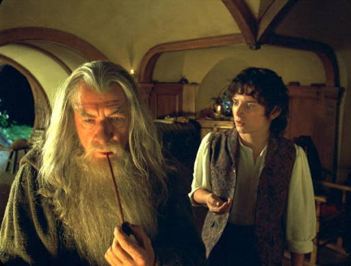
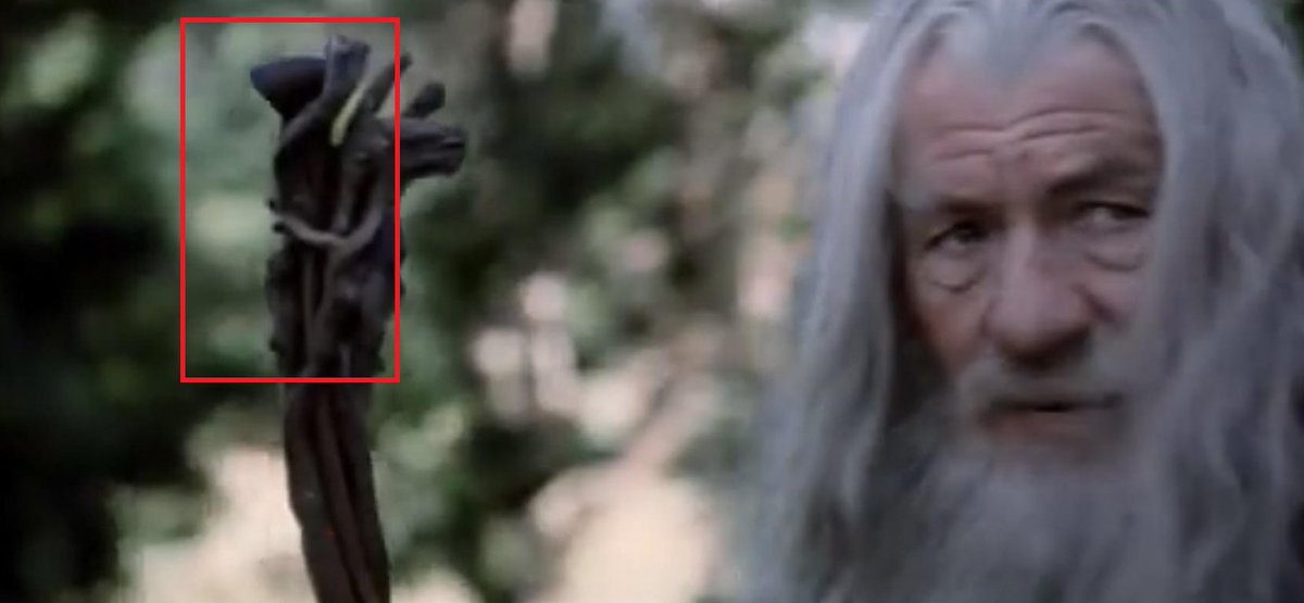
Gandalf smokes his pipe in various scenes of the fellowship, I bet it would've been cool to have one where they show us how he stores it back into his staff, but it's not necessary, hidden details are incredibly fun to notice on rewatches.


The Late Knight Show@Knightly_Hist
LOTR's costumes have detail in places that don't get any attention or dedicated screentime. Aragorn's first sword has a (by)knive on the scabbard, which is inspired by historical practice.
English

@yuungsheldon i didn't add any color, just increased contrast and moved the tint to look more like a late 90s period piece
English

@vikare06 Maybe it serves the story it's trying to tell and we shouldn't get bent about a trailer anymore ?
English

@GlobalBoxOffice thank you for the definitely real review of the Odyssey
English