
Daru Sim
34 posts


People really go back to the 2010s style huh?
Nils@nilseller
Tip: Stop using gray 1px borders. Stack a 1px white inset shadow + 1px black 4% outer shadow instead to make elements feel sharper and more dimensional.
English
@saifgeeky A, but the speed should be slow and subtle to avoid distraction
English

It has been 9 years since I last updated my portfolio, and I finally had the chance to redesign and launch a new one yesterday. darusim.com
Feel free to reach out anytime to discuss work, side projects, design, or just chat. I'm happy to connect! :)
English
Daru Sim retweetou

> walk around your city catching pokémon
> game asks you to scan a fountain. sure why not
> 30 billion scans later
> niantic owns a more detailed map than any government
> sells game for $3.5B
> spins off a spatial AI company
> your pokéwalk is now classified infrastructure
> delivery robots now navigate using your walks
> you were never the player. you were the product.
BuBBliK@k1rallik
English
Daru Sim retweetou

your agents can now pay for things online without the risk of sharing your card details. create one-time Visa cards from Claude Desktop just by saying 'create a card'. more below 👇
English
Daru Sim retweetou
@gaddafirusli I’m so used to seeing avatars in the comments sections of most apps I use that they naturally serve as anchors for each comment. In opt 2, I tend to skip the 2 replied comments.
English

Deciding whether avatars are needed in threaded comments. Are they necessary or will they make the UI too cluttered?

English
@gaddafirusli I'm not sure if this would be useful, but the idea is to provide context about the holiday (possibly w/ supporting images to make browsing the app more engaging).
E.g., historical view/descriptions about the Thaipusam celebration in the bottom sheets for mobile view?
English
Long weekend incoming.
Can't wait to get off work to... vibe code more??

English

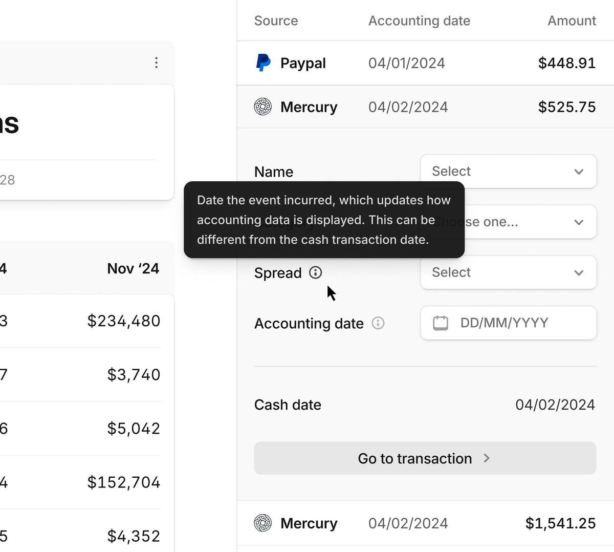
Automatic import process from the App Store, with full icon support and billing period detection. Magic 🪄
English
@gaddafirusli @_phosphoricons Huge fan of hugeicons, no pun intended
English
Last minute new year project:
🇲🇾 2026 Malaysia public & school holidays in a single calendar
— Filter by states
— View in monthly calendar or list view
— View the full year at a glance
👉 Senang nak plan holiday kalau tahu bilacuti.my
English
Daru Sim retweetou


It’s official – I’m excited to introduce Alloy (@alloyapp), the world’s first tool for prototypes that look exactly like your product.
All year, PMs and designers have struggled with off-brand prototypes – built with “app builder” tools that look nothing like their existing app.
They’re left with confused stakeholders, prototypes they can’t show customers, and demos where they’re apologizing for the design.
Your prototypes should look like your actual product. Starting today, they can.
Alloy is AI Prototyping built for Product Management:
➤ Capture your product from the browser in one click
➤ Chat to build your feature ideas in minutes
➤ Share a link with teammates and customers
➤ 30+ integrations for PM teams: Linear, Notion, Jira Product Discovery, and more
In lab results, Alloy delivers 3-5x more detail than alternatives when you start from an existing product. It’s powered by groundbreaking technology you won’t find in any other tool.
Alloy is now available for you to try for free.
Comment “ALLOY” and I’ll DM you an invite with instant access and extra credits.
English

Design tip 101.
Adequate spacing.
Consistent typography.
Obvious contrast.

English
Pro tip to my design bros.
Scanability is essential (you can Google wtf is that). It becomes even more critical when designing a dashboard with a large amount of data.
A tip that I can give is to always list down your contents. Mark which one has the highest priority, and improve the UI hierarchy (you can also Google this) of those components or sections.
Try to follow the Atomic Design way. Start with the entire page and decide which section needs highlighting. You can also go down level by level for each component or section.
This way, your content will not look flat, and users will immediately know which information is essential.

English
@izuddinhelmi If you’re questioning its worth, deep down you know it’s not. 😂
English
Is it worth upgrading to Enterprise? I'm using it for my own projects, lol.

English