Закреплённый твит

💤
180.4K posts

@ShadowStarMode
Sundown #RaisedByWolves

What do you think?

What do you think?

Minimalism is such a stain on sports. There’s no space better suited for kooky maximalist fun design, but instead we’re slowly turning everything into a millennial targeted D2C olive oil brand (derogatory)


Minimalism is such a stain on sports. There’s no space better suited for kooky maximalist fun design, but instead we’re slowly turning everything into a millennial targeted D2C olive oil brand (derogatory)


What do you think?
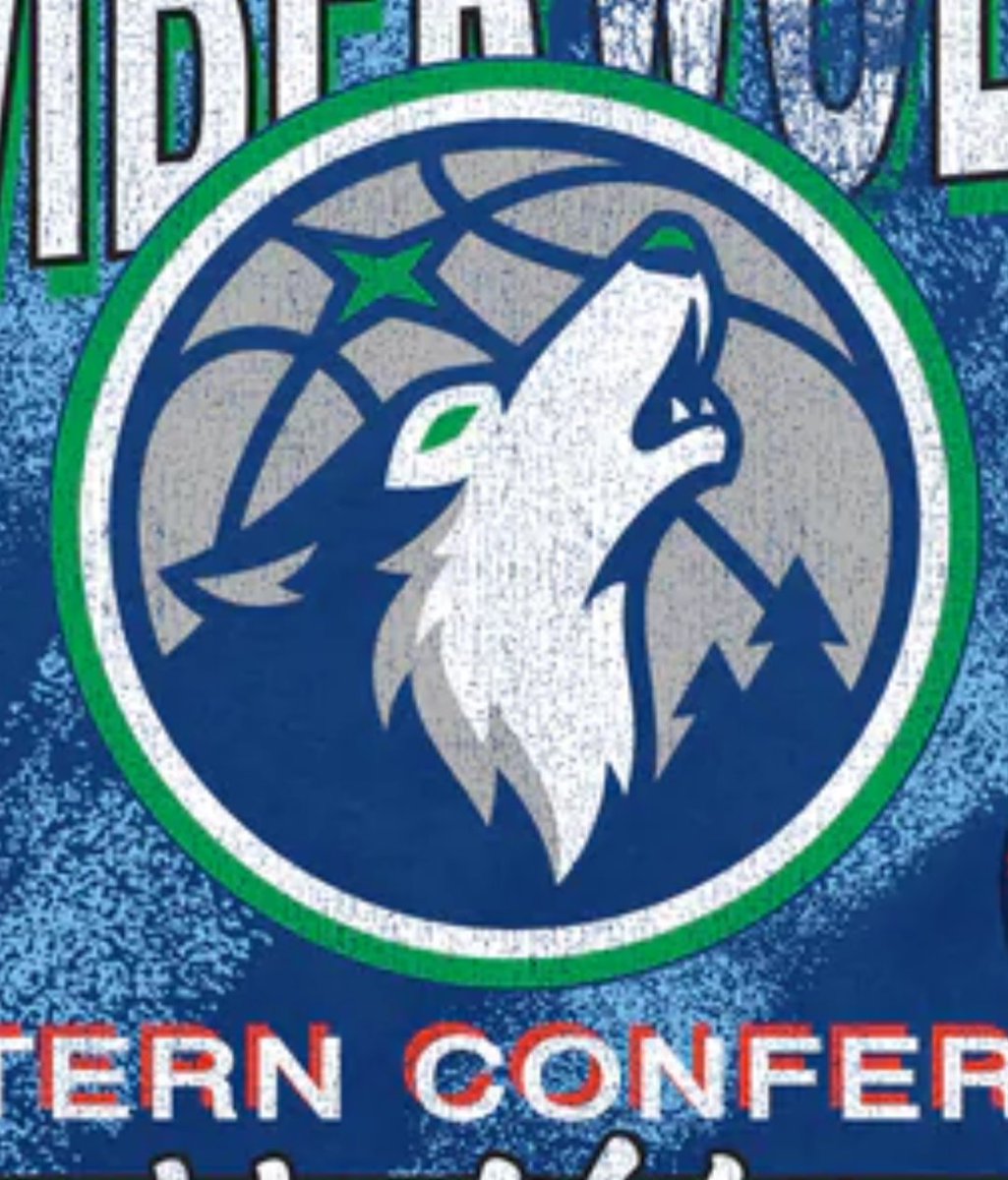
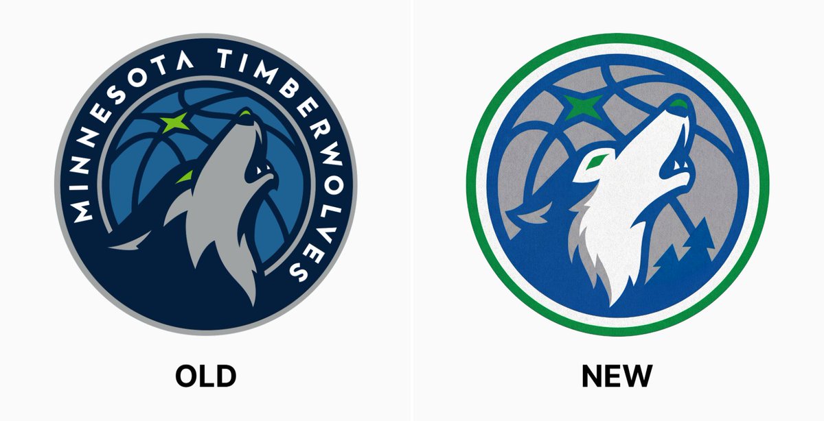
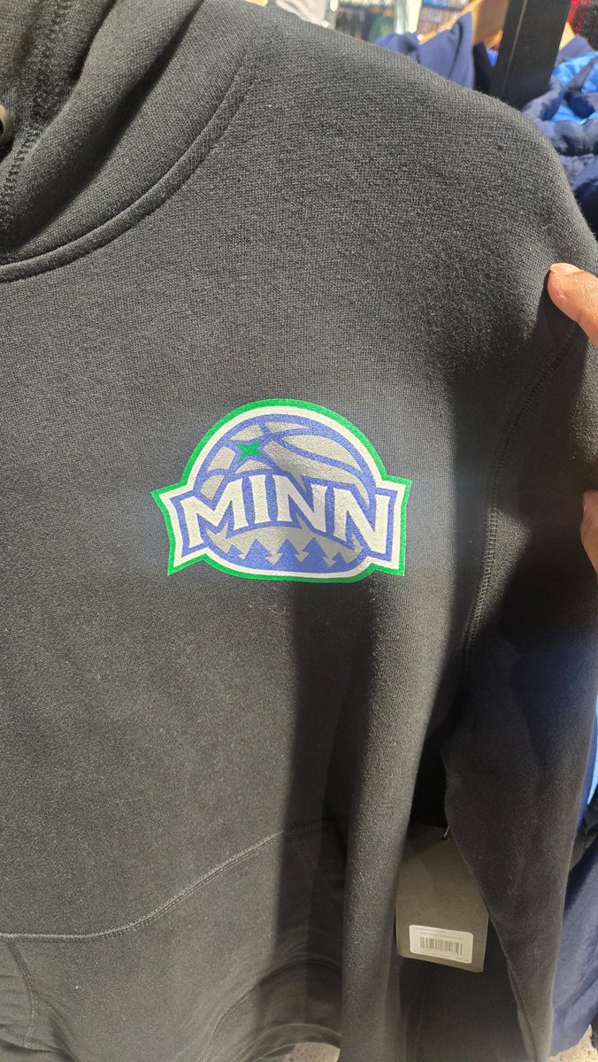
There is a non zero chance the NBA store leaked the new logos already (couple weeks ago)

There is a non zero chance the NBA store leaked the new logos already (couple weeks ago)
Why did they abbreviate Somalia, “MINN”?

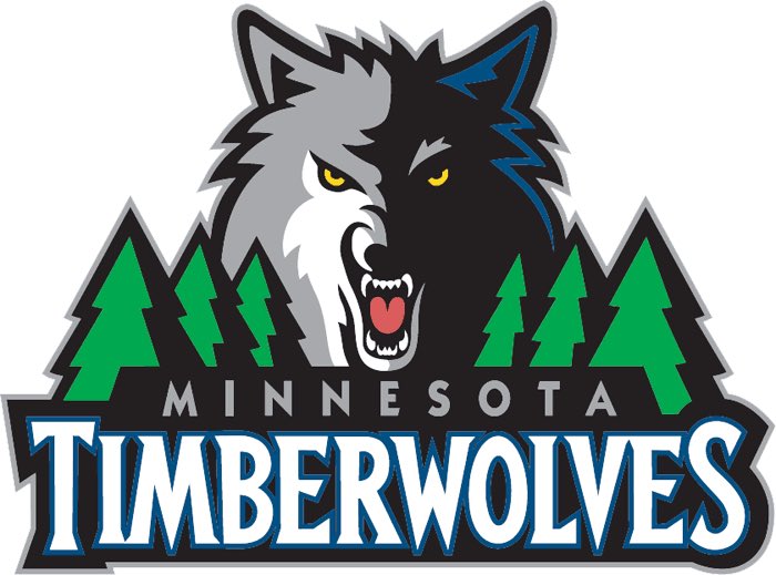
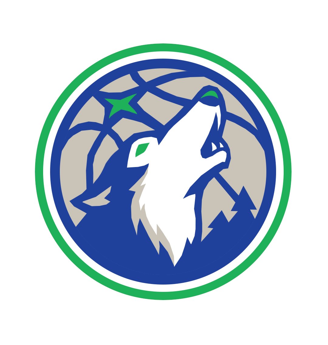
This guy is correct. I have close friends who work for Fanatics and can confirm there is a rebrand scheduled for this summer. The rebrand will include the old 90's classic T'Wolves blue and green mixed with the tree trim from the 2000's era. The logo is Old Shep from the 90's logo but he's howling much like the current logo instead of facing forward like the 90's. Jerseys will include home white with "Wolves" on the chest and away will be the blue and black.