Arama Sonuçları: "#Boxplot"
20 sonuç


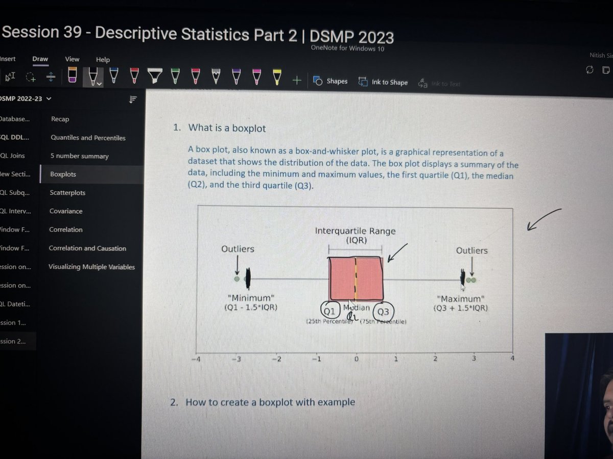


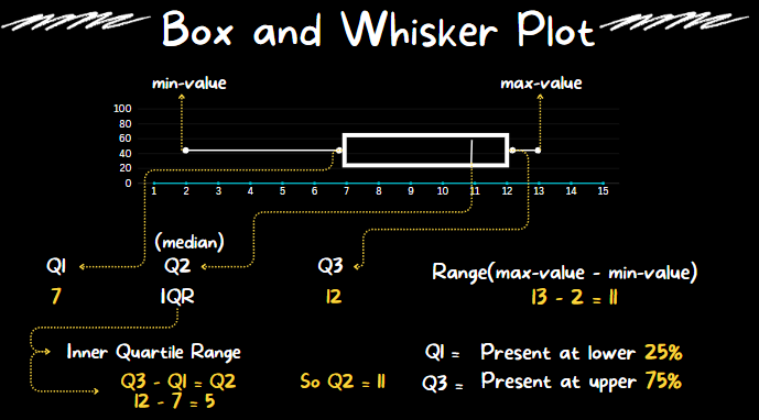


Boxplots are one of the most useful tools in my Data Science arsenal. In 6 minutes, I'll teach you 6 years of using box plots for EDA and problem-solving. Let's dive in. 1. What is a boxplot? A boxplot is a standardized way of displaying the distribution of data based on a five-number summary: minimum, first quartile (Q1), median, third quartile (Q3), and maximum. 2. Invention: The boxplot was invented in 1969 by John Tukey, as part of his pioneering work in data visualization. Tukey's EDA emphasized the importance of using simple graphical and numerical methods to start understanding the data before making any assumptions about its underlying distribution or applying complex statistical models. The boxplot emerged from this philosophy. Tukey's boxplot was designed to be a quick and easy way to visualize the distribution of data. 3. Usage: I use boxplots during the exploratory phase. First, I assess correlations to an outcome I am interested in. Then I explore the top features during Exploratory Data Analysis (EDA). Boxplots are heavily used in my EDA. 4. Key Features of Boxplots: In one quick visualization, boxplots display distribution summary, outliers, skewness, and it facilitates comparisons between multiple groups or categories. 5. The Box: The box spans from the first quartile (Q1) to the third quartile (Q3). This range, known as the interquartile range (IQR), contains the middle 50% of the data. The line inside the box represents the median (the second quartile, Q2), which divides the dataset into two equal halves. 6. The Whiskers: The whiskers extend from the box to show the range of the data. A common approach is to extend them to the smallest and largest values within 1.5 times the IQR from the first and third quartiles, respectively. Data points outside this range are considered outliers and are sometimes plotted as individual points. 7. Outliers: These are data points that lie beyond the end of the whiskers. They are not part of the bulk of the data and may indicate variability in the data, experimental errors, or novel findings. Explore these! 8. Skewness: If the median is not equidistant from Q1 and Q3, or if the whiskers are of unequal lengths, it suggests that the data is skewed. There you have it- my top 8 concepts on boxplots. The next problem you'll face is how to apply data science to business. I'd like to help. I’ve spent 100 hours consolidating my learnings into a free 5-day course, How to Solve Business Problems with Data Science. It comes with: 300+ lines of R and Python code 5 bonus trainings 2 systematic frameworks 1 complete roadmap to avoid mistakes and start solving business problems with data science, TODAY. 👉 Here it is for free: learn.business-science.io/free-solve-bus…