"We not only cover history, we make history." @JohnSafran is here to give you a sneak peek on what's coming up in his episode of Who the Bloody Hell Are We?
Who the Bloody Hell Are We? | Premieres Wednesday 19 July on SBS and SBS On Demand
@_phoebeparadise It’s so wild that there was a bunch of news stories a year or so ago about telcos being forced to get tough on this and somehow it’s got worse.
If you want to report spam on Vodafone this is the length of the form they expect you to fill out every single time…
Marathon Art Style (a short thread). First of all thanks to everyone for all the kind words and enthusiasm for the art style/direction in our announce trailer, it's been amazing to see. This was the result of many talented artists working together, with the support of an amazing
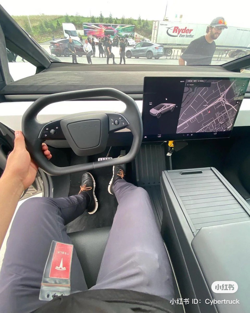
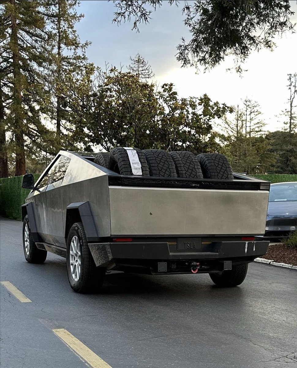
@AnondoRando@horselover21115@TaylorOgan These are all over Australia and I’ve never heard of them being singled out as any more dangerous than any other vehicle?
@horselover21115@TaylorOgan These are OK for Japan where speeds tend to be at or below 40 kph, button American roads, these things are death traps. Even a fender bender becomes a emergency room delivery.
@GergelyOrosz I think a lot of this is in the framing of the question.
Seamless is a wide word.
Do iOS users want their apps to be *limited* to old established features common to Android or Web?
I don’t think so.
Software doesn’t want to ignore hardware, it wants to dance with it.
One thing to consider for mobile engineers and web developers:
There is an ever-increasing push both from business owners and from users to have no differentiation between web, iOS and Android. To have stuff work the exact same way (save for small UX tweaks for platforms).
@hobdaydesign Could you drag the original bubbles to see the time stamp like you can now?
If so then those would be a tangible draggable thing for touching (that could have been made from plastic)
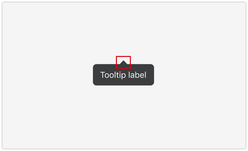
This is not an attack on Ilya, just curiosity: what’s the justification for making text messages shiny bubbles? Is this a reference to some real-world concept?
I can understand with buttons because some real buttons are rounded shiny plastic.
@_phoebeparadise Ha! I got to see ‘30 odd foot of grunt’ at the Caxton seafood festival years ago, and it was epic. Russel said “the last time I played this song I was dressed in the garb of a Roman centurion…’ and I’ve never heard a crowd respond in such perfect unison ‘what a wanker’…
@zainadeel@hobdaydesign 5 colours are wide enough a palette to support Harmonisation
> Harmonization makes adding and introducing new colors to your app more seamless by automatically shifting hue and chroma slightly so that a product's colors feel more cohesive with user colors
m3.material.io/styles/color/t…
@hobdaydesign Do we really need 5 surface/elevation colors on a base color? If i ever imagine this expanding to AR/VR shouldn’t the active content area be the brightest meaning the closes to you? Rather low/high. Would a close/far language work better?
Google’s Material 3 uses language like “high” and “low” to describe layer colours. But “lowest” is the brightest, so it looks the closest in terms of elevation, and “highest” is the darkest so looks the farthest away.
What's a good name/term/way to describe the way that interfaces are designed in "layers"? If I wanted to write a guide to how to choose neutral colours for the different levels/elevations of an interface, I wouldn't know what title to use.