Molly Hellmuth Tsacudakis

2.3K posts

Molly Hellmuth Tsacudakis banner
Molly Hellmuth Tsacudakis

Molly Hellmuth Tsacudakis

@molly_hellmuth

Teaching what I know about Figma & Design Systems Newsletter https://t.co/MyENQXKwWG Course https://t.co/mS04Tlbs2r

Denver, CO เข้าร่วม Ekim 2017
519 กำลังติดตาม16K ผู้ติดตาม
ทวีตที่ปักหมุด
Molly Hellmuth Tsacudakis
Molly Hellmuth Tsacudakis@molly_hellmuth·
UI Prep 8.0 is Live!!! 🎉 
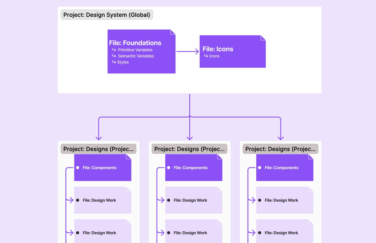
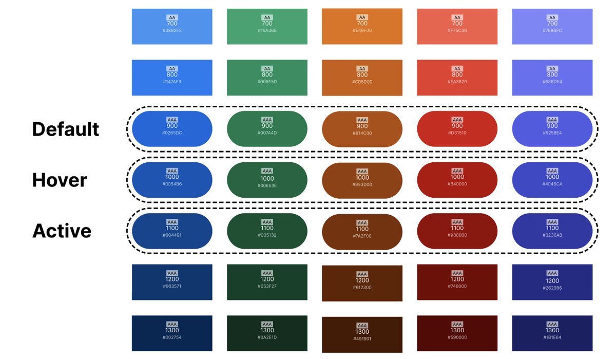
The UI Prep Design System has been completely rebuilt to include all updates from Config23! Including...
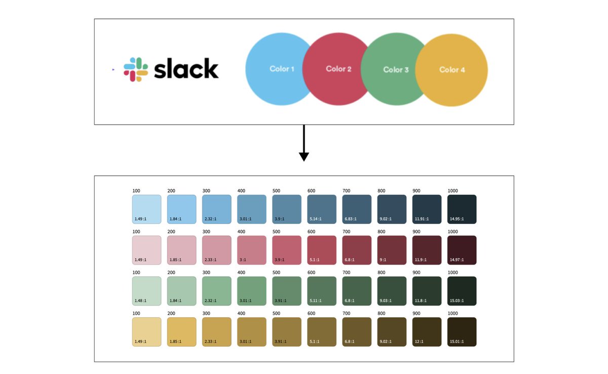
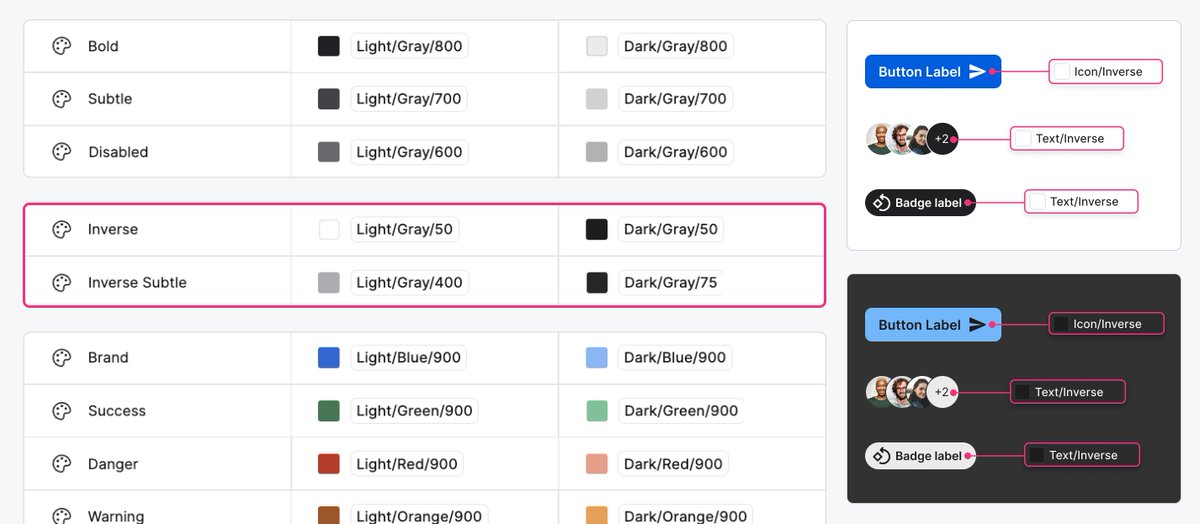
 ✨ Color Variables ✨ Light & Dark Mode ✨ Number Variables 
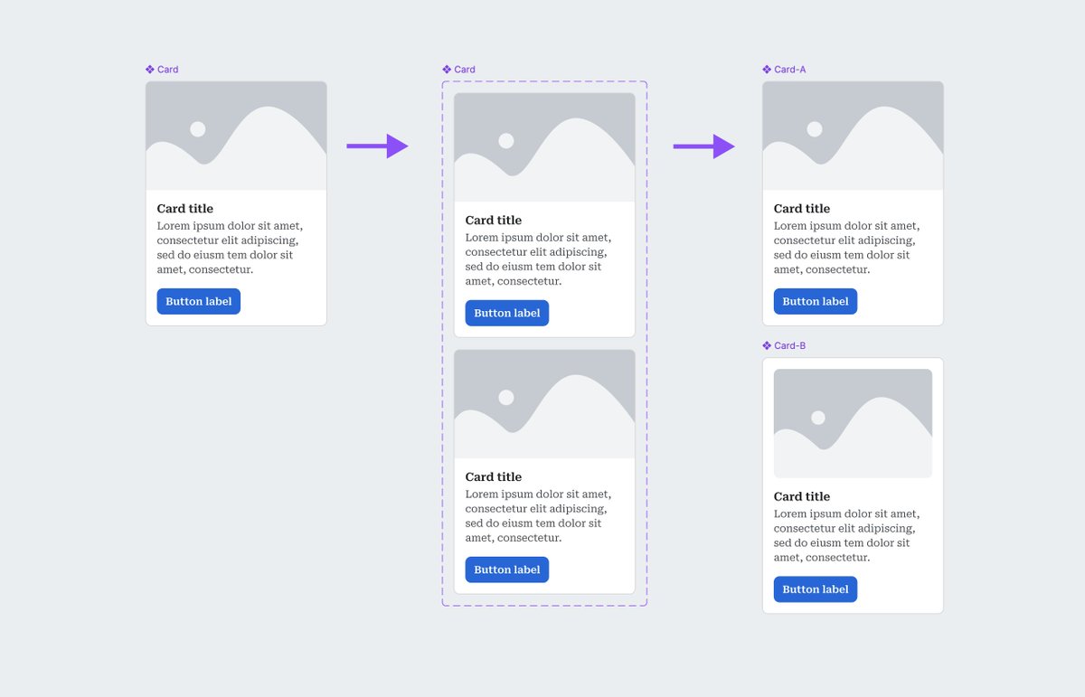
✨ Auto Layout (Max/Min/Wrap)
Molly Hellmuth Tsacudakis tweet media
English
17
19
172
32.3K
Molly Hellmuth Tsacudakis
Molly Hellmuth Tsacudakis@molly_hellmuth·
Subscribe to my newsletter, Friday Five, to get tips like this directly in your inbox! ✨ Join 25,000+ subscribers ✨ Learn about Figma & Design Systems ✨ Great tips, no fluff uiprep.com/newsletter
English
0
0
1
407
Molly Hellmuth Tsacudakis
Molly Hellmuth Tsacudakis@molly_hellmuth·
💡 Design System Tip: Create custom color palette components Build custom color palette components directly in your design system. This makes color documentation visual, reusable, and much easier to maintain. One especially helpful trick: add a variant or property that shows whether a color is currently “in use.” A simple badge or visual treatment instantly tells designers which colors are active tokens—and which ones aren’t. Useful properties to include: • In use (true / false) • Scale number (100–900) • Hex value • Contrast rating • Recommended foreground (black or white) This keeps your color system clear, scannable, and tightly connected to real usage—not just theory.
Molly Hellmuth Tsacudakis tweet media
English
2
0
3
808
Molly Hellmuth Tsacudakis
Molly Hellmuth Tsacudakis@molly_hellmuth·
Subscribe to my newsletter, Friday Five, to get tips like this directly in your inbox! ✨ Join 25,000+ subscribers ✨ Learn about Figma & Design Systems ✨ Great tips, no fluff uiprep.com/newsletter
English
0
0
0
312
Molly Hellmuth Tsacudakis
Molly Hellmuth Tsacudakis@molly_hellmuth·
💡 Figma Tip: Duplicate complex components without rebuilding them Ever needed a new component that’s almost identical to an existing one—but didn’t want to rebuild all the nested layers and properties from scratch? Here’s my go-to trick 👇 If you duplicate a component, Figma gives you an instance (not helpful). But if you turn it into a variant set first, then break it apart, you get multiple main components—each with the same structure and props as the original. How to do it: Select the component → click Add variant Drag both variants out of the purple container Rename + customize your new component Done. You’ve created a perfectly structured duplicate in seconds. This saves a ton of time when working with complex components—and keeps everything consistent across your system.
Molly Hellmuth Tsacudakis tweet media
English
3
0
5
924
Molly Hellmuth Tsacudakis
Molly Hellmuth Tsacudakis@molly_hellmuth·
Subscribe to my newsletter, Friday Five, to get tips like this directly in your inbox! ✨ Join 25,000+ subscribers ✨ Learn about Figma & Design Systems ✨ Great tips, no fluff uiprep.com/newsletter
English
0
0
0
370
Molly Hellmuth Tsacudakis
Molly Hellmuth Tsacudakis@molly_hellmuth·
💡 Figma Tip: Let Figma Make write your design system docs for you If you’re still creating DS documentation manually… you don’t have to anymore. Figma Make can generate documentation directly from your variables, styles, and components—all tailored to your team’s level of detail. How to do it 👇 Publish your design system as a Library → click Export to Make Create a new Make file and add your library Prompt Make to document your variables, styles, or components Share it, review it, refine it—repeat Pro tip: Connect extra context from Notion or other docs to turn your Make file into a single source of truth for your design system.
Molly Hellmuth Tsacudakis tweet media
English
5
2
24
2.3K
Molly Hellmuth Tsacudakis
Molly Hellmuth Tsacudakis@molly_hellmuth·
DS Tip: Use separate color palettes for marketing and product UI Marketing and product design have very different goals, constraints, and accessibility needs. That’s why it’s often best to maintain two related—but distinct—color systems. Marketing teams can explore attention-grabbing visuals, run A/B tests, and move quickly. Meanwhile, product teams can focus on consistent component states, nuanced semantics, and higher accessibility standards. If you need to translate brand colors into a UI-ready palette with 10–14 steps, Leonardo is an excellent tool. Here’s how to generate scales from your brand colors: 1. Create a new color in Leonardo. 2. Add one or more brand colors as “keys.” 3. Generate a 10–14-step color scale. 4. Repeat for each additional color you need. Two palettes = one cohesive brand that still respects the very different needs of marketing and product.
Molly Hellmuth Tsacudakis tweet media
English
2
1
15
1.5K
Molly Hellmuth Tsacudakis
Molly Hellmuth Tsacudakis@molly_hellmuth·
Q&A 10/10 — Counting down to the next cohort of Design System Bootcamp with 10 questions asked by previous students. "Should I use component tokens (tier 3)?" We start MONDAY! 2 spots left! 🔥 maven.com/ui-prep/design…
English
0
0
0
513
Molly Hellmuth Tsacudakis
Molly Hellmuth Tsacudakis@molly_hellmuth·
🎯 Figma Tip: Use SOME component level tokens (aka tier-3) When used sparingly, component level tokens are extremely helpful for components with specific needs like the following.. 🎨 Button/Color: Background, Foreground, Border 🎨 Focus-Ring/Color: Border 🎨 Form/Color: Background, Border 🎨 Link/Color: Foreground But don’t go overboard. Any more than these 4 categories of color tokens and you’ll risk the number of your tokens exploding - becoming more complicated than they are helpful.
Molly Hellmuth Tsacudakis tweet media
English
1
0
21
1.6K
Molly Hellmuth Tsacudakis
Molly Hellmuth Tsacudakis@molly_hellmuth·
Q&A 9/10 — Counting down to the next cohort of Design System Bootcamp with 10 questions asked by previous students. "Combining ALL component types is more efficient, right?" 4 spots left! 🔥 maven.com/ui-prep/design…
English
0
0
1
437
Molly Hellmuth Tsacudakis
Molly Hellmuth Tsacudakis@molly_hellmuth·
🧸 Figma Tip: Create “Goldilocks-sized” component sets Not too big, not too small — just right for usability, performance, and sanity. 🍜 Too small - Poor usability When every type, state, and size is its own component, the library becomes cluttered and confusing. A simple button set can explode into 50+ nearly identical options that are hard to find or use correctly. 🍜 Too big - Poor file performance At first, combining everything into one mega-component seems efficient — until it isn’t. Overloaded components often: • Slow designers down with endless property menus • Get misused due to complexity • Eat up huge amounts of memory (each instance carries every hidden layer and variant — sometimes 20× the file weight!) 🍜 Just right - Perfect! The sweet spot lies in between. Create components with just enough variants to keep the assets panel simple and the file fast. Each team’s “Goldilocks zone” will look a little different — but aim for clean, performant, and intuitive.
Molly Hellmuth Tsacudakis tweet media
English
1
0
12
1.3K
Molly Hellmuth Tsacudakis
Molly Hellmuth Tsacudakis@molly_hellmuth·
Q&A 8/10 — Counting down to the next cohort of Design System Bootcamp with 10 questions asked by previous students. "Can I use the name "white" in my design system?" 5 spots left! 🔥 maven.com/ui-prep/design…
English
0
0
0
448
Molly Hellmuth Tsacudakis
Molly Hellmuth Tsacudakis@molly_hellmuth·
💡 Figma tip: Add “inverse” color tokens to your design system 🎨 Ever noticed how buttons often flip the theme? While most light themes use light backgrounds with dark text, buttons (and other call-to-actions) usually do the opposite — dark backgrounds with light text for stronger contrast. That’s where inverse colors come in! Create tokens like color.text.inverse, or color.icon.inverse for those theme-bending components. Why not just call it “white”? Because abstract names make your color system more scalable, flexible, and themeable. The word “inverse” works perfectly in both light and dark modes — even when that color shifts from white → black.
Molly Hellmuth Tsacudakis tweet media
English
2
1
34
2.6K
Victor
Victor@vponamariov·
@molly_hellmuth You've just said a dangerous thing 😅 *An army of a11y advocates is coming*
English
1
0
0
81
Molly Hellmuth Tsacudakis
Molly Hellmuth Tsacudakis@molly_hellmuth·
💡 Figma Tip: It’s OK to use some low-contrast colors. Not every color in your design system needs to meet strict accessibility contrast ratios. Some lower-contrast colors are totally acceptable — as long as they’re used intentionally. ✅ When low contrast (3:1 min) is OK Large text: Easier to read at size. WCAG defines this as 18pt+ (or 14pt+ if bold). Graphical objects: Icons or graphics that convey meaning (like a standalone Facebook icon) can use slightly lower contrast. ⚪ When very low contrast (no minimum) is OK Inactive elements: Disabled buttons or fields are identified by their lower-contrast state. Non-essential graphics: Visuals that don’t convey meaning (like a divider line or a decorative icon beside text). Pure decoration: Text or images that aren’t meant to be read, such as book titles in a decorative image. 💭 Remember: These are minimums, not goals. Whenever possible, aim for higher contrast to support readability and clarity.
Molly Hellmuth Tsacudakis tweet media
English
3
0
13
2.3K
Molly Hellmuth Tsacudakis
Molly Hellmuth Tsacudakis@molly_hellmuth·
Q&A 7/10 — Counting down to the next cohort of Design System Bootcamp with 10 questions asked by previous students. "Does EVERYTHING need to be AAA?" Enrollment is open and space is limited--8 spots left! 🔥 maven.com/ui-prep/design…
English
0
0
0
435
Molly Hellmuth Tsacudakis
Molly Hellmuth Tsacudakis@molly_hellmuth·
Q&A 6/10 — Counting down to the next cohort of Design System Bootcamp with 10 questions asked by previous students. "Why should icons live in their own file?" Enrollment is open and space is limited--13 spots left! 🔥 We start Oct 20th! ⏰ maven.com/ui-prep/design…
English
0
0
0
404
Molly Hellmuth Tsacudakis
Molly Hellmuth Tsacudakis@molly_hellmuth·
Figma Tip: Store your design system icons in a separate file. Doing this gives your team a few key advantages: ✅ Better permissions control – Let more designers contribute icons without giving them access to edit component libraries. ✅ More flexible sharing – Share icon assets across files that don’t share components (e.g. product vs. marketing, or iOS vs. Android). This setup keeps your system tidy and scalable — a great practice for most teams. ⚠️ For very small systems, though, managing multiple files can feel a bit over-engineered. Use this approach when your team or file structure starts to grow.
Molly Hellmuth Tsacudakis tweet media
English
1
0
7
798
Molly Hellmuth Tsacudakis
Molly Hellmuth Tsacudakis@molly_hellmuth·
Q&A 5/10 — Counting down to the next cohort of Design System Bootcamp with 10 questions asked by previous students. "Can I use blue-900 for one button and green-600 for another?" Enrollment is open and space is limited--13 spots left! 🔥 maven.com/ui-prep/design…
English
0
0
0
380
Molly Hellmuth Tsacudakis
Molly Hellmuth Tsacudakis@molly_hellmuth·
Figma Tip: Use colors consistently across your DS palette For example, all button-bg-default use color "900" for consistant.. ✅ Contrast across color types (AAA) with white or black text ✅ Look and feel across color types for perceived hierarchy ✅ Change in state with predictable shade jumps
Molly Hellmuth Tsacudakis tweet media
English
1
0
9
1K