ทวีตที่ปักหมุด

vibe-coded this a few months ago using Claude, GPT, and Grok.
Liquid Glass toggle. inspired from @cerpow
Voicu Apostol@cerpow
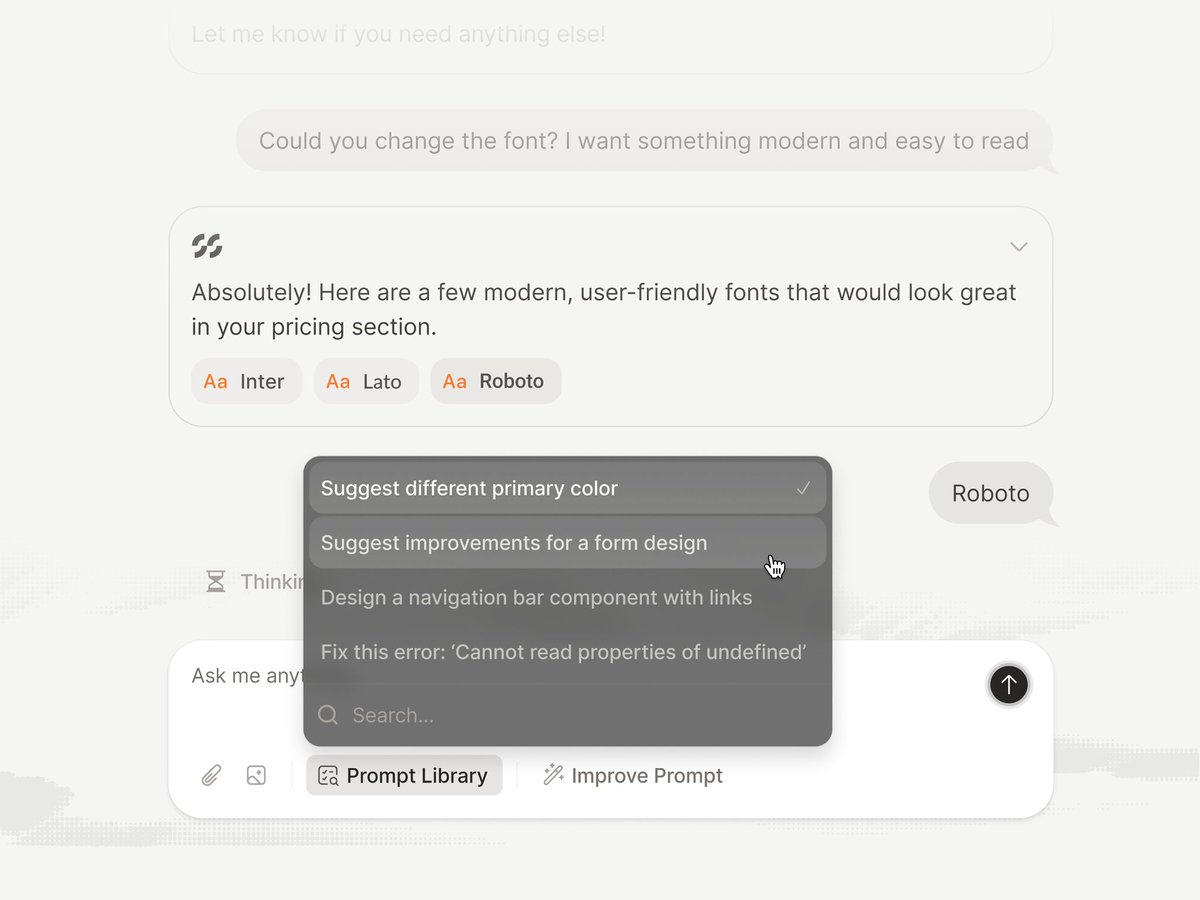
The all new @figma glass
English
Snig
175 posts

@snigdd
Vibe-Coder | Design Curator | Sharing UI/UX inspiration with full credit to creators. This profile is a library of the best designs on X.
The all new @figma glass

vibe-coded this a few months ago using Claude, GPT, and Grok. Liquid Glass toggle. inspired from @cerpow


Skeleton vs Spinner? A or B - what’s your pick? 骨架屏 vs 转圈,你会选哪个?
@figma on a playdate. ridiculous… but kinda genius💀 中国的创作者真的很厉害 👏