پن کیا گیا ٹویٹ

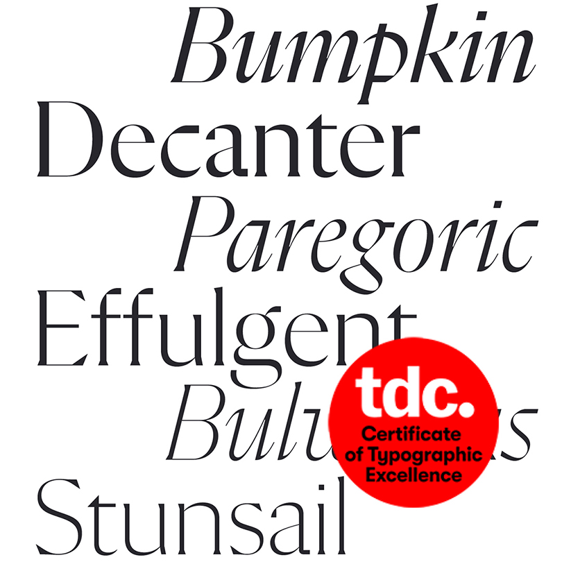
Very happy to know that Flecha has been selected by the judges to receive the “Certificate of Typographic Excellence”. Big thank you to the Jury!
English
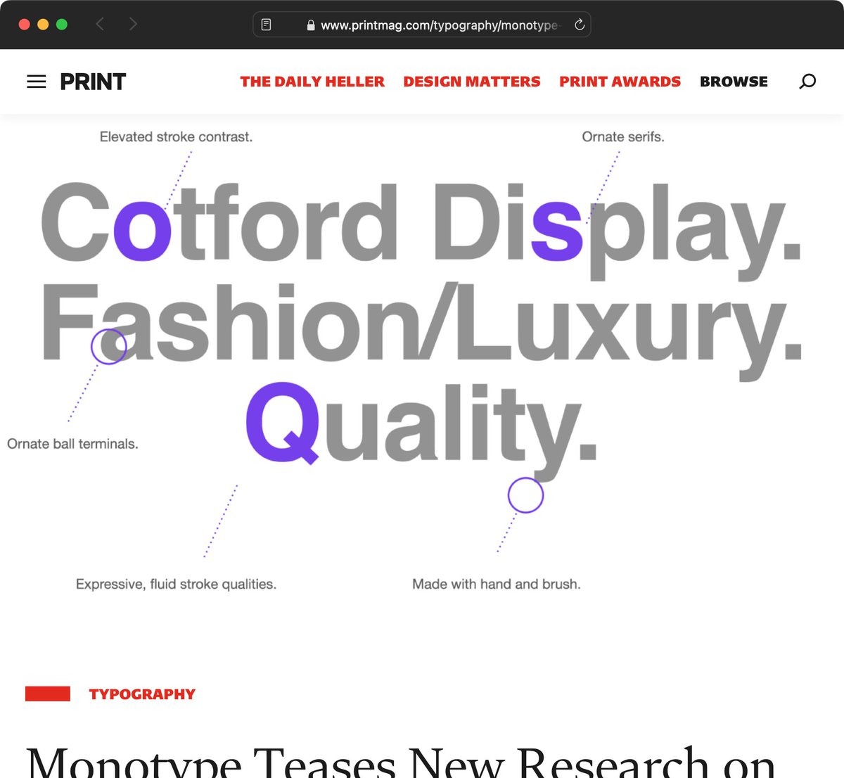
R-Typography
3.2K posts
@R_Typography
A typeface designer from the far west.

#EpigraphyTuesday WHAT is going on here? The inscription is tilting. Maybe the sculptor needed glasses, because this funerary altar is dedicated to the 'oculist doctor' ('MEDICO OCULARIO'), C. Terentius Pisto, who lived ... 87 years, 5 months, 24 days and 10 hours. 😳 1/