Sabitlenmiş Tweet
barth
675 posts


@Xxi5olc @Greg_TheBuilder @appfactory Antigravity looks like it was vibe-coded based on a codex screenshot
So unpolished
English

@Greg_TheBuilder @appfactory you can't say that simply because Antigravity looks identical to Codex
English

barth retweetledi

I just saw a product manager role with an 80k salary and I’m livid.
Nigeria is such a shitty place to be. A lot of software companies don’t value product managers, that’s why they can confidently pay 50-100k as salary.
If you’re just starting out as a product manager, don’t listen to anyone who tells you “you have to pay dues”. You’ve overpaid your dues just being born as a Nigerian.
This is how to set yourself apart so you don’t get underpaid:
1. First, you have to see the value in your role. PMs are not just there to give orders. I’ll post a more detailed breakdown of what PMs do but primarily - you decide if a product lives or dies. You have to deeply understand your customers, decide what features to build and prioritize, be the glue between all the teams, launch and improve the product, and so much more. Look out for my post that breaks this all down.
2. Have mad confidence to a delusional level. This has gotten me gigs that even I know I wasn’t qualified for at the time. Don’t stutter in interviews - this one takes practice tbh. Like I say - have the audacity of a Nigerian man when talking in interviews. They respect that.
3. Show you’re adaptable - A lot of you just think “if i do my job, that’s fine”. No! You have to know how to collaborate outside your team, show impact outside your JD. I’m not saying be a slave. Just show that you’re someone people can count on.
4. Know your responsibilities like the back of your palm: If interviewers are the ones listing your job description for you, and you can’t even tell what’s yours and what isn’t? You can’t tell which one is complex and which is simple? Just collect whatever salary they give you, cause you deserve it. You should be the one explaining what you’ll do when they bring you on board, not the other way round. Then, you can negotiate.
You’re welcome.👍
English

@Biscuit_Base @buckadeath idk, i dont really keep up with what other people do, i recently swapped out my 3070 for a 5070ti, not sure a 3060 could run modern games (even if most of them are slop)
English

Temu GPUs are going to obliterate the US market
Pamphlets@PamphletsY
🚨🇨🇳 BREAKING — China Unveils Gaming GPU To Challenge NVIDIA
English
Still horrible that Gemini can’t connect to external apps that aren’t in the google suite. Super annoying.
barth@barthkosi
I’m glad google has been paying more attention to design lately. The new Gemini refresh and the subtle updates to their apps across this board has been a delight to witness.
English

English


@bedesqui It does fit well for sure, this is me being in a little bubble because i use gcal, not notion cal
English


@matyukhinmax @heysatya_ @jaydwivedi_ I took a look at your website
It’s decent but the ai claim is funny because the output is nowhere close to what this studio does on a single project.
English

@heysatya_ @jaydwivedi_ this list is exactly what one designer + ai does in 2026.
shipped a brand identity, landing page, launch video and copy for my last project. solo. 6 days.
the killer team is now one person who uses the right tools
English

We’ve got a killer team now - people who can literally do everything.
- Brand Designer
- Illustrator
- Copywriter
- Web Designer
- Animator
- Web Developer
- Product Designer
- App Designer
- Motion Designer
From building your brand identity to producing your launch video, we handle it all in-house, fast, and done right.
Just drop your project on our table, we’ll take it from there.
(Still building and looking for more awesome creatives to join kree8)
English


Mum, I made it.
I finally stumbled on some of my work repurposed?
And for one of my favourite up and coming design companies @paper
Same gray, same nav items, same size, same padding, same blur?
Maybe it is, maybe it isn't.
TBH i'm not overly fussed, just thought it was funny to stumble on something so familiar.
Just excited I get to join to cool designer gang.

Kieran Parker@_kprkr
This mobile-nav just feels so calm 🧘♂️
English

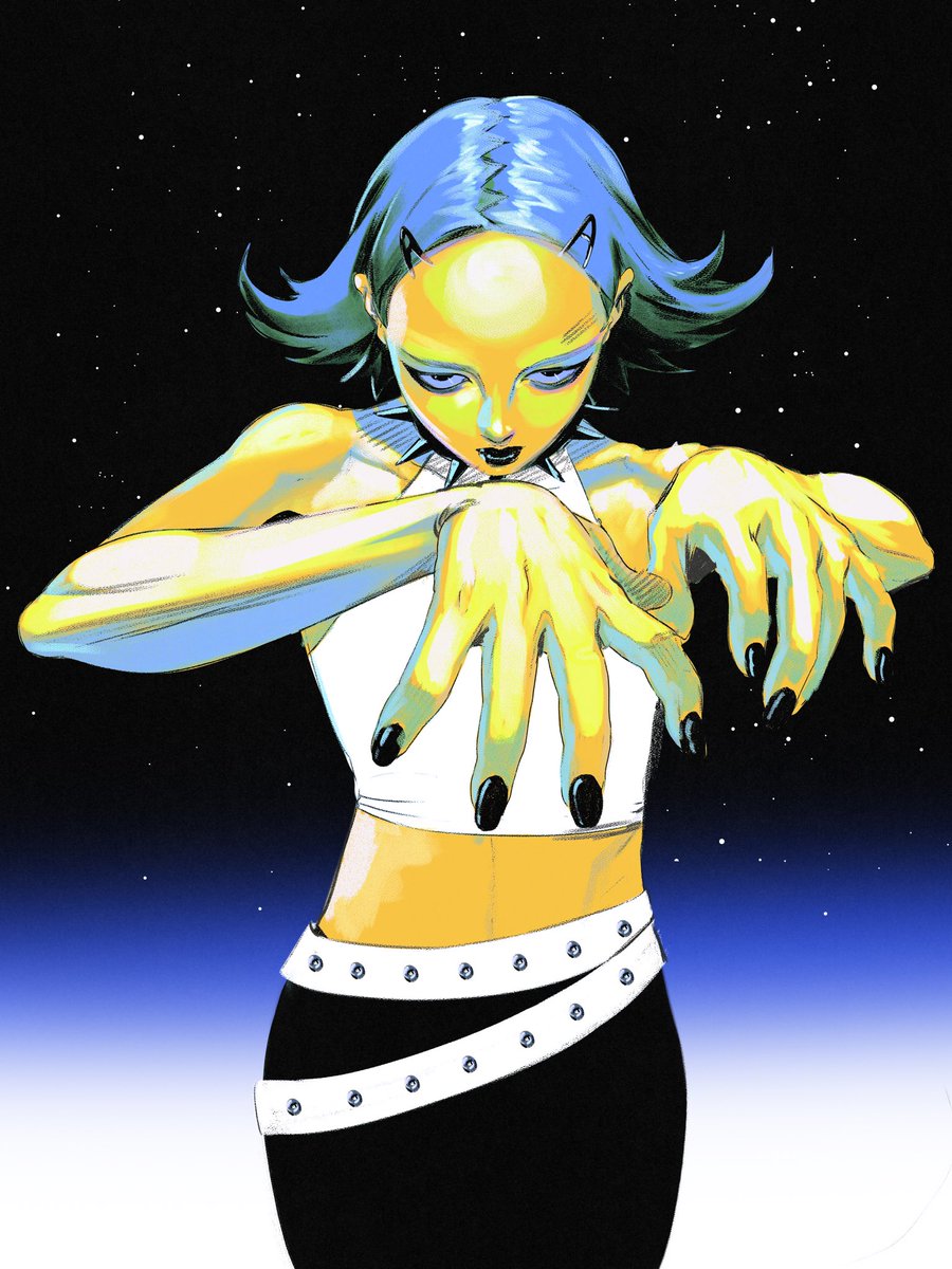

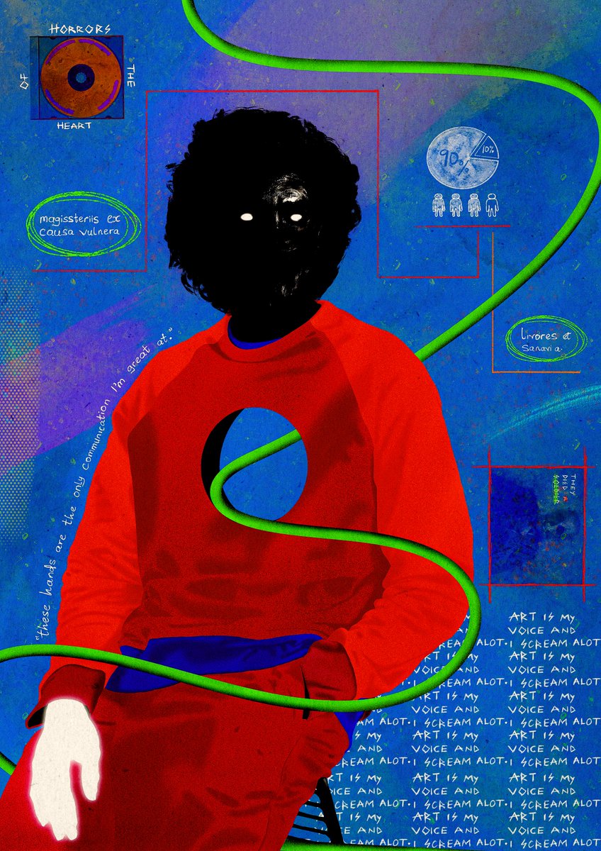
i'm gigi from nigeria, this is my art.
Zahra ladani@zahraladani
I’m Zahra from Iran, this is my art
English


@stevelauda_ Figma make
A few weeks ago I downloaded my Figma make project then took it into antigravity and kept building from there
English

This is better not stone walled within Figma ecosystem. Allow us to export it as true code to coding agent please.
If not, this is not really a winning move.
Figma@figma
Release Notes, EP-007 → Take your vibe-coded prototypes further in Figma → Connect design systems to code → Ship your best idea fast MAY 5, 9AM PT | 12PM ET
English