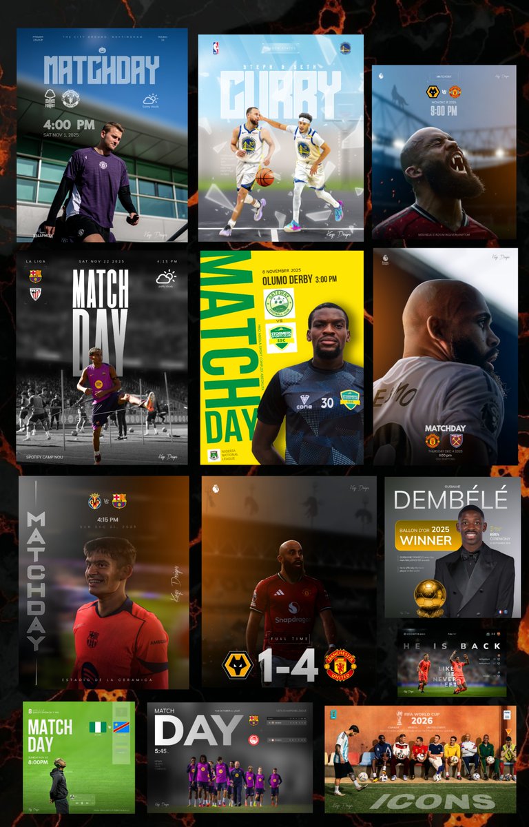
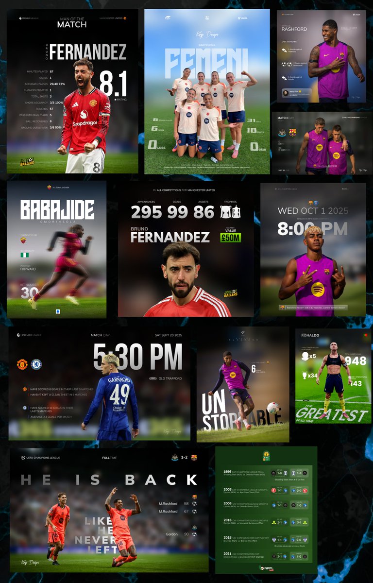
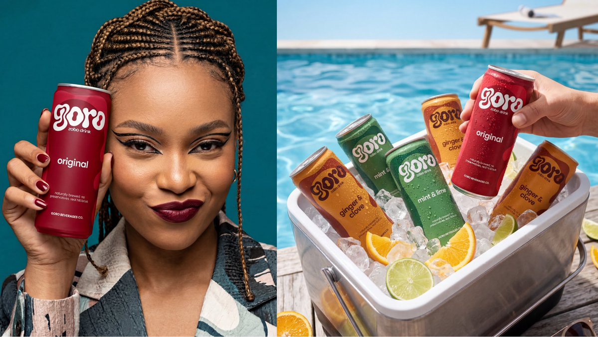
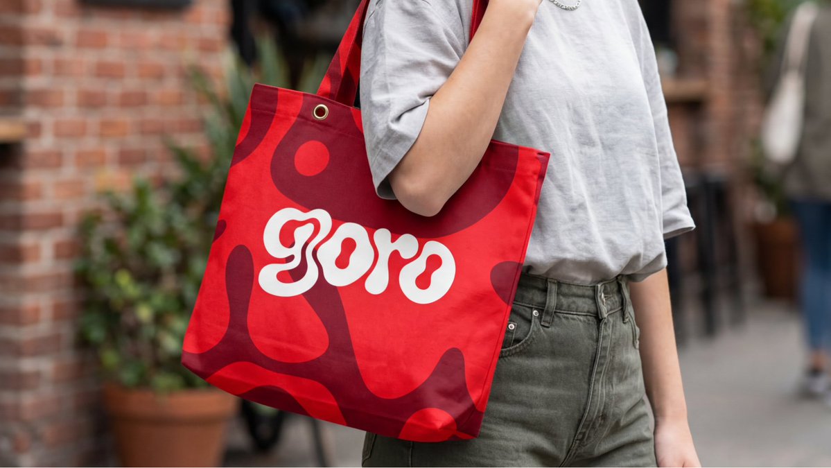
Credo | Graphic Designer

1.5K posts

Credo | Graphic Designer

Credo | Graphic Designer

@Credo_Designn

Creative Genius | I help brands stand out and sell more through creative, strategic visuals. ➡️ Work with me 📩 https://t.co/2WuJyTDSgm

Katılım Mart 2023
197 Takip Edilen185 Takipçiler
OLOBA THE ARTIST
OLOBA THE ARTIST@IamOloba_·
While I was trying to wrap up my final clearance yesterday, my phone kept buzzing non-stop with notifications. I had to stop and check Mehn it was coming from LinkedIn! @mandydesignsng’s effect was going on… didn’t know when I shouted in public, the happiness and all… Ngl I was super happy… you know when you at that point when you feel you in the void., as if you aren’t seen and suddenly some significant persons pat your back saying ‘I see you and all you do’ That feeling yeah?! That was how I felt! Q1 has really brought me good networks in from hoping on a call with my leader @avstudiosng for free to connecting with the founder of @Aikidotcom @TechnicalBben properly and having lengthy calls to getting a post from my leader @ampliqhq To be seen, known and be known that you good! I really don’t take this networks for granted and I’m really grateful to you all honestly. Happy weekend my loves How is the weekend going 🦾
OLOBA THE ARTIST tweet mediaOLOBA THE ARTIST tweet mediaOLOBA THE ARTIST tweet media
English
14
4
143
2.9K
DR𝟛Y 🎖️💜
@Ddeliveryguy 😂😂😂 It's so bad to the extent you'll hear something like "Remodel designs that you copy" As if the brain has lost its function to generate ideas. Must "COPY" be a thing?
English
1
0
1
77
0xvittorio.eth
0xvittorio.eth@Ddeliveryguy·
“ I don see this design for Pinterest before“ Nigeria Designers and this mentality, na ghost Dey design the ones wey Dey there ?😂😭. Una go Dey make am Belike say everything is always stolen or Nigerians are not creative enough. SMH
English
7
2
32
766
Sam (TSA) | Static Ads | Email Mkt Designs
Crazy right! I optimised my page, use some keys words when I post my works and voilaaaaaa! All my timeline is filled with contents from eComs brands, designers, UGCs and agencies.
English
2
0
8
160
^
^@omoiiyapupa·
@Credo_Designn God's blessings will henceforth dwell more in your life 🙏
English
1
0
1
6
Credo | Graphic Designer
Credo | Graphic Designer@Credo_Designn·
A lot of learning to do, but currently Nepa is winning me and I honestly don’t like it
English
1
0
2
20
Sandra Kings
Sandra Kings@sandixdesigns·
@Credo_Designn Yes it's important to always give them a maximum number of corrections, it keeps them in check when they know an extra will cost them
English
1
0
1
9
Sandra Kings
Sandra Kings@sandixdesigns·
A client just ran my design through ChatGPT for critique 😭 Designers, we are entering a new era fr. I will share the rejected vs approved versions later 🥺
Sandra Kings tweet media
English
149
7
271
38.8K
Stephy Designs
Stephy Designs@StephanieInii·
It’s Friday! POST YOUR WORK!
Stephy Designs tweet media
English
145
12
370
22.8K
Credo | Graphic Designer
Credo | Graphic Designer@Credo_Designn·
@Finaltoucch I’m the only one yet to experience this, after several optimization from last year. I have bought connects and it has exhausted. I’m tired fr😭. Someone should help me. I’m yet to get a gig on upwork
English
2
0
1
94
Zazzy
Zazzy@zazzygfx·
a friend bet me i couldn't make zobo look like it belongs on a shelf next to coke and pepsi. i took that personally. So i built goro, a canned hibiscus drink brand. here's how i thought about it as a brand designer 🧵 First question i asked myself: why does local packaging look local? it's not the product. zobo is genuinely one of the best drinks on the planet. deep red, tart, hibiscus-forward, spiced with ginger and cloves. the packaging just never matched that. So the brief i gave myself: build a brand that could hold its own on a premium shelf anywhere. lagos. london. new york. no asterisk. The logo came first. i built around a fluid organic "g" mark, a bold blob letterform that mirrors hibiscus petals. soft, rounded, grown not manufactured. i posted two directions here and you all voted. the open airy version won and honestly the people were right. Lesson: your audience is a free focus group. use them. Colour system was flavour-first. every hex code justified by the ingredient. crimson red for original, amber for ginger & clove, butter yellow for pineapple, sage green for mint & lime. no random choices. For the illustrations i went abstract. fluid blob shapes echoing the logo mark, tonal only, one shade off the background. character without noise. that's the difference between decoration and design. For the case study visuals i used nano banana within flora ai. fridge shots. tote bags. hands clinking cans. all rendered without a single photoshoot. you can now take a packaging concept from die-line to full campaign imagery without leaving your desk. you just need to know how to prompt with intention. Ai didn't design Goro. i did. Ai just helped me show it to the world. tagline: "taste the bloom" two words. botanical. experiential. works everywhere. zobo is not a local drink. it's a world-class drink that's been waiting for a world-class identity. full visual on my instagram - @zazzygfx
Zazzy tweet mediaZazzy tweet mediaZazzy tweet mediaZazzy tweet media
Zazzy@zazzygfx

been staring at these two for 30 minutes and i still can't pick like… they're the same but they're NOT the same?? Left feels more open and airy. Right feels tighter and more confident. This is for a canned zobo( hibiscus drink) brand btw. Which one are you reaching for off the shelf?

English
106
159
1.5K
150.8K
Noah | Brand Designer
Noah | Brand Designer@amixaura·
Bad News 😔... Today was supposed to be my New PC unveiling day for you guys. But unfortunately, I was robbed of that same PC while heading home along banex area. N500k gone. But I thank God my life is still active. Seems like a planned work. The terrible event happened on Monday Eve.
English
418
41
1K
55.2K