I figured I should also share my take on a logo redesign for Nokia. Incorporated some design elements from their new logo, but mostly it's an homage to the classic.
Old My concept
I think its important to examine projects like these and ask yourself why you think something works or doesn't. As a creative I can respect the work that went behind this. But obviously there's place for criticism as long as its pointed in the right direction!
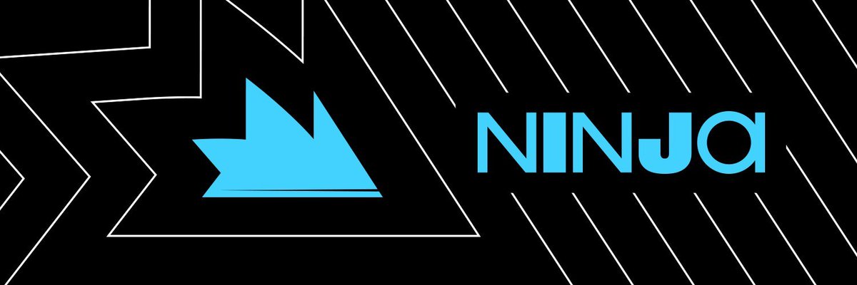
Last thing I'll mention is the odd choice in colors. The almost unsettling cyan color paired with a pure black is honestly the most baffling part about this. Couldn't be less welcoming if you tried.
@VahlkorTV I could only speculate what the intent was behind it but unfortunately I don't think much thought went behind the design.
It has a certain lack of direction that's concerning to see in branding for someone as huge as Ninja. 😰