
Greg Harbour
2.6K posts
Presenting a solution as a suggestion makes even the greatest idea appear not good enough.
English
@l_kutnjak20952 @leeclowsbeard 💯Often having all the impact comes with none of the credit
English

I have actually done this on purpose. If you present an idea or a solution as a suggestion, like you're the weak aspect, and if it's actually the solution or a great idea, someone just might tweak it just enough to claim it, and suddenly it moves forward. And then it becomes more than good enough.
Old-school Creative Directors called it setting “phone poles.” You give people something to react to, shape, or even “steal,” and before long the work gets approved because someone will end up thinking they came up with it.
No tricks. Just human nature taking a course. And nobody gets hurt. :)
English
@leeclowsbeard Don’t look to capitalism for a participation trophy
English
If how you made it is the point, what you made is probably pointless.
English
@leeclowsbeard Matters less where the buck stops than that they’ve stopped
English
All brand wounds are self-inflicted, and shifting blame won’t stop the bleeding.
English
@leeclowsbeard Here’s what you asked for *and* here’s what we came up with, covers what they think they’re paying you for and what they need if they’re to continue to pay you
English
Should we think outside the box or stick to the brief? Maybe and maybe.
English


@leeclowsbeard 😅 Also DOA if it’s not true to their org culture
English
If your messaging matrix needs a tour guide, you’ve actually built a mausoleum.
English
If you don’t know what you’re doing, how are you going to know if the thing that’s doing it for you is doing it well? Even the fanciest tool can only cloak incompetence for so long.
English
The secret to managing client expectations is to detail and defend what’s expected of them.
English
@leeclowsbeard Knowing if it’s incompetence or politics will help
English
People who don’t know what they’re doing insisting people who do know what they’re doing actually don’t know what they’re doing hasn’t done the industry any favors.
English

@leeclowsbeard Free land grab if you’re prepared to pay to build on it
English
It doesn’t matter if someone else could say it if no one actually is. It barely matters if everyone is saying it if no one says it well. When you know what you’re doing, you can do what you want.
English
@paulg @gibarilla @Mahmut_Jomaa Checked with my barber if I needed a haircut and imagine my surprise
English
@gibarilla @Mahmut_Jomaa After we'd been in England for several years, I asked the people who do our taxes to check, and they told me that I actually saved money by moving to England. That's how high California state taxes are already.
English
Larry Page is gone. He wasn't just pretending to move to Florida. He has moved. The proposed wealth tax hasn't even passed, and already it has cost California both Larry's presence and all the tax revenue it made from him.
English

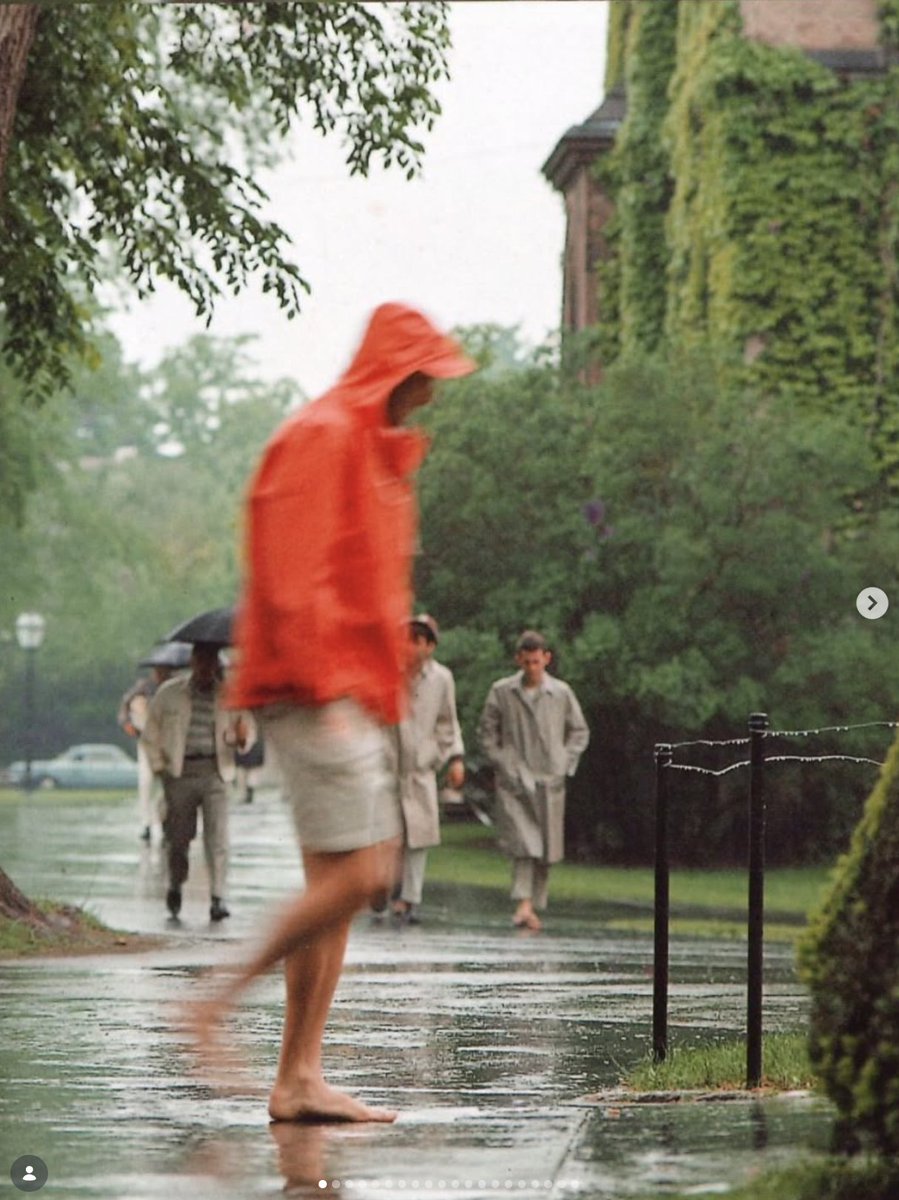
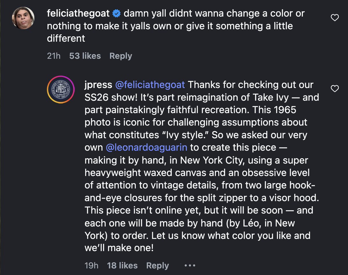
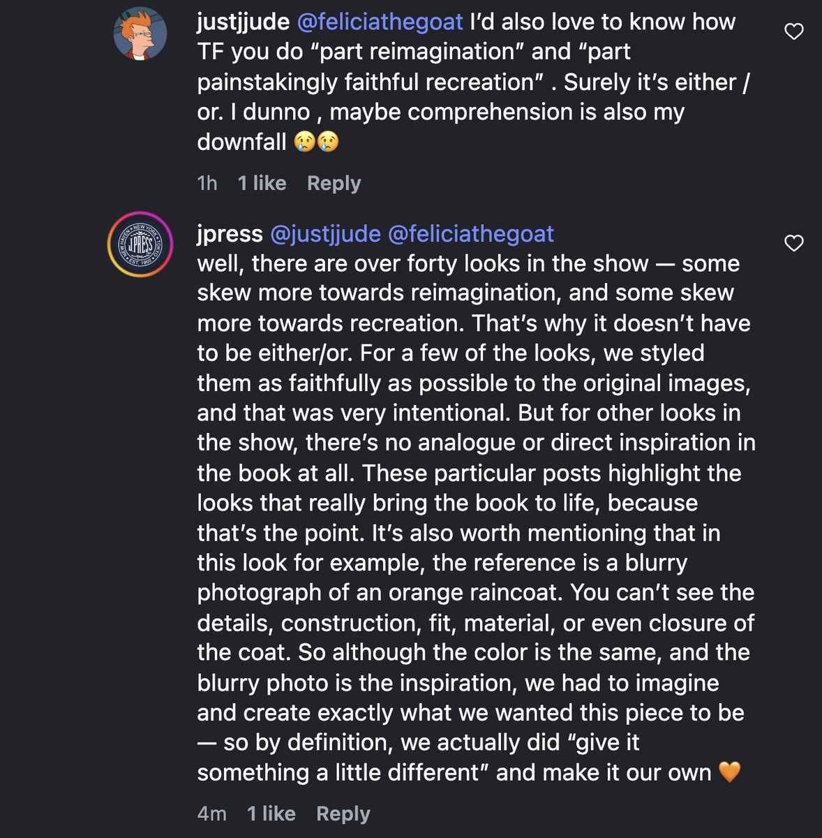
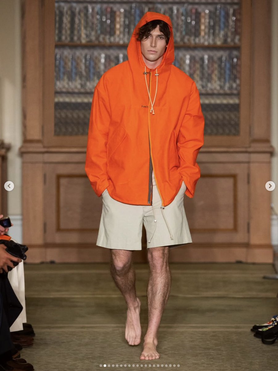
@rfkenmore Seems like valid criticism to me. It’s wholesale copying of the outfits in those pictures.
English

They're coming for J Press in the IG comments
Led by... Tyler, The Creator? 😭
English
Hey Yves Klein’s patent attorneys: what’s the bounty for this one
naz 🪷@tiramissu027
Went on a walk to the beach and the sky was so blue :)
English
With an illustrator/animator bg, color was part of my design moat, which just got a bit narrower. Cool, thoughtful feature which I doubt would get a look-in elsewhere.
charlota@0xCharlota
Stop using pure black. Many designers default to #000000 without thinking. It's making their work look flat. Pure black doesn't exist in nature. Shadows aren't black, they're dark versions of the colors around them. The darkest corner of a terracotta room is a deep desaturated brown. A shadow on snow is navy. When you tint your blacks, everything suddenly feels like it belongs together. your app, your business cards, your slide decks, your social templates. A real brand system doesn't have black and colors. It can have a tinted black, derived from the same DNA as everything else. The trick is simple: take your brand's dominant color, push it to near-zero lightness and low saturation. That's your darkest tone now. I built an interactive tool in @Framer (with their AI Workshop tool it took me just a few prompts) to show you exactly what I mean. Pick any brand color and it'll generate your custom black derived from it. Try it and you'll never reach for #000000 again. (Framer remix link below 👇)
English
@0xCharlota Old design dog craft being built into platforms is gonna make me up my game isn’t it
English

Stop using pure black.
Many designers default to #000000 without thinking.
It's making their work look flat.
Pure black doesn't exist in nature. Shadows aren't black, they're dark versions of the colors around them. The darkest corner of a terracotta room is a deep desaturated brown.
A shadow on snow is navy.
When you tint your blacks, everything suddenly feels like it belongs together. your app, your business cards, your slide decks, your social templates.
A real brand system doesn't have black and colors. It can have a tinted black, derived from the same DNA as everything else.
The trick is simple: take your brand's dominant color, push it to near-zero lightness and low saturation. That's your darkest tone now.
I built an interactive tool in @Framer (with their AI Workshop tool it took me just a few prompts) to show you exactly what I mean.
Pick any brand color and it'll generate your custom black derived from it. Try it and you'll never reach for #000000 again.
(Framer remix link below 👇)
English
What the client says always carries weight, but it should never become an anchor.
English
You can easily spot marketers who believe the creative work doesn’t impact results by their enthusiasm for tools that automate making work that doesn’t impact anyone. If only it were as easy to avoid them.
English
Stop framing your third concept as the “wild and crazy” one. An idea is either on-brand and on-strategy or it’s not.
English