Just published on APSR First View: “Policy Impact and Voter Mobilization: Evidence from Farmers’ Trade War Experiences”, by Jake Alton Jares and Neil Malhotra. cambridge.org/core/journals/…
Jake Jares
333 posts

@JakeJares
Assistant Prof of Political Science @TAMU. US political economy & ag policy. Trying to follow Jesus, work in progress.

Just published on APSR First View: “Policy Impact and Voter Mobilization: Evidence from Farmers’ Trade War Experiences”, by Jake Alton Jares and Neil Malhotra. cambridge.org/core/journals/…


Why does anyone care about Stiglitz ? Explain without jargon ? he seems like a massive midwit leftist who's just wrong about everything


Take your age. Do 73.8 - age. That’s how much you have left statistically.


Seattle has one of the worst housing crises in the country. I see it every time I’m home in my district. People working full-time jobs who can’t afford rent. Teachers, nurses, and transit workers who can’t live in the city they serve. Families on housing assistance waiting lists that have been frozen for years. This is a policy failure, not an inevitability. We built this crisis by choosing developers over people. We can choose differently. Housing is a human right. We fight for it like one.

Some of us just dodged the pissing match about randomized trials versus macro development because we believe the marginal returns to research in both areas are pretty high


How partisan is voting in US local elections? Our new preprint covering everything from state legislature down to hundreds of school board and local referendums: osf.io/preprints/osf/…


My graduate student Patrick Crawford introduced me to "partial residual plots" as a tool for showing relationships. Its so simple in elegance. The partial residual plot below shows the conditional relationship between newspaper competition and rebellion after controlling for everything else. On the x-axis is market concentration (HHI: higher = fewer newspapers), and on the y-axis is the residualized level of rebellious activity. Basically, the entire logic of the graph is for visualization. The regression has already controlled for other variables. What remains is the variation in rebellion intensity (depvar) attributable to the independent variable of interest. "Centered" just means both axes are normalized so that 0 corresponds to the sample mean. Positive values imply more rebellion than average (conditional on controls) (and vice-versa). Now, its not exactly a new estimation method per se. But it does allow for a nice visualization of results that I had not seen and may even allow you to play with different functional forms with the residuals. I know we should not care about "does it look cute" but I disagree with that sort of. I mean, at one point, we have to convince and convincing is really about cutting on inputs needed to (honestly) push a person from disbelief to acquiescence. That graph below is cutting down on inputs.

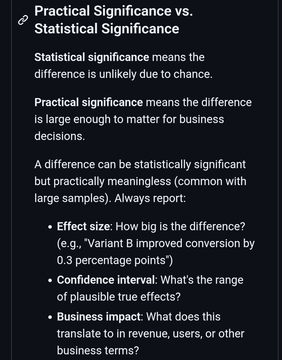
This, from a guest @stuartbuck1 substack post on institutional review boards, is really spot on


Profoundly Moving. Start to Finish. Thank You @BenSasse for Your Personal Courage and Showing What it Means to Love Your Family and Love God🙏🏻