
Jan Erlend Austevik
581 posts


Om Arsenal-spillerne får ekstra nerver av å se disse matchene her i kveld? Svaret er Ja på det, svaret er Ja
Norsk


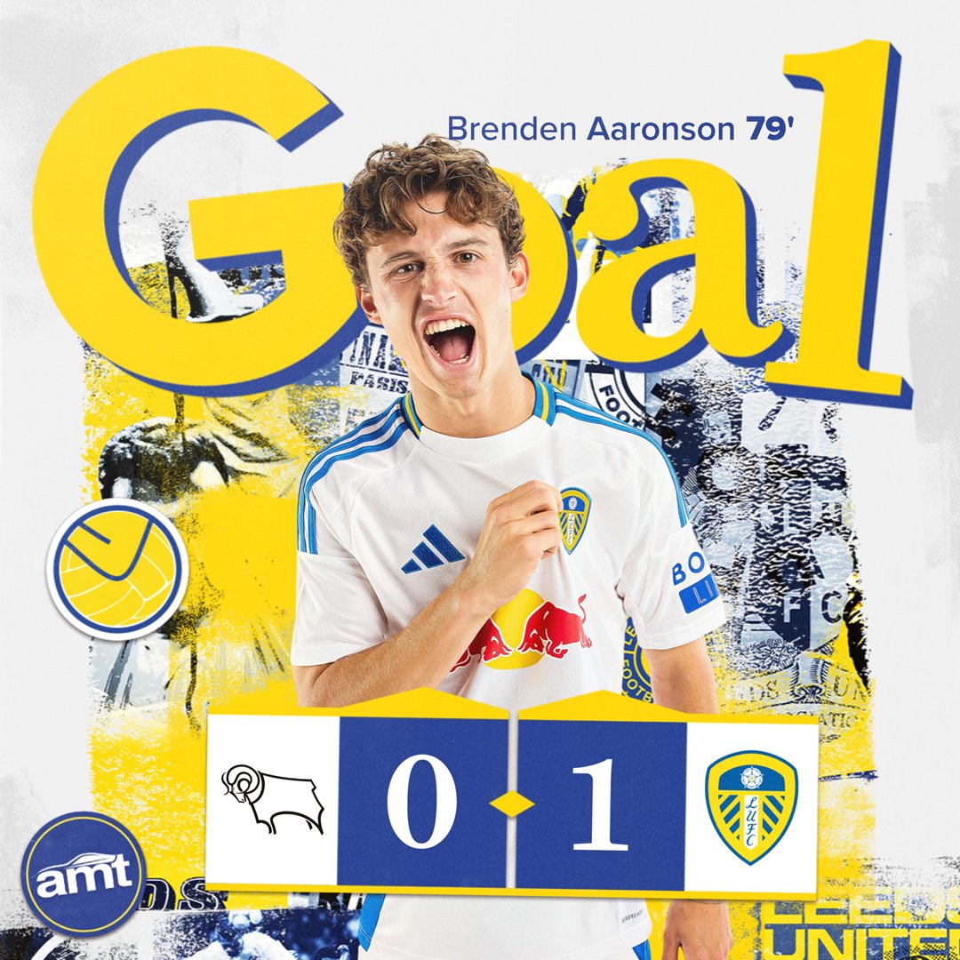
GGGGGGGGGGGGOOOOOOOAAAAAALLLLLL!!!!! BREEEEEEEEEEENNNNNNDDDDEEEEENNNNNNN!!!!
Nederlands

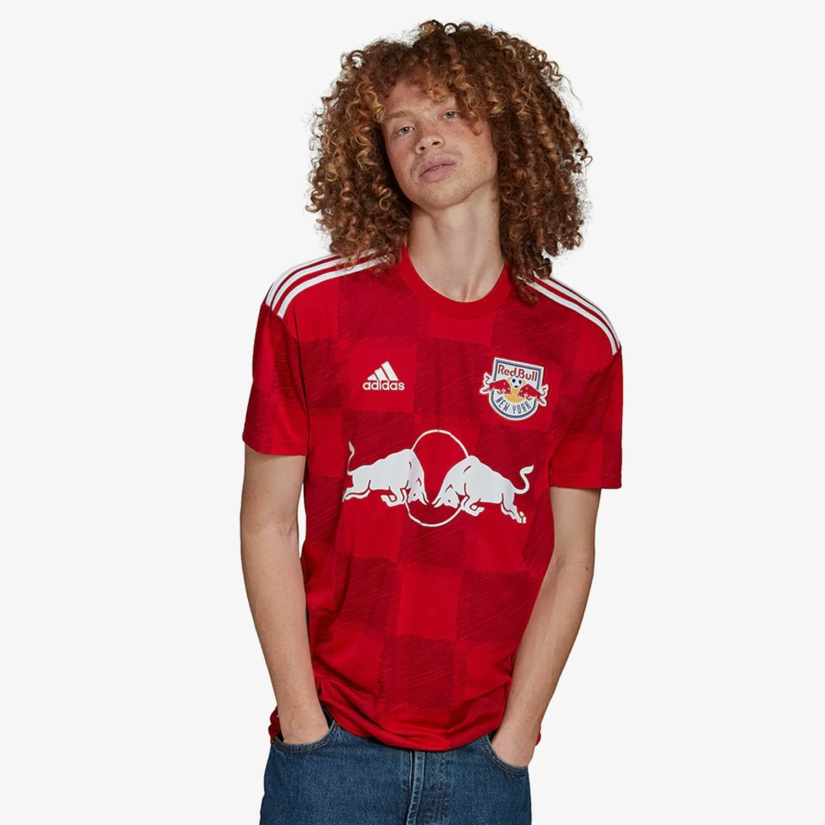
It looks very cheap, the logo is too high, the colours clash and the swooshes remind me of the tacky Diadora era shirts.
After knocking it out of the park last season, it's a letdown for me.
Craig Reid@jockreid66
@TSSLUFC Go on then, I'll ask... what's so bad... if you say RED ......
English
English

@JanEAustevik @lufc1919ER @FootyHeadIines Yep and it labels them as concepts, and list the colour of the 3rd Lilac and ink.
English


@Michael_TSB This is our last years sponsors logo, they did not jused their original color, so it can be done….

English

They had options, is all I'm saying. The brand guidelines allow it.


English
We will be back. Gutted to end it like that but massive thank you for all your support this season👏🏽👏🏽 See you next season 💙💛

English
@LUFC_WorldWide Thats a really big pressure to put on someone that young to keep bailing out a poor team preformance time after time
English

Rutter been off it since surgery. Hasn’t been bringing anything to the table since. There’s been countless times this season where he’s played poorly and managed to get an assist that wins us the game. Just isn’t happening.
English
Summerville & Rutter way off it yesterday
When they don’t bail Leeds and the manager out, not many others can
And the one that could yesterday, Gnonto, was taken off at 0-0
English
Jan Erlend Austevik retweetledi

If you’re suffering from depression and are looking for a sign to not go through with ending your life, this is it. This is the sign. We care.
If you see this on your Twitter, retweet it. You could save a life..
English


Strong.
Gotta feel for Ampadu. Poor lad will never get a rest 😂
Leeds United@LUFC
📋 Your #LUFC Starting XI...
English
If this is it….. Thanks for the great memories and everything you done for #lufc moderndaylegend and a great ambassador for @LUFC @lukeayling_8!
ً@Cosm1cz
English
What would you do with this Leeds United squad in January?
An extra left-back would seem sensible but as it stands, the line-up’s picking itself, results are impressive and certain good players are struggling for minutes.
Stick or twist? ⬇️
theathletic.com/5124185/2023/1…
English