Sabitlenmiş Tweet
Lk Gupta
22.4K posts

Lk Gupta
@Lk_Gupta
Artist 🎨 https://t.co/sNHv59LV8A Musician 🎶 https://t.co/wWqnYdPkZL
Katılım Ekim 2009
647 Takip Edilen2.9K Takipçiler

Lk Gupta retweetledi

Lk Gupta retweetledi

Lk Gupta retweetledi

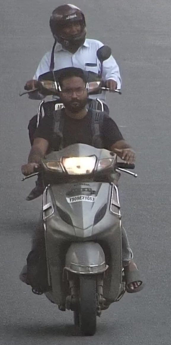
Dear @HYDTP @hydcitypolice
My vehicle was stolen 3 months ago, and an FIR has already been registered at Habeeb Nagar Police Station.
Today, I received a traffic challan for the same vehicle, and the image clearly shows the thief’s face
I kindly request you to look into this
English
Lk Gupta retweetledi

This painting is known as the Prado Mona Lisa, a near identical version of the famous Mona Lisa. It was created in early 16th Century by a student working in the workshop of Leonardo da Vinci, likely alongside the master himself.
For centuries, the Prado version was overlooked, covered by a dark background that hid its true significance. But during restoration work in 2012 at the Museo del Prado, conservators removed the overpaint and revealed a landscape nearly identical to the original.
That discovery confirmed it was painted at the same time as the Mona Lisa, not copied later.
What makes it so valuable is its condition.
The Prado version has suffered less aging and varnish distortion, meaning details like the eyebrows, facial contours, and background colors appear clearer than in the Louvre’s version.
It gives historians a rare look at how the Mona Lisa may have originally appeared over 500 years ago.
Infrared analysis showed that both paintings share nearly identical underdrawings and corrections, suggesting the student was working side by side with da Vinci, following his process stroke by stroke as the original was being created.
#archaeohistories

English
Lk Gupta retweetledi

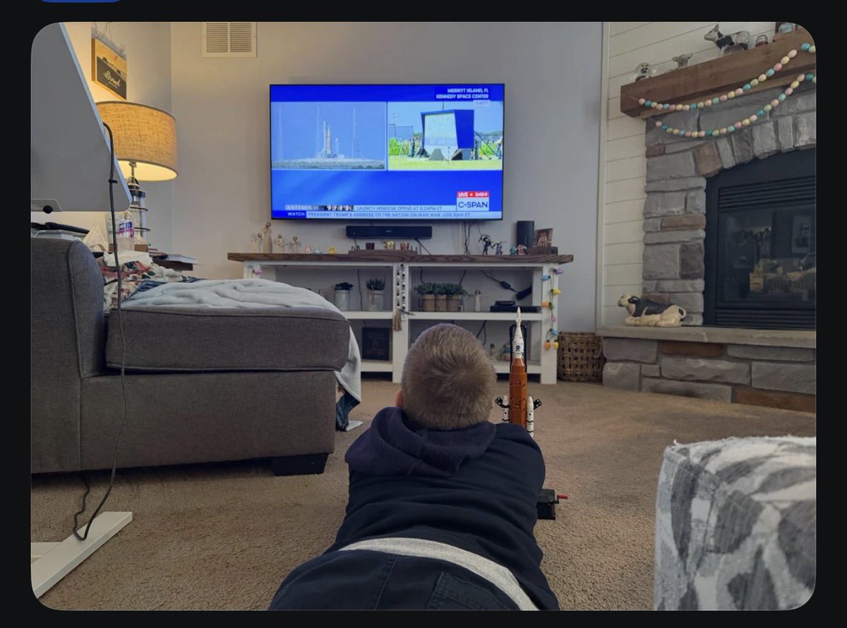
It is not by chance that Americans are going to moon and our country is struggling to find enough kids interested in college education.
While they are on the mission to make colonies on Mars, we are discussing if 9172893th version of Ramayana was made right or not?
The toys tell the difference about societies. Primitive toys-primitive cultures.
Simple toys- simple minds (not a compliment).
Keeping all that in mind, look at these 4 pictures. A kid is eagerly watching launch of Artemis II with his new Artemis Lego set which he just made himself. You can imagine the kid’s curiosity. It is as if he made that space mission possible for his country. His father is having a proud moment.
Lego launched 2 specific sets for this new space adventure. Amazingly well detailed and kinda explains the amount of engineering it takes to make such spaceships & rockets.
Please! Please, get lego sets for your growing kids. You might end up giving them a drive for their lives.
Superpowers are not made by divine blessings. You gotta make kids capable of creative thinking first.


English
Lk Gupta retweetledi

Lk Gupta retweetledi

@joybhattacharj Just saw this superb explanation of this Pic. Must read. And download.
x.com/i/status/20404…
Javier de la Cuadra@JavierDlacuadra
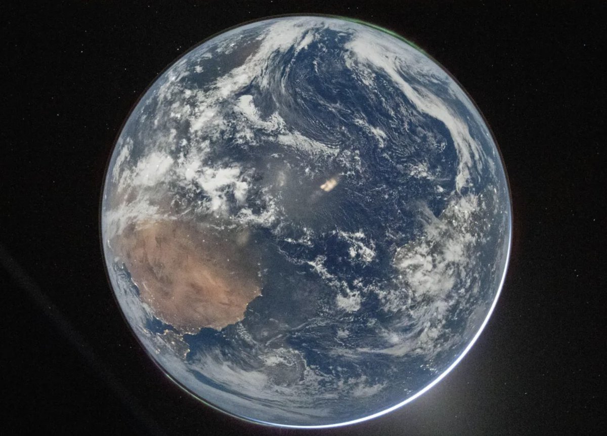
Ahora sí hablemos en serio de la foto. Este es un trino para interesados en fotografía, astrofotografía y el que quiera ¿Por qué esta foto es increíble? Algún conspiranóico, dándoselas de suspicaz, preguntó que por qué esta foto tomada por el comandante del Artemis II se veía más opaca que la foto tomada por la tripulación del Apolo 17 en 1972. Bueno. Acá viene lo emocionante. Esta fotografía hubiera sido imposible tomarla con una cámara análoga; y no cualquier cámara digital puede tomarla. El archivo original de esta foto está disponible para su descarga en la página de la NASA. En las propiedades del archivo se puede ver con qué cámara fue tomada y los ajustes de exposición que se usaron. Hasta el serial de la cámara. Esto, primero que todo, garantiza que la foto que estamos viendo no fue creada digitalmente, ni con IA, sino capturada por una cámara real por un humano. Sé que no es suficiente argumento para los conspiranóicos, pero ni modos. Esa que está ahí es la Tierra. Ahora sí lo interesante. ¿Por qué se ve como más opaca que la del 72? porque resulta que en la cara de la tierra que vemos en esa foto, está de noche; si hacen zoom pueden ver el brillo de la iluminación nocturna. Pero ¿cómo, si es de noche, puede verse como si fuera de día? Porque la foto se hizo con un altísimo ISO de 51200! El ISO es la sensibilidad del sensor a la luz. Con la mayoría de cámaras digitales, con ISOs de más de 6400, el ruido es tanto que la foto se ve prácticamente ilegible. Pero la cámara que tiene el comandante Reid Wiseman es una NIKON D5, que no es una cámara muy nueva; tiene 10 años de haber sido lanzada. Pero su sensor es reconocido por garantizar una calidad decente de imagen con ISOs altos. Y eso, para los que siempre preguntan cómo se hace una buena foto del cielo, es fundamental ¿Por qué? Pues para poder tomar fotos de los astros sin tener que bajar mucho la velocidad de exposición. Porque si bajas mucho la exposición apra que entre más luz, queda capturado el movimiento de los astros y de la rotación de la Tierra, cuando estás en la Tierra. Así que un iSO tan alto hizo posible que Wiserman pudiera disparar a una velocidad de 1/4 de segundo. Que es baja, pero no tanto. Es digamos, el límite para la astrofotografía. Por eso esta foto tiene ruido, porque de todas formas es un ISO altísimo. Pero lo que más me emociona a mí, es que la tomó con un lente 14 -24mm F2.8. Es decir, en terminos coloquiales, que esta foto no tiene zoom. Para que lo dimensionen: cuando uno quiere tomar una foto de la Luna desde la Tierra que salga así de "cerca" tiene que usar un lente de unos 400mm de distancia focal. Wiserman usó un ¡gran angular de 22mm! Es decir que él estaba viendo la Tierra asi de grande frente a sus ojos. Porque la foto no fue recortada en edición y eso lo sabemos porque en las propiedades del archivo siempre aparece cuando una foto fue editada. El archivo está limpio, tiene la resolución original de la cámara. La tierra era inmensa frente a su mirada. Hermoso. Pero para mí lo más mágico de esta foto, incluso más que las auroras boreales, es que se ve como la luz de sol, que está del otro lado de la tierra, ilumina nuestra atmosfera. Y eso es magia pura, porque esa atmosfera tiene una composición milimétricamente perfecta para permitir que la vida, tal y como la conocemos, sea posible. Esta foto, es un regalo precioso para la humanidad. Les dejo al link para que descarguen la foto en alta resolución y el pantallazo de las propuedades del archivo.
English

NASA just released a stunning picture of earth taken by the Artemis astronauts. And someone said it was our latest group photo.
It was, all of us, that's all of us other than the 4 in Artemis and 10 in the International Space Station. Iranians and Americans, Arabs and Jews, mothers and daughters, dog lovers and cat fanciers. Musicians and mechanics, microbiologists and merchandisers...
That's all we have together.
English

@joybhattacharj @TweetinderKaul This is #Apollo17 image that's posted by @NASA .
Explain why the image quality is better than the current #Artemis2 image.
@isro @ISROSight
Why can't NASA after 50+yrs still can't post a better and clear image from their space missions?

English
Lk Gupta retweetledi


Lk Gupta retweetledi

Lk Gupta retweetledi

me trying to find the HDMI port on my TV
arman@SURVlVALHORROR
this is one of the best posters i’ve seen in a very long time btw
English
Lk Gupta retweetledi

Ever wondered why North is at the top of our maps?
If you're assuming there are logical, scientific, Nature-driven reasons for it - yeah, me too.
In fact, they're often whimsical, arbitrary or just plain ridiculous.
Hold onto your hat. This may turn your world upside-down.
1/
English
Lk Gupta retweetledi

Some days you can’t love social media enough. This is one of those days. It began like this. Someone stole 12 tons of KitKats.
And then the replies started coming in. Scroll down.

English
Lk Gupta retweetledi

Lk Gupta retweetledi

We analysed 3.4 million cricket deliveries across every men's international since 2001. The advantage of left-right batting partnerships? Precisely zero.
The raw data seem to confirm the myth: mixed partnerships outscore right-right pairs. But the ordering is LL > LR > RR. More left-handers = higher score. It is left-hander quality, not hand diversity, doing the work.
With the IPL starting this week, coaches are still engineering left-right balance in batting orders. The evidence says: pick the best batsman. Ignore the hand.

English
Lk Gupta retweetledi

Sir please change your name to Shubhash Gh you are not ready for AI 🙏
Subhash Ghai@SubhashGhai1
CANT BELIEVE IT 🧐 My friend sent me this amazing sand picture made by our famous SAND ARTISTE Sudarshan Patnaik a Padma Shree recipient and the best sand artist known in India from puri with such perfection and affection. 💝 Thank u🙏🏽 sudhershan ji. Stay blessed always 🙏🏽
English
Lk Gupta retweetledi

If your autorickshaw driver is wearing white they own the vehicle and if they are wearing khakhi they rent the vehicle. This tiny factoid has massive impact on your auto hailing sucess rate.
Mumbai Heritage@mumbaiheritage
Hit me with the craziest Mumbai history facts you know.
English
Lk Gupta retweetledi

WORTH THE WATCH:
his name is Azeem Banatwalla and this is one of the most creative and hilarious comedy bits you will ever hear. someone's definitely going to try and replicate it. 😭
English
Lk Gupta retweetledi

Watch this new ad first (agency: Talented). Then read the perspective below.
...
...
...
...
...
...
...
...
The best uses of s****l innuendo or taboo references in advertising work because the product or the category earns the reference. A c***om ad using double entendre is doing thematic work. A men's underwear ad deploying the female gaze is commenting on the product's relationship to the body and desire. The risqué element and the product/category are in the same universe in terms of context and meaning.
Here, the O***F**s reference is pure bait-and-switch. The "joke" is entirely in the gap between what you feared the ad was about and what it actually sells. Once the laugh lands, the fan has zero relationship to s****lity, desire, money, or anything O***F**s actually connotes. The category is just... there.
This is sometimes called borrowed interest in advertising... using an emotionally charged idea that has nothing to do with your product to generate attention. It can work, but it's considered a crutch by serious creative standards, because the memorability attaches to the hook, not the brand. People tend to remember it as, "that O***F**s wala ad".
There's a specific sensibility at work here: the ironic, terminally-online, "lol imagine if your mom heard the word O***F**s" energy. That is very native to a particular demographic. For that demographic, the reference lands as culturally fluent and funny. But it assumes that O***F**s sits in the same semi-taboo, widely-understood cultural space for a 45-year-old homemaker in Indore as it does for a 24-year-old copywriter in Bangalore. That's a significant assumption and a stretch.
Worse, the ad arguably needs the older generation's confusion to function. The joke only works if Mummy-Papa-Daadu don't know what O***F**s is. Which means the creative is laughing at a gap in cultural knowledge rather than finding something universally true about the product, the category, or the audience. That's a very, very thin foundation.
Of course, Flipkart's actual goal with these ads may not be deep brand-building at all, particularly since it is not selling the Flipkart brand here but merely selling a 'sales' promo for air conditioners (all brands). The goal might simply be virality and search traffic around the sale period. By that narrow metric, the O***F**s hook works perfectly regardless of product or brand or category fit. The disconnect almost doesn't matter if the goal is just "get clicked and shared".
But that's a tactical win at the cost of craft, and at the cost of the brand. A more disciplined creative team would have asked "why does this product deserve this reference?" before signing off. The fact that no good answer exists (except, in an utterly juvenile way, "we are selling beyond fans, and the word has 'fans') suggests the reference came first and the category was fitted to it after... which is usually how mediocre advertising gets made.
#advertising #marketing
English