@signulll The best designers will do this naturally, and the best product managers will be able to communicate a vision and bring people with them. But separating ideas from execution is always a good idea
English
Luke Woodhouse
307 posts

@Luke_W_
Executive Creative Director @Ragged_Edge


Just checked Jony Ive’s design firm LoveFrom and the landing page is so confusing. It’s only a 30-second animation of a bear walking on a logo. No e-mail capture, about page, pricing or CTA button. How will clients know the offering or how much it costs or how to contact Jony?

Introducing the new Faces. Interactive presentations that help entrepreneurs break through the static. If a website can do it, so now can your decks. Each slide is a software artifact, built for storytelling. Where others simply make deck-building faster or prettier, Faces are new interfaces for your idea, in its full glory.


New look. Same notepad.

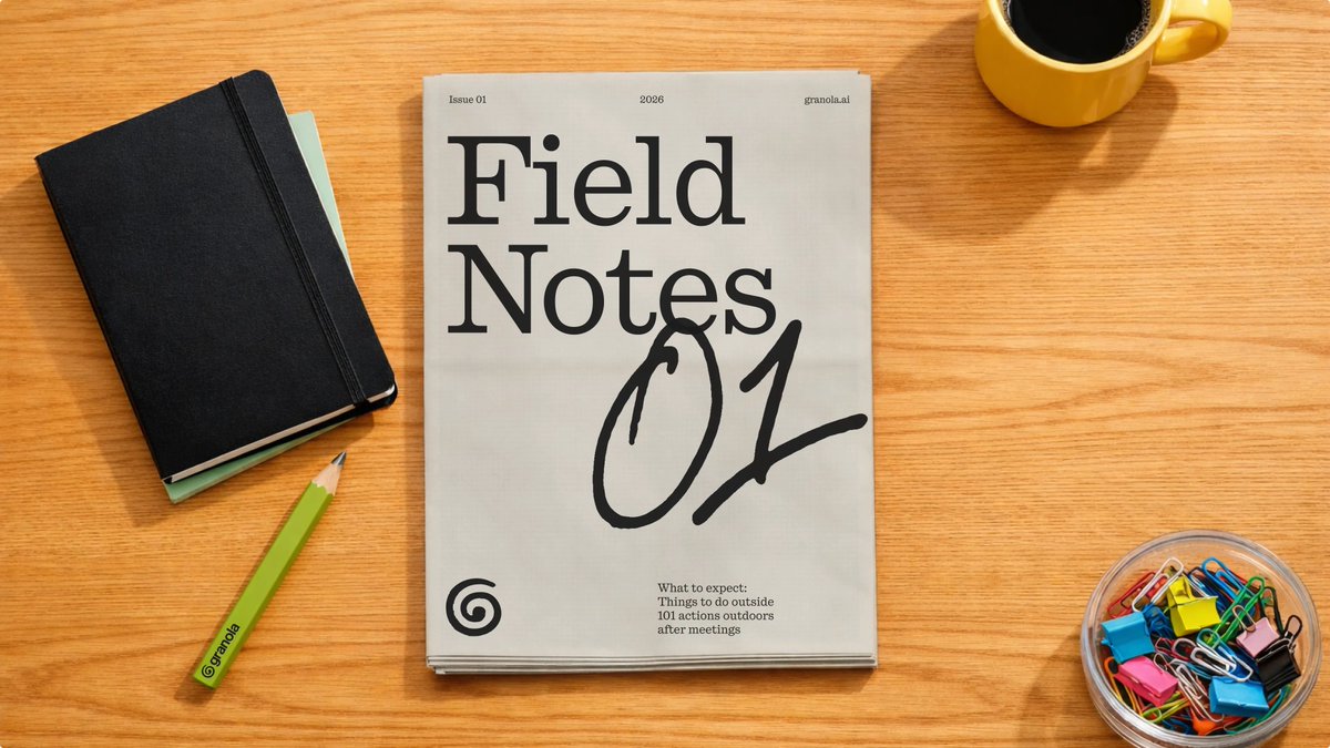
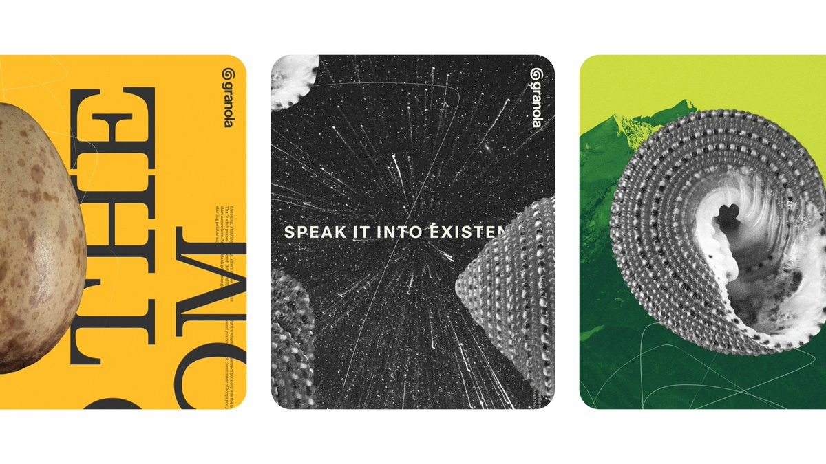
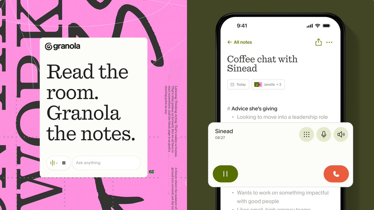
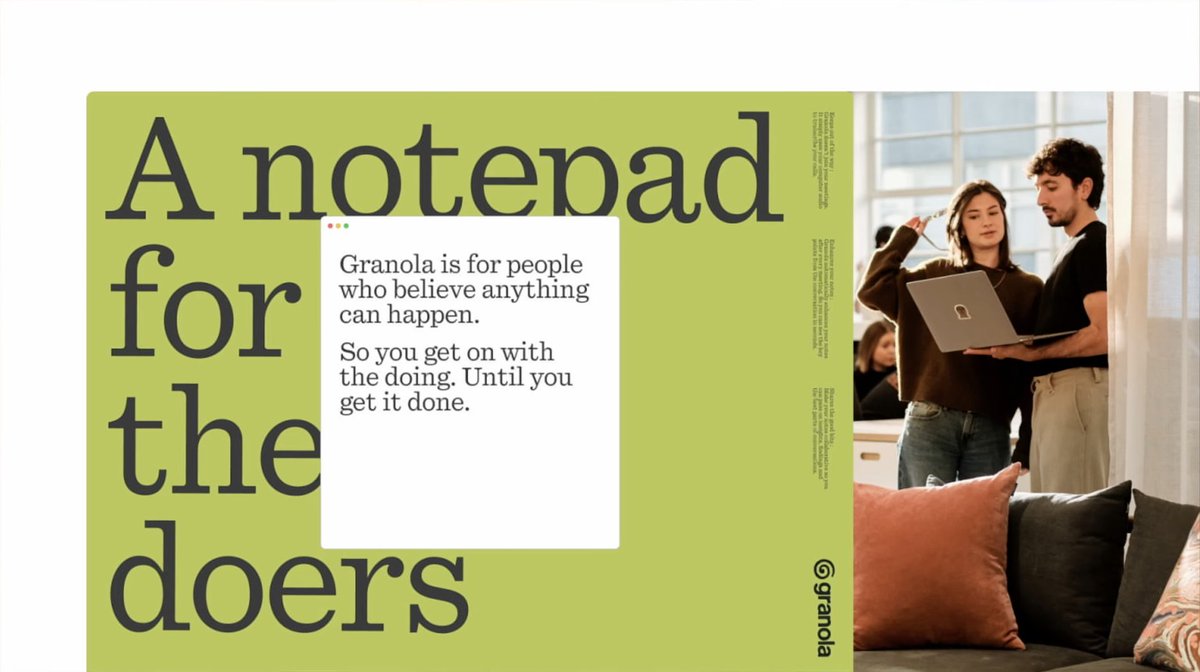
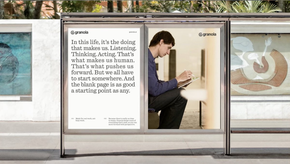
A first look at our new identity and campaign for @meetgranola the AI notepad that helps you get the doing done. A brand for people who care more about progress than process. Made for humans by humans. Some of it’s out in the world already. And some of it’s still in progress.


New look. Same notepad.