Sabitlenmiş Tweet

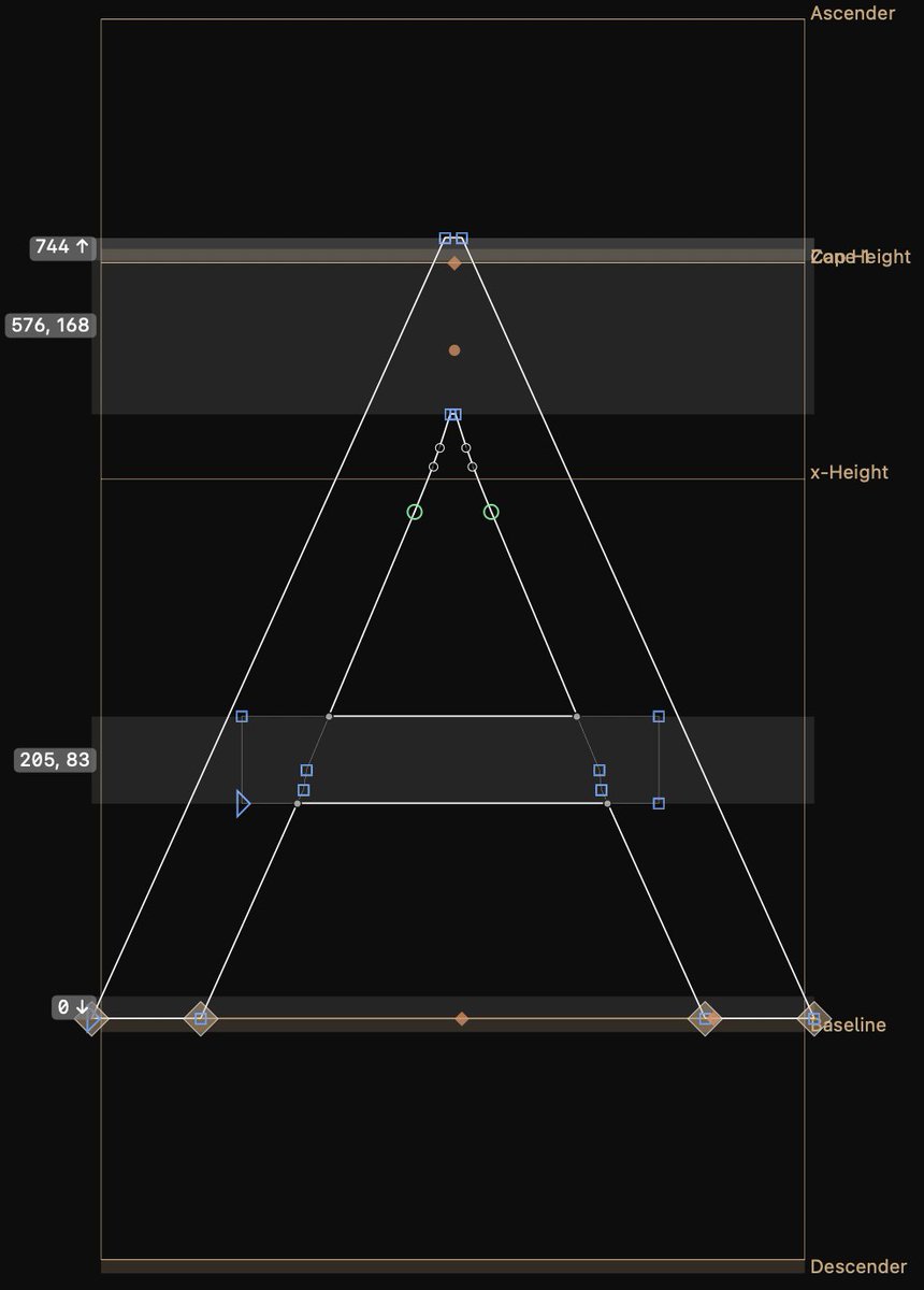
Open source font update 1.5, and a @calcom font mini-site to celebrate!
Thanks to @peer_rich, @meewgumi for @Framer development, @tmthyluke for concepting
Brooklyn, NY 🇺🇸 English
Mark Davis
12.3K posts
@MarkFonts
Sexy Fontent.™ Lead font engineer and foundry growth @WELTEKRN. Helped at @Calcom, @BuzzFeed, @FontBureau, @GoogleFonts. Idiot Savant. He/him.

Writing an article on the future UI trends, and made a prototype of plasticity-type button - fully reactive to how hard and WHERE you press it. Our devices are increasingly powerful, yet we go for gimmicks like camera-based-reflections. This is dope! Article drops tonight!


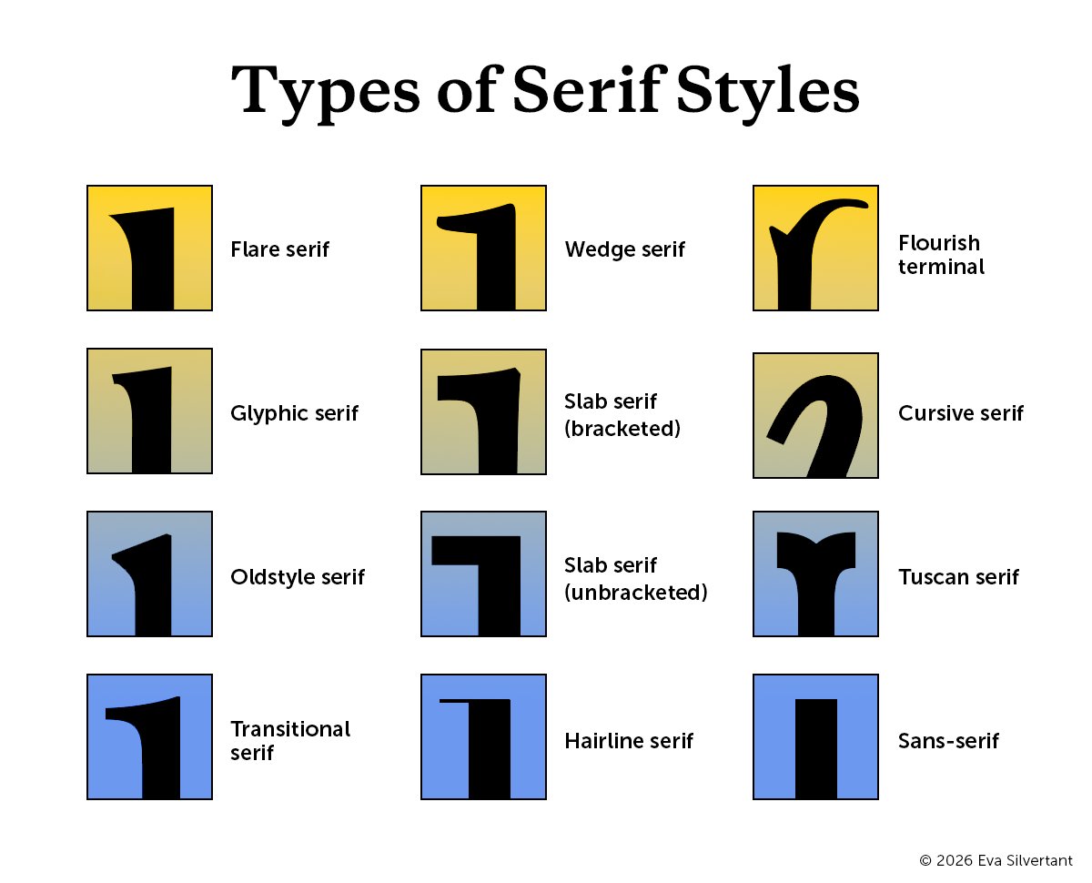
Comecei a ver várias identidades visuais e websites usando uma variação específica de fonte com serifa mas não sabia qual era o estilo dela. Aí fui atrás e achei essa imagem que lista todos eles. E o estilo que eu procurava era: Bracketed Serif. Link do pdf no próximo tweet.


we're hosting something special with the clay design team during config week this year! 🥟 designers who dim sum: june 23, 6–8pm lmk if you'll be around and might be interested in attending. expressing interest doesn't guarantee a spot, but we'll try our best 💕