Sabitlenmiş Tweet
Max | Ecom Email Marketing
12.3K posts
Max | Ecom Email Marketing
@Max_Alexxander
Trusted by Ancestral Supplements, Primal Queen, Marcella NYC // We'll add an extra $50k in 45 days or you don't pay // Book a call for a free Klaviyo audit👇
Katılım Mayıs 2021
2.2K Takip Edilen10.8K Takipçiler

Email Structure
A common problem brands make is sending emails that are basically a wall of text.
The problem with that is that it goes against how most people consume ecom emails.
Most people scan first, then decide what to read more closely.
So emails should be broken into clear sections, such as short blocks, light bullets, or distinct product highlights.
This helps readers quickly understand the message without needing to read everything word for word.
Example:

English

Both ChatGPT and Claude can now directly plug into your Klaviyo account as part of a new update. This means AI can analyze your campaigns, flows, and give you recommendations & insights without you opening your Klaviyo account.
Here is a basic example of what you can do with it: I asked Claude to pull up the past 30 days flows performance.
Obviously you can go a lot deeper with it but the main advantage is that it can easily pull up all your analytics without you having to dig through complicated reports on Klaviyo.

English

President Trump says he will "respect" Joe Biden's pardon of Dr. Anthony Fauci and will no longer challenge its validity.
Trump says he is sure Biden didn't sign Dr. Fauci's pardon, but it would be too difficult to prove.
"The most powerful thing a president has is the power of pardon."
"I can't tell you what the law is. You have to have a lot of proof."
English

This email got sent to me from a women’s jewelry brand.
It’s not terrible but if they implemented what I’m going to show in this post, they could easily 2x the sales from this back in stock campaign.
Here’s the breakdown:
1. Hero image
For visual-heavy brands like jewelry, the hero image is very important.
This hero image isn’t bad but I’d put the header at the top & turn the CTA into a clickable button instead of underlined text.
Would make the button very large (this affects CVR).
I’d also remove the top banner, since it’s redundant with the header. Would also put the logo there so people know which brand they’re looking at.
2. Product categories
In this email they include 5 product categories, with 1 image & a list of up to 14 items per catregory.
This is suboptimal because the majority of people reading the email will not be familiar with the product names and so it will be at best a waste of space & at worst an opportunity to lose their attention and have them drop off.
The better option here is to narrow it down to 3 categories (you can promote the other 2 categories in a separate email) and for each category, include a gif showing the top 3 best sellers from that category.
This makes it a lot more relevant to new shoppers to the store who don’t know the products by name, and it’s a lot easier to promote them via imagery than text.
3. CTA
At the bottom it’s missing a CTA for anyone who reads to the bottom of the email.
I’d include a brief text asking them to shop now before they sell out again (urgency) and include a big CTA button linking to the product page.

English

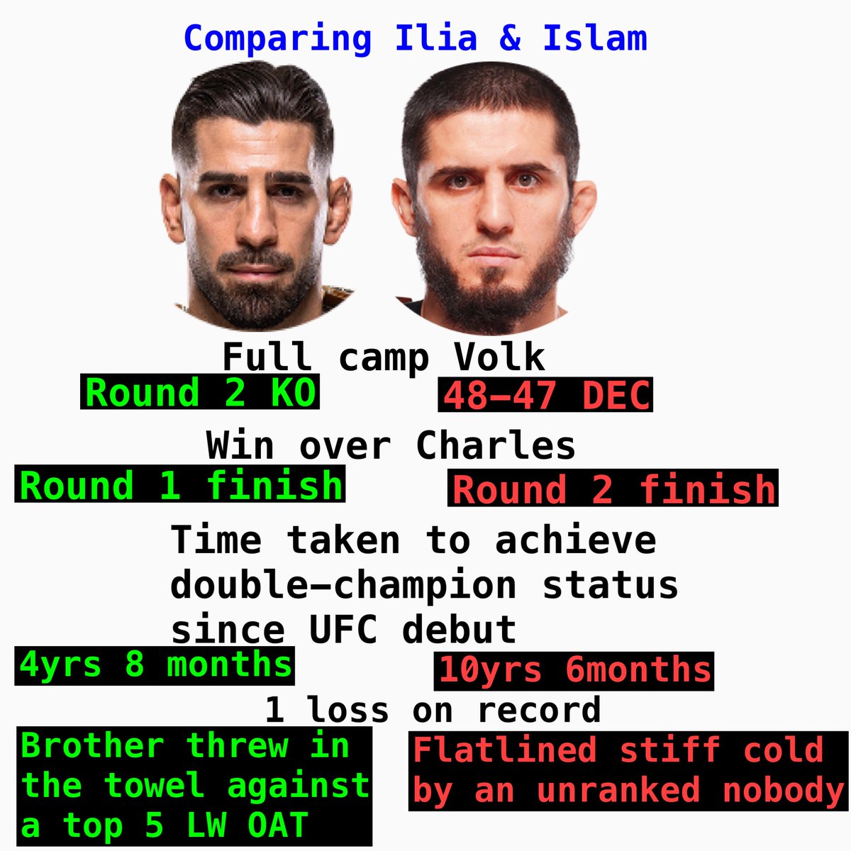
@qpe @HerronNoon That's not what everyone was saying before the Gaethje fight
English

Charles Oliveira says he fought stupid against Ilia Topuria #UFC
Do you want to see Topuria vs Oliveira 2?
English