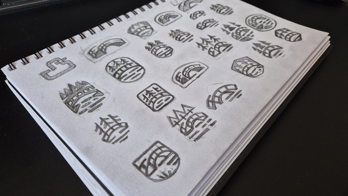
One of many directions I explored for Optiworks, a brand restoring Soviet lenses. My usual instinct is to strip a logo down to a single idea and polish it until nothing else is needed. Here, the opposite happened, and I didn't fight it. Eccentric lens rings, an abstract eye, a craftsman bent over his work. Even the split between black and white reads like a photograph developing on paper. I don't believe a logo needs to do five things at once, but when those readings emerge without effort, I think it's worth noticing rather than editing out.
Designed this logo before the inbox opened. No client, no deck, no rationale to defend. Just a mark, solving itself before coffee. When was the last time you designed something nobody asked for?
This elephant came out of two hours of grid work before breakfast. No brief, no client, no deliverable – just the kind of practice that quietly builds taste over time. In those two hours, no one rounds the corners back out in revisions, no one tells you the trunk is too thick. You sit with the shape until it reads right, and tomorrow you start something else. We've trained ourselves to expect a concept behind every mark, but isn't a fully resolved shape already a concept?
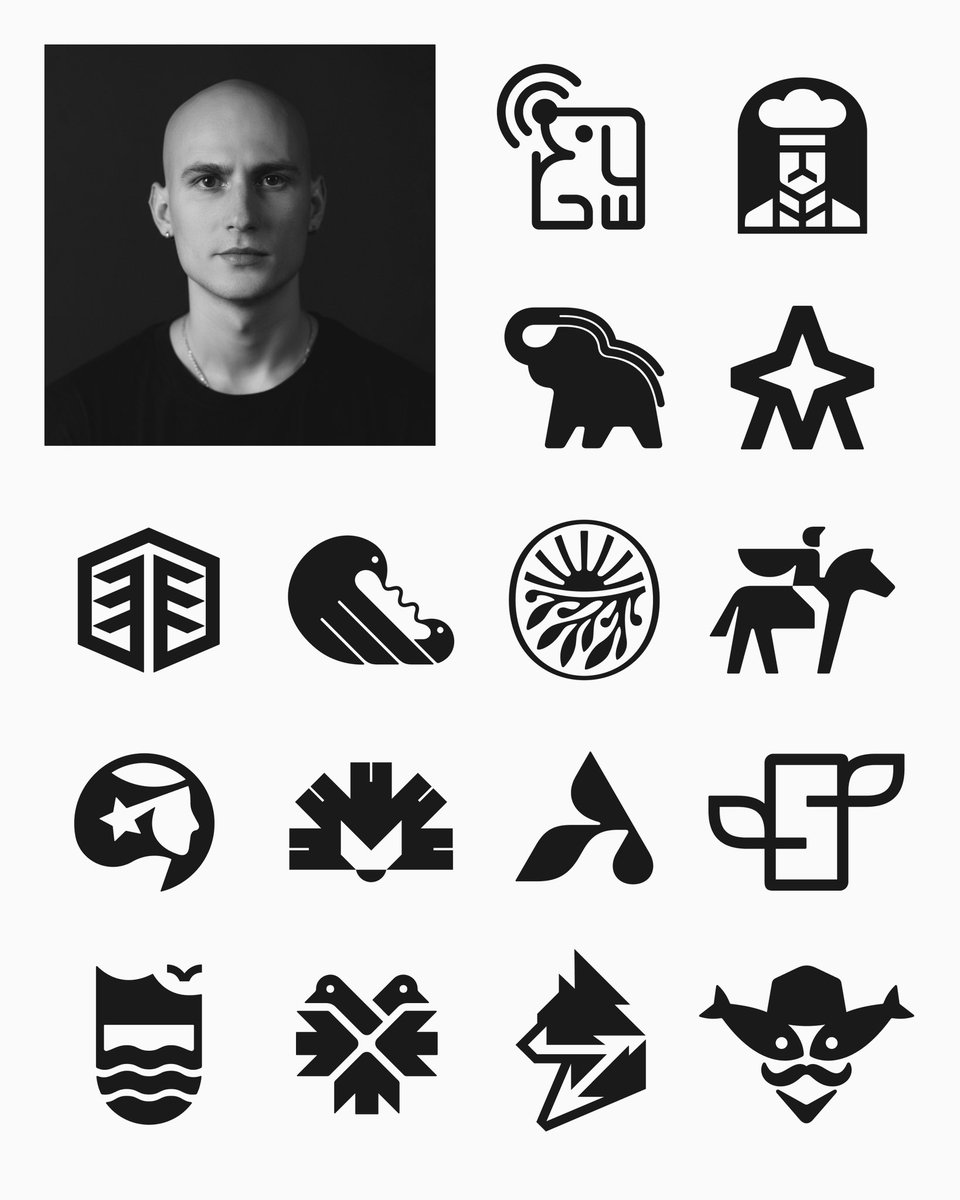
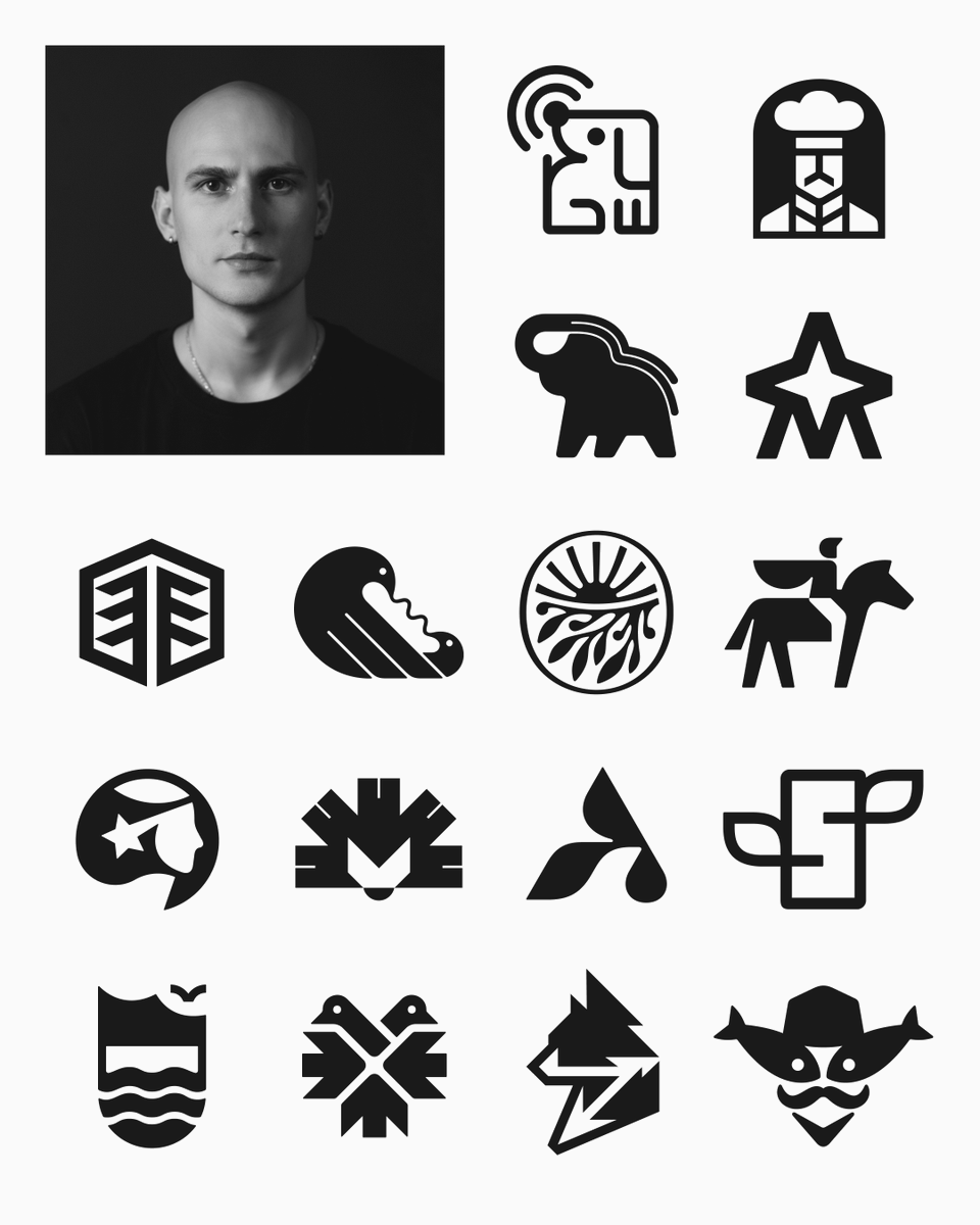
LogoArchive Now: @MaximDurbailov
LogoArchive has celebrated the logo designer of the past, but what of the future, who might find their own logos in the archive twenty years from now?
Create and tag us in your own to be featured.
#logos#branding#design
One post wasn't enough. Marks I keep coming back to – collected and sent over to @LogoArchive for round two. Logo design is the discipline I return to when I want to remember why I started. Which one holds up best for you?
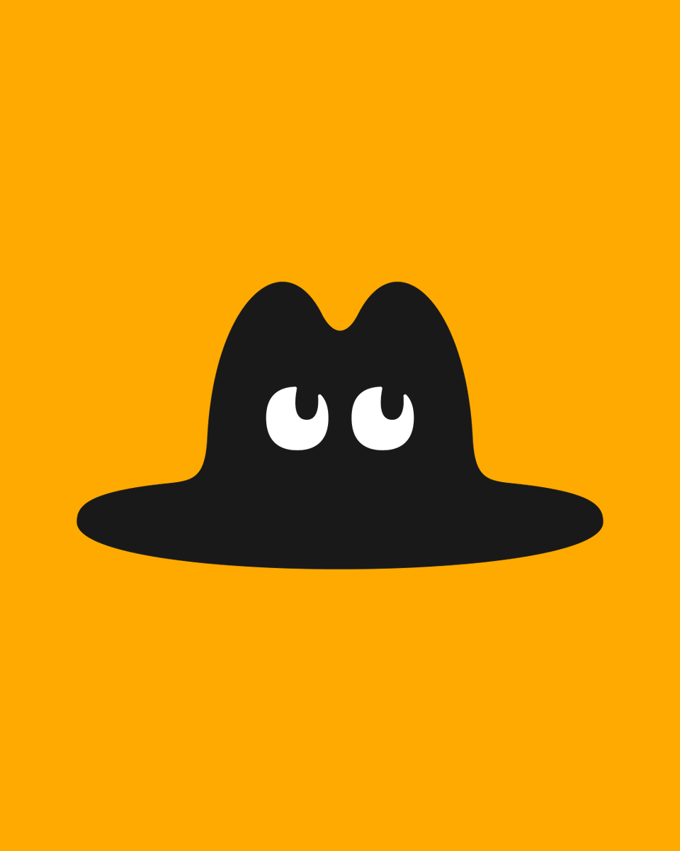
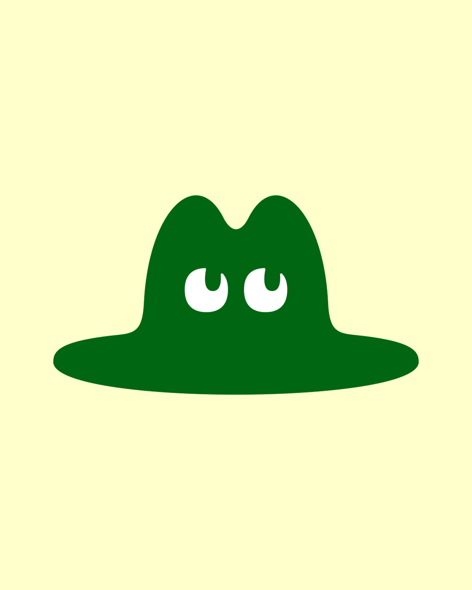
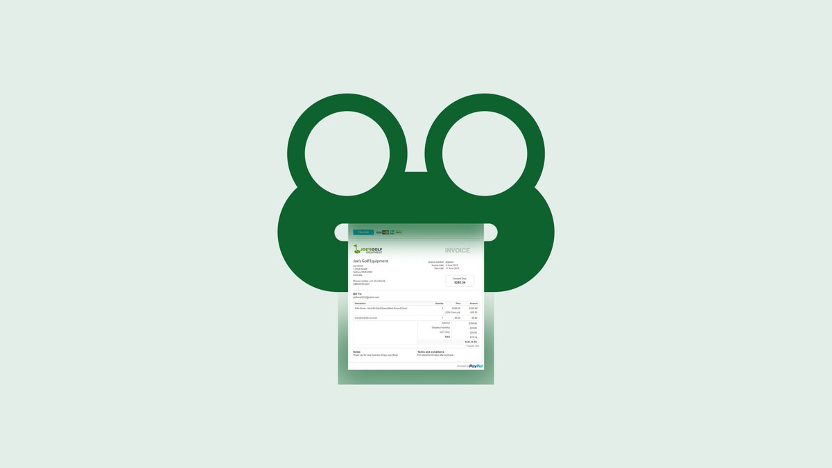
I sat down to draw a cat in a hat. Somewhere between the outline and the color picker, it turned into a frog. The interesting part isn't that the meaning changed, it's how little it took to change it. Same drawing, two animals. If I'd shown only one, no one would suspect the other existed. Curious what you’re seeing here?