OpticAlpha

83 posts

OpticAlpha

OpticAlpha

@OpticAlpha870

Stop paying for five tools to do what one terminal should.

Katılım Mayıs 2026
14 Takip Edilen0 Takipçiler
OpticAlpha
OpticAlpha@OpticAlpha870·
@BullTheoryio The yen carry unwind feeds directly into US Treasury pressure. When Japanese investors repatriate, they sell Treasuries, pushing US long-end yields higher. The 30Y is already at 5.20%. JGB instability isn't just Japan's problem, it's a feedback loop into global rates.
English
0
0
0
6
Bull Theory
Bull Theory@BullTheoryio·
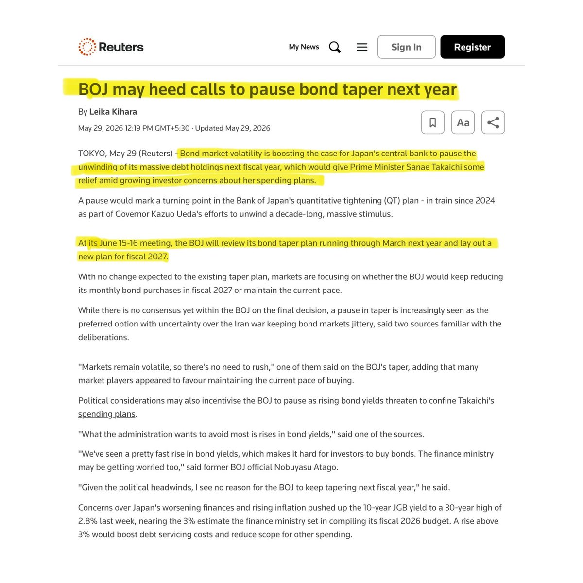
🚨 SOMETHING VERY ALARMING IS HAPPENING IN THE JAPAN BOND MARKET RIGHT NOW. And it could become a problem for every stock market in the world. The Bank of Japan spent the last two years trying to unwind one of the biggest money printing programs in history through Quantitative Tightening. The goal was simple: reduce its massive bond holdings, normalize policy, and slowly return the bond market to private investors after years of central bank intervention. Now that plan may be falling apart. According to Reuters, BOJ officials are increasingly considering a pause to QT in 2027 as bond market volatility continues to rise. This would be a major reversal for a central bank that has spent years trying to exit emergency-era policies. The reason is the bond market itself. Japan's 10-year government bond yield recently hit 2.8%, the highest level in nearly 30 years. Long-dated bond yields have reached record highs, and investors are becoming increasingly concerned about Japan's debt burden and rising inflation. This is becoming a serious problem because Japan has more than $8 trillion of government debt. The finance ministry built its entire 122.3 trillion yen budget assuming yields would not exceed 3%. Japan's debt servicing costs have already risen 10.8% this year to 31.3 trillion yen. Every move above 3% automatically wipes out spending room the government does not have. At the same time, inflation is rising again. For years Japan wanted inflation because the country was stuck in a low growth, low wage environment. Now inflation is being driven by higher energy costs and imported inflation from the Iran conflict, which is a very different type of inflation and much harder to control. Japan has recorded above-target inflation for 45 consecutive months. This leaves the BOJ trapped. If it continues QT, bond yields could move even higher and put more pressure on government finances. If it pauses QT, it risks showing that the bond market still depends on central bank support after more than a decade of intervention. And this is where global markets come in. Japan is the third largest economy in the world and the single largest foreign holder of US Treasuries. The BOJ currently owns 49% of all outstanding Japanese government bonds, 503 trillion yen out of a total 1,025.8 trillion yen market. When Japanese bond yields rise, Japanese institutional investors stop buying US Treasuries and bring money home instead. That reduces demand for US debt, pushes US yields higher, and tightens financial conditions for every market on earth that prices risk against the US 10-year rate. But the bigger risk is the carry trade. For years global investors borrowed money in Japan at near zero interest rates and invested those funds into higher yielding assets around the world US stocks, emerging market bonds, tech stocks, crypto. This trade worked as long as Japanese rates stayed low. As the BOJ raises rates and Japanese yields rise, the cost of borrowing in yen increases. That forces carry trade investors to close their positions, selling the assets they bought and converting back to yen to repay their loans. In August 2024 the BOJ raised rates by just 0.15%. What followed was the single largest single day crash in the history of the Japanese stock market and a violent selloff across global equities, crypto, and emerging markets within 48 hours. The BOJ is now expected to raise rates to 1% at its June 15-16 meeting. That is a significantly larger move than August 2024. The carry trade built on decades of near zero Japanese rates is estimated at over $4 trillion globally. That's why this should scare every investor in the world.
Bull Theory tweet mediaBull Theory tweet mediaBull Theory tweet media
English
44
147
719
38.7K
OpticAlpha
OpticAlpha@OpticAlpha870·
@ailuc55373257 $BTC over $ETH in risk-off makes sense. When ETF flows go deeply negative, capital retreats to the most liquid reserve asset first. The fear and greed index is in extreme fear territory alongside this. That combo usually marks where the floor-hunting begins.
English
0
0
0
2
Scarlett
Scarlett@ailuc55373257·
ETF funds are collectively withdrawing. 🚨 The Bitcoin spot ETF has just set a record for 10 consecutive trading days of outflows, with a cumulative outflow of nearly $3 billion. 📉 More notably: The situation for the Ethereum ETF is even worse, having seen outflows for 14 consecutive trading days. ⚠️ Frankly, if this indicates the market is entering a risk-averse mode, then, judging from fund flows, BTC may still outperform ETH. Because when funds begin to contract, the market often returns to the most core and liquid assets first. 👀 #BTC #ETH #Crypto
Scarlett tweet media
English
1
0
0
38
OpticAlpha
OpticAlpha@OpticAlpha870·
@Enkhmanal The STLFSI2 financial stress index never spiked through any of this. Cyclical recessions show credit stress first. That hasn't happened. It's the clearest evidence the structural read is right. The labor market is speaking a language the Fed's models weren't built to decode.
English
0
0
0
2
Enkhmanal 🟠
Enkhmanal 🟠@Enkhmanal·
FRED Just Flagged The Weirdest Unemployment Pattern Of The Modern Era — Unemployment Has Risen Slowly For 3 Years Without A Recession And Friedman's 'Plucking Model' Just Got Broken The St. Louis Fed's FRED Blog published a piece on Monday that deserves much more attention than it's getting. Looking at 75 years of US unemployment data, the Fed's economists noticed something genuinely unprecedented: the unemployment rate has been rising slowly from a low level for the past three years, but there has been no recession and no sharp rise. That's not how unemployment is supposed to behave. Milton Friedman in 1964 and 1993 famously described unemployment as following a "plucking model" — it's almost always doing one of two things: declining slowly during expansions, or rising rapidly during recessions. The slow-rising pattern of 2023-2026 doesn't fit either bucket. It's the first time in the dataset. For Mongolian investors trying to make sense of a confusing US macro picture, this is one of the most important data points of the year. Let me explain why. The Friedman Framework Friedman's "plucking model" is conceptually simple. Imagine an economy operating at potential. Unemployment sits at some natural rate (currently estimated around 4.0-4.2%). Shocks pluck the unemployment rate down or up like a guitar string: • Expansionary plucks (declining unemployment): Slow and gradual, lasting years. New hiring happens incrementally as firms add capacity, demand grows, and labor market frictions are reduced. • Contractionary plucks (rising unemployment): Fast and brutal, typically associated with recessions. Layoffs are lumpy. Firms cut workforce in bulk when demand collapses. The FRED Blog graph that triggered Monday's piece shows: • The jagged red line: actual US unemployment rate over decades • The smooth green line: 25-month moving average • Green triangles: each local minimum of the moving average • Blue circles: unemployment rate 36 months after each minimum In every cycle except 2020 (COVID) and 2023-present, the unemployment rate climbed significantly within 36 months of a local minimum. The current cycle is genuinely anomalous. What's Actually Happening The slow rise without recession is the macro puzzle of our era. Several non-mutually-exclusive explanations: 1. Demographic-driven labor force decline. US labor force participation has been declining due to baby boomer retirements. The "available workers" denominator is shrinking. Even modest job losses don't push the unemployment rate up sharply because exits to retirement and disability offset. 2. Labor hoarding by firms. Post-pandemic, firms learned that hiring is hard and expensive. Many are keeping workers on payroll even when demand is weak because rehiring later would be more costly. This shows up as "labor productivity" weakness in some sectors and slow-growing unemployment despite slowing economic activity. 3. Sectoral asymmetry. The economy is splitting. AI and tech employment is growing. Construction, manufacturing, restaurants, retail are flat or shrinking. The aggregate unemployment rate masks dramatic divergence by sector. Tech firms hiring offsets manufacturing layoffs. 4. The k-shaped economy. As the New York Fed has documented, top-income spending is up 7.6% year-over-year while low-income households are flat. This translates into employment: jobs in upscale services, financial services, and tech are abundant. Jobs at the lower end (entry-level retail, restaurants, hospitality) are thinning. The unemployment rate is a population-weighted average that smooths over this divergence. 5. Fiscal sustainment. Federal spending remains at post-COVID highs despite DOGE-era cuts. Defense spending is surging. Healthcare spending is high. State and local employment growth is strong. The fiscal floor under the labor market is keeping things from breaking. 6. AI-driven productivity offsetting demand weakness. AI tools and automation are letting firms produce more output with the same headcount. This shows up as flat productivity (because GDP growth is muted) but it's actually huge productivity gains masking demand weakness. Without AI, this would look like a clear recession. 7. Demographic anomalies in the COVID cohort. A generation of workers retired or left the labor force during COVID. They didn't come back. The labor market structure has been permanently altered. Why This Matters For Macro Policy The Fed's framework for understanding recessions has been broken for three years. Powell's models assume that rising unemployment is a recession indicator. Slow rise without recession means the Fed's "wait and see" approach to rate cuts may be wrong: • If we're in a slow-rolling recession that doesn't show up in unemployment, the Fed should be cutting • If we're in a structurally different labor market where slow unemployment rises are normal, the Fed's traditional reaction function doesn't apply • If we're seeing AI-driven productivity offsetting weakness, the Fed should be focused on inflation rather than labor Kevin Warsh, the new Fed chair, has been the most hawkish chair in three decades. His instinct is that this is a strong economy that doesn't need cuts. The "slow unemployment rise without recession" data point is actually evidence for Warsh's position — the labor market really is structurally different and tighter than the headline rate suggests. The dissents at the FOMC have been increasing. The May meeting saw three hawkish dissents — the most since 1992. The internal Fed disagreement reflects the genuine puzzle about how to read this labor market. The Investment Implications For Mongolian investors trying to make sense of US assets, several implications: 1. Cyclical stocks face structural confusion. The traditional "recession trade" — short cyclicals, long defensives — doesn't work when recession indicators are broken. Industrials (CAT, GE, ETN) and consumer discretionary (HD, LOW, TJX) have been ripping despite "recession signals." That continues until the labor market actually breaks. 2. Tech employment growth supports tech multiples. The Mag 7 and AI infrastructure stocks (NVDA, AMD, MSFT, GOOGL) are benefiting from the same labor market dynamics that are driving the slow unemployment rise — tech is hiring while everything else stagnates. The "tech is overvalued" trade keeps failing because tech employment growth keeps surprising. 3. Bond yields stay structurally elevated. If the Fed can't read the labor market clearly and the economy isn't tipping into recession, then the 10-year yield doesn't have a clear path down. The "duration" trade (long Treasuries, long REITs, long utilities) underperforms in this regime. 4. The financials trade benefits. Banks (JPM, BAC, WFC) benefit from elevated rates without recession. Insurance (BRK.B, AIG, PGR) benefits from labor-market-driven premium growth. Capital markets firms (GS, MS) benefit from continued M&A activity. 5. Defensive sectors underperform. Consumer staples (PG, KO, PEP), utilities (NEE, SO, DUK), and healthcare (UNH, JNJ) all assume a more traditional cyclical pattern. In a "slow grind sideways" labor market regime, defensives don't get the recessionary tailwind they need. 6. Gold and silver work as anti-confusion hedges. When traditional macro indicators are broken, gold/silver work as a hedge against monetary policy uncertainty itself. Both have been ripping in 2026 partly because the Fed's confusion is part of the structural bull case. The Friedman Critique There's a deeper point here that Austrian economists (and increasingly even mainstream macro) are starting to argue. The "plucking model" assumed a relatively pure market economy where labor allocation responds to demand signals. The current US economy: • Has 28% of GDP coming from government spending • Has $35 trillion in federal debt • Has massive credit creation through Fed liquidity facilities • Has 0DTE options trading 94% of all options volume • Has structural fiscal deficits being run during expansion In an economy with this much non-market intervention, why would Friedman's market-derived plucking model apply? The model assumed a labor market that responded primarily to private-sector demand. Today's labor market responds heavily to fiscal policy, monetary policy, immigration policy, regulatory policy, and the unique demographics of the post-COVID cohort. The honest macro read is: the United States has built a labor market structure that may genuinely be more resilient to traditional recession dynamics. But that resilience comes at the cost of running massive fiscal deficits, accumulating debt, and creating asset price distortions that may matter more for the long-term economic outcome than the unemployment rate itself. The Mongolian Read For a country watching the US economy from the outside, the slow-rolling unemployment puzzle has implications: 1. US Treasury yields stay elevated longer than expected. The currency implications are real — the dollar remains structurally strong as long as US rates are higher than competitors and the labor market doesn't crash. 2. US consumer demand stays elevated. US imports continue at high volumes, which means continued demand for Mongolian-exported commodities (copper, coal indirectly via Australia, gold). 3. The "American capacity to absorb shocks" narrative is real. The fact that the US economy can absorb a major Iran war, an aborted China trade reset, and a banking sector wobble without recession is a credible signal of underlying strength. 4. Patience for traditional cycle indicators may not pay off. Mongolian investors who have been waiting for a "real recession" to deploy cash may be waiting indefinitely. The structural shifts in the US labor market may have permanently changed cycle dynamics. What To Watch • Labor force participation rate trends (declining = more "plucking model violation") • Jobless claims weekly data (the leading indicator that hasn't broken) • Continuing claims (the lagging indicator that hasn't broken either) • Sectoral employment breakdowns (tech up, manufacturing flat = structural) • Fed dissents and Warsh's posture going forward • The next Beige Book release for qualitative labor market reads The FRED Blog post is a quiet but important macro signal. Friedman's plucking model has been one of the most reliable empirical regularities in US labor economics for 75 years. It just stopped working. Either the model is genuinely broken (and we need a new framework) or we're about to see a delayed but extreme adjustment (and traditional recession dynamics reassert themselves dramatically). Position for both scenarios, but lean toward the structural-shift interpretation — because that's where the data has been pointing for three years.
English
1
0
0
74
OpticAlpha
OpticAlpha@OpticAlpha870·
@CappyGrowth ETF flow data separates the two regimes. When $BTC spot ETF flows turn negative while dominance drops, it's de-risking across the board. When flows stay positive but dominance falls, that's actual rotation. Right now flows are negative. That's not altseason, that's a flush.
English
0
0
0
2
OpticAlpha
OpticAlpha@OpticAlpha870·
@GreeksOptions Both camps are right depending on conditions. High positive GEX near max pain amplifies the magnetic effect through dealer hedging. In negative GEX or with a major flow imbalance, that gravity disappears. Gamma context is what separates the two regimes.
English
0
0
0
2
Greeks
Greeks@GreeksOptions·
📊 Weekly Poll — $SPY Max Pain is at $738 this week Do you trade the Max Pain magnet effect? (At expiry, price tends to gravitate toward the strike where option sellers lose the least) #maxpain #options #SPY #poll
English
2
0
1
57
OpticAlpha
OpticAlpha@OpticAlpha870·
@sarcastic_hedgi @feinht @itsdjain @TLAMB91 Right take. Raw flow direction is almost always noise without dealer positioning context. A 10k put sweep means nothing if it's hedging an existing call position. The flow that actually matters changes where dealers are forced to hedge, not just what direction it prints.
English
0
0
0
2
Sarcastic Hedgie
Sarcastic Hedgie@sarcastic_hedgi·
@feinht @itsdjain @TLAMB91 lol most "options flow" discourse is just people staring at unusual whales alerts wondering why their 0dte spy calls didn't print when a hedge fund bought 10k puts to delta hedge some custom derivative they sold to a client the flow isn't the trade, it's the exhaust
English
2
0
1
65
OpticAlpha
OpticAlpha@OpticAlpha870·
@asymmetricmind The reflexive part is what makes it tricky. If Warsh signals any dovish lean to placate the White House, the 30Y sells off harder, tightening conditions further regardless of Fed funds. Fiscal dominance means the bond market can override the chair. The yield is the policy now.
English
0
0
0
1
TheAsymmetricMind
TheAsymmetricMind@asymmetricmind·
3/ Kevin Warsh confirmed as Fed Chair. He walks into a divided FOMC majority leaning toward rate hikes, a president demanding cuts, and a 30-year yield at 5.20%. The long end of the Treasury curve is now setting policy. Not Trump. Not Warsh. The market.
TheAsymmetricMind tweet media
English
2
0
4
40
TheAsymmetricMind
TheAsymmetricMind@asymmetricmind·
1/ 30-year Treasury at 5.20% — highest since 2007. S&P 500 near 7,400. Hormuz running at 2% of normal flow on Day 82. Bonds are pricing war. Equities are pricing a deal. Both cannot be right. This is the one pattern that matters today. Full brief in comments.
TheAsymmetricMind tweet media
English
2
0
1
76
OpticAlpha
OpticAlpha@OpticAlpha870·
@TedPillows The CVD divergence on $ETH started weeks before this trendline break. Price held structure while buy pressure eroded underneath. Spot BTC ETF flows turning negative this week is the macro confirmation. Trendlines show you what happened. Orderflow tells you earlier.
English
0
0
1
3
Ted
Ted@TedPillows·
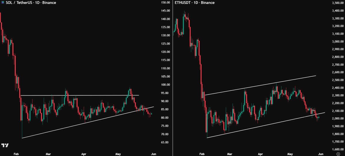
$ETH and $SOL have lost their uptrend. This isn't looking good.
Ted tweet media
English
166
103
620
37.6K
OpticAlpha
OpticAlpha@OpticAlpha870·
@Andy__Moss The 'weight of evidence' framing is how you stay objective when markets look extended. The trap is leading with price. When the macro calendar is dense and yield curve signals are mixed, the evidence-based read matters more than any single setup. Solid framework.
English
0
0
0
1
Andrew Moss, CMT
Andrew Moss, CMT@Andy__Moss·
📈Weekly Charts📉 Not much has changed — and that’s generally a good thing. The market may be extended in places, but the weight of the evidence still favors higher prices until proven otherwise. Also included this week: a look at Bitcoin, bonds, commodities, sector rotation, and the latest developments from Alphatrends. Video and charts below.
Andrew Moss, CMT tweet media
English
2
0
5
1K
OpticAlpha
OpticAlpha@OpticAlpha870·
@unusual_whales COO admissions like this matter more when you layer in the insider transaction window. Exec statements that undercut the AI narrative tend to precede either buyback announcements or analyst target cuts. Worth watching how $UBER insiders are positioned right now.
English
0
0
0
1
unusual_whales
unusual_whales@unusual_whales·
Uber, $UBER, COO Andrew Macdonal has said the rideshare giant wasn't seeing productivity and other gains in line with its increased AI spending.
English
179
169
1.4K
134.9K
OpticAlpha
OpticAlpha@OpticAlpha870·
@EdwardXLreal MACD. It's RSI and two moving averages in a trench coat. Traders treat the histogram like it has predictive power when it's just showing momentum of momentum. By the time it crosses, the move that mattered already happened.
English
0
0
0
1
Edward
Edward@EdwardXLreal·
Most OVERRATED trading indicator? Go.
English
196
23
452
30.8K
Edward
Edward@EdwardXLreal·
Define your Trading Strategy in 3 words.
English
698
62
767
50.3K
OpticAlpha
OpticAlpha@OpticAlpha870·
@ChartsRUs0 The repeat print filter is the real edge. A $MSFT dark pool hit on EOM rebalance day is noise. That same name printing elevated DP two or three sessions before the window opens is a different signal entirely. Persistence across sessions separates accumulation from repositioning.
English
0
0
0
2
Charts R Us
Charts R Us@ChartsRUs0·
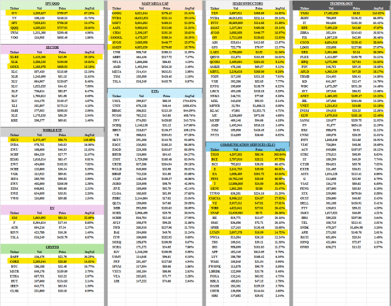
Dark pool from May 29th, 2026 We're seeing the typical EOM repositioning DP prints. Because of that, a lot of the volume on your charts is going to look inflated and Friday's list will be filled with unusually large numbers. Don't get distracted by the big prints. Focus on the names that were already showing elevated dark pool activity before today's repositioning flows hit. Those are the tickers that were attracting institutional interest before the EOM noise entered the equation. $MSFT $AAPL $NVDA $BAC $NEE
Charts R Us tweet mediaCharts R Us tweet mediaCharts R Us tweet media
English
6
0
17
2K
OpticAlpha
OpticAlpha@OpticAlpha870·
@LanceRoberts What breaks it isn't usually news but the GEX flip. When $SMH crosses from positive to negative gamma exposure, dealers go from buying dips to selling rips. The dehedging cascade can be fast. Watch where net GEX turns negative - that's the structural ceiling.
English
0
0
0
2
OpticAlpha
OpticAlpha@OpticAlpha870·
@Kalshi_Crypto The mechanics matter. IBIT outflows don't mean BlackRock is bearish - APs are just redeeming shares. The signal is cumulative net flow across all spot ETFs. When every issuer bleeds the same day, that's a real demand read. One issuer's outflow in isolation tells you little.
English
0
0
0
1
Kalshi Crypto
Kalshi Crypto@Kalshi_Crypto·
JUST IN: BlackRock has sold $2.1B worth of Bitcoin over the past 10 days
English
120
74
1.1K
65.8K
OpticAlpha
OpticAlpha@OpticAlpha870·
@SanyaKupetz The cleaner input thesis is underrated. If offshore perp dominance contaminated the funding signal, that 46-day negative streak reads differently. Not pure sentiment, partly structural distortion. The Kalshi vs. Binance migration rate is the actual signal to watch here.
English
0
0
0
1
Alexandr Kim
Alexandr Kim@SanyaKupetz·
The CFTC just approved the first regulated U.S. Bitcoin perpetual futures contracts. The product story is clear. The market structure shift is more important. Perpetual futures — not spot ETFs — drive roughly 75–80% of BTC price discovery. The funding rate mechanism is where leverage and institutional sentiment crystallize in real time. That market has been offshore and opaque to U.S. regulators since 2018. What changed: U.S. institutional desks can now run the full carry trade in a regulated venue — long spot ETF, short regulated perp. No offshore counterparty risk. No CME expiry roll cost. The CFTC stamp gives compliance teams the green light that CME-adjacent products don't fully cover. Second-order effect: the 46-day negative funding streak and the current 9-day ETF outflow record were both partly shaped by offshore perp positioning dominating the price discovery signal. As volume migrates to regulated U.S. venues, funding rates and ETF flow data become cleaner inputs. The record 9-day outflow ($2.8B) reflects a market still dominated by the old structure. Watch regulated perp volume on Kalshi vs. Binance/Bybit over the next 90 days. That migration rate is the signal the current data doesn't capture. Not advice.
English
1
0
0
24
OpticAlpha
OpticAlpha@OpticAlpha870·
@OVcrypto BTC COT history only goes back to 2017 so the sample of these extremes is thin vs $EUR or $JPY where you have decades of mean-reversion data. The setup is real but the edge is in the week-over-week position shift magnitude, not just the snapshot itself.
English
0
0
0
3
OVcrypto
OVcrypto@OVcrypto·
#Bitcoin COT Data - still an interesting setup 🔸Commercial are still heavily net short 🔸Large speculators are still heavily net long Looking at previous instances when Commercial were net short around -2000 or below and Large speculators were net long around +2000 or above, then a leg up followed for BTC.
OVcrypto tweet media
English
4
5
24
826
OpticAlpha
OpticAlpha@OpticAlpha870·
@0xElenchuseiqx Real outflow, but incomplete picture. ETF redemptions happening alongside declining exchange supply complicates the institutional selling narrative. Those two metrics measure different things. ETF flow tracks fund redemptions. It doesn't tell you where the coins actually land.
English
0
0
0
1
Musab Gaza 𓂆
Musab Gaza 𓂆@0xElenchuseiqx·
Whales shaking out weak hands with that $528M IBIT outflow… honestly? Classic pre-pump behavior. BlackRock doesn't build the world's biggest BTC ETF just to abandon it. Temporary pain. 👀 #Bitcoin Who's been buying this dip?
English
2
0
1
40
OpticAlpha
OpticAlpha@OpticAlpha870·
@mcatorce_ CVD diverging bullish while price makes new lows is a strong structural read. When you layer in negative funding on top, it means shorts are paying to stay in while real market buying is happening beneath. That combination tends to resolve one way. Good catch on the confluence.
English
0
0
0
4
Mike Catorce
Mike Catorce@mcatorce_·
Spotting a textbook Daily Bullish Divergence on $VVV. 🧠📈 ​Price is trickling down to test macro support at $16.35, but Daily CVD is exploding straight up to +24.1M. This means whales are aggressively absorbing the sell-off with market buys right into the MA(30). ​Add in negative funding (-0.0032%) and a massive flush-out of retail longs, and this looks like a spring being compressed for a macro short squeeze back to $20.70. ​Bulls are defending this line hard. Eyeing $17.18 (MA10) for the official trend flip. ​$VVV #VeniceToken #Crypto
Mike Catorce tweet mediaMike Catorce tweet media
English
1
0
2
201
OpticAlpha
OpticAlpha@OpticAlpha870·
@TedPillows $13.6M at 47x means the liquidation engine would need to buy back ~185 $BTC to close. That's not nothing. Weekend sessions with thin order books make the hunt more likely not less. These positions show up on liquidation heatmaps as bright targets for exactly this reason.
English
0
0
0
2
Ted
Ted@TedPillows·
A whale opened a $13,656,000 $BTC short with 40x leverage. He is only $630 away from getting fully liquidated.
Ted tweet media
English
129
37
462
51.6K